Like all the "starters" the following tutorial illustrates a very simple concept—in this case, how to add text to a photo. The internet abounds in complex tutorials, but sometimes the easy things get ignored because the pros think they're too obvious. I fell into that trap until Michelle said, "I know a lot of people who don't know how to put text on a photo." So here's hoping those people read my blog...
The example
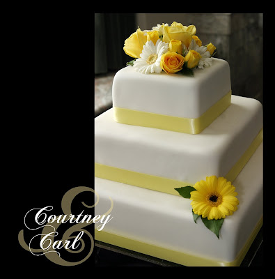
As an example, I will use a page from a wedding album I designed a couple of years ago. In this case I wanted to use a vertical image of the cake, but I thought the square page looked too plain with just the photo. My solution: put the name of the bride and groom next to it. I think the final result is much better than just the photo alone:
 The steps
Let's look at how I got there while we learn basic principles you can apply to your own projects.
step 1. Open the photo you want to which you want to add text. Here's the wedding cake all by its lonesome:
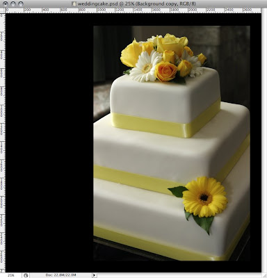 Note that all my screen grabs are from CS3 this time, but you can also do it in Elements, I promise.
step 2: Hit "T" for text or click on the icon in left toolbar that looks like a "T". (In Elements you may have to double click the background layer and click "OK" to rename it to an editable "layer 0."). If you click on the "T" in the toolbar, you will notice that you have options like "Horizontal type tool," the pointless "Vertical type tool" (pointless, because you can make the horizontal type vertical anyway) and others that we'll save for another time (or not). Once you have selected the type tool, a menu bar will appear at the top:
 If you have done any word processing, the menu will not be intimidating: a pull-down list of fonts, a place to adjust the font size, right, left, or center justification...pretty standard. You will also notice an icon (at far left for Photoshop and at right for Elements) that allows you to change between vertical and horizontal type with a simple click. And then there's the box you can click to change color (we'll use this later).
step 3: Now go ahead and click somewhere in the photo. You will notice that when you use the text tool, you automatically create a new layer. Now type away (hint: If ever you type and can't see your text, chances are, your color box matches your background or the font size is super small)
I typed the name of the bride.
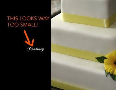 But the size you select may not be right so....
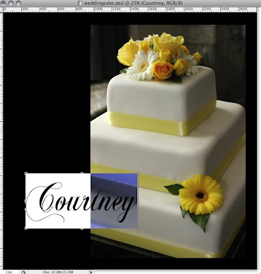
step 4: Change the size of text as needed by highlighting the text (double click on it or on the text layer in the layers palette—the "T" thumbnail icon, not the layer name) and selecting a new font size in the menu bar. Alternately, you can bring up a some free transform handles by holding the command key (Mac) or Crtl for you Windows folks. Those little handles will let you drag and distort the font as you like, the disadvantage of this latter technique being that you can't make it constrain the proportions (experts please correct me if I'm wrong). You can see the highlighted text (now looking too big) with the transform handles below:
 step 5: Add more text on another layer. We can't forget the groom, so we'll make sure the text tool is selected and create a new text layer by clicking somewhere else in the photo. (Just for the fun and frustration of it, try clicking near a word you have already typed and it will snap back to that layer instead of creating a new one. If this ever happens, you can avoid it by holding "Shift" while clicking.) When the text is highlighted you can move it wherever you like (your cursor will become a move tool when it's outside the highlighted part—just click and drag).
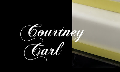
step 6: Move the groom into a good place...say, in a subordinate position to the bride? How's that?
 Step 7: On yet another text layer (you know how), add a giant fancy ampersand (much cooler than boring old "and"), and then use the text menu bar to change the size and the color.
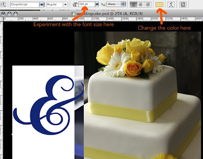 How about a buttery yellow?
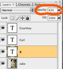
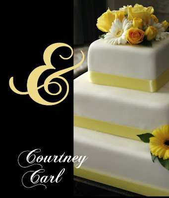 Step 8: Final adjustments. First, I moved the ampersand to a more logical place. Next, in the layers palette, I dragged it under "Courtney" and "Carl" so their names would not get buried. And finally, since the ampersand was too intense (This wedding is brought to you by the symbol for "and"! ) I lowered the opacity.
 Before printing, you can flatten and save as a jpg for printing. That's it. Now you can start doing cool things with text and photos.
Postscript tip
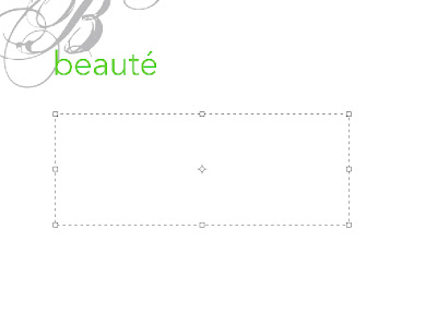
One more thing. What if you want to add a big chunk of text and you don't want it to run wildly off the screen? You can create a text box to keep your text where you want it. After selecting the text tool, click and drag to define the size of the text box (hint: if you want a perfect square, hold down the shift key). Now you can type away and everything will stay within the box. Here's a section of a book layout where I wanted to add a quote:
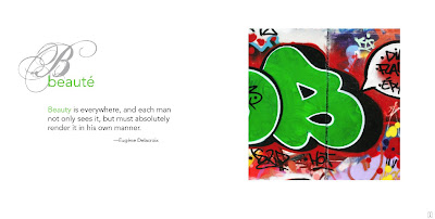
 After typing the quote in the text box I can move the text around as one chunk until I like the layout. Here's the finished two-page spread:

Customize cakes are very popular and are in a trend now a days and that is why we also written a blog to give people dissertation help online
ReplyDelete