Wednesday, January 28, 2009

Interview with Elain Vallet of Elainev.com

I first happened upon Elaine's blog back in August when I was doing the "photo within a photo" theme. As is the case with all good French people, Elaine was taking a four-week vacation in August. Luckily, she had posted a great photo within a photo shot on her site. I have been admiring her work ever since, so I am happy to share some of it with you in this brief interview

(NOTE: As always, my guests hold the copyright to their work. Please respect it.)

Most of your photography on your blog and website is black and white, is there a reason that you favor black and white photography over color?

My first approach to photography was in black and white, through my father’s photos as a kid, seeing them appear on paper in an improvised darkroom in our flat. Then, I discovered the b&w humanist photographers such as Cartier-Bresson or Ronis and the work of Magnum agency journalists by whom I have been very much influenced.

Besides, I find it easier to convey the sense of a moment without the interference of colors and also because monochromatic settings leave more space for graphics, shadows, lights and contrasts which are very dear to me and I have to admit also much easier to shoot. As far as I’m concerned, colors are terribly difficult to handle…

Here, the use of b&w gives a sense of unity between the boy, shadow and reflection

How do you decide which photos to leave in color and which ones to convert to black and white?

I hardly ever use film cameras but if I do, it is with b&w films, so that I can do the printing myself in a darkroom, which I find fascinating.

Otherwise, I use my canon digital camera (rebel Xti), taking most of my photos in RAW, for the flexibility of the format. Yet my camera is always on b&w settings, so that I get direct b&w screen control. I have gotten used somehow to thinking in b&w, anticipating what a scene will look like once captured, focusing on lights and shadows.

Nevertheless, I can change back to colors on the computer and sometimes I am pleased with the result and decide to leave it that way, especially when there is one main color in the scene, as a sort of “bichromatic” picture. If you have a look at my galleries, all the color pictures have a clear dominant tone.

This would be more of a “black and blue” picture than a full “color” picture

Can you share how you convert your photos from color to black and white?

As I have said before, my camera is always on b&w settings, so when I upload the photos onto the computer they are already in b&w. I work on the RAW files with Canon’s software DPP and most of the time I adjust the levels or curves a little to sharpen the contrast. I also enjoy very much the filters effects, especially the red one that is always very efficient on skies and reflections.
Here the red filter effects make the clouds stand out and the light appear darker.

When I need a bit more processing, I use Photoshop to create layer masks so as to work on a selected part of the photo. And that is about it really, as I am not very good with computers and not willing to spend too much time on processing.

Do you have any advice for people who are new to black and white photography?
I got into b&w photography because I was moved by some photographers’ work. I remember the emotional shock it was for me to discover Sebastiao Salgado’s collection or “reading” Abbas’s Children of Abraham book. So I guess it mainly depends on one's sensitivity. People around me keep asking why I don’t take color pictures and the only thing I can say is that I shoot in b&w because this is the way I feel it, because this is what I find “beautiful.” So, if I were to give advice to someone, with my very small experience, it would be to shoot what you like, because it moves something in you that you want to share. The main key to a strong b&w photo is obviously the light and the shadows it creates, but it is also easy to play with transparencies, reflections, smoke etc. Marc’s rules for b&w are just the most important things you have to bear in mind. :)

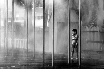
The artificial mist creates a particular mood around the boy and makes him stand out in this graphic environment.

What do you hope to share with others with your photography?

This is a very tricky question actually. I guess I just want to provoke emotions in others the way some photos do for me, either because it tells a story (funny, tragic, informational...) or because the aesthetic or the mood in the picture gets at you. It is mainly about sharing a point of view on one moment in time. The theme that keeps coming back in my photos is the isolation of men in their self-made environment, and my photos are probably my way to show that I care....

Could you comment on a few of your favorite black and white photos?

There are a few of my pictures that are important to me for the moment they represent or for the time I put into them or simply because I was lucky to be there at the right moment.

"Adieu"

Adieu was taken in New York City. There was a big puddle on the ground and some NYC-style buildings were reflecting in it. It took me a while to figure out what I wanted to do with this and I put my hand over my eyes to protect them from the sun. This is when I realized my hand appeared in the sky, as if coming out from the cloud. It is one of my first water reflection experiences and it has opened up lots of new perspectives to my photographic habits. I didn’t do any processing on it. (1/400 sec f 3.5)

"Rrrrr"

I like the story in this picture which I find quite funny, this little boy escaping from the roaring man on the poster. This is a photo I had to process bits by bits to get the poster up front bright enough and to get rid of the reflections on it. I also appreciate the general graphic of the composition.
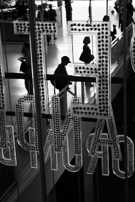
"Grand Ecran"

"Grand Ecran" is an example of human isolation in big cities, everyone in his box, letter ...no communication… and yet a beautiful surrounding. Here I used the red filter to make the letters stand out (as they were red lights) and the light coming from the back helped a lot to darken the silhouettes.

Thanks Marc for having me on take-out photo.

Thank you, Elaine, for sharing your work and insight.

As a side note to my readers, I have to say how impressed I am with both Marcel and Elaine for their willingness to talk about their work and their ability to discuss it so eloquently in a second language. Ever since my interview with Lorrie McClanahan in August I have been wanting to do more interviews, so being able to do two this month has been great.

The month is almost over, but there is still time to post your own black and white work as part of the Monthly Special. [New to Take-out photo? Check out the FAQ page.]

Tuesday, January 27, 2009

The Zone System

Because we are doing black and white this month, I thought I would share some photo history. This post is not meant to be a tutorial about the zone system. In fact, I never use it in my own work, most likely because I tend to be more intuitive (a euphemism for undisciplined?) rather than methodical. However, given that many of the great masters swear by the zone system, you may want to know about it.

A brief history of the zone system

Ansel Adams and Fred Archer created the zone system around 1941. I think it is safe to assume that you have heard of Ansel Adams and seen some of his stunning black and white landscapes. Every poster store in America carries reproductions of his work. Fred Archer, on the other hand, has never achieved a comparable level of popularity, and is often eclipsed by Adams even in accounts of the zone system. Some would argue that Archer first came up with the idea and that Adams, after having read about it in a series of articles, helped to formalize the system.

The goal of the zone system is to have better control over exposure. The first step in achieving good exposure is to visualize the entire photograph and to study the gradations from blackest black (zone 0) to whitest white (zone 10). You can see a good chart of the 11 zones (typically labeled with roman numerals) on Wikipedia. Ansel Adams only considered zones I to IX to be useful for film density.

I asked my assistant, Lucy, who uses the zone system all the time, to help out by labeling one of her photos according to zones:

Photo by Lucy Call

If you are just reading to get a basic understanding of the zone system, you might be satisfied by looking at the photo above and then skipping to the conclusion, but if you want to plunge into the more technical aspects and try it out (this is a darkroom process), here is an explanation from Lucy:
    1. You must find your effective film speed. With large format camera and B&W sheet film, I use Kodak T-Max 400, expose five sheets of film. You bracket these exposures, so that one exposure is right on and one is ½ stop under and another is 1 stop underexposed. Then the other two are ½ stop over exposed and 1 full stop overexposed. These are all developed at the suggested time for your film and developer type. Then to determine the effective ISO, you look at the different exposures and find where you think your values, mainly shadows, look best. So if you like the one that was exposed for what the meter said, then you would shoot your film at 400. I believe that the ½ stop underexposed would be ISO 320 if I remember correctly.
    1. Now that you have your ISO, you want to find your effective developing time. So expose 5 sheets of film at your new ISO and develop each sheet. If your suggested developing time was 7 ½ minutes, then you would put one sheet of film into the tray of developer and wait thirty seconds and then another and wait thirty seconds and another and so on, until the first sheet has been in the developer for 8 ½ seconds and the last one put in has been in it for 6 ½ seconds. Once this is finished you can determine your effective developing time. Look at highlights.
    2. Then go shoot and use the zone system. The first thing I do is look to see what I think should be in zone III (my darkest darks that still have full detail) and then I meter that and stop down two because it is giving me middle gray. Then with that I meter where other values will fall accordingly. If I don’t like where some of my highlights are falling than I adjust that with my developing time. So if my highlights needed to be brighter, I would push my developing or develop for longer. You determine this by step 2.
Conclusion
If you read Lucy's explanation, you can see why someone as distracted as myself might shy away from that process. If, on the other hand, you want to learn more, check out usefilm's article, the Wikipedia entry, the Luminous Landscape article, and a host of books for further reading.

But even if you find the system not applicable to your needs or too intimidating, your awareness of the zones will help you better appreciate black and white, Archer and Adams, and the photographic process.

Monday, January 26, 2009

Split Grading in Photoshop and Elements

Split grading combines a high contrast image with a low contrast image for a better tonal range in a black and white photo. In other words, split grading allows you to increase contrast without losing highlight or shadow details. This quick tutorial shows you how easy it is to boost the range of a flat image. This is a fun trick to know. It is extremely easy, and although you won't need to use it on every image, it can come in handy.

A lot of tutorials will begin with a color-to-black-and-white conversion that uses the "desaturate" command. I have already shown you that the channel mixer is a far better method. I mention this because if you begin with desaturate and then use split grading the difference in the final image will be more dramatic. Here, because we begin with a better conversion, the difference is more subtle.

The Tutorial
1. Open a color image that you want to convert to black and white.
2. Change to black and white by using channel mixer as learned at the beginning of month, and flatten your image.
photos by Lucy Call

3. Now duplicate layer twice using Command-J (PC: Ctrl-J). and rename the top layer "high contrast" and the bottom layer "low contrast."
4. Deselect the "high contrast" layer by clicking the eye icon (layer visibility) in the layers palette. With the "low contrast" layer active, select Image-->Adjustments-->Brightness /Contrast from the top menu bar.


NOTE FOR ELEMENTS USERS: The only that changes with this tutorial is that you must select Enhance-->Adjust Lighting-->Brightness/Contrast as in the following screenshot:
(variation for Elements users)

In the dialog box, lower the contrast to -50 or until there is visible detail in the shadows and highlights.
(sorry, the above picture should show the slider at -50 under contrast)

5. Now you will want to make the "high contrast" layer visible (by clicking the eye icon). As long as your high contrast layer is the top layer, you will not need to deselect the bottom layer. You will repeat the steps above ( Image-->Adjustments-->Brightness /Contrast), except this time you will boost the contrast to +50.
6. With the "high contrast" (top layer) active, change the blending mode (in the layers palette) to "overlay."
7. Adjust the opacity of the top layer until you have detail in the highlights while still retaining contrast.
If your channel mixer conversion was good to begin with, your final image will have more detail in shadows and highlights. Here are the before and after images:
The "before" image (above) already has a good tonal range, but...

The "after" image shows better texture and highlights. Look at dirt around the window or at the bottom of the image. There is better overall contrast and the highlights haven't become too extreme.

Tuesday, January 20, 2009

An interview with Marcel S. Pawlowski of the blog Eight Minutes Old


I enjoy reading Marcel's photoblog as much as I enjoy looking at the images he produces. His commentary adds insight and depth into his work. I love learning about the thought behind the image. Even the name of his blog—a reference to the time it takes for light to travel from the sun to your camera's sensor (or film—more on that later)—suggests a unique point of view.

Marcel kindly agreed to answer a few questions and share some of his work with us (and by "share" I mean "show"—please respect his copyright). I hope his insight will inspire you.

Why do you choose to shoot black and white rather than color film?
There are many reasons for this decision. When I started, I used both color and black and white. I gave the film to a lab to develop and print them. Prints were of varying quality and if I wanted a second print, it often looked totally different. The negatives need individual changes in the processing (e.g. developing times), which is seldom done in mass-processing labs. As my skill developed, I became dissatisfied with these results.

I decided to develop the film myself, which is pretty easy for black and white, I can do it in my bathroom. Color processing is much more tricky and the chemicals are more dangerous.
Printing, on the other hand, requires a fully equipped darkroom. Missing enough space, I bought a good scanner. That made is possible to combine the advantages of film and digital photography, and it enables me to present my pictures on the blog.

I could use color film, e.g. slides give pretty nice colors. But black and white has a special feeling to it. I think it is a more honest representation of the scene I took the picture from. To reproduce the true colors is almost impossible. Usually a film / camera chip records three broad band color ranges, red, green and blue. True colors show a much more detailed spectrum.
Colors also increase the possibilities in editing, which on the one hand allows for more artistic freedom, but on the other hand results in more parameters to control and keep in mind, resulting in more work while editing. That might distract me as a photographer. Many photoblogs suffer from too much variety in the presented photos, lacking a personal, recognizable style.

Finally, what might be most important for me is that black and white emphasizes structures and forms. Colors might distract from the graphical character of some photos. Take my Touristscope Series for example: The public pay-telescopes seem to smile at you.

An example of Marcel's Touristscope Series

Another example is silhouettes and shadows. In the photo with a man standing in the monument at the German Corner in Koblenz, colours would have emphasized the background behind the person, especially the yellow crane to his right and the partially blue sky.

Silhouette of a man in Koblenz

Do you do any post-processing once you have scanned your negatives?
One thing is mandatory: removing dust. There always is some dust on the negatives. That’s truly a disadvantage of film photography.

After that, I tweak the curve a bit, usually to increase the contrast. Some parts might need dodge or burn, too. All in all, I do what I would do in a darkroom, but in a much more convenient manner: The changes can be undone or affect parts of the picture only: I might want to increase the contrast in the sky more than in the other parts. At the PC that’s easy. In a darkroom, where the contrast is mainly determined by the paper you use, that’s a much more tricky task.
And for the web the photos get sharpened a bit.

Do you still look at the different colors around you while you are photographing even though you are shooting in black and white film?
As said before, including colors might result in more parameters and thus work while editing. The same is true when shooting: to find a scenery where all colors fit together is more difficult than to find one where the shades of gray lead to a good black and white photo.

But of course I still look at the colors around me. I enjoy colourful scenes and I’m not sorry I can’t record them with my camera with black and white film loaded. Not everything has to be photographed. We should always be ready to enjoy what we see, enjoy the beauty of the moment.

Even when taking black and white pictures I have to look at the colors in frame. As you described in this month's first post, pictures from digital cameras consist of three color layers. When converting them to black and white, the ratio between the different colors determines the result. The same is true for black and white film photography, but here this can not be done later, in post-processing at the screen. It has to be done when taking the picture, using colored filters. These transmit more of one color than of another.

For example, in the picture with the contrasty sky (taken in Brittany this summer) I attached a dark red filter.

Landscape in Brittany

It transmits red very well, but blue becomes dark. I have to look at the colors in the scene to determine the effect of the filter. In the example, I saw that the sky is blue and decided to use the red filter to make it look dark. The white clouds were not affected in the same manner, which results in a strongly increased contrast. There was no need to increase the sky contrast in post-processing.

If I take pictures of people, a yellow-green filter is better, just as you described in your post. The filters change the contrast between different colors, so I need to look at them. But I do not depend on them the same way I would if I were shooting color: If in a color image there is one spot in the frame with a bad color, it might distract the viewer and destroy the whole photo. Shooting black and white, I do not have to care for such details.

What are the steps you go through from start to finish when photographing?
I need to feel relaxed and have the time to let myself drift. I can not photograph when I am in a hurry. That’s why I take most pictures while traveling.

First I have to know where I’ll be and what I will take pictures of. This determines my equipment (carry a tripod, which filters, which lenses?), the kind of film I load and what I expect. Most of the time I try to be flexible. Everything can change and I don’t plan my photos in advance at home. The general idea might exist. For example, when I know I’m near the sea, I take my tripod and a grey filter with me. I love to experiment with long time exposures.

It was afternoon and the sun already went down at the beach in Brittany. With a grey filter that blocks 99.9% of the light, the exposure time became 1000 times longer. Using a tripod I took a long time exposure of about 10 seconds. You don’t see anything when the filter is attached, so the focussing has to be done before. The rather short time left some structure in the sea, what I prefer over the mirror-like results of longer exposures. This way, the movement of the water becomes visible.
A long exposure photo in Brittany

Afterwards the exposed films might wait weeks until I develop them. They ripen like a good wine ;-). They are developed in the bathroom or in the university’s darkroom. Once the films are dry I scan the ones I like, and the negatives then go to my archive.

What kinds of subjects are you interested in shooting?
Landscapes, especially near the coast. Urban scenes, you might call them cityscapes, too. This often includes a sky with high contrast and some clouds, at least those are my preferred shots.
I also like street photography a lot, but most of the time I don’t dare to take pictures of others. And I’ve not presented any of these photos on the web, to avoid legal issues.

To sum it up: My subject is reality. The world the way it is. No posed scenes, no artificial light, no manipulation.

Are there any photographers that have inspired your work or continue to?
No, not really. I never understood the concept of idolising someone, so there was no inspiration in a strong sense. There are many photographers whose work I enjoy, most names I forgot (I’m not good at names). This might count as a weak form of inspiration. A legend would be Henri Cartier-Bresson, his work is amazing. One less well known is Dave Beckerman, I follow his blog constantly. In general I try to visit many exhibitions (and photoblogs of cause), where I tend to like black and white photography most. But there are many works in color that can fascinate me just as much.

And for the “really” in “not really”: There is one photographer that did inspired me strongly: My girlfriend Julia. I’m very thankful for that. She actually inspired me to start photography, and still does when we are out to take pictures together. It’s much more fun together than alone.

Is there anything that you want people to learn or gain by looking at your photographs?
In a specific manner: no. As said, my photos are not planned in advance usually. I don’t come up with a message first and then think about how to convey it in a photographic way.

But in a broader sense my photography has a message: The world and reality is beautiful. It needs no hiding behind a transcendental fog, it’s just there in front of us. We only need to take the time to look. Just as there are no simple answers there is no fast-paced beauty.

Tuesday, January 13, 2009

When do you use black and white? part 2

As I said in my last post, there are no set rules for when to choose black and white over color. The best way to decide for yourself is to experiment. Convert some photos from color to black and white and then compare. For me, the most important general rule might be the following:

Use black and white when light is more important than color.

Black and white emphasizes tonal range. I don't mean to suggest that light is not important in color photos, but sometimes color competes with (or is less important than) what is happening with the light. In the above photo, for example, the wet pavement, the tabletops, the texture of the metal grating, and the chrome outline of the chairs all gain more interest in black and white. The deserted scene also seems to call for monochrome.


Another photo that I've used before in color is well suited to black and white. The flea-market setting and the old photogravure give a sense of the past—as does black and white. Something about the emotion changes when you remove the red from the container behind the dog and the pink from the tablecloth.

This photo I took of an older man examining the provocative window display at a large Parisian department store looks more Doisneau-esque (not a word, I know) in black and white. As with the photo of the dog above, the emotion changes in black and white. The relation between the man and the mannequin (each "looking" at the other) somehow changes, but I can't put it into words.

What do you think? When you use black and white? Share your comments, and share your work this month.

Friday, January 9, 2009

When do you use black and white? part 1

Truth be told, I am a reformed black and white snob.

Before I went digital, I shot almost exclusively in black and white. Why the change? I learned to appreciate color as soon as I had to work to calibrate my printer for it. Suddenly, I paid more attention to color and I began to shoot with color in mind.

But let's say you are trying to convert color to black and white for the Monthly Special. Do some photos work better in black and white than others? Yes. Most definitely. But which ones? That's the hard part. Personal preference plays a huge role here; there are no set rules. Nevertheless, here are a few ideas to consider:

I'm envisioning something a teenager might like in their room rather than realism. This very contrasty and stylized (almost iPod ad-like) conversion emphasizes the silhouette and dramatizes the sky.

Possible rule #1: Extreme lighting converts well to black and white.

The above detail from a statue in the Louvre highlights the life-like body and beautiful folds of fabric created by the sculptor. I liked the color original, but seriously, how much color did it really have?

Possible rule #2: If the image is fairly monochromatic to begin with, it's a good candidate for black and white.

Technically, this isn't the best image, but I wanted to post it anyway because I like the old man stooped over the bin of books contrasted with the younger man going about his business and glancing sideways. Is he judging? Is he thinking about stopping to look at books as well even if it means arriving late to work? In color, the trees, awnings, and umbrellas in the background distract from the real subject matter.

Possible rule #3: If color distracts from the real focus try black and white.

Friday, January 2, 2009

January Monthly Special: Black and White

Introduction
Months ago I decided that January would be the perfect month to explore black and white photography. Winter here is very monochromatic, and unless you love to ski/snowboard, the only positive thing about the stark and frozen environment is that the obligatory sweaters hide extra post-holiday pounds. Were it not for the Sundance Film Festival, I'm sure I'd be a prime candidate for SAD. Instead, when I am not hibernating in movie theaters I will be learning to appreciate shades of gray.

Throughout the month, I will present a few methods for converting color to black and white, beginning today with the Channel Mixer.

The Channel Mixer method works in most versions of Photoshop, including Elements (sort of—more on that later). After this tutorial, you have no excuse for using the inferior Desaturate or Grayscale commands. Later in the month, we will move on to more nuanced work.

The tutorial
Let's start with Photoshop.
Open a color photo. I chose an old one of my son Lucas (looking like he's up to no good):
If you look at the Layers palette, you will see a tab named "Channels." Assuming you are working in some form of RGB, you will see something like this:

Each channel forms part of a "Channel Sandwich." The Red, Green, and Blue layers appear in grayscale representations of their respective pixels. If you turn off the layer visibility (by clicking the eye) of all but one layer, you will notice the variations. Here is the Red Channel:

Note the smooth—too smooth—appearance of the skin. No freckles.
And now the Green Channel:
We start to see freckles, and the overall appearance is less alien, but a bit on the dull side.
Finally, the Blue Channel:

On Lucas, it doesn't look bad, but try the blue channel on an adult and they'll be horrified at how every sign of age gets emphasized.

What we really want is the perfect mix of all three channels in monochrome. In Photoshop, we can mix the channels using the Channel Mixer.

Step 1. In the top menu, go to Image—>Adjustments—>Channel Mixer:
Once selected, a dialog box will allow you to mix your own customized blend of all channels.
Step 2. At the bottom left on the dialog box, check the "Monochrome" box to see things in black and white.

Step 3. Time to mix. This is at once simple and difficult. The simple part is that there are no right answers, no magic formula. Some people will tell you that the combined total of each channel should equal 100%, but I disagree. In fairness, I should acknowledge that the 100% formula will help you avoid blowing out highlights. But maybe you want extreme contrast. I say, boost what you want, diminish what you want, percentages be damned.

If you looked at the individual channels earlier, you may remember which ones you preferred. For portraits, the general rule is to emphasize the red channel and downplay the blue channel for the simple reason that most people want smooth skin. But there are many possible exceptions. For example, I don't want to eliminate Lucas' freckles, so I am not going to go too heavy on the red channel. Every photo is different—and that is the difficult part. If you are indecisive, the mixing process might drive you crazy. In any case, here is the recipe you DO NOT want to use:

Red: 30%
Green: 60%
Blue: 10%

What's so bad about that? you ask.
It's approximately the same formula you get with grayscale. Do you see why I don't like grayscale. You get the same mix every time. On Lucas, it's not bad (because, if you recall, I liked the Green Channel), but it doesn't work for every photo.

For Lucas, I decided to do the following mix (which totals 121%!):

Red: 60%
Green: 36%
Blue: 25%

On my monitor it looks good (I say that, because I'm sure I'll hate it on our iMac at home, which I find far too bright).

Step 4. Adjust the "Constant" slider for more drama. The Constant slider changes the brightness. I lowered mine by -8% for a moodier constrasty look:


Here's the final product (with no additional adjustments):
And now for the Elements (I am using version 6) users:
When you choose "Convert to Black and White," you have "Select a style" options that give you different RGB presets. To the right of those styles, however, you will see sliders for Red, Green, and Blue channels that function exactly as described above. You also have a "Contrast" slider in place of the "Constant" slider. Elements simplifies things, but it still gives you creative control.

Try experimenting with black and white this month, post your results and come back here to share them with others.