Tuesday, March 31, 2009
Hint for the April Monthly Special
I am really excited about the theme for the April Monthly Special. For some, it will be familiar territory, for others, a chance to push your photography beyond your comfort zone. I took the above photo during my recent trip to Vegas where lines of orange-clad workers sporting "Girls direct to you" t-shirts try to force cards into the hands of passers-by. Here, a competing distributor with an entirely different message looks like his "Repent or Perish" pitch (as seen on the flip side of his t-shirt) might soon be delivered with his fists.
Despite appearances, I actually think that they were engaged in a discussion about where to eat lunch. On a different note, which handout do you think that construction worker chose? I had to magnify the photo about 800% to find out that repentance won out over lust.
So any ideas what the next monthly special is going to be?
Thursday, March 26, 2009
A current software favorite: Nik
I rarely do any kind of review. In fact, I have done one since last August when I gave some Photoshop reading suggestions. But one of the advantages of not accepting advertising is that I can express my opinions without worry.
Right now I am such a fan of Nik Software that I wish I could ignore all of my computer woes and just experiment with it. Although I heard of it a while ago and even downloaded a trial version of Viveza, I don't think I really understood how amazing it is until I sat through several demonstrations at the PMA in Las Vegas. I immediately bought the entire suite as an Aperture plug-in (but it is also available as a Photoshop plug-in and soon as a Lightroom plug-in). I don't have the time and expertise to go through every program right now, but let me give you a sample of one of them.
Silver Efex Pro
Silver Efex Pro is the best black and white conversion program I have ever seen. Here is a snapshot of how it works:
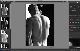
In the main window you see the picture that I want to convert to black and white. On the left are presets that correspond to various darkroom techniques (push process, various filters, sepia, etc.). The panel on the right allows you to fine tune the preset in pretty extraordinary ways. The most innovative feature is the "control point."
You can add control points (as many as you like), adjust the diameter of the area to be affected, and then use very intuitive little sliding dots to make precise changes without any tedious masking (as you would normally do in Photoshop). I won't pretend to understand how they created an algorithm that eliminates the need for masking, but they did it. From what I understand, it senses the tone, the edges, and other information and applies your adjustments only to parts of the image that are similar to where you have placed a control point and that fall within the area you have defined.
The right side panel (click on the image to enlarge) includes not only the control points but also various filters typically used in film photography and a selection of film types that faithfully replicate the look of classic films. Never again will I add grain in photoshop. Instead, I can select, say, Kodak Tri-X 400TX Pro (I used to love to shoot with that), and get the same tone, grain, and sensitivity that I would have seen in film.
Finally, if you look at the bottom of the panel at right you will see the numbers 0-10, indicating the zone system I talked about in January. As I said in that post, I don't really use the zone system because it can be an arduous process. In this program, however, you can just click on the number that corresponds to the zone you want to affect and the computer does all of the work. Very cool.
If I weren't dying to go eat lunch, I would show you the others, but for now you can check them out at their web site.
If you want more posts in the future about products that I use and like, let me know in the comments section.
Right now I am such a fan of Nik Software that I wish I could ignore all of my computer woes and just experiment with it. Although I heard of it a while ago and even downloaded a trial version of Viveza, I don't think I really understood how amazing it is until I sat through several demonstrations at the PMA in Las Vegas. I immediately bought the entire suite as an Aperture plug-in (but it is also available as a Photoshop plug-in and soon as a Lightroom plug-in). I don't have the time and expertise to go through every program right now, but let me give you a sample of one of them.
Silver Efex Pro
Silver Efex Pro is the best black and white conversion program I have ever seen. Here is a snapshot of how it works:
In the main window you see the picture that I want to convert to black and white. On the left are presets that correspond to various darkroom techniques (push process, various filters, sepia, etc.). The panel on the right allows you to fine tune the preset in pretty extraordinary ways. The most innovative feature is the "control point."
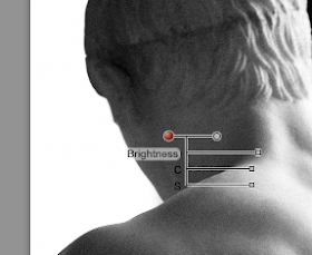
You can add control points (as many as you like), adjust the diameter of the area to be affected, and then use very intuitive little sliding dots to make precise changes without any tedious masking (as you would normally do in Photoshop). I won't pretend to understand how they created an algorithm that eliminates the need for masking, but they did it. From what I understand, it senses the tone, the edges, and other information and applies your adjustments only to parts of the image that are similar to where you have placed a control point and that fall within the area you have defined.
The right side panel (click on the image to enlarge) includes not only the control points but also various filters typically used in film photography and a selection of film types that faithfully replicate the look of classic films. Never again will I add grain in photoshop. Instead, I can select, say, Kodak Tri-X 400TX Pro (I used to love to shoot with that), and get the same tone, grain, and sensitivity that I would have seen in film.
Finally, if you look at the bottom of the panel at right you will see the numbers 0-10, indicating the zone system I talked about in January. As I said in that post, I don't really use the zone system because it can be an arduous process. In this program, however, you can just click on the number that corresponds to the zone you want to affect and the computer does all of the work. Very cool.
If I weren't dying to go eat lunch, I would show you the others, but for now you can check them out at their web site.
If you want more posts in the future about products that I use and like, let me know in the comments section.
Tuesday, March 24, 2009
Le temps change tout...
I remember seeing graffiti scrawled onto the side of Château de Chambord that read: Le temps change tout (Time changes everything). Although I hated the fact that someone had defaced the chateau, I did find the quote fairly a propos.
The above photo is a foreground/background example that plays with the theme of time and change—not at Chambord, but at a the Louvre. A few years ago, the Louvre hosted a temporary exhibition that juxtaposed sculpture from its permanent collection with works by modern artists. Here, the "permanent collection" sculpture, although hundreds of years older than the its "temporary exhibition" counterparts, seems to look on with casual curiosity, secure in the knowledge that she will outlast the plaster newcomers and their plastic wall clocks.
Is this just a self-indulgent post or is there a point?
Mostly self-indulgent, BUT the "foreground" lesson here may be that when you see something you want to photograph (e.g. the plaster men holding clocks), you might try taking some photos of that thing in relation to a foregrounded object (e.g. an onlooker). This fits with my "observing the observer" exploration of foreground/background.
On a side note:
I rediscovered the above image when I was looking for something in black and white to merge with my corrupted digital files. I took the "Rothko on acid" photo from my last post, rotated it, added the black and white photo on top of it, and then used "pinhole light" blend mode to create this strange image:
So my two monitors now have that photo and this one:
I doubt the images will have universal appeal and I know that vivid colors (as a wallpaper) may start to get on my nerves, but I guess I am fascinated by the random glitches of corrupt files because they still have symmetry and they would be very difficult to produce intentionally. I like that they were born from a catastrophic computer failure for which an entire team of professionals has no explanation.
Share your own "foreground" photo for the March Monthly Special (currently with a whopping three contributions).
Monday, March 23, 2009
Call me crazy but...
I've been sorting through my recovered data from my computer fiasco and I'm really liking the corrupted photos.
I'm sure I wouldn't like these as much if I didn't already have backups of the uncorrupted versions. I'm using a couple on my monitors as wallpaper—it's only fitting to showcase the wreckage from my nightmarish loss.
I think the top one is my favorite. It looks like Rothko on acid.
I'm sure I wouldn't like these as much if I didn't already have backups of the uncorrupted versions. I'm using a couple on my monitors as wallpaper—it's only fitting to showcase the wreckage from my nightmarish loss.
I think the top one is my favorite. It looks like Rothko on acid.
Saturday, March 21, 2009
Inspiration for using the foreground
1. Two ice creams and an ice tea, 2. Friday, 3. 112.365 - Screened, 4. Day 297 / 365 - Cunning Plan!, 5. Looking Through the Window at My Baby, 6. il mio punto di vista, 7. Looking through other people's windows..., 8. YAB, 9. foreground
Don't have an idea for the monthly special? Here is a selection of photos from Flickr that do interesting things with the foreground.
1. Food, such as in the photo of a boy eating two ice creams, has many possibilities: The "it's good for you" food sitting in front of a defiant child, food tempting a person, remnants of a dinner party with someone cleaning in the background...
2. Deep focus allows relationships between the foreground and background to come through.
3. Any kind of screen creates intrigue. Windows, fabric, a tennis racquet, anything that creates texture or partially obscures the subject.
4. Sometimes I think that the writing on the hand thing has been overdone, but maybe that's just because I look at a lot of photos. In any case, I really like this one. Hands, in general are one of the most expressive parts of the body (think about Rodin, for example).
5. Something with severe geometry placed in the foreground can dissect the composition of a photo in interesting ways.
6. In this photo, writing as foreground to a landscape evokes the relationship between text and image. The idea that looking at the landscape may have inspired a poem reminds me of Horace's link between poetry and painting.
7. "Looking through other people's windows" may sound like a voyeuristic title, but here the person is looking out. Click to see the larger version in which a bottle of cleanser gives the perfect touch of reality. What is the view from your window and what objects inside become a part of that view?
8. Why are people compelled to write on fogged up windows? We have all done it. Try photographing your ephemeral creation. Try to go beyond smiley faces and hearts.
9. Foreground any object while maintaining focus in the background and strange things can happen.
Friday, March 20, 2009
How do you store your photos?
The Problem
This isn't exactly a part of this month's theme, but since my computer disaster I have been thinking about archiving and storage. Luckily, I had redundant backups of my Aperture database, but that doesn't mean I didn't lose any of my photos. For one thing, I was bad about putting retouched photos back into the database. Another problem: I was not as systematic as I should have been about backing up photos that were for me (I learned the hard way a long time ago to be good about backing up client photos).
When I interviewed Brad Slade about his process, he expressed concern about the longevity of digital media:
I think that Brad's positive experience with negatives and his concerns about digital can (in part) be explained by good habits in his early training. Brad began his systematic archiving of negatives as a student because photography was his passion and his field of study. I'm guessing that most people would have a hard time digging up old negatives. I know that when I was working on cleaning out the garage I found envelopes of photos from the 80s—often with warped, bent old negatives at best.
As Brad points out, digital photography poses two main problems:
Solutions?
At some point, we need to figure out a digital photography workflow or method for taking, processing, and storing photos. Here is a brief sample of a workflow:
Ultimately, if the system makes sense to you and if it includes backups then it's good. But here are a few words of advice:
I am not very worried about that. As new formats come along there will always be people ready to help you migrate your old media (think of all those tape-to-dvd services).
How do you store photos? Do you have a workflow? Any ideas to share?
This isn't exactly a part of this month's theme, but since my computer disaster I have been thinking about archiving and storage. Luckily, I had redundant backups of my Aperture database, but that doesn't mean I didn't lose any of my photos. For one thing, I was bad about putting retouched photos back into the database. Another problem: I was not as systematic as I should have been about backing up photos that were for me (I learned the hard way a long time ago to be good about backing up client photos).
When I interviewed Brad Slade about his process, he expressed concern about the longevity of digital media:
"I worry about losing digital files, whereas I still have negatives that I took in my first photo class in ’77. I wonder about migrating digital images from format to format as technology changes."I am not trying to be alarmist, but if my own cautionary tale of computer loss is to serve any purpose it may as well inspire someone to think about archiving and storage solutions.
I think that Brad's positive experience with negatives and his concerns about digital can (in part) be explained by good habits in his early training. Brad began his systematic archiving of negatives as a student because photography was his passion and his field of study. I'm guessing that most people would have a hard time digging up old negatives. I know that when I was working on cleaning out the garage I found envelopes of photos from the 80s—often with warped, bent old negatives at best.
As Brad points out, digital photography poses two main problems:
- digital storage
- migration of formats
Solutions?
At some point, we need to figure out a digital photography workflow or method for taking, processing, and storing photos. Here is a brief sample of a workflow:
- Take photos (preferably in RAW format)
- Load photos into a library such as Aperture, Lightroom, iPhoto, etc.
- Delete photos that you know you will never use.
- If your program allows it, add meta-data such as keywords, ratings, etc.
- Do any necessary or desired retouching (for some, this will be done first in RAW and then in Photoshop).
- Make sure your retouched photos find their way back into your main library.
- Backup your main library on at least one external hard drive every time you make changes to it.
- Get prints as desired. Some would argue that if you don't print your favorites at this point you may never look at them again.
Ultimately, if the system makes sense to you and if it includes backups then it's good. But here are a few words of advice:
- Not all CD backups are created equal. Mitsui Gold rates among the very best in cd-r storage. Those super cheap packs of CDs you get at most stores are great for everyday use, but they use a very unstable dye that breaks down within about 5 years (depending in part on exposure to light). Mitsui Gold lasts at least 100 years.
- DVDs have more storage but less longevity. In my experience, Mitsui DVDs are just plain horrible. DVDs have the same stability problems as the bad CDs. Taiyo Yuden media is supposed to be excellent for both CDs and DVDs, but I haven't tried their product. I remain very wary of DVDs for long-term storage.
- Online storage options abound, but don't put all your eggs in one basket. I love Dropbox (they should upgrade my storage for free based on my promo). You can get 2 gigs for free and 50 gigs for 100/yr. My wife uses Smugmug, and I know there are many other options out there.
- I admire how Tara Whitney manages to whittle down client images (unless I am misunderstanding her site) to a manageable 30-35 best-of. I would love to start doing that with all of my photography. Imagine keeping only the best. It's the digital equivalent of only keeping your favorite clothes and having a perfectly organized closet. Fewer photos (but all ones that you love)=easier storage.
- Reassess your workflow at least every other year. Search online in photography forums and see what people are doing. It never hurts to find more efficient ways to do things.
I am not very worried about that. As new formats come along there will always be people ready to help you migrate your old media (think of all those tape-to-dvd services).
How do you store photos? Do you have a workflow? Any ideas to share?
Tuesday, March 17, 2009
Foregrounding the observer
How much time do we spend as spectators? We watch sports, movies, television, people... Photographers have to cultivate the art of observation. If any photo is an expression of how the photographer sees the world, then what does a photo of an observer express?
The photo above was taken at a shoot in Paris. In my opinion, the stylist was a lot more interesting than the model herself. Seen from behind, the stylist's body language grabs our attention but leaves the interpretation to us—observers of the observer.
Why does this image appeal to me? Perhaps because I spend so much time observing others. I have no strong opinions about what the onlooker here is thinking. Is she envious? detached? judgmental? bored? I change my opinion each time I look at the photo. I think that the ambiguity pleases me because it reminds me that the eye of the beholder so important.
What about you? How much time do you spend people-watching? How could you foreground observation in a photo? Maybe at a sporting event, a protest, a museum, a park...? Something to think about for the monthly special. Let's see some of your own reflections on foreground/background. I love the photo that Ilan posted, but I am sure that there are others out there with some work to share.
Sunday, March 15, 2009
I haven't dropped off the face of the earth, but...
I came back from Vegas to find that my hard drive and backup drive had both been erased. That's right, all 400+ gigs AND the backup! No one seems able to explain to me what happened (including the computer support people who happened to be hacking into my computer without my consent via Unix/Terminal at the time). I guess I am now a cautionary tale to backup your backups. Crazy, right?
Luckily, I have multiple backups of my Aperture library, so my life as a photographer is not as devastated as my life as a professor. My research for a current book project, all of my students' grades, and thousands of other things have vanished. Here's hoping a pro- data retrieval service can restore order (and that the University pays for it).
I still have to re-install about a dozen programs, but I plan to get back to blogging this week.
Thursday, March 5, 2009
More from the PMA in Las Vegas
"Celebrity photographer" (feast on that two-for-the-price-of-one modifier) Brian Smith presented a slide show of his work, dispensed wisdom, and did a photo shoot, all the while remembering to promote his sponsor at the Sony stage today. Here's another shot I took with the Alpha 900 Sony. It's so portable and the quality looks just as good as my medium format cameras...
Although the product endorsement was as subtle as "The Stephen Colbert Dorito's Spicy Sweet Pennsylvania Primary Coverage Live From Chili-delphia City of Brotherly Crunch," I enjoyed hearing real-life tales of Smith's long career. Smith's self-depricating sense of humor came through in anecdotes about his work with septuagenarian burlesque dancers and nudist golf enthusiasts.
Otherwise, and uneventful day. Here are a few shots:
As I watched lens-envious photographers gaze at exhibition booths through 800+mm lenses, I thought of Marcel's touristscope photos.
Outside of the convention center...
I'm not sure if I felt more trapped by the trade show or the disorienting casinos.
The dizzying pastiche of Vegas that provides so much fodder for French theorists' smug assessment of American excess makes me feel like a ball darting through obstacles on a miniature golf course.
The amount of photography that takes place with cell phones amazes me. What do people do with those photos? Do they print them? Save them? Blog them? I have taken a total of 5 pictures on my cell phone. Ever.
Here is what they are photographing (quickly rendered in monochrome for the sake of my own sanity):
I overheard the announcer bragging that this habitat cost 9 million dollars. For a split second I wasn't sure whether he meant the one for the lions or for the humans.
Tomorrow I will go out and do some street photography. After that, I will be glad to get back to a more familiar kind of frenzy.
Tuesday, March 3, 2009
PMA 2009 International Convention and Trade Show
I'm in Las Vegas this week at the Professional Media Association conference, so I thought it might be fun to give you a taste of the trade show. I will do more posts throughout the week, but here are some first impressions:
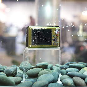
It seems like the point and shoot digital market is all about putting cameras in a fish tank. Great news if your name is Ariel or Aquaman! Pretty much every brand has got cameras that are dust- and water-proof. The one by Panasonic (above) shoots stills and HD video.
The PMA embraces diversity. Gay Ken dolls take a stroll in an "It's a small world"-esque diorama. A couple of provincial sled dogs look on with curiosity, but the fishing bear exhibits a tolerant insouciance. What the—? you say. Indeed. Some marketing genius (perhaps a 6 year-old girl?) decided that a tacky toy pastiche would be just the thing to promote their line-up of cameras.
I haven't been to Vegas in many years (possibly because I don't drink or gamble), so here are a few photo impressions taken tonight at TI:
The empty drink sitting alone a slot machine just says "Vegas" to me.
Two more variations on the drinking and gambling theme:
Sunday, March 1, 2009
March Monthly Special: Foreground
After spending a month (that seemed to fly by) on "Background," it seems only right to look at foreground this month. I am defining "foreground" very broadly as anything situated in the front of your image.
At first, this theme may appear more difficult than "background." How often do we put things in front of our main subject anyway? In the candid (above) that I took of Eva at a playground, the foreground serves as a frame that both hides and reveals her face. But are we really going to do a month of people peaking through things? No.
If you look back at the interview I did with Elaine, you will see that the relation between foreground and background plays a major role in at least three of the photos (the poles that frame the boy in the mist, the poster in "Rrrrr," the letters in "Grand Ecran"...). Attention to foreground adds depth to photos. The relation between the foreground and the background can tell a story, it can make a statement, it can add humor...In short, the foreground can have at least as much impact as the background.
So why not give it a try. Experiment with foreground this month, post your results, and come back here to post your link and share your work.