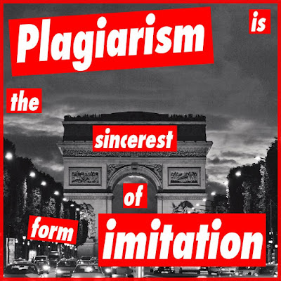
 Andy Warhol has his Photoshop tutorial. So does Lichtenstein. So do the impressionists. It's high time Barbara Kruger be welcomed into this little Pantheon of adoring photoshop plagiar—I mean, homage tutorials.
Who is Barbara Kruger, you say? Well, she's an artist most famous for bold and confrontational work like this:
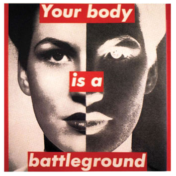 You can find the most thorough overview of her art in the Art History Archive, a nice review of her work at Swindle magazine, another good one here, and some more images on an educational site about feminism. And let's not forget the ever-popular Wikipedia entry. What? you don't want to navigate away from my wonderful blog for even a minute. Who can blame you? OK, so here's the oversimplified reductionist bio recap: Barbara Kruger uses black-and-white found photos coupled with her own pithy text (usually in white Futura Bold font on red background) to make strong statements about power, politics, gender, etc.
The article in Swindle calls her work "deceptively simple." A lovingly (we mock because we love, right?) satirical "Graphic Standards Manual" boils Kruger down to a formula. And yet, no one has (lovingly?) done a Photoshop-based tutorial on Kruger. So here goes...
The tutorial
I'd like to believe that during our politically turbulent times, Barbara Kruger wouldn't mind if a few adoring Krugerians made their own guerrilla art, hence my statement "Plagiarism is the sincerest form of imitation."
step 1.
Decide what you want to say. Don't just steal a quote. Tweak one. For example, Descartes wrote "I think, therefore I am." Kruger wrote "I shop, therefore I am." If you want to sound confrontational, try to use subject pronouns like "you" and "I" in your statement.
step 2.
Find your image, but make sure its connection to your quote has a touch of artistic ambiguity. In my case, I used a photo of the Arc de Triomphe. We usually connect plagiarism with writing, so instead I used an example of architectural plagiarism (the Parisian monument being a copy of the Roman Arch of Titus). If your image isn't in black and white, you can do a quick and dirty Image—Mode—Grayscale transform in Photoshop. (Just make sure you switch back to "RGB" mode once it's black-and-white, or you'll encounter problems later.) You can even add some grain if you like (just an option). Just remember, art isn't always pretty.
step 3.
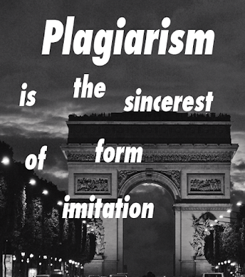
Select the text tool and set the font to Futura Bold with faux italic selected in the character formatting palette. You can then type in your text (you will probably want to use a new text layer for each word for maximum creative freedom) and mess with the size until your militant soul is satisfied.
 step 4.
Now you're ready for some Kruger red. In spite of what the Graphic Standards Manual says, I believe the correct red is R255 G0 B0, or ff0000. You can get that color by clicking on the foreground color box on your tools palette...
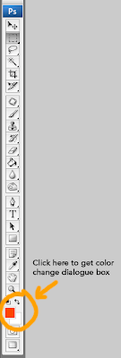 which will open up a dialogue box...
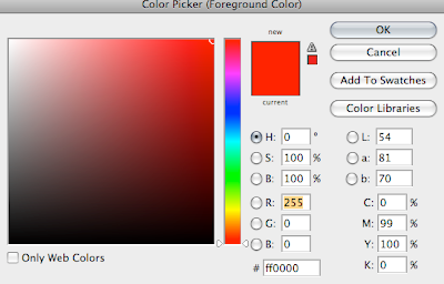 where you can type in my custom formula for Kruger red (ff0000).
step 5.
Now that you've got the right red, you just need to select some rectangles to house it. I suggest doing each rectangle on its own layer for each word (just in case you want to edit the type later). So in the layers palette select a "New Layer" for each word and name it to avoid confusion.
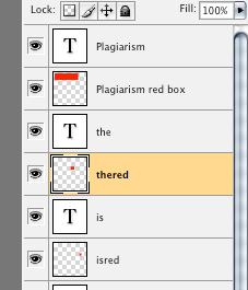
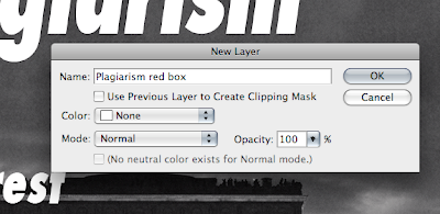 Now that you're on your "red box" layer, you can hit "M" to select the rectangular marquee tool, and then click and drag to create a rectangle around the word. Hit "G" for the paint bucket tool (your foreground color is still set to Kruger red, right?) and click in your selection to fill it with red. If your text disappears, it's because the red rectangle layer is on top of it. Just drag it below the word each time like this:
 step 6.
Let's assume that you now have all your words, each with its own red rectangle underneath. Now you want to move the words/boxes around. To make this easier, you will want to link each box to its word. You can do this by selecting the two layers (word and box) while holding shift:
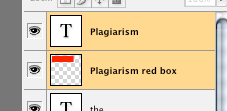 and then linking them with the pull-down menu from the layers palette:
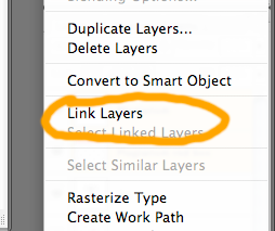 Do this for each word and its box and you will be ready to move them around (with "V," the move tool) while pulling your hair out and saying "Yes, this is deceptively simple."
step 7.
Since you want the feeling of collage, you don't want everything to be too perfect. Choose a word or two (but not too many) rotate just enough to bother your obsessive compulsive friends. You can do this by selecting the layer and then bringing up the free transform handles (Mac: command-T; PC: Ctrl-T):
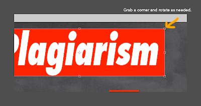 Grab a corner and rotate it just enough. Then, if you click on another tool you will see a dialogue box appear asking if you want to apply the transformation (you do). Once you're happy with everything, you can flatten and save. [And hey! if you do this tutorial, please post it somewhere and link back to the September Monthly Special]
step 8. (optional)
If you want to add a red box to your subversive masterpiece, you can bring up the layer style box by double clicking on the icon for your image in the layers palette and then selecting stroke. Here are the settings I used:
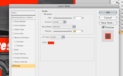 Make sure you click in the color box to enter the Kruger red formula. You will notice that I lowered the opacity to 90% just to bring in some of the texture from the image.
You have done it! Now proudly and defiantly display your art.
Fight the power! Make Barbara proud.

This comment has been removed by a blog administrator.
ReplyDeleteThis tutorial was outstanding. Please write clipping path tutorial
ReplyDeleteClipping Path Creative
Background Remover India
Thanks for sharing your information. I truly appreciate your efforts and I will be waiting for your next post thank you once again. Visit our website: Background removal service
ReplyDeleteThis tutorial is really helping for the background remove
ReplyDeleteThanks for all man!
ReplyDeleteYour work is awesome!!! hair masking services
This content is the greatest in internet thank you for sharing. Are you pursuing CIPD and you are experiencing difficulties with getting around the assignment given? If the answer is yes, you need some expert help with your assignments. Visit here
ReplyDeleteThis is a really informative article. I really enjoy this and hope I will get this type of informative article.
ReplyDeletePhoto Retouch Service
Photo Masking
Thanks for the helpful article.
ReplyDeleteGood Content !
ReplyDeleteHow amazing and informative blog article you have written i'm so glad. Image Retouching
ReplyDeletePhoto Editing Helps
Neck Joint
Photoshop Guideline
Clipping Path Tutorial
Drop Shadow Helps
Background Remove
Image Editing
Image Cut Out
Photo Manipulation
Your article impressed me a lot. You explained it so clearly. Thank you for this
ReplyDeleteBest Regards,
Clipping Path
That's a very good tutorial. Easy to understand and very detailed.
ReplyDeleteClipping Path Service Provider
Fantastic tutorial. Loved it very much. Thanks so much for teaching us.
ReplyDeletePhotoshop Image Editing Service
Good tutorial and helpful.
ReplyDeleteHow to Take Jewelry Photography
Very effective tutorial.
ReplyDeleteclipping path
That's a very good tutorial. Really helps people. Thanks so much.
ReplyDeleteMake Square Brushes in Photoshop
Hey Authhor!! Thank You sharing such a Lovely article!! Will share in Different Photographers in Gurgaon Group
ReplyDeleteThanks for sharing your info!You Can Also Visit:
ReplyDeleteEdit Bg
Barbara Kruger is a highly influential artist known for her use of text and images to explore themes of power, gender, and identity. She often incorporates techniques from graphic design, including the use of bold typography and red and white color schemes. Kruger has also been known to use Photoshop to manipulate images and create her distinctive visual style.
ReplyDeleteThe use of Photoshop in Kruger's work is significant because it allows her to easily experiment with different visual elements and create composite images that reflect her unique perspective. Through her use of digital tools, Kruger has been able to push the boundaries of traditional art forms and create works that are both visually striking and conceptually powerful.
See Some our real estate retouching Picture
This is an amazing idea for a tutorial! I'm looking forward to seeing the results. I admire the works of Barbara Kruger and the way she uses words to empower the viewer. I think it's great that her work is being honored with a Photoshop tutorial, and I'm excited to learn more about her unique style.
ReplyDeleteGet jewelry photo editing service
Barbara Kruger stands out as a groundbreaking artist, renowned for blending bold text with powerful imagery to tackle themes like power, gender, and identity. Drawing heavily from graphic design, she often employs strong typography paired with her signature red, white, and black color palette. Photoshop plays a key role in her creative process, helping her craft the sharp, layered visuals that define her work.
ReplyDeleteKruger’s use of digital tools like Photoshop isn’t just aesthetic—it empowers her to explore visual language in new ways, breaking down traditional artistic boundaries and delivering messages that are as provocative as they are visually compelling.
Want your product visuals to stand out with precision and impact?
Explore our Multiple Clipping Path Service today.
In an era where visual content dictates the success of a brand, "good enough" photography is no longer the standard—perfection is. Whether you are an e-commerce giant, a professional wedding photographer, or a growing creative agency, the quality of your post-production can make or break your professional reputation. At Retouching Cloud, we don't just ask you to take our word for it; we invite you to experience our craftsmanship through a dedicated free trial.
ReplyDeleteWhy Start with a Free Trial?
Trust is the foundation of any creative partnership. We understand that your images are more than just files—they are your hard work and vision. By offering a free trial, we remove the risk and the guesswork. This trial allows you to:
Assess Technical Precision: See how we handle skin textures, color grading, and complex masking.
Evaluate Turnaround Time: Experience our efficiency firsthand to see how we fit into your workflow.
Communicate Style: Use the trial to establish a specific "look" that aligns with your brand guidelines.
Our goal is to demonstrate that high-end retouching can be both accessible and consistent, regardless of the volume of your project.
Proof in the Polish: Our Portfolio
Seeing is believing. Before you even upload your test image, we encourage you to browse our extensive portfolio. Our gallery is a curated collection of diverse challenges we’ve mastered over the years. By exploring our portfolio, you will see our expertise in:
High-End Beauty: Retouching that enhances natural beauty without creating an "artificial" look.
Product & E-commerce: Ghost mannequin effects, shadow creation, and color correction that drive sales.
Real Estate: Balancing exposures and correcting perspectives to make every room look its best.
Jewelry: Intricate polishing and stone enhancement to capture the perfect sparkle.
Retouching Cloud are more than just a retouching house; we are your dedicated back-office partner. Founded on the principles of quality, scalability, and speed, we employ a global team of expert editors who specialize in various niches of digital artistry.
Our mission is to empower photographers and businesses by handling the time-consuming "heavy lifting" of post-production, allowing you to focus on what you do best—capturing the perfect shot. With 24/7 support and a commitment to data security, we ensure that every pixel is treated with the utmost care.
About Us