Today I want to look at how ideas can come from the objects that surround us. This semester, I'm teaching a new course on European cinema, so I've been buying a lot of DVDs. I find the Criterion collection irresistible because of their committment to quality, from the transfer to the commentary to the design and packaging (the photos you see in this post come from their site). I am a sucker for good design. I won't buy a cologne if the bottle isn't aesthetically pleasing. I will pay more for just about anything if it exemplifies good design. In that regard, I am an advertiser's dream.
As I was browsing Criterion DVDs, I was struck by how so many of them offer virtual templates of text + photo. Let's look at a few:
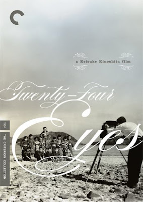 Change out the text with something romantic, replace the photo with a bride and groom and you've got a great layout for a wedding album page.
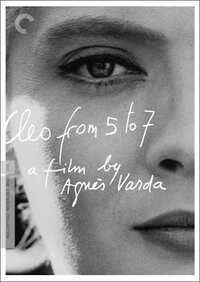 Use a cool handwriting-style font to express a poetic thought on a close-up of a loved one's face.
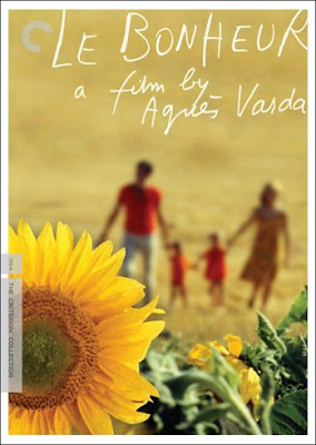 I soooo want to do this for someone's family photo. "le bonheur" means happiness in French and the warm glow of the photo is the perfect image of happiness.
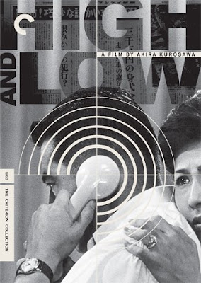 Look at how the photo-in-text effect has been applied here in a sophisticated way.
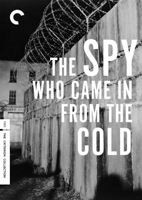 White text on a black-and-white photo can be stunning. And it's even easier to do than the example I gave you under "starters." I doubt you would want to use an image of a wall and barbed wire, but you get the idea.
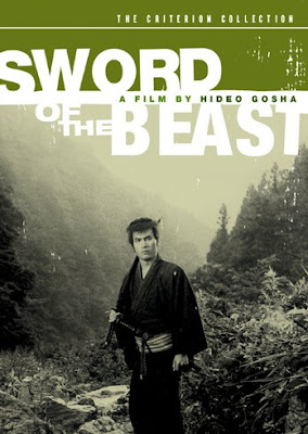 With the rectangular marquee tool, you can fill a section of your photo with a color and let part of your text be on the color and part on the photo. Use a photo of one of your kids, and instead of "sword of the beast," your Criterion-inspired photo with text could become "Lucas at the beach," for example.
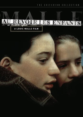 With a combination of clipping masks and lowered opacity, you could recreate this type of look.
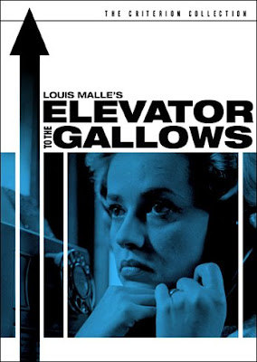 The same technique you learned in the photo in text tutorial is at work here, but with shapes instead of letters. You could take this idea and apply it to a less morbid topic.
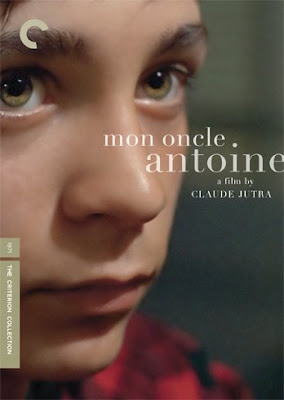 There's something very appealing about white (or even lowered opacity white) text on an extreme close-up.
And finally, two examples that use text along with a grid:
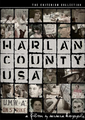 This grungy one is a bit more complicated than what we did back in June.
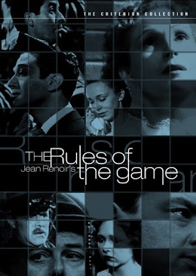 But this one is not quite as hard as it looks (it's not easy either). You'd probably want to use the one-photo grid cheat and then overlay darker colors at a lowered opacity on select squares.
Getting any ideas? These few that I have shared range from extremely easy to fairly complex. To be honest, the easy ones are my favorite. If you do get inspired, please post your work and come add your link to the September Monthly Special post.

Love it !
ReplyDelete