To begin, I will walk you through a project that I did for client as a Mother's Day gift. You do not need any prior experience to pull this off. A camera, a subject, and Photoshop Elements will suffice. This will teach you the principles, and then you can makes variations to your heart's content.
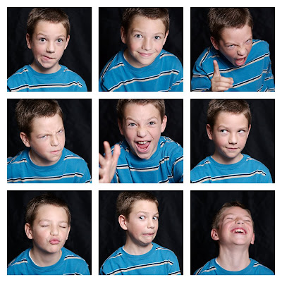
THE GRID
The photo session
I was photographing a family who had recently purchased an iMac. The kids loved to make silly faces using the built-in camera and the Photo Booth software (as do mine). I decided the kids might enjoy playing a game of "photo booth" by making a silly face on the count of three. We draped black fabric behind them (a very makeshift setup propped against the couch) and took a lot of pictures. I used a flash setup, but you could do the same thing taking advantage of natural light from a window or maybe going to a park, your backyard, wherever...
Building the grid
1. Choose 9 photos you like (or you could use nine cropped pieces of one photo, or any combination of things, but we'll talk about variations later)
2. In Photoshop Elements, create a new document that is 10 x 10 inches and 320 pixels per inch (see screen shot).
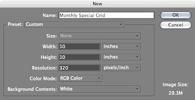
3. From the view menu, choose "grid."
Each large square will represent one inch by default (and each small square .25 inch).
4. Now leaving that blank document open, go ahead and open the first photo you want to place in the grid.
5. Hit "c" to get the crop tool (or, if you want to click, in Photoshop Elements 6 it's the 10th down on the toolbar at your left), and adjust the settings (see screen shot) above to 3x3 in and 320 resolution.

6. Now that your settings are in place (and make sure they stay that way for anything you crop for this grid), you can use the crop tool to select a portion of the photo you opened, hit return to crop, and voilà! (see screen shot)
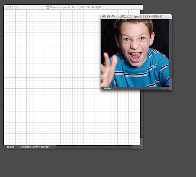
7. Arrange your windows so that you can see your newly-cropped photo as well as your blank grid. With the window of the cropped photo active, hit "v" to select the move tool (or if you like clicking the mouse, it's at the top of that left-side toolbar), and then drag the cropped photo onto your grid. (see screen shot)
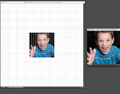
8. You will want to make sure the grid window is active, and then you can use that same move tool (v) to drag your photo to the place of your choice. Minimal math skills are required here. Here's your story problem: If you want to place nine 3x3 inch photos into a 10 inch square and keep an even amount of space between each photo, how much space do you leave? A: a quarter of an inch, or in other words, one of those small squares. So place your photos accordingly.
Rinse and repeat. Seriously, you're almost there.
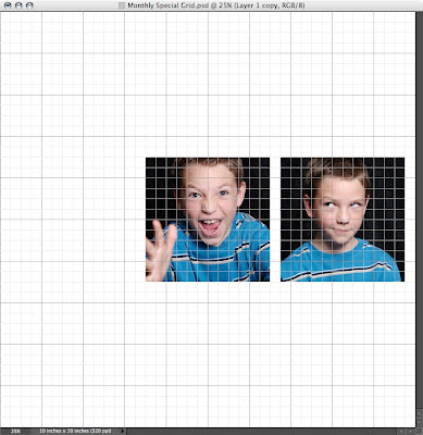
9. Open your next photo and go through the cropping and moving steps. And so on, and so on.....
BUT WAIT! A word about layers: If you look to the lower right of your screen, you will see layers (ahhhh, layers! you will come to love them.) Each photo you drag into your grid will become its own layer. You can click on the layer and name it if you want to (but this is only if you want to be hyper-organized). Click once on a layer to make it active. In other words, if you want to move a picture around (using the move tool), you'll want to make sure you have the correct layer selected first. I forget and move the wrong layer all the time, but that's why "undo" commands were created. Is that clear enough? (see screen shot of layers)
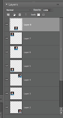
10. Once you've cropped and arranged your photos on their ideal place in the grid, you'll want to turn off that ugly grid (by deselecting it from the view menu) and admire your masterpiece.
So can I print it now?
Yes, but let me teach you one more cool thing first.
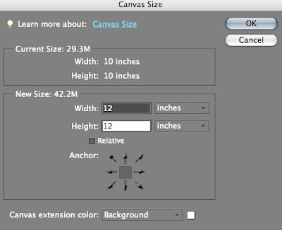
Let's say you want to upload your pic to Costco (and why not? They're inexpensive and they keep their printers well calibrated)...there's only one problem. You've got a 10x10 photo and they only print 8x8 or 12x12. You could resize your photo to 8x8 (or 12x12) by selecting Image-->Resize-->Image Size and then typing in your new size. But NO! You've already bought a 10x10 inch frame! So why not print your 10x10 on the center of a 12x12 and then trim off the excess? Here's how:
To change the 10x10 to 12x12, go to Image-->Resize-->Canvas Size and enter your new size. Note the options under "Canvas extension color." The default is set to "Background" (which in this case is white), but if you know you want to trim it to a 10x10, you may want to select "Gray" for easier trimming guidelines (this will keep you from inadvertently trimming off too much).
Variations on a theme
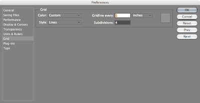
Once you've understood the principle, you can experiment. Do self-portraits instead of precocious children. Do details of things you like. Anything. You can even modify the size of the grid by going into the preferences menu (Photoshop Elements-->Preferences-->Guides, Grid, and Slices..) and changing the default settings.
Your finished product
Once you've finished, frame it and enjoy it. And if you're a blogger, please (pretty please) post your result and come back here to link it (see the FAQ page for questions about this) to this post so we can all share our results. I will do a few variations of my own during the month and post them, but you can always find the original monthly special post listed under "Participate in the Monthly Special" on menu to the right.
So please come back to this post to link your finished product and look at what others have done.


5 comments:
Fantastic post. I am going to try it.
Thanks Marc, this was so easy to follow. I made a grid of my new baby girl Cassandra form pictures that Whitney took. I also used the bleach bypass tutorial for some drama. Check it out:
http://photolaundry.blogspot.com/2011/12/welcome-cassandra.html
@Ryan—What a cute baby (as if you two would have anything but gorgeous kids). Nice job on the photos!
Dissertation Editing Services makes sure that your writings communicate clearly and concretely. Your writings will match the need of specific style of writings. Our editors understand the needs of each style of writing and edit your content accordingly.
View learning solutions in a portable format. Avail PPT to online mobile ready course conversion services, turn your Android phone to deliver impactfully and accurate mobile-ready e-learning solutions.
Post a Comment