Saturday, July 31, 2010

For Lucy...

Dear sensitive viewer: that black writing on her arm isn't what it looks like—or so we can pretend.

I was walking by the place today where Lucy took one of the photos you can see in her interview. The graffiti wasn't interesting or colorful, but the scummy fountain basin was filled with water that looked like toxic waste, complete with a dead pigeon floating in it (mercifully not photographed in spite of my hatred of those flying rats). Skate punks were doing their thing (badly, I might add) and they were replaced by fire breathers at night. The point of all of this? None.

Thursday, July 29, 2010

Interview with Lucy Call

If you've been reading my blog for a while now, you may have heard of Lucy. She has been working with me for almost as long as I've had my blog. Before she moves on to pursue her photography career, I wanted to share some of her amazing work with you. Rather than an interview with a particular theme, I have simply asked Lucy to comment on some of her work. As you will see, Lucy pays close attention to detail and her photos are never detached or overstated. Her vision always contains a strong personal undercurrent.

The following are Lucy's comments:

I chose this photo for a few reasons. I love photographing women and this photo has an elegant feel that I love because of the model, styling and lighting.

This is one of my favorite photos for a couple of reasons. I remember while I was taking the photo, I was getting so obsessed with every little detail. I think my model was going insane because of it. But in the end, I think it paid off and it has the elegant feel that I was hoping to accomplish. I also really love this photo because of the necklace. It was my great grandmother’s and it was given to my mom. I remember when I was little that I always wanted to wear it while playing “dress ups” and on rare occasions, my mom let me get it out of the box and wear it.

This photo is a part of a series that I have been working on for a while now. I have always thought that Bob Dylan’s lyrics are very narrative and while I listen to his songs, I get such a vivid picture of what he is singing about. So I decided to take lyrics where he sings about women and make photo illustrations of them. This particular one is from I Shall be Free No. 10. I like this photo because I often have a pre-visualization of what I want a photo to look like and this photo came out exactly how I visualized it.

I honestly don’t have a super exciting reason for liking this photo. One of my favorite things to do is to wander around places like the one seen in this photo and explore and take pictures. That’s exactly what I did this day. So I guess I like this photo because it embodies the feeling from those adventures.

This will probably always be one of my favorite photos, not because I think it is an amazing photo or anything like that. I actually took it with super cheap film and knew very little about photography at the time. The reason I love this photo is because of the memories that I have from this particular day. I took this photo while on a study abroad in France. I was wandering around the city by myself when I came upon these guys doing graffiti at this museum and I wanted to take photos of them so badly. This was the first time that I mustered up the courage to ask someone in my very pathetic sounding French to take their photo. I was pretty proud of myself that they agreed and could actually understand me.

The reason I love this photo is simply for the memories surrounding this place. My dad has repeatedly told the story, and will probably continue to do so, about how when he was little he hid behind the Lotus Café after leaving school early because his teacher got mad at him. The only time I actually ate there my grandma kept going on about how amazing the egg drop soup was. It was alright.

The photo means a lot more to me now than when I took it because the café will soon be torn down to make a parking lot. So I am really happy that I have this photo.


I took both of these photos while I was in China. I love these photos because of the amazing beauty that I was able to experience while there. I was so blown away by the ways that the Chinese people incorporated their houses and rice patties together in their villages. I love the second one of the two because it gives a feel of the entire village.

You can follow Lucy's blog to keep up with her and her work.

Wednesday, July 28, 2010

Eiffel Tower from Trocadero


I snapped a photo from the ground (left), walked up the stairs, and saw this (right).

Tuesday, July 27, 2010

The love padlocks "tradition" in Paris


When I was photographing a bridge on day 1 of trip to Paris, I noticed this lock with the words "I love you" attached to the bridge. How romantic, I thought. But also, What an eyesore! Still, you could imagine the scene: two lovers visit Paris, put the lock on the bridge as a symbol of their undying love, and throw the key in the river Seine to show that the bond will never be broken.

Then, I walked to the pont des arts—the artsy, bohemian bridge where artsy bohemian Parisians and groups of young tourists gather nightly for picnics until 1 or 2 a.m.

The pont des arts has a chainlink fence—all the better to hold padlocks. Hundreds and hundreds of them (which you'll have to imagine, because my photos must have been blurry and hence, deleted). Here, the locks fit the mood of the bridge and felt like the sort of art installation that asks for audience participation. But as expressions of love, I have to say that the aesthetics left something to be desired:

Let's take Olivier, who heart heart hearts Laura. Assuming he didn't just happen to carry a padlock around with him in case of a sudden bout of eternal love, he must have taken the trouble to go somewhere and buy a padlock and a sharpie. Is this the best he could do? Why choose a lock with a huge XINLEI brand marking right where the hearts go? Or is this a love triangle between a man, a woman, and a padlock company? Get on that, XINLEI marketers.

Olivier could at least take a cue from the Sid and Nancy aesthetic of Vick and Julien:

Or is it a serial killer aesthetic? A ransom note? Maybe not the best choice after all.

Then there's more ephemeral choice that I've only seen once so far:

A photo that, in all likelihood, will outlast their summer romance.

I overheard a couple of Italian women walking by (this one was near Notre Dame) and wondering if this was some sort of Paris tradition. It's not! I wanted to call out in Italian. But unfortunately, my spoken Italian doesn't extend beyond ordering gelato these days. I was in Paris for three months this past fall and there were no locks to be found. So where did it come from?

Google to the rescue. According to an article in The Telegraph, the lock phenomenon is a worldwide one. Locks can be found "on fences and bridges in Moscow, Verona, Brussels, and Mount Huang, China."

The origin?:
It is unclear who started the fashion. Italians claim it was sparked by a romantic novel called I Want You, by Federico Moccia, in which the hero and heroine attach a padlock with their name onto a lamppost on Ponte Milvio, near Rome, kiss and throw the key in the river Tiber.
Who are these Italians claiming it was sparked by a novel I've never heard of? Certainly not the women on the bridge. No, a phenomenon of this scale can only mean one thing: the crop circle aliens got bored. (Don't let M. Night Shayamalan anywhere near that idea. The man really needs to stop making movies)

For me, what started as an isolated case of quaint bemusement has become an irritation. When I went to photograph the pont Alexandre III, easily the most beautiful bridge in Paris, I saw this:

That's a whole lot of Photoshop work for me and a whole bunch of ugly for Paris.

If I could talk to these lock loving readers of Italian fiction (or sheep or aliens), I would tell them to use my own personal rule of graffiti: If it is well done and adds interest to an otherwise drab and dull space, then go for it.

But if it defaces something that is already beautiful or has historical significance, then you're just an irresponsible vandal.

Want to do something romantic on the bridges in Paris? Throw some rose petals in the Seine (it could use a little freshening up). Or kiss. But only if you're attractive and don't mind me taking your picture. I still need photos of romantic scenes before I leave. That, and more dogs. Lots and lots of dogs.

Thursday, July 22, 2010

10 wedding or engagement Photos I love to hate (but sometimes do anyway)

Yes, it's overdone (and I even toned it), but I did it anyway and I like it. Read more to find out why.

My wife tells me that I hate these photos because I see them all of the time, whereas most people don't spend so much time around wedding photography. It may be true in part, but sometimes the psychology of the shot rubs me the wrong way.

I wanted to recreate all of my pet peeves with the help of a Barbie and Ken bride and groom, but my daughter doesn't own a set and I'm not about to seek them out in Paris, so descriptions with have to suffice. Sorry. You will just have to imagine the photos.

But before I mock, let me say that (almost) every one of these photos has its place. I have done and will continue to do a few of them, because I think that detail and nuance can make all the difference. In other words, this isn't entirely about flat-out rejection. It's more about pausing to look at what a photo says.

1. The" kiss under the veil"
The recipe: Bride's veil covers both bride and groom as they kiss.

The problem: Too little veil and it looks silly. Too much veil and it looks like they are 6-year-olds building a fort or that they're in Africa trying to hide from mosquitoes carrying malaria. And then there's the kiss...too much and it makes the viewer feel like a voyeuristic perve.

A solution: The reason I like the photo at the top of the post is that I took it in December and I like how it shields them from gently falling snow. I also like how the folds of the veil hide the lips in just the right way. The kiss is not too much, but don't think I didn't have to delete some that were before ever showing them to the clients.

2. The "swan princess takes a bow"
The recipe: The bride (usually in a very full-skirted gown) sits on the ground with her gown spread all around her. She looks up demurely as the photographer snaps a shot from above.

The problem: The pose is so contrived that only a prima ballerina can get away with it. Unless you're wearing toe shoes, don't go there. The angle makes the head appear larger than the body which further gives a cutesy childlike look.

A solution: I can't think of one. I have never done this shot and don't think I ever will.

3. The "American Gothic couple reluctantly holding hands"
The recipe: Couple faces camera straight on about four feet apart, outer arms to the side, inner arms extended in a sharp diagonal line to hold hands in a symmetrically rigid manner. Expressions are blank as if posing for a 19th-century photo with heads held in vice determination. This is usually done as an engagement shot.

The problem: You're getting married, people! Ostensibly, you are in love! Yes, it looks good from a compositional standpoint, but it also looks like the photographer cares more about composition than message.

A solution: Smiling is OK. Having the couple look at one another is OK. Just remember that this is for an invitation to a wedding, not a geometry class.

4. The "playful piggyback"
The recipe: The bride (or usually, bride-to-be) hops on the back of her (future) hubby for a playful piggyback ride.

The problem: If the guy isn't strong enough, or is about the same height/size as his fiancée, she will end up looking fat. If the guy is more than a few years older than his fiancée, it will look like he's really robbing the cradle. If it isn't in your personality to do playful things like piggyback rides then the pose will look forced. Finally, this pose can also say "my clingy fiancée is strangling me."

A solution: In my opinion, the only way this shot works is if you take it just after she has jumped on his back or in some other natural moment that suggests real playfulness and not a pose.
In the example above, ideally her arms might give his neck some room, but I still think it works because 1. the couple requested the pose (hence, it was natural for them), 2. the groom is a lot taller than the bride and can easily carry her, 3. their smiles were natural because they were still laughing about her trying to jump up onto his back.

5. The "look at my ring!"
The recipe: A variety of potential poses, the two most popular being the engagement shot where the girl places her hand on the guy's chest in a way meant to show off her trophy of a ring OR the wedding shot of the two hands together with the rings showing.

The problem: The engagement version of the shot is such a cliché that most people mock it. The message seems to be "Look at this trophy I just scored. I'm totally a ten cow wife." What is meant to be a symbol of love and commitment can easily turn into a display of materialism.

A solution: Let's face it. We are all complicit in making the ring so important, so I understand the desire to showcase it. For the engagement shot, it's a matter of restraint. Show it, but not like you're a game show hostess. Be subtle. For the wedding shot, I think a close-up of the hands works great in the context of the whole story, and obviously the ring ceremony is something to capture.

6. The "shoe fetish"
The recipe: In the version that really bothers me, the bride's shoes are photographed perched on a nice occasional chair in all of their glory.

The problem: I know how much women like shoes, and this might be one of the cases where I hate the shot because I've seen it a thousand times, but still...doesn't it also just emphasize the materialistic side of things?

A solution: I prefer shoes on feet, preferably in a way that has more story to it. I know people who hate any shoe shot whatsoever, but I have done photos that I like of the bride and groom's feet with the bouquet next to them—it makes the story be about the couple (and also has more elements than just a pair of shoes on a chair) rather than about just an object.

7. The "lurking groom"
The recipe: Bride in front. Groom way in back and out of focus.

The problem: It's a fine line between interesting composition and a message of isolation and detachment. The groom could end up looking like a stalker or an afterthought, either way, not the best message.

A solution: The expression on the bride's face and the posture of the groom make all the difference. You need to look at it on a case by case basis. If the bride looks too stern, you're in trouble. In most cases, I would say that keeping the bride and groom close is a safer bet.

8. The "like a virgin"
The recipe: A variety of possibilities ranging from the ever-popular cleavage shot to a boudoir pose featuring cleavage and/or legs as the bride gets ready. Sleeveless or off-the-shoulder gowns are a must. Poses can be ripped from Madonna circa 1984 or from many bridal magazines.

The problem: Fashion photography and wedding photography should not (in my opinion) be the same thing. Fashion photography is meant to sell clothes by creating striking and provocative poses. Angry brides, brides with vacant soulless stares, brides with contorted postures, etc.—these are the brides that populate magazines, but your wedding isn't there to sell clothes.

A solution: If your bride's gown is showing off her décolleté, you don't need to emphasize it even more by taking shots straight down her dress while she leans forward. It's like the ring shot—keep it subtle and sophisticated. Think Grace Kelly rather than Lady Gaga. If you do a "getting dressed for the wedding" shoot, steer clear of anything that belongs in a Victoria's Secret catalog.

9. The "back-alley make-out"
The recipe: The woman has her back against the wall, the man leaning into her, possibly kissing her.

The problem: As an engagement shot, this can make recipients of your invitation feel awkward. It can easily look exhibitionistic rather than romantic, or predatory rather than passionate.

A solution: Watch the position of the legs. Does it look like too much is going on? Think twice about using an actual kiss. Keep it in playful mode.

10. The "this is all about me and my Photoshop filters"
The recipe: Bride and groom are there as props. This is all about drama and dramatic angles. The drama is heightened by the use of multi-colored gradient filters or by cgi effects ripped from films like 300 or Lord of the Rings. The more surreal the better.

The problem: If the people become only incidental to your oeuvre, then you I guess it has become the photographer's wedding. The oh-so-tired "Lord of the Rings" look is dramatic, to be sure, but it can often lead to photos that look like they were taken on Mordor. If "with this ring I thee wed" turns into "One ring to rule them all," you've got a problem.

A solution: It's like jewelry. Even if the trend is to wear a dozen strands of pearls and/or wrists full of bracelets and/or rings on nearly every finger, you probably wouldn't do that on your wedding day. Wedding photography, in my opinion, shouldn't be so trendy that you would be embarrassed to look at it in five years. If you want to do something really trendy, do it for the engagement pics, but for the wedding, it's better to use effects in moderation.


What do you think? What are your own pet peeves when it comes to engagement or wedding photography? If you've been married a while, what photos have stood the test of time? which ones have not? Comments?

Lucky dog

I promise I won't keep posting dog photos, but this is what I saw this morning just as the boulangeries were opening. After it waited patiently outside the store, this mangy dog got to carry home a fresh little campaillette baguette.

Wednesday, July 21, 2010

Un après-midi de chien


Had I known I'd be needing to take photos of dogs (this, for the company I signed with not long ago), I would have exploited (yes, exploited. I'm a heartless mercenary) the cuteness of my 5-year-old daughter who LOVES dogs back when we were all here last fall. It's not easy approaching random French strangers and asking them to take photos of their dogs, but mentioning you have a cute little girl back in America who loves dogs and that you have a chocolate lab back home as well helps break the ice. I would have preferred to get this dog looking at all those chickens, but you can't expect a stranger to wait for more than 30 seconds. Still, I do like the backdrop.

Tuesday, July 20, 2010

In Paris for the rest of July


I arrived in Paris yesterday. Having missed an entire night's sleep, I wandered around taking photos to fight off jet lag. I ended up going to bed way too late by the time I loaded all of my photos, but I couldn't resist hanging around this bridge and watching the sun go down. I will still do a post or two about the month's theme, but how can I resist showing a little of my favorite city.

Sunday, July 4, 2010

Design your own wedding templates in Photoshop

The intro part where I go on and on
When I did my first wedding album, I looked at the possibility of purchasing templates, but quickly abandoned the idea because 1. I thought that 90% of the templates were horribly tacky (keep in mind that this was a long time ago and things have improved since then) and 2. the "good" template software/plug-ins were expensive.

Things have improved since then, but I still custom design all my albums. When Asukabook came out with a free template program (other companies have done this for a quite a while now) a little more than a year ago, I thought I'd give it a try. It turns out, the program was a disaster. Hopelessly flawed, the "asukabook maker" was abandoned by the company with no news of a future release—and just when I was warming up to the idea of templates. What to do? Switch to Queensberry and Photojunction software? For the well-heeled client, sure, I guess. But the higher price point wouldn't sit well with a lot of my clients. Add to that, the fact that Asukabook customer service is excellent, that their print quality is top of the line, and that they are located in my once home state of Oregon, and I'll forgive their lack of a slick program—for now.

If you're a control freak like me, but want to spend less time on album design, then making your own custom templates is a good compromise.

The tutorial

(brief disclaimer: This tutorial uses clipping masks in an old school sort of way and does not take advantage of "smart layers" which are great if you want to automatically apply filter effects, which I don't. For a smart layers approach, check out the tutorial in Layers by Matt Kloskowski.)

step 1. Open a new document. Pick a size, resolution, and color mode that correspond to your needs and/or the specs given by the people printing your album. (In my case, I am doing a 10"x10" Asukabook album spread, so imagine everything you see as two facing pages in an album).

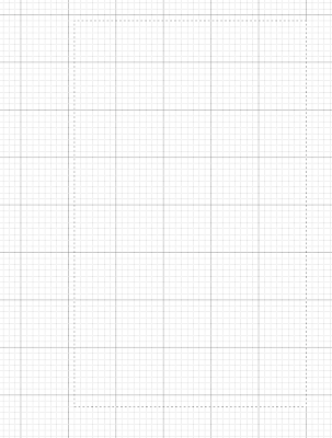
step 2. Turning on your grid will help you create shapes that line up properly. Go to View-->Show-->Grid
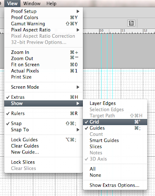
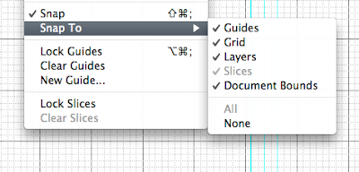
While you're at it, you should make sure that "snap to" has a check mark next to Grid so that the shapes you draw will snap easily to the lines:
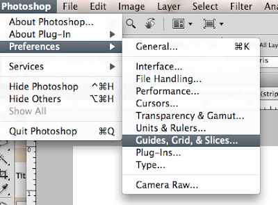
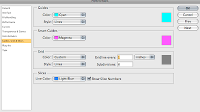
One more crucial thing about grids: you can set the size of your grid in preferences.


I like to set mine to 1-inch squares with 8 subdivisions per inch, but you will see what works for you once you start designing.


Before continuing, let's look at the end product to better understand the steps to get there:

The layers that make up this 2-page spread look like this:

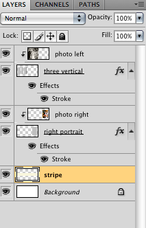
From the bottom layer up, you see:
1. The background, which I have set to white. You can choose any color, of course.
2. A layer for the stripe. Again, these are design choices. Do what you like, but make sure you do each element on its own layer.
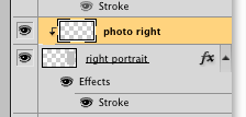
3. The "right portrait" layer is a shape filled with gray (the color doesn't matter). This represents the box into which you will drop a photo.
4. The photo layer that is set to create a clipping mask (note the little arrow pointing down) with the shape on the previous layer.
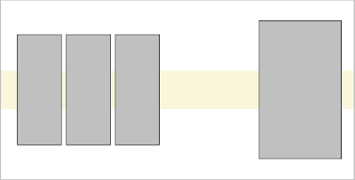
5. My window of three vertical rectangles.
6. The photo layer set to create a clipping mask with the three rectangles.


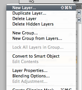
step 3. Let's start with the right portrait. Make new layer (remember to do this for every element of your design) by going to the down arrow on the top right of your layers palette and selecting "new layer.":

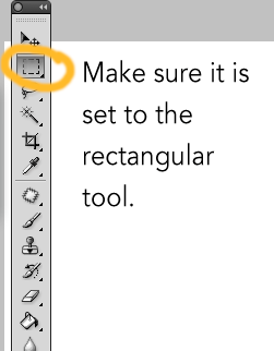
Make sure that the new layer you created is the active layer. Select the marquee tool either by hitting "m" on your keyboard or by selecting it on the toolbar.
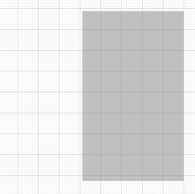
Then it's just a matter of clicking and dragging until you get the shape you like. Because you have a grid turned on, you can use the inches as a guide if you want a specific size (such as 5"x7"). I usually just do what looks right. If you don't like a selection you made (it happens all the time), just hit command-d to deselect it (or just click once outside your selection). It's not much to look at, but here is my selection (note the "dancing ants"):
step 4. Now you are going to fill that selection with a color of your choice. Select the paint bucket on the toolbar and click on the color swatches at the bottom of the toolbar to select a color.
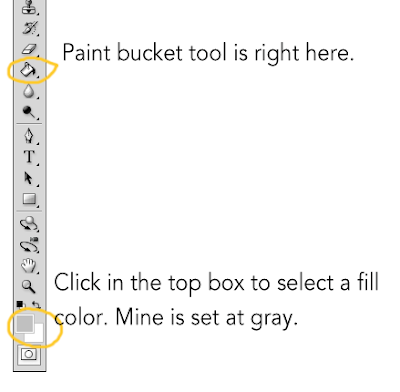
With the paint bucket tool selected, just click inside your marquee selection to fill it with color.
At this point, you probably want to deselect to make those annoying ants go away. You will also want to give the layer a descriptive name (double click where it says "layer 1" (or whatever) and then type in a name).

step 5. Fine tune as needed. What if you like the basic shape, but you you're not so sure about where you placed it on the page? Just hit "v" for the move tool and drag it around (or nudge it with the arrow keys). Another thing you probably want to do is add a stroke (a line) around the shape to create a subtle (or not so subtle if that's what you're after) frame for your photo. If you double click on the layer (avoid clicking on the layer name or it will think you want to rename it) you will get a "layer styles" dialog box:
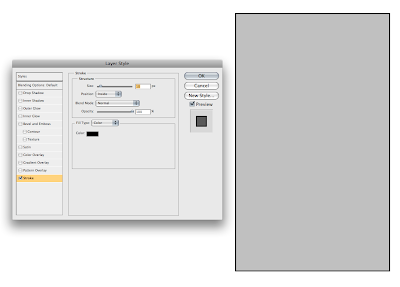
There are loads of options, but I believe that less is more so I'm sticking with a simple stroke. I checked the "stroke" option (make sure it's highlighted) and then set the size to 10 pixels, positioned it on "inside" and used black as the color (you can click in the color box and change it as needed). Now my template includes a nice little frame around the shape. I can quickly change it in the future by reopening the layer styles dialog box.

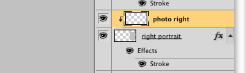
step 6. Create a new layer that clips to the shape below it. This will be the blank layer where you add a photo later. Select "new layer" and notice the dialog box:
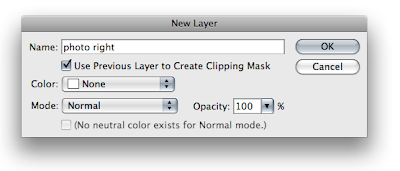
Assuming you still had the layer with the rectangle active, your new layer will be created above your template shape layer. Name your new layer something that reminds you that a photo belongs there (I named mine "photo right"). Check the "Use Previous Layer to Create Clipping Mask" box and you will get a new blank layer like this:
But what does it mean???
It means that any photo you put in that layer will only show through the window of that rectangle you just created.

At this point, you have all the basic principles you need. For the other side, I started out thinking I wanted three vertical rectangles, each on its own layer and each with its own "photo" layer set to create a clipping mask. To save time, I did one of the rectangles and then hit command-J twice to make two more the exact same size. Then, with the appropriate layer active, I used the move tool (v) to arrange each rectangle. If I had stuck with my original plan, I would simply add a new layer (as in step 6 above) above each of the individual rectangle layers, each clipping to the rectangle below it. Instead, I decided that it would be cool to make the three rectangles into one "window" for one photo.
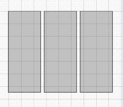
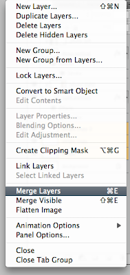
So I selected the three separate layers, then from the pull-down menu in the layers palette (the arrow), I selected "merge layers":
Now I had one layer with three rectangles. I then did step 6 (add new photo layer with clipping mask option selected). So in the end, my one photo could peek out from behind the three rectangles.

Once you understand the basic principles, you can do as many layers as you like. My stripe layer, for example, was created on a new layer above the background layer (if I did the stripe layer on top, it would cover the photos), and then with the help of the rectangular marquee tool and the paint bucket, I poured in a color (that can be changed at any time by pouring a new one in with the paint bucket).

In the end, I have a basic template for a two-page spread:
This is what I would now save as a template. IMPORTANT: DO NOT FLATTEN. Save the template as a psd file with layers so you can put the photos in as needed.

Using your templates

When you are ready to add photos to your template, open the template and open a photo you want to add. Select the photo (command-a), copy it (command-c), then paste it (command-v) into the "photo" layer above the shape on your template. For example, for the right side photo, I would select the layer called "photo right":
When I paste my photo into that layer, it looks like this:
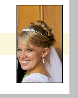
DO NOT PANIC when this happens. Sometimes you won't even see the photo if it lands outside the "window" of your clipping mask. We have not created an action that will automatically resize your photo to fit the window. The control freak in me does not want to, because I want to size/crop on the fly to try out different looks.

To size, use command-t (free transform):
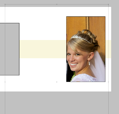
When I hit command-t, you can see the outlines of the real photo which is obviously a lot bigger than the clipping mask. Holding the shift key, I will click and drag one of the corner handles toward the center until I get a better size. You can also drag the whole picture around to get ideas for a good crop. Here, you can see how I have made the photo smaller. Based on the transform lines, you can see that I could go even smaller if I wanted to.
Once you have a size you like, apply the transformation by hitting return. You can still drag the photo around with the move tool until you have the perfect placement.

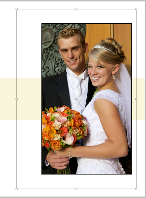
Eventually, you get a spread you like:
Make sure to do a "save as" so you keep your template photo-free and ready to save you time in the future. Now imagine the same template with different photos. OK, don't imagine, I'll do one really fast:

Thursday, July 1, 2010

I'm back! July Monthly Special: Weddings

Beautiful Polynesian couple kissing by the Salt Lake City Temple

OK. So my short break turned into a two-month hiatus during which I began to wonder where I ever found the time to do a blog in the first place. One of the many things keeping me busy was wedding season, so I figured, Why not do the July Monthly Special on weddings?

If you're not interested in wedding photography, you will still find posts on other topics this month, including my first interview in a long time and who knows what else? I will be in Seattle and then in Paris during this month, so you can expect some photography or inspiration from there.

But back to weddings...You have no idea how much I want to do a post on the worst engagement photos ever or on some of my pet peeves in wedding photography. But I try not to be mean. Still...I might just have to do a not-so-mean version.

Although I have no actual data on the matter (which never stops me from making wild assertions—just ask my wife), I bet Utah is the wedding capital of the world and BYU is the epicenter. If you know Utah Mormon culture, you're aware of the cliché of 21-year-old LDS men fresh off their missions, hormones ablaze with virtuous lust, zealously in pursuit of an eternal companion (usually blond) while studying for their pre-med, pre-law, or pre-MBA future. If your only contact with "Mormon" culture is Big Love, you should know that you would have to go to some freaky fundamentalist splinter group compound in Southern Utah to see polygamy and that the people won't be nearly as attractive. If you want a look at the equally strange monogamous mainstream, get your hands on a copy of the poorly-executed Mormon comedy "The Singles Ward" and then read the satirical Mormon mommy blog "Seriously, so blessed!" which is seriously, so accurate a satire of a certain Utah type that readers will either be offended or die laughing depending on their sense of humor.

This month, I will give some advice to photographers who want to do wedding photography and will do a tutorial (that can apply to other things than weddings) on making your own Photoshop templates.

And what about those of you who want to participate by posting something on your blog and then linking it back on this post? Why not share your favorite or least favorite wedding photo? Or do a post about what you love/hate about wedding photography. Go ahead and be opinionated. I will.