When I did my first wedding album, I looked at the possibility of purchasing templates, but quickly abandoned the idea because 1. I thought that 90% of the templates were horribly tacky (keep in mind that this was a long time ago and things have improved since then) and 2. the "good" template software/plug-ins were expensive.
Things have improved since then, but I still custom design all my albums. When Asukabook came out with a free template program (other companies have done this for a quite a while now) a little more than a year ago, I thought I'd give it a try. It turns out, the program was a disaster. Hopelessly flawed, the "asukabook maker" was abandoned by the company with no news of a future release—and just when I was warming up to the idea of templates. What to do? Switch to Queensberry and Photojunction software? For the well-heeled client, sure, I guess. But the higher price point wouldn't sit well with a lot of my clients. Add to that, the fact that Asukabook customer service is excellent, that their print quality is top of the line, and that they are located in my once home state of Oregon, and I'll forgive their lack of a slick program—for now.
If you're a control freak like me, but want to spend less time on album design, then making your own custom templates is a good compromise.
The tutorial
(brief disclaimer: This tutorial uses clipping masks in an old school sort of way and does not take advantage of "smart layers" which are great if you want to automatically apply filter effects, which I don't. For a smart layers approach, check out the tutorial in Layers by Matt Kloskowski.)
step 1. Open a new document. Pick a size, resolution, and color mode that correspond to your needs and/or the specs given by the people printing your album. (In my case, I am doing a 10"x10" Asukabook album spread, so imagine everything you see as two facing pages in an album).
step 2. Turning on your grid will help you create shapes that line up properly. Go to View-->Show-->Grid
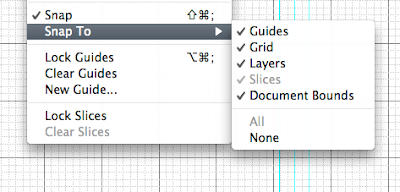
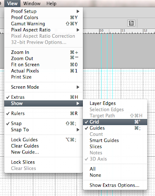 While you're at it, you should make sure that "snap to" has a check mark next to Grid so that the shapes you draw will snap easily to the lines:
 One more crucial thing about grids: you can set the size of your grid in preferences.
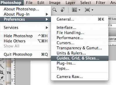
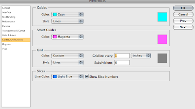
I like to set mine to 1-inch squares with 8 subdivisions per inch, but you will see what works for you once you start designing.
Before continuing, let's look at the end product to better understand the steps to get there:
 The layers that make up this 2-page spread look like this:
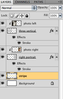 From the bottom layer up, you see:
1. The background, which I have set to white. You can choose any color, of course.
2. A layer for the stripe. Again, these are design choices. Do what you like, but make sure you do each element on its own layer.
3. The "right portrait" layer is a shape filled with gray (the color doesn't matter). This represents the box into which you will drop a photo.
4. The photo layer that is set to create a clipping mask (note the little arrow pointing down) with the shape on the previous layer.
5. My window of three vertical rectangles.
6. The photo layer set to create a clipping mask with the three rectangles.
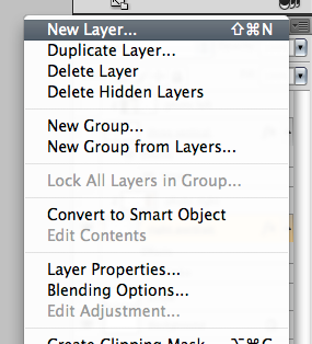
step 3. Let's start with the right portrait. Make new layer (remember to do this for every element of your design) by going to the down arrow on the top right of your layers palette and selecting "new layer.":
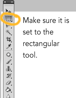
Make sure that the new layer you created is the active layer. Select the marquee tool either by hitting "m" on your keyboard or by selecting it on the toolbar.
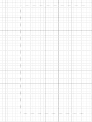
 Then it's just a matter of clicking and dragging until you get the shape you like. Because you have a grid turned on, you can use the inches as a guide if you want a specific size (such as 5"x7"). I usually just do what looks right. If you don't like a selection you made (it happens all the time), just hit command-d to deselect it (or just click once outside your selection). It's not much to look at, but here is my selection (note the "dancing ants"):
 step 4. Now you are going to fill that selection with a color of your choice. Select the paint bucket on the toolbar and click on the color swatches at the bottom of the toolbar to select a color.
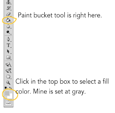 With the paint bucket tool selected, just click inside your marquee selection to fill it with color.
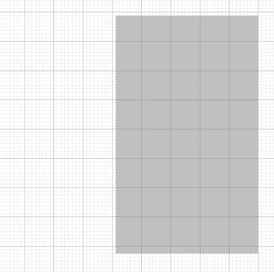 At this point, you probably want to deselect to make those annoying ants go away. You will also want to give the layer a descriptive name (double click where it says "layer 1" (or whatever) and then type in a name).
step 5. Fine tune as needed. What if you like the basic shape, but you you're not so sure about where you placed it on the page? Just hit "v" for the move tool and drag it around (or nudge it with the arrow keys). Another thing you probably want to do is add a stroke (a line) around the shape to create a subtle (or not so subtle if that's what you're after) frame for your photo. If you double click on the layer (avoid clicking on the layer name or it will think you want to rename it) you will get a "layer styles" dialog box:
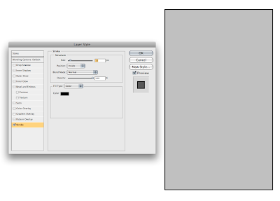 There are loads of options, but I believe that less is more so I'm sticking with a simple stroke. I checked the "stroke" option (make sure it's highlighted) and then set the size to 10 pixels, positioned it on "inside" and used black as the color (you can click in the color box and change it as needed). Now my template includes a nice little frame around the shape. I can quickly change it in the future by reopening the layer styles dialog box.
step 6. Create a new layer that clips to the shape below it. This will be the blank layer where you add a photo later. Select "new layer" and notice the dialog box:
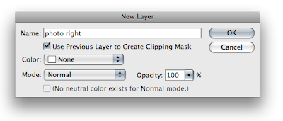 Assuming you still had the layer with the rectangle active, your new layer will be created above your template shape layer. Name your new layer something that reminds you that a photo belongs there (I named mine "photo right"). Check the "Use Previous Layer to Create Clipping Mask" box and you will get a new blank layer like this:
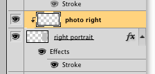 But what does it mean???
It means that any photo you put in that layer will only show through the window of that rectangle you just created.
At this point, you have all the basic principles you need. For the other side, I started out thinking I wanted three vertical rectangles, each on its own layer and each with its own "photo" layer set to create a clipping mask. To save time, I did one of the rectangles and then hit command-J twice to make two more the exact same size. Then, with the appropriate layer active, I used the move tool (v) to arrange each rectangle. If I had stuck with my original plan, I would simply add a new layer (as in step 6 above) above each of the individual rectangle layers, each clipping to the rectangle below it. Instead, I decided that it would be cool to make the three rectangles into one "window" for one photo.
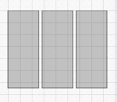 So I selected the three separate layers, then from the pull-down menu in the layers palette (the arrow), I selected "merge layers":
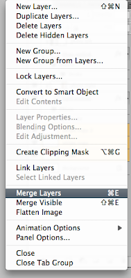 Now I had one layer with three rectangles. I then did step 6 (add new photo layer with clipping mask option selected). So in the end, my one photo could peek out from behind the three rectangles.
Once you understand the basic principles, you can do as many layers as you like. My stripe layer, for example, was created on a new layer above the background layer (if I did the stripe layer on top, it would cover the photos), and then with the help of the rectangular marquee tool and the paint bucket, I poured in a color (that can be changed at any time by pouring a new one in with the paint bucket).
In the end, I have a basic template for a two-page spread:
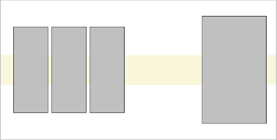 This is what I would now save as a template. IMPORTANT: DO NOT FLATTEN. Save the template as a psd file with layers so you can put the photos in as needed.
Using your templates
When you are ready to add photos to your template, open the template and open a photo you want to add. Select the photo (command-a), copy it (command-c), then paste it (command-v) into the "photo" layer above the shape on your template. For example, for the right side photo, I would select the layer called "photo right":
 When I paste my photo into that layer, it looks like this:
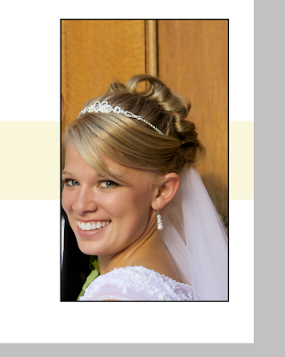 DO NOT PANIC when this happens. Sometimes you won't even see the photo if it lands outside the "window" of your clipping mask. We have not created an action that will automatically resize your photo to fit the window. The control freak in me does not want to, because I want to size/crop on the fly to try out different looks.
To size, use command-t (free transform):
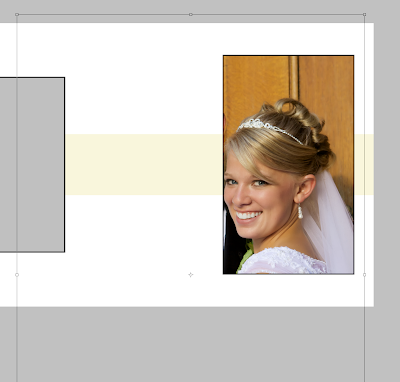 When I hit command-t, you can see the outlines of the real photo which is obviously a lot bigger than the clipping mask. Holding the shift key, I will click and drag one of the corner handles toward the center until I get a better size. You can also drag the whole picture around to get ideas for a good crop. Here, you can see how I have made the photo smaller. Based on the transform lines, you can see that I could go even smaller if I wanted to.
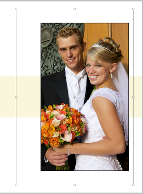 Once you have a size you like, apply the transformation by hitting return. You can still drag the photo around with the move tool until you have the perfect placement.
Eventually, you get a spread you like:
 Make sure to do a "save as" so you keep your template photo-free and ready to save you time in the future. Now imagine the same template with different photos. OK, don't imagine, I'll do one really fast:


8 comments:
This is awesome! Thanks for sharing such useful information! Professor, my roommate Abigayle took your French culture/photo class and I'm DYING to take it, too! Also, I'm currently visiting Paris with my parents and your guided walks are so fun. I hope to work with you soon!
Emily Wheeler
Awesome! Thank you so much for the walk-through!
Thank you , this is a great tutorial.
Wow, what a sexy couple.
Awesome tutorial which motivated me to design my first spread sheet in 15mins. Really loved it. Thanks a lot once again :)
Nice post sharing information regarding custom wedding album design
Post a Comment