1. Open a photo (Your next family Christmas card? A new Facebook profile picture?). Most photos will greatly benefit from the following simple adjustments. And unlike one-click automatic adjustments, the following method gives you customized control. Once you understand the basics, you can correct color with more precision or even stylize color in unexpected ways.
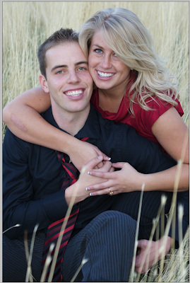
I will be using this engagement photo:

To be fair: Step 2 (in which you duplicate the background layer) is not strictly necessary in this tutorial, but I think that step should be automatic (for reasons that will be apparent in future tutorials), so you may as well practice good habits now.
2. Hit Command-J (PC: Ctrl-J) to duplicate the background layer. You will now see "layer 1" in your layers palette just above the background layer.
Note: If the duplicate layer does not appear, double click on the word "background." This will bring up a dialog box to rename the layer and "unlock" it. Hit return to name it "layer 0" or you can rename it "original" or anything else. Some people do this as habit before duplicating a layer.
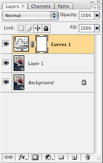
3. Open what is called a "curves adjustment layer" by clicking on the pull-down menu in the bottom of the layers palette:
 Once you have done that, you will see a new layer (which should be active) that looks like this:
Notice that there is no thumbnail of your photo on your curves layer. That is because it does not actually contain your photo; it only contains the adjustments themselves. On the left side, that curvy line represents—surprise—the curves adjustment, and on the right, a layer mask (which will not be used in this tutorial (but for the curious: it allows you to selectively remove or "mask" adjustments).
4. Next, you will lighten or darken your photo on the curves adjustment layer to get better skin values. Double click the curve box on the left side of that layer to get a dialog box like this:
 It looks intimidating, but we are going to keep it easy.
A quick explanation to demystify it: the horizontal axis represents the tonal information within the image, running from black (left) to white (right). The vertical axis shows how much information falls within various tones. For example, the two "mountains" show that my photo has a lot of light and dark tones, and the "valley" shows that it has fewer midtones. Naturally, your photo's histogram will differ. If too much information is on the far left, you probably have an underexposed image. And if too much information is on the far right, you probably have an overexposed image.
Pep talk digression:
I am not going to pretend that curves adjustment layers aren't powerful and complex tools. They are. But then, so are computers, right? And my three-year-old daughter enjoys playing Nick Jr. games without knowing how to program. So my point is, Dora now, programming later. Or not. You may never need to get very complicated.
And now, it's curves playtime. See that line cutting diagonally across your histogram? You can click anywhere on that line (top right is white, bottom left is black) and an adjustment point will appear. You can add as many points as you want, but let's just stick to one for now. Help! you say, I was too hasty and I've already made ten of those points on the line! No problem. You can click on a point and drag it off of the line (drag way off, out of the box) to make it disappear.
Since your photo will vary, this is a good time to experiment. You probably will want to stay away from the extreme ends. Also, don't go hog wild. Keep it subtle. Set a point and pull it toward the right and down to darken, or to the left and up to lighten. As long as your "preview" button is checked you can see the effect in your photo. Toggle the checked preview box on and off to compare. I decided to lighten my photo a little bit. Here is what my curves adjustment looks like:
 A small, but not insignificant change. Depending on your photo, you may want a larger adjustment. When you have something you like, click OK.
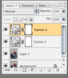
5. Now it's time for another curves adjustment. Add another curves adjustment layer (so you can appreciate the changes for each step) just like you did in step 3. This new curves layer will appear on top. Double click as you did before to open your new adjustment layer.
 In the dialog box at the top left it says "Channel RBG" along with a pull-down menu from which you can choose the red, green, or blue channel. Go ahead. Check them out. You can set a point and pull one way or the other on each of these channels as we did in step 4. Pull to the left and increase one color, pull to the right and bring out its opposite.
Red (left) is opposite Cyan (right).
Green (left) is opposite Blue (right).
Blue (left) is opposite Yellow (right).
Start with the Blue channel:
 Since I want a nice warm photo, I will click in the dead center of the line and pull toward the bottom right (the yellow side).
With my preview box unchecked you can see the before:
 And with it checked on again, the after:
 The second one looks warmer, and in my opinion, more inviting. Now do your own blue channel adjustment, but don't click OK. You will want to move on to the Green channel before you're done.
6. Now that I've warmed up the blue channel, I am seeing a bit too much green. So in the Green channel, I am going to set a point in the middle (as I did before) and drag it a little to the blue side.
How do you know how much and which colors to change? Experiment and you will educate your eye. Some people seem to be able to look at a photo and say "too much blue" or "too much red" with no problem. If you are not one of those people, experiment with the channels and see what pleases your eye.
Another pep talk digression:
There is no right answer when it comes to color. For example, a lot of people are doing heavily yellowish looking photos right now. For those not into that trend the yellow may represent an ugly color cast. Similarly, as a rule, bluish skin is undesirable. But for a certain steely and desaturated look, it may be perfect. You decide what looks good. The important thing is that you are no longer at the mercy of an auto-adjust button.
7. I am leaving the red channel alone, but if you want to tweak it, you know how.
8. One final curves adjustment will give added contrast. Add another curves adjustment layer. Double click and leave the dialog box on all channels (as opposed to the individual R, B, or G ones). This time you are going to add what is called a classic "S" curve by manipulating two points. As you place and then pull a point somewhere in the top half (not too high up or you will clip highlights) to the left side, and another point in the bottom half (not too far down or you will lose shadow detail) to the right side, an S-shaped curve will appear, and more importantly, you will increase contrast. Here is what my subtle s-curve looks like (not much of an "s," is it?):
 The more prominent your "s," the greater the contrast in the result. Try it on your photo.
That's it for now. If you practice this tutorial on several photos, it will soon become second nature.
Below are the before and after photos.
The differences you see may depend upon your computer monitor, but what I am seeing is an improvement that is not overstated. The more portrait retouching I do, the more I am a fan of restraint. Unless you are going for a highly stylized look (which I also love), you don't want something that screams out "Hey! I've been Photoshopped!"


5 comments:
Nice tutorial, simple and a good introduction to curves. Keep up the good work :)
What does a layer mask in Photoshop do? And how do I use it ...
retouching service
This is easier and surely gives comfort to internet users. Thanks for sharing. Post like this offers great benefit. Thank you!
Ottawa Photo Booth
I wanted to thank you for this great read!! I definitely enjoying every little bit of it.I have you bookmarked to check out new stuff you post.
jacksonville wedding djs
This is the best blog i have seen about the photography. Keep up the excellent work.I am really impressed.
fine art photography
Post a Comment