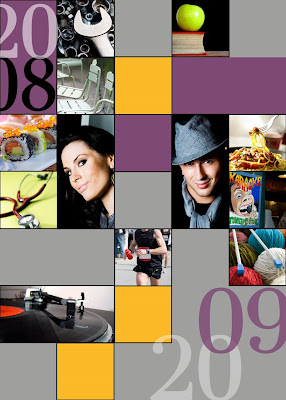
Meet Esmé and Finn.
Esmé just finished her residency at Johns Hopkins. She dabbles in auto repair in her spare time. She adores sushi, strolls in the park, and vintage vinyl.
Finn knits (yes, knits) when he's not teaching sign language to underprivileged children. He loves pasta, and always loads up on carbs before a marathon in spite of what Esmé says about current research on the topic. Much to Esmé's chagrin, his idea of the perfect date includes three or four lively hours at a local Karaoke bar.
Esmé and Finn's favorite colors (this season, anyway) are purple and orange.
Aren't they adorable. No one has to know that the New Year's cards they just sent out were printed at—gasp!— Walmart.
Esmé and Finn aren't real, but I did have fun inventing them. My point in so doing is to suggest some photo-based card alternatives to the family newsletter approach.
No offense to anyone who sends one of those typed brag-fest missives touting everyone's accomplishments throughout 2008. But here is my opinionated take on it: The people you keep in contact with already know what you've been doing, and the ones you only send cards to once a year are probably wondering why you only give them this information once a year—or so I imagine.
Maybe visual clues could replace the newsletter this year. A picture is worth a thousand words, right?
Besides, if you blog, the full story is all there for the reading (and you could always have your blog address printed on the back of the card). So why not send a "year in photos" card or some variation thereof. We might be doing a less-hipster version for our own family card, but I may have said too much already. When I did the Christmas "dots" card tutorial in October, Michelle said she liked it but that now that everyone had seen it...
So, at the risk of ruining another card idea for our own family, let me tell you how easy it is to do something like this.
It's all based on a grid. Back in June, I did a grid tutorial that teaches the basic principles behind creating a grid. I used some of those same methods in creating this card. In a nutshell, here is what I did:
1. I created a document that was 5x7 inches at 320 dpi.
2. I went to Preferences-->Guides, Grid (etc.) and set the grid lines to appear every inch:
 3. Now it was just a matter of selecting photos, cropping them, and dragging copies to a space in the grid. All of my photos are either 1x1 in or 1x2 in, so it was very easy to just drag each one to a square in the grid (easy, provided you selected View--Grid so you can see the grid).
4. For the colors, I used the rectangle shape tool and changed colors using the menu at the top. Look at step 10 in my dots grid tutorial if you don't remember how to do this.
5. For the text, I just added it the same way that I have explained in the "add text to photo" starter.
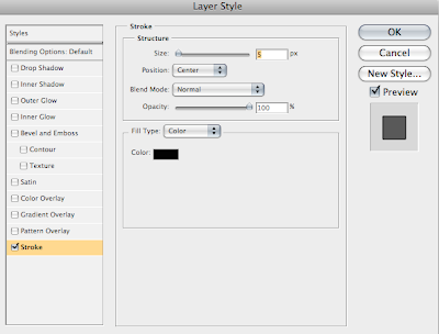
6. Those black lines around the photos were created by adding a "stroke" in the layer styles box. Just double click the thumbnail image of the layer in the layers palette to get the "Layer Style" box. Highlight "stroke" and adjust the settings/color to your liking. These were my settings:
 Once you have the stroke on one layer, you can copy and paste it in the layers palette or simply drag it onto another layer (rather than go through the process each time).
It was really pretty easy.
And here's the great thing...
No assembly required. Once you prepare a file, you can have a 5x7 card printed at your local Walmart (I assume they have taken over the world by now, haven't they?). What is great about the cards is that you have the option (unlike Costco, for example) of uploading your own photo to a 5x7 folded card without using one of their holiday-themed templates. This means total control (perfect for fellow control freaks). They happen to have a 12 photo collage option (for which I applaud them), but I would rather have the freedom to design something exactly as I please.
I braved the stench of cheap hairspray this morning (I'm not kidding, that was the smell of our local Walmart) to check out the quality. They couldn't show me a finished sample, but they showed me the paper and it was a bit on the flimsy side. But at $1.42 per card including the envelope, it is still at least as inexpensive as something you would make with photos and card stock. And the bonus is that you will save a lot of time.
If you want to bump the quality up a notch, try the Moo Holiday Cards option. The printing and paper quality is unbeatable for the price. Two possible deterrents: increase in price, and the 4.1 x 5.8 inch size that is less neat and tidy for a grid. And one more: less time to procrastinate. They ship from England and take about 10 working days to arrive. Of course, any printing place will do as long as it will let you print photo cards from a full photo instead of a template. Just be sure to get the dimensions and design accordingly.
Let your imagination run wild and think of alternatives to the family newsletter this year.


0 comments:
Post a Comment