Showing posts with label Christmas card. Show all posts

Tuesday, December 22, 2009

A design idea from last year

I'm taking the easy way out today and doing a re-post from last year. In preparation for the holidays, I did some posts about design inspiration, including a series about Criterion DVD design. This was a follow-up that shows how you can recontextualize a design to suit your needs:

It can be a lot easier to adapt a pre-existing good design than to invent something from the ground up. And you would be surprised how easy it is to do. I won't do a whole tutorial in this post, but you will have plenty in the coming months. For now, I just want to show you how fun it can be to go from foreboding drama...

to happy holiday card...
using the things you've learned on this blog.

The shorthand version of how I did it:
1. I brought up the inspiration photo and turned on the grid to approximate the layout.
2. I opened a new document (with "show grid" enabled) and used the rectangle shape tool to draw the shapes. For the tree on top, I used a dingbat from a free Christmas collection (it was the letter "d").
3. I toned the image of the girl (a stock photo for demonstration purposes) and then copied it into the other document.
4. I created a clipping mask using the shapes in exactly the same way as with fonts.
5. I used a red-to-green gradient, a duplicate clipping mask, and a layer mask to fill with color up to the tree.
6. I added text (using two different fonts to make the spacing match up better).

Note:
The shorthand explanation of that post was more about adaptation than a step-by-step tutorial. When you encounter designs you like, think about how you might do your own version in Photoshop. And if you've got something you would like to do but don't know how, leave me a comment about it and maybe I'll cover it in a future post.

Sunday, December 20, 2009

And now for a moment of sarcasm...


No tutorial today. Just a scene from the metro in Paris. The caption reads "And if Christmas lasted all year?" I don't think I could have made a better arrangement of people/poses/colors if I had planned it. My favorite serendipitous detail is hard to notice at this size: The woman on the right is covering up the "or" of the cell phone service logo so that instead of "orange" we get "ange" (angel) with a TM (trademark registered) next to it. This is my kind of twisted Christmas card.

Wednesday, November 19, 2008

A stylish holiday card from Walmart?


Meet Esmé and Finn.

Esmé just finished her residency at Johns Hopkins. She dabbles in auto repair in her spare time. She adores sushi, strolls in the park, and vintage vinyl.

Finn knits (yes, knits) when he's not teaching sign language to underprivileged children. He loves pasta, and always loads up on carbs before a marathon in spite of what Esmé says about current research on the topic. Much to Esmé's chagrin, his idea of the perfect date includes three or four lively hours at a local Karaoke bar.

Esmé and Finn's favorite colors (this season, anyway) are purple and orange.

Aren't they adorable. No one has to know that the New Year's cards they just sent out were printed at—gasp!— Walmart.

Esmé and Finn aren't real, but I did have fun inventing them. My point in so doing is to suggest some photo-based card alternatives to the family newsletter approach.

No offense to anyone who sends one of those typed brag-fest missives touting everyone's accomplishments throughout 2008. But here is my opinionated take on it: The people you keep in contact with already know what you've been doing, and the ones you only send cards to once a year are probably wondering why you only give them this information once a year—or so I imagine.

Maybe visual clues could replace the newsletter this year. A picture is worth a thousand words, right?

Besides, if you blog, the full story is all there for the reading (and you could always have your blog address printed on the back of the card). So why not send a "year in photos" card or some variation thereof. We might be doing a less-hipster version for our own family card, but I may have said too much already. When I did the Christmas "dots" card tutorial in October, Michelle said she liked it but that now that everyone had seen it...

So, at the risk of ruining another card idea for our own family, let me tell you how easy it is to do something like this.

It's all based on a grid. Back in June, I did a grid tutorial that teaches the basic principles behind creating a grid. I used some of those same methods in creating this card. In a nutshell, here is what I did:

1. I created a document that was 5x7 inches at 320 dpi.
2. I went to Preferences-->Guides, Grid (etc.) and set the grid lines to appear every inch:
3. Now it was just a matter of selecting photos, cropping them, and dragging copies to a space in the grid. All of my photos are either 1x1 in or 1x2 in, so it was very easy to just drag each one to a square in the grid (easy, provided you selected View--Grid so you can see the grid).

4. For the colors, I used the rectangle shape tool and changed colors using the menu at the top. Look at step 10 in my dots grid tutorial if you don't remember how to do this.

5. For the text, I just added it the same way that I have explained in the "add text to photo" starter.

6. Those black lines around the photos were created by adding a "stroke" in the layer styles box. Just double click the thumbnail image of the layer in the layers palette to get the "Layer Style" box. Highlight "stroke" and adjust the settings/color to your liking. These were my settings:
Once you have the stroke on one layer, you can copy and paste it in the layers palette or simply drag it onto another layer (rather than go through the process each time).
It was really pretty easy.

And here's the great thing...
No assembly required. Once you prepare a file, you can have a 5x7 card printed at your local Walmart (I assume they have taken over the world by now, haven't they?). What is great about the cards is that you have the option (unlike Costco, for example) of uploading your own photo to a 5x7 folded card without using one of their holiday-themed templates. This means total control (perfect for fellow control freaks). They happen to have a 12 photo collage option (for which I applaud them), but I would rather have the freedom to design something exactly as I please.

I braved the stench of cheap hairspray this morning (I'm not kidding, that was the smell of our local Walmart) to check out the quality. They couldn't show me a finished sample, but they showed me the paper and it was a bit on the flimsy side. But at $1.42 per card including the envelope, it is still at least as inexpensive as something you would make with photos and card stock. And the bonus is that you will save a lot of time.

If you want to bump the quality up a notch, try the Moo Holiday Cards option. The printing and paper quality is unbeatable for the price. Two possible deterrents: increase in price, and the 4.1 x 5.8 inch size that is less neat and tidy for a grid. And one more: less time to procrastinate. They ship from England and take about 10 working days to arrive. Of course, any printing place will do as long as it will let you print photo cards from a full photo instead of a template. Just be sure to get the dimensions and design accordingly.

Let your imagination run wild and think of alternatives to the family newsletter this year.

Tuesday, October 14, 2008

A "dots" Christmas card tutorial

If you don't want to create templates and clipping masks, if you prefer eyeballing it, then this is for you. Beware, however, that a more free-form style of creation can lead to imperfections (or shall we call them "variations," as in "variations in fabric should not be considered imperfections in manufacturing..."?).

That said, keep in mind the "galloping horse" rule. We learned the rule in our household back in our quilting days. It goes like this: If you don't notice the mistakes when riding by on a galloping horse, then it's good.

Now, on to the tutorial.
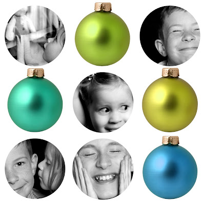
If you want to do a grid of dots, why not incorporate a few round things? Pumpkins come to mind for a Halloween card. But we have a hard enough time sending out Christmas cards, so I will use Christmas ornaments. Here's how I did it:

1. Create a new document that is 5x5 inches at 320 dpi (this is because 5x5 is a good card size).

2. Get into those grid preferences and adjust the settings for nine equal squares (just like we did in the previous "dots" tutorial).
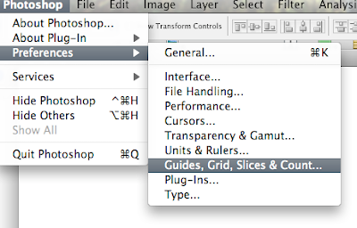
I set the main divisions at 1.66666, but I put the subdivisions at on 16 (as opposed to the 32 on the previous tutorial—galloping horse rules, right?).

3. So now that you have a nice little blank document with a grid (if you don't see the grid, turn it on in the menu: View--> Grid), you need two things: those ornaments, and some round pictures. First, the ornaments...I really didn't feel like having an ornament photo session, so I bought a photo from iStock Photo (this one). Stock photography is a great way to get good quality images quickly. For certain purposes, the price of a stock photo is worth the time it would take to do your own. Just make sure to buy an image size big enough for your needs. As for your own family photos, well, unless you want to construct the perfect artificial family (which, for the right person, might be very entertaining), you had better take your own portraits.

4. Now you need to separate those ornaments and drag the ones you want onto your card-in-progress. The advantage of stock photography is that you can get clean photos on white (read: extraction-friendly) backgrounds. Every Photoshop user has their favorite method of extracting an image. In this case, here's what I did:

Maybe it's because Halloween is near, but I chose the "Magic Wand" tool (W). When it is selected, you can put a number between "0" and "255" in the "tolerance" box. Because I am a reasonably tolerant person, I set it to "40" for starters. But, no! That just wasn't tolerant enough. When I was hoping for a completely outlined ornament, I got something like this:
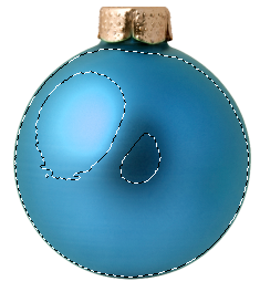
It turns out, if I had put "200" in the tolerance box as seen below...
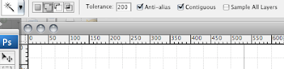
...I would have been able to select it in one click. So the lesson here is to play around with tolerance numbers. Oh, and just so you know, what those numbers really mean is how closely the magic wand will match colors (i.e. larger number=wider selection).

One more thing before we move on: if you make a selection that isn't wide enough (such as in the image above), you can keep adding to it until you get what you want. Just click the "add to selection" box in the magic wand menu bar (it's the second from the left) and click in areas that aren't selected until you finally get something like this:
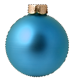
5. Now it's time to get that selection on its own layer and drag it onto your card. Hit Command-J (PC: Ctrl-J) and you have a new layer with nothing on it but that one ornament. Now you can use the move tool (V) to drag it onto your card.

6. Congratulations! Your card is looking much more festive already. But are you happy with the size of the ornament? If not, hit Command-T (Ctrl-T) to bring up a transform box around it (see below).
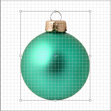
Just grab one of those corner handles (while holding shift to keep the aspect ratio) and drag out or in to change the size. Hit "Return" to apply the transformation. You will be using this step many times before the card is done.

7. So let's say you have got one ornament to just the right size. What about the others? First, you need to extract them one by one (as seen in step 4), drag them onto the card and into the same approximate space as the already-transformed ornament (step 5), and then—because we are not going to be too picky—put the new ornament layer below the perfectly sized one and use it as a guide:
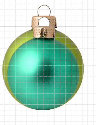
Make sure the appropriate layer is selected, and then bring up that transform box. If you line up the bottom and then drag the top corners down (a little from one side and then a little from the other), you should be able to get pretty close. You can move it around at any time by clicking in the box (not the handles) and dragging. Once you think you've got it right, apply the transformation. Then, to double check, change the layer order so the model ornament is on top. If it still looks good you've done it. If not, just transform it some more until you've got it.

8. Repeat the above process until you have all the ornaments you want.
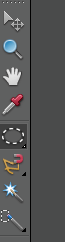
9. Time for the photos. Open a photo. Select the elliptical marquee tool (seen for Elements at right, and CS3 at left). Now click and drag in your photo while holding the Shift key (this keeps it circular) until you have the area you would like to crop. Hit Command-J (Ctrl-J) to copy your selection onto its own layer. You can now move it (V) onto your card and transform it as desired. I used the ornament for a general guide on the first one:
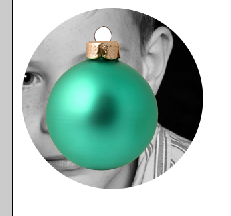
But after that, I used the first photo as a guide for the others as described in step 7. If you look at my card, you will notice that I decided to make the photos larger than the ornaments (not that you have to do the same).

10. One more thing you may notice is that I removed those little loops from the top of the ornaments. They were getting in the way. I simply selected the rectangular marquee tool (right up there sharing menu space with the elliptical one), selected the offensive loop, and then cut it out (Mac: Command-X, PC: Ctrl-X or choose Edit-->Cut).
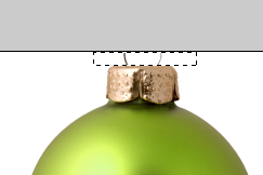
Make sure you are on the correct layer when you do this or you will cut a hole in another image.

11. Finally, you are free to arrange the photos and ornaments as you like. Use the subdivisions in the grid to help you keep things in line. When you are happy (or at least "galloping horse" happy), you can flatten your card, print it, and glue it on to card stock and impress all your friends.

Sunday, October 12, 2008

Introducing the Christmas cards and gifts series

If you're like me, you wait until the very last minute to do your Christmas shopping. But maybe that will change this year (for both of us) with my October through December series of ideas for Christmas cards and gift ideas—all of which relate to photography, of course. Within the next couple of days I will post a card idea that relates to the "dots" theme, but today's idea is much more straightforward.

This is the photo we used for a card two years ago. That same year, I did one for a client that spelled NOEL using three kids and their dog (not an easy task). For the client, I did a grid of four in black and white with alternating red and green letters. For our own card, we stuck with all black and white.

The recipe
1. Get letters from a craft store and paint them

2. Take individual photos of each child with their letter. I used natural side lighting from a window. I would also recommend using a black or dark background. I used a dark wood screen and then darkened the background even more in Photoshop. Had I just used some black fabric, I could have saved a lot of time.

Note: Make room for serendipity. Eva would not cooperate. She began to cry after only a few photos and she wouldn't hold her letter. For a few seconds, she put her letter over her head and I took the photo that you see here. Her head became to "O" and the letter became a sort of halo. What was frustrating at the time of the shoot became, in my opinion, the best part of the card.

3. Do the Photoshop bit. We decided to make the photo into strips 2x6 inches long that would eventually end up on larger rectangles of prepared cardstock. The math was easy. I cropped each photo to a 2x2 inch square. I then created a new document (4x6 at 320 dpi) and dragged each square onto the appropriate place in the new document. Since my document was 4x6, I could fit two 2x6 strips on each photo (which made this an inexpensive project). Since I didn't feel like doing the dragging part two times, I deselected the backround layer (leaving the layers with the three kids visible) and selected "merge visible" from the layers pull-down menu. Now I could just copy (Mac: Command-J or PC: Ctrl-J) that layer and drag it down with the move tool (V) its spot. I flattened the whole thing and then got them printed.

4. Assemble the cards. This was Michelle's part of the job, so all I can tell you is that we used white cardstock and printed a red border inside of which we (and by "we" I mean "she") pasted the photo strip. We kept it simple and were very happy with the results. I can't show you the finished product because—alas!—we mailed all of them that year and have only a crumpled photo on the fridge to show for it.

Variations
You can easily take this basic idea and do your own variations. Grids, vertical strips, etc. For me, the most important part is not the letters, but rather the plan to use individual photos instead of a standard group portrait. The nice thing about putting individual photos into a group later is that you still get to see everyone, but each person can look their best.