The backstory
Have you ever seen a photo inside text? At a whale watching place in Oregon, for example, I saw a poster that said "Whale Watching" but with photos of—you guessed it—whale watching inside each letter. For some reason, I thought the whole photo-in-text thing would make a good August Monthly Special, but there were two major deterrents:
1. I realized that every time I see a text made of photos it is HIDEOUSLY TACKY (Sorry, but I have strong opinions, so no offense if you are itching to spell out PUPPY LOVE using photos of your new pet terrier. I will teach you how to do it, but please, for the love of taste, don't go there.)
2. I try to make things Elements-friendly, and as it turns out, Elements does not treat the process in the same way as Photoshop.
But who am I to back down from a challenge? I just delayed it a month. My lofty goal to kick September: to create a photo-in-text project that I like. Wish me luck.
The tutorial for Photoshop and Elements
I will go through the basic steps to add photos inside text and then I will attempt to apply those principles to a project. In a future post, I might get even more ambitious. Be very afraid. I am.
The following is oh-so-easy. The hard part will be coming up with a finished product that isn't tacky (see above).
Step 1.
Create a new document with a white background. The document can be any size you want—see the grid tutorial for some basic principles. Also, you can change the background color at any time by using the paint bucket tool, selecting a color, and dumping the paint into the background layer.
Step 2.
Create a Type layer and type in whatever you want. See the Starter if you're not sure how to do this.
Step 3.
Open a photo that you want to use and put it on a layer above your text layer (the grid tutorial will help you if you don't know how to bring a photo into a new layer).
Step 4 (Photoshop).
Now you are going to create a "clipping mask," which means that the photo above will only be visible through the shape below (in this case, text). To create the mask, make sure your top layer (the one with the photo) is selected and then hold down Command-Option-G (Mac) or Ctrl-Alt-G (PC). And voilà, photo inside text. You can still change the text on its layer or move/transform the photo on its layer as long as you don't merge/flatten the image.
Step 4 (Elements).
Why this is different in Elements, I don't know, but you are going to create a clipping "group." Make sure your top layer (the one with the photo) is selected and then hold down Command-G (Mac) or Ctrl-G (PC). And voilà, photo inside text. You can still change the text on its layer or move/transform the photo on its layer as long as you don't merge/flatten the image.
Superfluous note for Photoshop: If you're not a fan of keystrokes, then you can choose "Clipping Mask" from the pull-down menu in the right of the layers palette. Or, if you like compromise, you can hold down the two keys without the "G" and move your cursor in between the photo layer and the text layer until you see the arrow change into a clipping mask icon. Any way you do it, you end up with a clipping mask.
Superfluous note for Elements: If you love using your mouse, go to Layer--Group with previous for the same result.
Part II: My attempt at photo in text
With my critique of all the tacky photo-in-text layouts, I have really set myself up for critical scrutiny. This is not exactly a step-by-step account, but here's an explanation of what I did.
Remember the graffiti "B" and the quote about beauty from the starter postscript tip? Well, since I already intended the image and the quote to be read together, I thought it might be fun to merge the two. So I opened the graffiti photo and used the type tool to start adding in text.
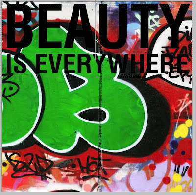 You can see that I messed with the font formatting in ways beyond what the starter taught. I should also note that I did this in CS3. Once you started playing with the text formatting, you get a feel for how you can play with text:
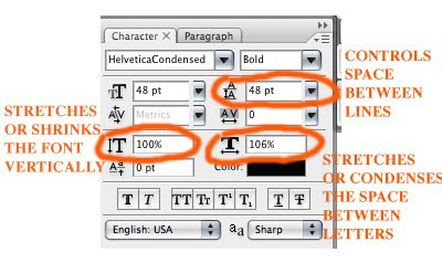 I quickly learned that life would be easier (i.e. more control) if I didn't put all my text on one text layer. In the screen grab below, I was highlighting a altering a separate text layer until I got it to match the proper width.
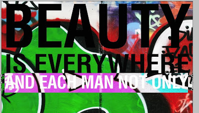 But I needed to duplicate the clipping mask over each layer of text:
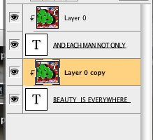 It's easy to do, but it starts to look like a mess with each added layer:
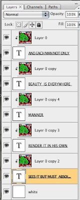 Eventually, I finished and had all the photo/text on a white background. It looked too stark and wherever the graffiti was white the text seemed to disappear. So I did a few things:
First, I copied a layer of the photo and dragged it to the bottom just over the white background, and instead of "Normal" blend mode I selected "Luminosity." This made a black and white version of the entire photo that could show through between the text. I dialed the opacity down so it wouldn't overwhelm the already complicated image. Still wanting more definition, I highlighted all the layers except the two background ones and selected "Merge Visible" from the pull-down menu at the right of the layers palette. Now I could easily make one final edit on my merged layer.
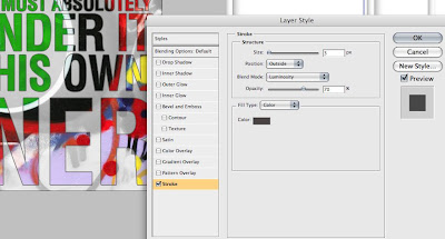
I double-clicked on the merged layer to bring up a "Layer Styles" box. I won't give a tutorial on all the options here, but I will show you that I selected "stroke" to create a line around the text, and I adjusted that line's opacity so it wouldn't be too intense:
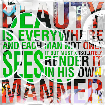
 The end result may make your eyes hurt more than the cutesy puppy and kitten image that I mocked, but I think it has a nice urban album cover sort of feel. The words take time to decipher. The image demands concentration. The message about the subjectivity of beauty certainly hits home. What do you think? Love it? Hate? Whatever?
 Your challenge
The Text+Photo theme this month invites you to explore the marriage of text and photography in any way—even without Photoshop. I may have another go at the image-in-text thing, but I will also explore other possibilities and give new tutorials. I can't wait to see your own work. Come back here to link and share your own work and to see what others have done.


1 comments:
here is my link to September's Challenge
http://janezlifeandtimes.wordpress.com/2008/09/19/take-out-challengetake-out-challenge
well I am at www.janezworld.com
the blog is on there.
I cant find where to put the link so I hope tis works.
Jane
Post a Comment