Months ago I decided that January would be the perfect month to explore black and white photography. Winter here is very monochromatic, and unless you love to ski/snowboard, the only positive thing about the stark and frozen environment is that the obligatory sweaters hide extra post-holiday pounds. Were it not for the Sundance Film Festival, I'm sure I'd be a prime candidate for SAD. Instead, when I am not hibernating in movie theaters I will be learning to appreciate shades of gray.
Throughout the month, I will present a few methods for converting color to black and white, beginning today with the Channel Mixer.
The Channel Mixer method works in most versions of Photoshop, including Elements (sort of—more on that later). After this tutorial, you have no excuse for using the inferior Desaturate or Grayscale commands. Later in the month, we will move on to more nuanced work.
The tutorial
Let's start with Photoshop.
Open a color photo. I chose an old one of my son Lucas (looking like he's up to no good):
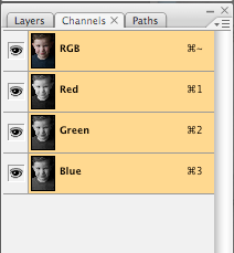 Each channel forms part of a "Channel Sandwich." The Red, Green, and Blue layers appear in grayscale representations of their respective pixels. If you turn off the layer visibility (by clicking the eye) of all but one layer, you will notice the variations. Here is the Red Channel:
 Note the smooth—too smooth—appearance of the skin. No freckles.
And now the Green Channel:
 We start to see freckles, and the overall appearance is less alien, but a bit on the dull side.
Finally, the Blue Channel:
 On Lucas, it doesn't look bad, but try the blue channel on an adult and they'll be horrified at how every sign of age gets emphasized.
What we really want is the perfect mix of all three channels in monochrome. In Photoshop, we can mix the channels using the Channel Mixer.
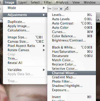
Step 1. In the top menu, go to Image—>Adjustments—>Channel Mixer:
 Once selected, a dialog box will allow you to mix your own customized blend of all channels.
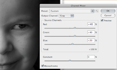 Step 2. At the bottom left on the dialog box, check the "Monochrome" box to see things in black and white.
Step 3. Time to mix. This is at once simple and difficult. The simple part is that there are no right answers, no magic formula. Some people will tell you that the combined total of each channel should equal 100%, but I disagree. In fairness, I should acknowledge that the 100% formula will help you avoid blowing out highlights. But maybe you want extreme contrast. I say, boost what you want, diminish what you want, percentages be damned.
If you looked at the individual channels earlier, you may remember which ones you preferred. For portraits, the general rule is to emphasize the red channel and downplay the blue channel for the simple reason that most people want smooth skin. But there are many possible exceptions. For example, I don't want to eliminate Lucas' freckles, so I am not going to go too heavy on the red channel. Every photo is different—and that is the difficult part. If you are indecisive, the mixing process might drive you crazy. In any case, here is the recipe you DO NOT want to use:
Red: 30%
Green: 60%
Blue: 10%
What's so bad about that? you ask.
It's approximately the same formula you get with grayscale. Do you see why I don't like grayscale. You get the same mix every time. On Lucas, it's not bad (because, if you recall, I liked the Green Channel), but it doesn't work for every photo.
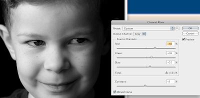
For Lucas, I decided to do the following mix (which totals 121%!):
Red: 60%
Green: 36%
Blue: 25%
On my monitor it looks good (I say that, because I'm sure I'll hate it on our iMac at home, which I find far too bright).
Step 4. Adjust the "Constant" slider for more drama. The Constant slider changes the brightness. I lowered mine by -8% for a moodier constrasty look:
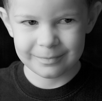
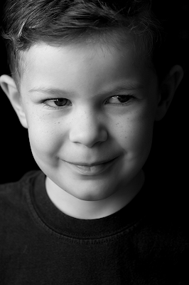
Here's the final product (with no additional adjustments):
 And now for the Elements (I am using version 6) users:
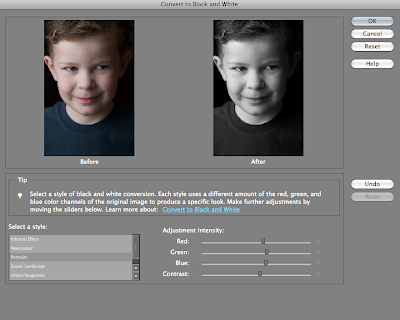 When you choose "Convert to Black and White," you have "Select a style" options that give you different RGB presets. To the right of those styles, however, you will see sliders for Red, Green, and Blue channels that function exactly as described above. You also have a "Contrast" slider in place of the "Constant" slider. Elements simplifies things, but it still gives you creative control.
Try experimenting with black and white this month, post your results and come back here to share them with others.


1 comments:
Thanks. Very clear.
Post a Comment