 Let's say that in the photo above we don't like the swingset and the kid on the swing. Maybe instead of the juxtaposition of play and quiet reading, you just want to emphasize the solitary reader. I have to warn you that this kind of fix takes time and that I hate doing it. Consequently, I'm not going to do a pro-worthy retouch, but I'll do enough to give you the idea.
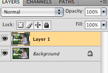
1. Open the document with the distracting background and duplicated the layer (Mac: Command—J or PC: Ctrl—J). You never want to work on the background layer.
 2. Select the clone stamp tool (S), and in the top menu bar select a medium-hard brush (at least 50%). Your opacity and flow should be set to 100% and the "Aligned" option should be checked (it's the default setting). Throughout the process you will change the brush size and shape (and possibly opacity) as needed.
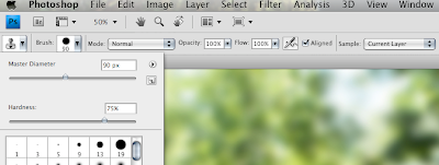 You are about to begin the tedious process of cloning. The basic principle is simple: with the clone stamp tool selected you will set a source point and then clone that point wherever you want. Place your cursor in a part of the image you want to copy, hold down Alt and click to set a source point. Now (without holding down alt or anything) you can click anywhere in the image and clone from the source. Try it. Once your source point is set, anywhere you click will be aligned with that point and the surrounding area.
Time for tedium. This is why I hate cloning out things. See that clubhouse and swing set? I am going to set a source point on some nearby greenery and then clone leaves over the distracting parts of the image. It won't look convincing, but for now the main objective is to cover up the swing set with green. If you look at the image below, you will see that I have cloned out the boy's head. Now all I have to do is repeat that process about a hundred times. Ugh! To be fair, the number of times you have to choose new source points and the size of the brush you use vary greatly according to the size of the area you want to cover.
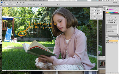 Check out a detail of my sloppy effort to cover the clubhouse:
 So much for good bokeh. More careful cloning can get better results, but you will most likely not be happy at the stage.
3. Let's assume you are not a pro retoucher (if you are, I'm flattered that you're reading my tutorial and all, but get back to work). Once you have cloned over your cluttered background, you may want to improve it with a two step touch-up. First, do more cloning to break up unnatural repeated patterns. Next (and Elements users do not have this option), you can select the patch tool (J)—the one above the brush tool that looks like a patch—and smooth out the rough spots. I love the patch tool because you can make really jagged and sloppy selections, drag those selections to a new spot, and presto! thanks to a complex algorithm the source and destination merge into a "healed" final product.
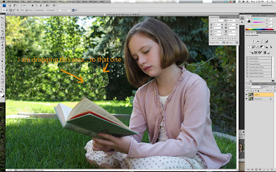 In the image above (click to see it larger), I clicked down and drew a circle around a light area, then dragged it over a not-so-smooth transition to a dark area, and then it created a better transition (not pictured).
I LOVE the patch tool. I use it all the time in portrait retouching (but more on that in another tutorial). The only thing you should watch for is that if you use it too close to something you don't want in the blended mix (for example, near the pink sweater), you will get an unappealing blog (say, a pinkish green leafy blur). There are ways around this, but they are too complex for (read: I am too lazy to write them in) this tutorial.
I used the patch tool until I was sick of it, and was left with a still unconvincing background.
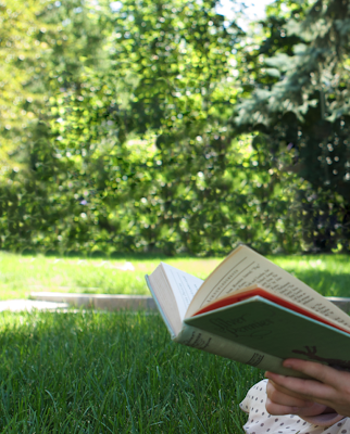 4. Blur to the rescue!
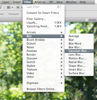 In order to beautify the bokeh, I selected Filter-->Blur-->Gaussian Blur, and dragged the slider until things began to look better:
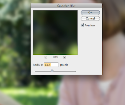 Now the background has a better blur, but what about the girl?
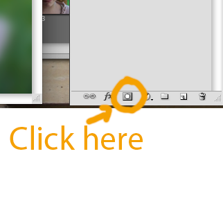
 5. Time for a layer mask. In the layers palette, click the layer mask icon to add a blank white layer mask:
NOTE to Elements users: Photoshop doesn't want you to have access to layers that aren't "Adjustment layers," so you have to do the following cheat:
- add a new adjustment layer such as Levels (we won't actually change the levels, we just want to steal its layer mask). When the dialog box comes up just click OK
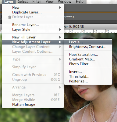
- Now copy the photo layer and make an adjustment layer sandwich by dragging your new copy to the top like this:

- Now create a clipping group:

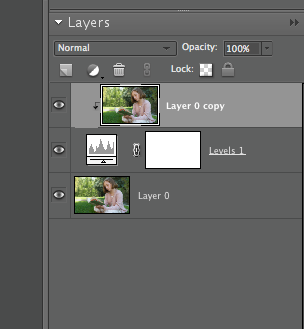 Now you can go back to following the Photoshop directions.
6. Time to mask out the blur where we don't want it. Select the brush tool (b) and then use a medium hard round brush at 100% opacity with your foreground color set to black (the squares at the bottom of the left toolbar should show black in front and white in back. If they have another color, just hit "d" to return to default.) Because the layer mask is white, you will be painting out the blur filter wherever you paint black. You can toggle between black and white by hitting "x" (if you want to add blur back in somewhere, for example).
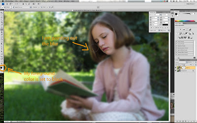 Three helpful hints:
- As you mask out the blur, you can use the right and left bracket keys to increase (right) or decrease (left) the size of the brush. Hold the shift key and use the bracket keys to make the brush harder (right) and softer (left).
- Use a soft brush wherever you want a smoother transition between sharpness and blur
- Hit the backslash key (\)to check your progress (This is called a "quick mask." See image below). Hit it again to return to normal view.
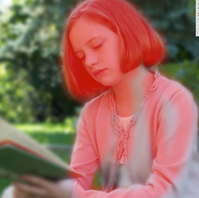
Anywhere you see red is where I have painted on black. You can leave it in quick mask mode as you paint. If the switch to quick mask mode has also switched from black to white (or vice versa), just hit "x" to get the color you want. You will have to watch out for that when switching between quick mask and normal view.
One last hint:
- As you paint blur in or out, experiment with different opacities on transitional areas. Thanks to the mask, you can even experiment with that selective blur look that has been popular for a while now.
Here is the "before" image:
 And here is the "after" (I warmed it up a little as well—see my "adjust tone and color" post):


13 comments:
Just awesome! May I post your link on my website? http://www.nescreationdesigns.com
renee@nescreationdesigns.com
Fantastic tutorial! I used it and posted the results on my blog
http://nobadphotos.blogspot.com/2010/03/perfecting-great-photos.html
This was very helpful, thanks!
I am really enjoying reading your well written articles. We all need picture background remover software and thanks for sharing this one. It looks like you spend a lot of effort and time on your blog.
nice write up. Convert image to Blurry Background using GIMP.
Like your work..very nice keep doing good work.
Compress JPG Online Free
Online Compress JPG
Compress JPG Online
Great Post, Thanks for sharing
This is awesome !!This is SUPER helpful. I've been curious about this. Lovely tutorial too.
This is really very useful post.Thanks for sharing this very helpful post here with us. https://prophotoshopexpert.com/portfolio/body-retouching/
Hey! Do you use Twitter? I’d like to follow you if that
would be ok. I’m undoubtedly enjoying your blog and look forward
to new posts.
espn.com/activate
Thank you very much for sharing amazing photo editing tutorials. If any one need any kind of photo editing service please feel free to contact at Clipping Path Service
This tutorial on using the clone tool to remove distracting backgrounds is very practical and shows how even simple edits can dramatically improve a photo’s composition. Cleaning up busy or unwanted elements makes your subject stand out more, and learning tools like the Clone Stamp or Healing Brush really boosts your editing confidence. Another powerful technique that complements background cleanup is learning how to blur the background — this helps create depth, separate your subject from the scene, and give images a more professional, polished look. If you’re interested in improving that part of your workflow, this guide on How To Blur Background In Photoshop walks you through simple steps to achieve smooth and natural background blur while keeping your main subject sharp and eye‑catching, which works well for portraits, product photos, and creative edits.
Post a Comment