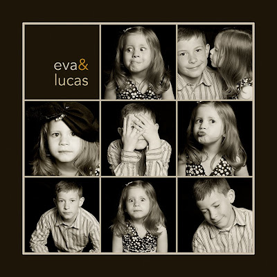
Maybe it's because I skipped lunch today, but I'm afraid my grid is starting to look like the logo for my favorite local restaurant, Pizzeria 712. I wanted to try thinner lines this time, so I made each photo 3.25 x 3.25 inches and I left only 1/16th inch space between each photo. I changed the grid subdivisions to 16 per inch so it would be easy to keep everything in line. I toned the photos with a plug-in for Aperture called Tiffen Dfx that I'm dying to own (but, alas, I have only 7 days remaining on the free demo), and then I sampled colors from the photos (using the eyedropper tool) and poured them into the background (using the paint bucket).
I will do some more posts throughout the month, but you can always access and link to the page with this month's project by using the perma-link under the "Participate in the Monthly Special" at the right. I'm really enjoying looking at everyone's work and I hope to see even more during the rest of the month.
Meanwhile, more posts and little tips are to come.


0 comments:
Post a Comment