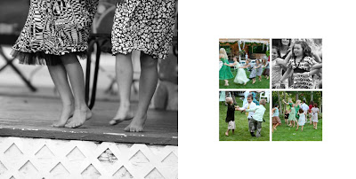
And speaking of variations, I thought I'd post a minimalist grid from a wedding album layout I did not long ago. The album is a 10x10 inch AsukaBook coffee table style album and the photo you see below is a two-page spread of children dancing at the reception.
 I kept it simple with a full 10x10 shot of some barefoot dancing on the left and a simple four-square grid on the right page with ample white space around it. Putting one photo in black and white with the others in color adds interest (or you could do the opposite).
Just another idea on grids before we move on to next month's special. I hope to see more finished projects linked back to the grid post before the month is over.

This comment has been removed by the author.
ReplyDeleteThis comment has been removed by the author.
ReplyDeleteAnsel Adams said that "landscapes give you the greatest satisfactions but also the greatest disappointments." i think that this picture was a huge satisfaction for certain. Congrats! Please take a look at my essay site and advise me to improve pictures quality.
ReplyDeleteThen you definately need to use photo Grid 2017 for pc and make lovely collages with your pictures. pick out some photographs and make video with the ones photo. Photo Grid - you may upload unique appropriate song to that video and pick video slide to each photograph for better look.
ReplyDelete