This month I'm leaving behind software and portraiture (don't worry, they'll be back) for a project aimed at appreciating our surroundings. My own example will come from Paris, which may seem unfair given how easy it is to find beauty there, but my goal is to inspire you to look more closely at the structures around you and to discover the beauty in them.
The story behind the project
Twelve years ago, while living in Paris with my wife and our one-year-old son, I was in need of a creative photo project. I didn't want to take the same touristy photos that you see on all the postcards, probably because I didn't want to think of myself as a tourist. When you've gone through all the work of finding and furnishing an apartment, you want to think of yourself as something more than a visitor. You want to believe you love the city more deeply than someone running through the Louvre, stopping by the Eiffel Tower, and then hopping on a plane or train to their next destination. Paris is not fast food, you think. Slow down. Take in the subtleties. You knew you liked the Eiffel Tower before you left home, but what else do you like now that you've spent some time here?
I remembered taking a class on Renaissance poetry and learning about the blason--a kind of poem devoted to praising a woman by describing a single body part (e.g. the eyebrow, the lips, the nose, the tooth (I kid you not), the thigh, etc.). The result could range from comical to seductive to downright nasty, depending on the body part and on the skill of the poet.
With the blason in mind, I tried to identify what specifically I loved about Paris. At that time, it was without a doubt the ironwork. Had I moved to Paris from New York (which has some beautiful examples of ironwork) rather than from Seattle, I may have taken it for granted. But I had never before been surrounded by so much beautiful wrought iron. I loved looking at the variations in balconies, gates, bridges, and staircases. And so began my photographic ode to ironwork.
I wasn't shooting digital back then, but here are a couple recent shots:
The challenge and why you should participate
This month, I want to invite you to photograph architectural details around you. This could be your home, your work environment, your city, a place you like to visit, almost anything as long as it is an architectural detail.
I am giving a broad definition of architectural detail as human-made structures or things more-or-less permanently attached to them. For example, your fireplace mantel would qualify, but the knick knacks sitting on top of it would not. Your antique door knobs and locks would qualify, but your keys would not. Sound clear?
If you do this month's special I believe you will begin to appreciate your surroundings on a deeper level. Keep a camera with you when you go out and new things will come to your attention. This month is all about seeing rather than about software. I hope to see even more people participate. Pick your favorite (or favorites) and post them on your blog or photo site and link back here to share your results. I can't wait to hear the stories behind your photos. I will have more posts coming through the month, but you can always find the Monthly Special in the menu bar at the right.
Friday, June 27, 2008
Thursday, June 26, 2008
A teaser for July's Monthly Special
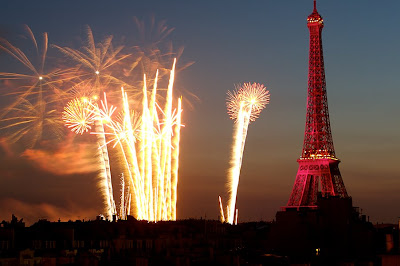 (Just for eye candy--the fireworks from July 14, as seen from my precarious perch on the rooftop of the apartment where I will be staying)
I will be in Paris for half of July (boo-hoo. poor me, right?) so I'll post the July Monthly Special tomorrow before I leave, with more posts to come from Paris. But before doing so, here's a little teaser...
A few weeks ago I stumbled upon this beautiful grid, by architectural photographer Andy Marshall. Check it out for a major clue to the July Monthly Special (and no, it's not more grids). I think his work is great, but he apparently doesn't like to post comments since he never allowed mine (or anyone's?) to be posted. Oh well. In any case, I love it when people post their comments, so please, don't just lurk and leave. Let me know what you're thinking.
One more hint for the upcoming July Special....check out the fortune cookie message at the bottom of my blog (it changes each month).
Friday, June 20, 2008
Grid from a wedding album layout
If you haven't done the June Monthly Special yet, it's not too late. Click on the grid post under "Participate in the Monthly Special" (and check out the FAQ page) for instructions. I love to see all the variations people have done on this month's theme.
And speaking of variations, I thought I'd post a minimalist grid from a wedding album layout I did not long ago. The album is a 10x10 inch AsukaBook coffee table style album and the photo you see below is a two-page spread of children dancing at the reception.
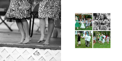 I kept it simple with a full 10x10 shot of some barefoot dancing on the left and a simple four-square grid on the right page with ample white space around it. Putting one photo in black and white with the others in color adds interest (or you could do the opposite).
Just another idea on grids before we move on to next month's special. I hope to see more finished projects linked back to the grid post before the month is over.
And speaking of variations, I thought I'd post a minimalist grid from a wedding album layout I did not long ago. The album is a 10x10 inch AsukaBook coffee table style album and the photo you see below is a two-page spread of children dancing at the reception.
 I kept it simple with a full 10x10 shot of some barefoot dancing on the left and a simple four-square grid on the right page with ample white space around it. Putting one photo in black and white with the others in color adds interest (or you could do the opposite).
Just another idea on grids before we move on to next month's special. I hope to see more finished projects linked back to the grid post before the month is over.
Friday, June 13, 2008
A one-photo grid cheat
Do you like those one-photo grids some of TOP Monthly Special participants have been doing? Here's a little trick to save you a lot of cropping. Draw the grid first by using the rectangular marquee tool (use "M" to select it) to select where the grid lines should be and then the paint bucket tool ("K" in Elements, "G" in Photoshop) to fill in your selection with the color of your choice.
Here's how (the photo below is a 10x10 with thin 1/16th inch grid lines like the one I posted of Lucas and Eva, but you can apply the principles for creative variations):
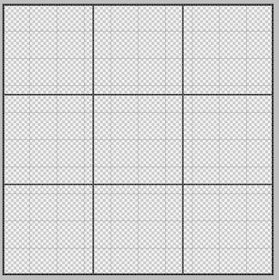
1. Open a 10x10 320 dpi new document as explained in the June grid special.
2. Use Command "J" to make a duplicate layer (this is the layer you'll use to make your grid lines).
3. Use the marquee tool (M) to select the grid lines (just click and drag until you get the selection you want). You'll have to figure out where the lines go (don't forget the outside edges) and select them and then use the paint bucket (K or G--see above) to fill with the color of your choice (you can choose the color, btw, by clicking inside the "set foreground color" box at the bottom left of your tools--experiment with it, it's simple) by pouring the paint into your selection. If you accidentally pour the paint outside the selection, there's always "undo."
4. Repeat the process until you've got your painted grid layer--OR--to be even more efficient, you can use "shift" after each marquee selection and to keep adding new selections until you get your whole grid and then pour the color in all at once. If you click to make a new selection without holding "shift," you'll have to start over with your selections (oops). But it does feel better to pour that paint in all at once, so try it.
5. Now, oh grid experts, all you need to do is find the photo you want to use, crop it to 10x10 at the 320 dpi, and use the move tool (v) to drag it into your grid template.
6. Drag the grid layer above the photo layer, and there you have it--fake cropping.
7. Before you flatten and save your final product, why not do a separate "save as" that keeps the layered version so you can reuse the grid in the future?
I hope this makes sense without a lot of screen shots. Try it out.
And for those who are new to the TOP Monthly Special, please click on "June: The Grid" under "Participate in the Monthly Special" in the side bar at the right to see this month's project and links to the results so far. The month is only half over. It's not too late to give it a try.
Finally, if you don't have Photoshop or PS Elements and you want to participate, stick around. Next month's challenge does not require any special software.
Here's how (the photo below is a 10x10 with thin 1/16th inch grid lines like the one I posted of Lucas and Eva, but you can apply the principles for creative variations):

1. Open a 10x10 320 dpi new document as explained in the June grid special.
2. Use Command "J" to make a duplicate layer (this is the layer you'll use to make your grid lines).
3. Use the marquee tool (M) to select the grid lines (just click and drag until you get the selection you want). You'll have to figure out where the lines go (don't forget the outside edges) and select them and then use the paint bucket (K or G--see above) to fill with the color of your choice (you can choose the color, btw, by clicking inside the "set foreground color" box at the bottom left of your tools--experiment with it, it's simple) by pouring the paint into your selection. If you accidentally pour the paint outside the selection, there's always "undo."
4. Repeat the process until you've got your painted grid layer--OR--to be even more efficient, you can use "shift" after each marquee selection and to keep adding new selections until you get your whole grid and then pour the color in all at once. If you click to make a new selection without holding "shift," you'll have to start over with your selections (oops). But it does feel better to pour that paint in all at once, so try it.
5. Now, oh grid experts, all you need to do is find the photo you want to use, crop it to 10x10 at the 320 dpi, and use the move tool (v) to drag it into your grid template.
6. Drag the grid layer above the photo layer, and there you have it--fake cropping.
7. Before you flatten and save your final product, why not do a separate "save as" that keeps the layered version so you can reuse the grid in the future?
I hope this makes sense without a lot of screen shots. Try it out.
And for those who are new to the TOP Monthly Special, please click on "June: The Grid" under "Participate in the Monthly Special" in the side bar at the right to see this month's project and links to the results so far. The month is only half over. It's not too late to give it a try.
Finally, if you don't have Photoshop or PS Elements and you want to participate, stick around. Next month's challenge does not require any special software.
Thursday, June 12, 2008
Max's grids
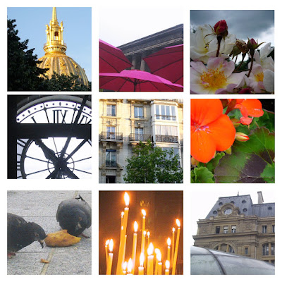
I believe that Max (my 12 year old son) is the junior-most and most prolific participant in this month's grid special. Since his blog is private, I thought (as the proud parent) that I'd post his work here. Here are the five grids he did:
A composite of photos from last spring in Paris (sadly, he had to use a very ancient digital camera for some of these):
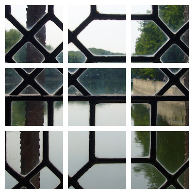
Flowers from an excursion to Monet's garden at Giverny: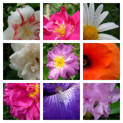 Almost a grid of a grid, looking out the window in a Loire valley chateau (Chenonceaux, I believe):
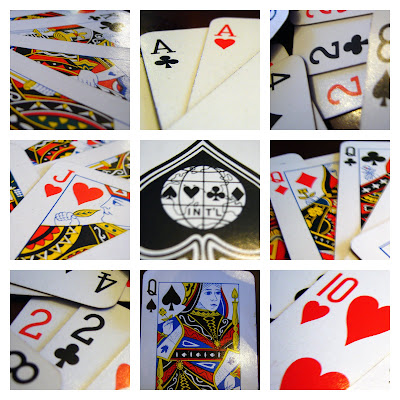
 A Martha Stewart-worthy photo based on his obsession with cards:
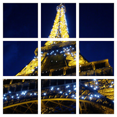
 A shot of the Eiffel Tower in all its glory:
 Great inspiring stuff!
A composite of photos from last spring in Paris (sadly, he had to use a very ancient digital camera for some of these):

Flowers from an excursion to Monet's garden at Giverny:
 Almost a grid of a grid, looking out the window in a Loire valley chateau (Chenonceaux, I believe):
 A Martha Stewart-worthy photo based on his obsession with cards:
 A shot of the Eiffel Tower in all its glory:
 Great inspiring stuff!
Thursday, June 5, 2008
A grid of Eva and Lucas
I'm so impressed with the response to the "Monthly Special" so far and with the great work I'm seeing. I took a break today and did this grid of Eva and her brother, Lucas. Big brother Max gets left out of this one, but there's a future project based on a photo of him, so he'll get his turn soon enough.
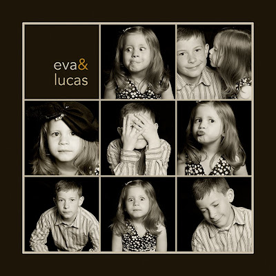
Maybe it's because I skipped lunch today, but I'm afraid my grid is starting to look like the logo for my favorite local restaurant, Pizzeria 712. I wanted to try thinner lines this time, so I made each photo 3.25 x 3.25 inches and I left only 1/16th inch space between each photo. I changed the grid subdivisions to 16 per inch so it would be easy to keep everything in line. I toned the photos with a plug-in for Aperture called Tiffen Dfx that I'm dying to own (but, alas, I have only 7 days remaining on the free demo), and then I sampled colors from the photos (using the eyedropper tool) and poured them into the background (using the paint bucket).
I will do some more posts throughout the month, but you can always access and link to the page with this month's project by using the perma-link under the "Participate in the Monthly Special" at the right. I'm really enjoying looking at everyone's work and I hope to see even more during the rest of the month.
Meanwhile, more posts and little tips are to come.


