Introduction
Our theme for October: Dots!
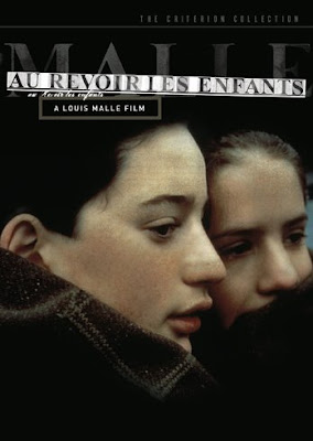
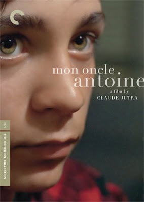
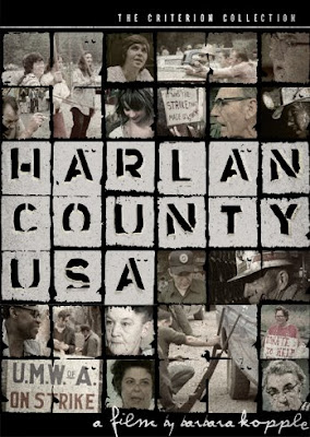
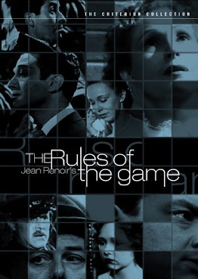
Not the candy. Sorry. The ubiquitous design theme. The ever-popular polka dot. The Hyatt place has a logo made up of polka dots. So does the Reelz channel. So does one of the world's top wedding photographers. And so on. If you've been following my blog, it will come as no surprise to you that my original inspiration for this "Monthly Special" came from a Criterion DVD cover.
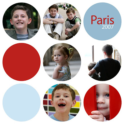
In this (completely revised) tutorial, you will learn how to make a 5x5 inch polka dot photo card (see below). You can apply the principles you learn to other sizes as well, and best of all, you can use the project as a template to save time on future variations.
The tutorial
I have written this for Photoshop Elements or Photoshop. If a step differs in Photoshop, I will indicate the change in parentheses (screenshots come from a mix of the two due the changes).
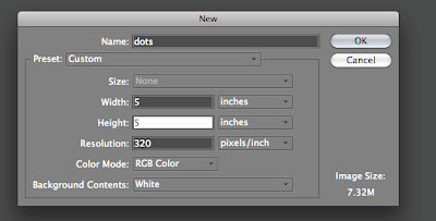
1. Create a new document, 5x5 inches at 320 dpi. (I use 320 dpi because it's what big chains like Costco use, and I know that Costco will print on 5x5 paper for you).
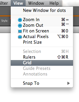
2. Turn on the grid by selecting View-->grid (or in PS, Mac: Command+H, PC: Ctrl+H)
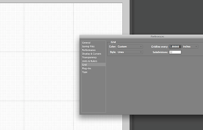
3. Customize your grid by opening Preferences-->grids. Before typing in any numbers, you will decide the number of dots you want across each row (here, it will be 3). Next, get out your calculator (if you're as bad at math as I am) and divide the number of inches by the number of dots (e.g. 5/3=1.66666667). Now type that number in the "Gridline every" box. And under "subdivisions," type "32."
4. Duplicate your background layer (Mac: Command+J, PC: Ctrl+J). You will now be working on a new layer to create a "dot template."
5. Time to create your first dot. Select the elliptical marquee tool from the toolbar.
Hold down the shift key (this makes your selection snap to the grid) and place your cursor in the middle sqaure, one small subdivision from the left and top lines. Still holding down the shift key, click and drag to form a circle within the grid lines, leaving only one small subdivision on the right and bottom sides. When you're done it should look like this:
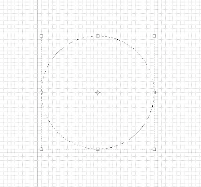
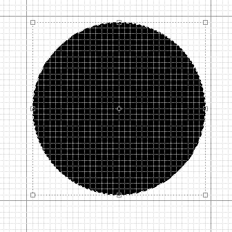
6. Now you will click on the paintbucket tool (G) and click in the circle to fill it with black (the color doesn't actually matter). It should now look like this:
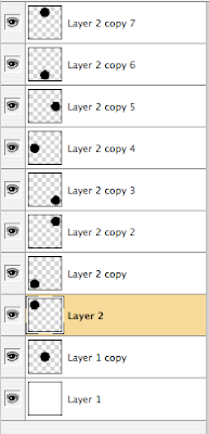
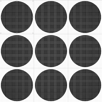
7. Now you get to duplicate that dot eight more times, not by repeating that process, but by using the keystrokes command–J (PC: Ctrl–J) eight times. You will now have nine total dots all sitting one on top of the next in the center circle. Move each one so that it perfectly centered in its own sqaure (one subdivision on each side). You do this by clicking once on one of the layers, then using the move tool (V) to put it in a different square. Repeat the process on each layer until you have a grid of black dots like this:
These going to create a template that you can use over and over. Here's how:
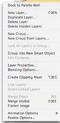
8. Deselect (by unclicking the eye icon in the left of the layers palette) the layer (or layers) below all of your dot layers. In other words, you will still see your grid of dots, but no background. Now you can merge the dots onto one layer by selecting "merge visible" from the layers palette pull-down menu ("merge visible" is four from the bottom on the image at right). All of your dots will now be on the same layer. This is a good time to do a "save as" and call it "5x5 dots template." If you are worried about accidentally saving over your template, create another file with and name it something else by doing a "save as" again.
9. Now the fun begins. Since you know the size of the grid square for each dot, you can begin opening and cropping photos for each dot. Open a photo, and with the crop tool selected, enter 1.67 x 1.67 (inches, not pixels) at 320 dpi resolution and crop your photo as desired.
If you like the crop, duplicate the layer and move it (with the move tool) on top of one of your dots like this:
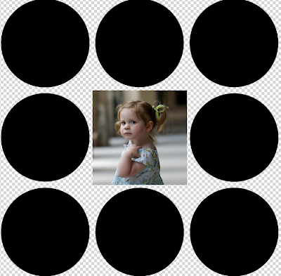
Each time you do this, you will creating a new photo layer on top of the dot layer. Keep them on their own layers as long as you want to move them around, but when you like your layout you will merge the photos just like you did with the dots earlier. But first...
(optional) 10. What about some colors? In my opinion, it looks nice not to have photos in every single dot. You may want to reserve a few dots for colors. It's amazingly easy. Just choose the rectangle shape tool (NOT the dotted line marquee tool):
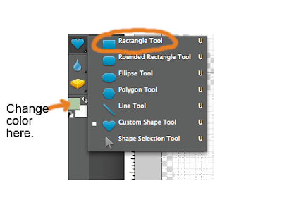
and you can change the color by clicking in the foreground box and selecting a new color (Note: in Photoshop, the box to click for changing color is in the top menu bar). Now, when you click and drag to fill a grid box, your selected area will be filled with color. Want to change colors? No problem. Just make sure that layer is active and click in the color box to change it. You can add new color squares and change their colors as needed until eventually, you get something like this:
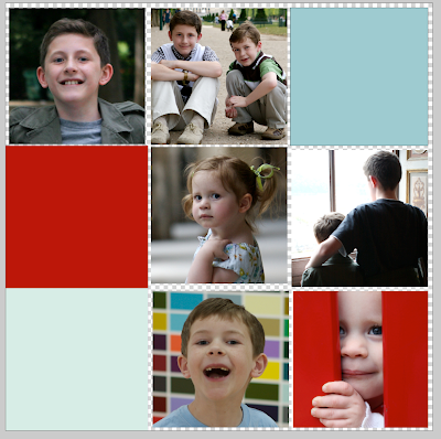
11. Once you are happy with the layout, you will need to put all those photos and colors on the same layer before we get back to the dots. As you did in step 8, you will deselect anything you don't want to merge—this means anything that is not a photo or color square. DO NOT merge the dot layer with everything. It needs to stay on its own layer.
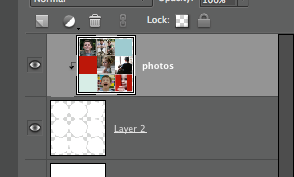
12. Now you are ready to see it turn back into polka dots by creating a clipping group/mask (If you did last month's photo in text tutorial, you already know how). Make sure all your layers are now visible (eyeball icons on each). Then, make sure your photo layer is above the dot layer as seen below:
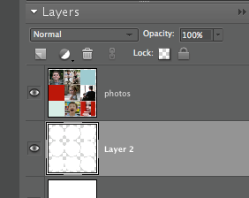
Make the photo layer active by clicking on it (note that—uh-oh—it is not the active layer in the photo above) and then create a clipping group (in Elements) by holding down Command+G (Mac) or Ctrl+G (PC). (In Photoshop, you will create a "clipping mask" by holding down Command+Option+G (Mac) or Command+Alt+G). See how the top layer is clipped by the layer underneath it?
IMPORTANT NOTE: If the above step does not work, you may be using an earlier version of Photoshop. In that case, simply place you cursor in between the two layers being used for the clipping mask while holding down the option (or alt) key until you see two intersecting circles. Click when those little circles appear and it should work.
(optional) 13. Want to add text over a box? Apply the same basic principle seen in my "add text to a photo" tutorial.
13. Finally, you can flatten your image, save it, print it, and bask in the satisfaction. And don't forget to come back to this link (under the "Participate in the Monthly Special" at the right), and share your results for all to see. See the FAQ page for details. If (when?) you do post and link back here, make sure you use the permalink (also discussed on the FAQ page)—the link for that post—and not just your general blog link.
I can't wait to see your results!
Tuesday, September 30, 2008
Hint for the October Monthly Special
Trick or treat! October will have some great treats in store. For those who are new to the site, we focus on a new theme each month, and readers are encouraged to do a project related to that theme, post it on the internet (their blog, flickr, or other image site), and then link it back to the "Monthly Special" post. For more information, read the FAQ page on the right.
Guess what October's theme will be.
Friday, September 26, 2008
More text + photo inspiration: Duane Michals
The first time I saw a Duane Michals photograph, I knew I was looking at something special. His work is so intimate, honest, and vulnerable that its own artistic self-effacement makes it stand out in the same way that a great acting performance makes you forget the actor.
Two years ago, Popphoto.com profiled Michals in an article called "Underrated Photographers," so if you've never heard of him, you are not alone. Wiki him (Is "wiki" a verb yet?) and you might be inspired by his lack of formal training or his environmental portraiture back when everyone was doing studio work. In this post, I hope that his work will inspire you to try your hand (perhaps literally, as in hand-written) at the text + photo challenge during these last few days of September.
I stumbled upon a blog entry (a homework assignment?) by a photography student (I won't post the link) about Michals that contained a critique that said (I'm summarizing) "Whatever. I don't see what the big deal is." This had me fuming. Why do a post on Michals if your only purpose is to express indifference? (This is why I concluded that if must be a homework assignment, but if true, a bad one.) Incidentally, if you look at my profile, you will see that I love opinionated people. I just don't think that "whatever" qualifies as an opinion. It's just intellectual laziness.
End of rant. Back to Michals.
Look at this photo:
How can that leave a person indifferent?
Michals hates the snobbery of the art world, but that doesn't stop his photographs from selling way out of my price range (but then, a postcard is out of my price range until I get paid next week). You can see 24 of his photographs for sale ("Sale," as in, "If you have to ask the price, don't bother.") on artnet.
Here are a few of those 24 that I like (screengrabs from Artnet—I'm sharing them based on my understanding of "fair use"):
The text reads "The cat, which may or may not be inside the box, wonders if Madame Schrödinger is or is not outside the box."
And another:
I won't pretend I have any idea what this poetic photo+text means, but I love how it combines the August "photo within a photo" challenge with the September "text + photo" challenge. Now how can I get Duane Michals to participate?
And finally:
When I first heard the Duane Michals was working in color I was shocked, but this little ode to the last rose of summer is stunning.
Many of Michals works use a series of photos along with text to tell a story. If you explore more of his works, you may find some themes or images for mature audiences, but nothing that is made merely to shock. I hope a look at his work will give you more ideas about the marriage of text and photography.
Two years ago, Popphoto.com profiled Michals in an article called "Underrated Photographers," so if you've never heard of him, you are not alone. Wiki him (Is "wiki" a verb yet?) and you might be inspired by his lack of formal training or his environmental portraiture back when everyone was doing studio work. In this post, I hope that his work will inspire you to try your hand (perhaps literally, as in hand-written) at the text + photo challenge during these last few days of September.
I stumbled upon a blog entry (a homework assignment?) by a photography student (I won't post the link) about Michals that contained a critique that said (I'm summarizing) "Whatever. I don't see what the big deal is." This had me fuming. Why do a post on Michals if your only purpose is to express indifference? (This is why I concluded that if must be a homework assignment, but if true, a bad one.) Incidentally, if you look at my profile, you will see that I love opinionated people. I just don't think that "whatever" qualifies as an opinion. It's just intellectual laziness.
End of rant. Back to Michals.
Look at this photo:
"Proof" as seen at Shane Lavalette.com
The text (handwritten by Michals) reads, "This photograph is my proof. There was that afternoon when things were still good between us, and she embraced me, and we were so happy. It did happen, she did love me. Look see for yourself!"How can that leave a person indifferent?
Michals hates the snobbery of the art world, but that doesn't stop his photographs from selling way out of my price range (but then, a postcard is out of my price range until I get paid next week). You can see 24 of his photographs for sale ("Sale," as in, "If you have to ask the price, don't bother.") on artnet.
Here are a few of those 24 that I like (screengrabs from Artnet—I'm sharing them based on my understanding of "fair use"):
The text reads "The cat, which may or may not be inside the box, wonders if Madame Schrödinger is or is not outside the box."
And another:
I won't pretend I have any idea what this poetic photo+text means, but I love how it combines the August "photo within a photo" challenge with the September "text + photo" challenge. Now how can I get Duane Michals to participate?
And finally:
When I first heard the Duane Michals was working in color I was shocked, but this little ode to the last rose of summer is stunning.
Many of Michals works use a series of photos along with text to tell a story. If you explore more of his works, you may find some themes or images for mature audiences, but nothing that is made merely to shock. I hope a look at his work will give you more ideas about the marriage of text and photography.
Monday, September 22, 2008
From a Criterion DVD to a Christmas Card
A promise of things to come...
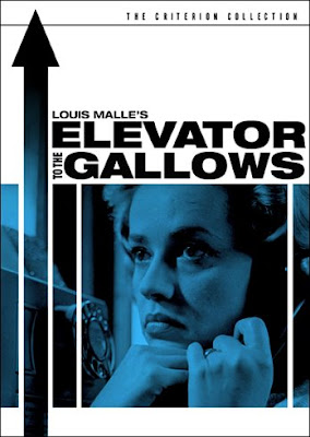
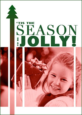
Beginning in October and all the way through December I will do a series on holiday gift ideas and DIY card inspiration—all using photos, of course. I recently did a post about getting inspiration from good design (in this case, Criterion DVDs). It can be a lot easier to adapt a pre-existing good design than to invent something from the ground up. And you would be surprised how easy it is to do. I won't do a whole tutorial in this post, but you will have plenty in the coming months. For now, I just want to show you how fun it can be to go from foreboding drama...
to happy holiday card...
using the things you've learned on this blog.
The shorthand version of how I did it:
1. I brought up the inspiration photo and turned on the grid to approximate the layout.
2. I opened a new document (with "show grid" enabled) and used the rectangle shape tool to draw the shapes. For the tree on top, I used a dingbat from a free Christmas collection (it was the letter "d").
3. I toned the image of the girl (a stock photo for demonstration purposes) and then copied it into the other document.
4. I created a clipping mask using the shapes in exactly the same way as with fonts.
5. I used a red-to-green gradient, a duplicate clipping mask, and a layer mask to fill with color up to the tree.
6. I added text (using two different fonts to make the spacing match up better).
That shorthand explanation won't be much help (esp. step 5) if you're new to Photoshop, but in future months you will be getting some easy-to-learn ideas for cards and more.
Friday, September 19, 2008
Eva 24/7: The first Criterion-style text + photo
A couple of days ago I did a post about how the design of Criterion DVDs might inspire you with ideas for this month's text + photo theme. In order to show you how easy it is to take inspiration from a design and adapt it to your own needs, I plan on doing a few and walking you through the steps.
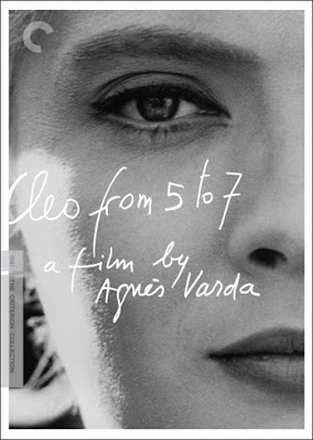
Since I just got back from driving my wife to the airport (Her sister just had a baby so she's going to visit and help out for a week), I thought I'd do a quick rendition of the Cleo from 5 to 7 cover in a way that suits my circumstances (i.e. dealing with the ever-needy Eva by myself).
So here is the Criterion original:
And here is my message to Michelle:
It was very easy once I gave up on the idea of trying to use the brush tool (on the trackpad of my laptop!) to copy the font. Here's what I did.
1. Found a picture of Eva and converted it to black and white.
2. Tried to draw my own version of the font using the brush tool.
3. Failed again and again.
4. Checked out 30 pages worth of free handwriting fonts at dafont.com until I found one (OK, actually two—I used a different font for the "E") that satisfied my now-lax standard of similarity to the Criterion original. FYI, the "E" is from a free font called Jellyka—Estrya's Handwriting, and the rest is a free font called Phontphreak's Handwriting.
5. Used the text tool to type in the text (like I showed you in the text+photo starter).
6. Flattened the image.
7. Decided I had better add a small white border, so I made the canvas larger (as I taught you to do at the end of the grid tutorial).
8. Added a thin black stroke around the outside (under blending options).
9. Ate a chocolate chip cookie.
10. Noticed that even though it's 12:30, Eva is awake and crying in her room.
11. Wondered if I will be getting any sleep this week.
12. Wondered how much a nanny would cost.
Steps 3 and 7-12 are entirely optional, although I would advise you to keep step 9.
Tuesday, September 16, 2008
Confessions of a font junkie: an interview with Randy Stuart
When Jill left a comment on my earlier typography post about how her husband, Randy is a font junkie, I knew I'd have to interview him. Since this month's theme is all about text + photo, it might pay to get some input from a font pro. Randy Stuart has a background in illustration and has worked as an in-house designer for more than fourteen years and is currently a senior designer at Further Creative. I'm happy to say that he designed the logo for my photography business (it makes an appearance on the take-out box in my banner).
I spoke with Randy last night about some of his favorite—and least favorite—fonts.
What are some of your favorite fonts?
Myriad, of course. It's Apple's proprietary font that Steve Jobs had commissioned. It has a good variety of weights and styles. It is almost impossible to make look bad.
A good workhorse font is Futura.
Futura comes in a lot of different weights and styles. I like it because it has a more round shape to the lower case open forms (the a, o, d, b).
Trade Gothic is another font that's hard to make look bad, no matter what you do to it. In fact, Trade Gothic Extended is used extensively on the Food Network.
Avenir: It's nice, light, open, friendly, and feminine without being girly. It's the font that was used in Cingular wireless advertising.
Frutiger is good because it's really well weighted, which means it's easy on the eyes. For example, if you look closely at, say, Times, it's kind of an ugly font because it has super thin serifs, but it's designed that way because on a newspaper there is dot bleed, so the thinness is made to compensate for the spreading of the ink on newsprint. But it looks too pointy on good quality printing. Frutiger was designed for all the signage at Charles de Gaulle airport. They wanted a font that would be world-wide friendly.
I notice you didn't mention any script font. Is there a script font you would recommend that doesn't look tacky?
Bickham I'm not really a script font guy, but it's OK. There are a couple of Shelley fonts that are OK. Those would be my recommendations.
Are there any fonts that make you cringe?
Lots of them.
For example?
Well, the King Daddy of them all is Comic Sans. People overuse it, or use it inappropriately because they think it's cute and fun.
Brush Script. There's a standard one that you see on every bad "On Sale Now!" sign on State Street. Going out of business! Everything must go!
Papyrus. It is like the go-to font that everyone uses who wants to do something antique-y or for people who say "I want it to feel like a Day spa!"
Eccentric. It kind of seems like it's trying to be a Frank Lloyd Wright-looking font, but it's just done poorly. The open areas (say on a capital R) are super squished and yet it has very long legs.
You know, another category that we haven't talked about is fonts that I generally don't like, but that can look good when used in the right ways.
Such as?
Copperplate. It's used way too much in many inappropriate ways, but when used correctly—such as in signage for, say, a really old building that's been updated for loft space—it's really quite good. It's a display font, not a text font.
Thanks for your time, Randy.
I spoke with Randy last night about some of his favorite—and least favorite—fonts.
What are some of your favorite fonts?
Myriad, of course. It's Apple's proprietary font that Steve Jobs had commissioned. It has a good variety of weights and styles. It is almost impossible to make look bad.
A good workhorse font is Futura.
Futura comes in a lot of different weights and styles. I like it because it has a more round shape to the lower case open forms (the a, o, d, b).
Trade Gothic is another font that's hard to make look bad, no matter what you do to it. In fact, Trade Gothic Extended is used extensively on the Food Network.
Avenir: It's nice, light, open, friendly, and feminine without being girly. It's the font that was used in Cingular wireless advertising.
Frutiger is good because it's really well weighted, which means it's easy on the eyes. For example, if you look closely at, say, Times, it's kind of an ugly font because it has super thin serifs, but it's designed that way because on a newspaper there is dot bleed, so the thinness is made to compensate for the spreading of the ink on newsprint. But it looks too pointy on good quality printing. Frutiger was designed for all the signage at Charles de Gaulle airport. They wanted a font that would be world-wide friendly.
(above) A sample of Frutiger on Wikipedia.
Gotham is great. It's a square font, meaning most of the letterforms are as wide (or close to as wide) as they are high. It's a really good font to use if you want to customize text. I'm kind of opposed, as a rule to stretching fonts. You're better off finding a font at the beginning that looks stretched. However, if you want to start monkeying with the points, the vectors, etc., it works well because a lot of the strokes have a uniform thickness. Gotham can lend weight and beefiness, without being clunky. Gotham is Obama's font, but also Coke in all sans serif applications, and Saturday Night Live in the opening credits.I notice you didn't mention any script font. Is there a script font you would recommend that doesn't look tacky?
Bickham I'm not really a script font guy, but it's OK. There are a couple of Shelley fonts that are OK. Those would be my recommendations.
(above) Bickham via Veer.
(above) Shelley standard via Veer.
But you can also use other fonts instead of script, such as Bodoni (because it has nice thin flat serifs) or Didot. Those can be light and airy and sophisticated. People seem to equate script with "fancy" and that's not necessarily the case.
(above) A sample of Didot from the drool-worthy collection at Hoefler Frere-Jones.
Are there any fonts that make you cringe?
Lots of them.
For example?
Well, the King Daddy of them all is Comic Sans. People overuse it, or use it inappropriately because they think it's cute and fun.
(above) Screen capture of Comic Sans from "Comic Sans Sucks" post on Exhibit 5A.
Brush Script. There's a standard one that you see on every bad "On Sale Now!" sign on State Street. Going out of business! Everything must go!
Papyrus. It is like the go-to font that everyone uses who wants to do something antique-y or for people who say "I want it to feel like a Day spa!"
(above) Papyrus as seen in "5 Terrible Fonts You Shouldn't Use in Print Design"
Eccentric. It kind of seems like it's trying to be a Frank Lloyd Wright-looking font, but it's just done poorly. The open areas (say on a capital R) are super squished and yet it has very long legs.
(above) A sample of eccentric from (sorry) the excellent font source Lynotype.
Zapf Chancery. It's the script used on every crappy low-budget wedding invitation.(above) A classy with a capital "K" example of Zapf Chancery from Lynotype.
You know, another category that we haven't talked about is fonts that I generally don't like, but that can look good when used in the right ways.
Such as?
Copperplate. It's used way too much in many inappropriate ways, but when used correctly—such as in signage for, say, a really old building that's been updated for loft space—it's really quite good. It's a display font, not a text font.
(above) A screen capture from a blogger who is sick of seeing Copperplate. Maybe he has just seen it misused too often.
Thanks for your time, Randy.
Monday, September 15, 2008
Text + Photo: Design Inspiration from Criterion DVDs
I am hoping that this post will inspire more participation in the September Monthly Special, which is any exploration of text + photo. Oddly enough, while readership of my blog has increased, active participation has gone down. Not that I think you must participate to enjoy the site. However, I love seeing what other people come up with each month, and if you blog, the monthly specials can be a good ongoing challenge. Michelle's use of text + photo, for example, is so good that I'm going to have to include it in a series of gift-giving ideas for the holidays (stay tuned for that starting next month).
Today I want to look at how ideas can come from the objects that surround us. This semester, I'm teaching a new course on European cinema, so I've been buying a lot of DVDs. I find the Criterion collection irresistible because of their committment to quality, from the transfer to the commentary to the design and packaging (the photos you see in this post come from their site). I am a sucker for good design. I won't buy a cologne if the bottle isn't aesthetically pleasing. I will pay more for just about anything if it exemplifies good design. In that regard, I am an advertiser's dream.
As I was browsing Criterion DVDs, I was struck by how so many of them offer virtual templates of text + photo. Let's look at a few:
Change out the text with something romantic, replace the photo with a bride and groom and you've got a great layout for a wedding album page.
Use a cool handwriting-style font to express a poetic thought on a close-up of a loved one's face.
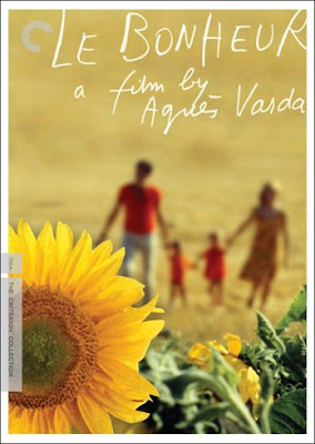
I soooo want to do this for someone's family photo. "le bonheur" means happiness in French and the warm glow of the photo is the perfect image of happiness.
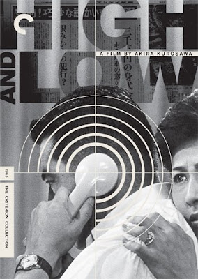
Look at how the photo-in-text effect has been applied here in a sophisticated way.
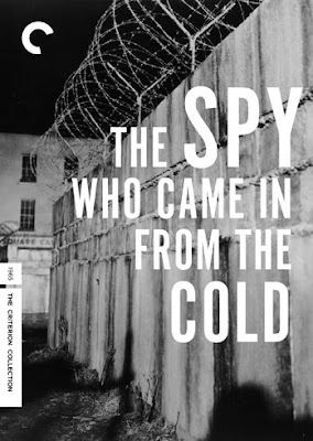
White text on a black-and-white photo can be stunning. And it's even easier to do than the example I gave you under "starters." I doubt you would want to use an image of a wall and barbed wire, but you get the idea.
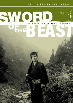
With the rectangular marquee tool, you can fill a section of your photo with a color and let part of your text be on the color and part on the photo. Use a photo of one of your kids, and instead of "sword of the beast," your Criterion-inspired photo with text could become "Lucas at the beach," for example.
With a combination of clipping masks and lowered opacity, you could recreate this type of look.
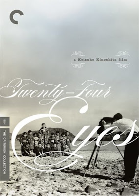
The same technique you learned in the photo in text tutorial is at work here, but with shapes instead of letters. You could take this idea and apply it to a less morbid topic.
There's something very appealing about white (or even lowered opacity white) text on an extreme close-up.
And finally, two examples that use text along with a grid:
This grungy one is a bit more complicated than what we did back in June.
But this one is not quite as hard as it looks (it's not easy either). You'd probably want to use the one-photo grid cheat and then overlay darker colors at a lowered opacity on select squares.
Getting any ideas? These few that I have shared range from extremely easy to fairly complex. To be honest, the easy ones are my favorite. If you do get inspired, please post your work and come add your link to the September Monthly Special post.