1. "Go stand by that tree..."
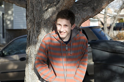 Why are we so conditioned to think that photos of people must be taken in front of trees? Here's what happens all too often. People automatically look for a tree. That tree may even be quite beautiful, but unless your subject is twenty feet tall, chances are you will only see the trunk.
Although this photo has many problems, I will focus on background issues. For starters, I would rather have him stand in the middle of the street, sit on the sidewalk, or lie down in the grass for the photo than lean against a tree trunk. And then there's that trash can, mini van, and house! Even if the lighting were wonderful, I would never want to frame this photo.
But what if this kind of photo is the only one you have of your best friend who is now far away in the Peace Corps? Can you do something to fix it?
BACKGROUND DISASTER SOLUTION 1: Blur and Crop

If you blur the background to smithereens it won't look particularly realistic, but at least you won't be looking at a trashcan. To further reduce ugliness, crop as close as possible. As I'm sure you can tell, I did a quick and sloppy job, but you get the idea. Also, I didn't try to improve the vampire-white skin that we have passed along to all of our kids. Like I said above, I'm just trying to give quick fixes for background disasters.
One more trick for this picture...
BACKGROUND DISASTER SOLUTION 2: Convert it to black and white
 When you do a massive background blur, you are going to get some color bleed that doesn't belong in the background. His sweatshirt, for example, created some distracting orange tones. Eliminate the color and you've eliminated the distraction.
2. Teenager or teletubby? Nice antenna! Does it pick up pay-per-view?
 I have seen so many pictures with everything from a telephone pole to the Eiffel Tower protruding from the back of a person's head.
BACKGROUND DISASTER SOLUTION 3: Clone and blur
 With the clone stamp tool, you can get rid of objects, but not without effort. If your results are less than perfect, just add a bit more blur to the background to make imperfections less noticeable.
3. I know that the 80s are back, but do we have to have such clashing colors?
 The orange converse sneakers and the muted orange and gray striped hoodie would be nice with a concrete wall, but in this photo I'm not wild about the overall color scheme.
BACKGROUND DISASTER SOLUTION 4: Image-->Adjustments-->Replace Color
I will give you specifics on all of these techniques in a separate post, but for now, here is an example:
 I could have changed the wall colors, but in this case I just changed the stripes on the hoodie, the color of the shoes, and did a quick curves adjustment. It's not a great finished product, but it's a step in the right direction.
4. Backlit botch-up
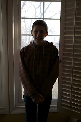 Unless you want your friend to look like a Balinese shadow puppet, avoid backlighting. A flash could have fix this, but if you listen to Brad Slade (and you should), you would do better to keep the flash off. Why not turn your subject and use natural side lighting instead? But if it's too late to reshoot, the following tip can lighten things up:
BACKGROUND DISASTER SOLUTION 5: Screen and screen and screen. Use the same technique I taught you in "Fix dark photos" to bring your subject out of the dark.
 I added layer upon layer with the "Screen" blending mode, but those dark areas start to get a lot of noise (especially ugly chromatic noise) as they get lighter. To help hide the color noise, I converted to black and white and to make the other noise seem more intentional, I added some monochromatic noise [Filter-->Noise-->Add Noise and then select uniform monochromatic noise]. In spite of this fix, the noise still looks pretty bad, which leads to an important lesson:
Photoshop can help save complete background disasters, but you can save a lot of time by preventing them in the first place. Some mistakes are just more bother to fix than they're worth:
5. Ent-itis.
 Nice 'fro, dude. Who does your hair? Treebeard?
This could be fixed, but it's certainly not as easy as cloning out a lamp post. I wouldn't waste my time.
6. Home clutter
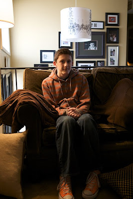 This is just an all-around bad photo, but even if it were technically perfect the background would still look cluttered. Too much clutter=too much of a pain to fix. Of course, clutter can be an important part of a photo if you intend to use it, but unintentional clutter is distracting.
Hopefully this post will help avert some disasters. But if you want to fix some disaster photos, I will explain a couple of the techniques mentioned here during the next week.
Meanwhile, let's see some photos with backgrounds you love. Post them and then share them on the Monthly Special page.


1 comments:
Hi
This company is currently looking for members who want to sell their photography pictures, would you be interested?
- You should be able to take and submit at least 10-50 photos a week.
- Your photos will be used for websites, catalogs, books, magazines and ads.
If you’re interested, register here now as spaces are filling fast.
Regards,
P.S. You don’t need to be a professional photography to get started. >> Sign up here
Post a Comment