Friday, August 29, 2008

Photos I didn't take this month...

I heard about the unphotographable blog from Michelle a while back. Many of you may already be familiar with it. After all, the photoless photo blog about pictures not taken and missed opportunities has been featured in USA Today, the L.A. Times, etc.--so this is hardly breaking news. But I have been thinking about the photos (specifically those that match the Monthly Special) that I never took this month, and I thought I'd share some of them with you in "unphotographable" style:
  • This is a picture I did not take of an elderly woman contemplating an image from her childhood.
  • This is a picture I did not take of a child holding a picture of her father who is in Iraq.
  • This is a picture I did not take of Eva looking at unrealistic beauty ideals in a fashion magazine (Rest assured, it would have been staged for the social message. Thankfully, we don't have any of those magazines in our home.)
  • This is a (horribly manipulative) picture of a child's small hands trying to tape together the torn wedding photo of his parents. (Not pretty, but I was imagining it as a good stock photo for an article on the effects of divorce on children.)
  • This is a picture that I DID take but decided not to post for fear the content would alienate/offend readers (what do you think? good call? bad call?). It shows a homeless man sleeping underneath a huge image (billboard-sized ad in the Paris Metro for a sale at the department store Galeries Lafayette) of a mostly-naked woman stretched out and dangling her bikini bottom playfully from her foot.
Looking at the list I realize that those photos don't fit the generally upbeat nature of my blog, but I think they demonstrate the variety of possibilities that a "photo within a photo" can offer. Judging from the number of participants so far, I think this month's theme may have been too....too what? postmodern? bizarre? intimidating? You tell me. But at the same time, even though the participation has been lower the readership has been great so I'm still glad to have done this topic.

Next month, we have a new challenge complete with multiple Photoshop tutorials, a couple of creativity-inspiring posts about artists/photographers, and hopefully, another interview. Stay tuned.

Wednesday, August 27, 2008

Things we lost in the expansion: remembering the orchards

Anyone who knows me well knows that I'm a big fan of civilization. I love traveling and exploring cities the same way that some people love hiking and camping. My favorite way to view nature: from a loft apartment overlooking Central Park. Nevertheless, with all of the construction going on in my small city of Orem, Utah, I am feeling nostalgic for the things that disappear to make way for city growth. And in Orem, new construction often means the death of an orchard or two.

My city was once blanketed in orchards. Many were destroyed before I lived here, and many have been uprooted to make way for more lucrative land use since I arrived ten years ago. I'm not going to burst out into the Joni Mitchell "paved paradise and put up a parking lot" song, but I will miss the fruit stands when they're gone. These photos-within-photos are my way of remembering a piece of our local history. Instead of making the past black-and-white, I decided to leave it in color to better express the beauty of what has disappeared. For the image representing the present, I chose a muddy warm gray.

Dream homes and McMansions have eclipsed the orchards near my home, the only reminder being the black widows that once fed on the fallen fruit.

My oldest son attended Orchard Elementary. A small remnant of an orchard and a few confused farm animals stand behind a chain-link fence that borders the playground, like a living diorama of life in Orem a couple decades ago.

Why do we name constructions after the things they replace? "The Orchards" strip mall has a gas station, a supermarket, a spray-on tan store, a dry-cleaner, a cheap hair salon, and a Mexican restaurant. The large sign reminds me of a tombstone in memory of the trees that have been uprooted.

It's not too late to do your own photo within a photo for the August Monthly Special. Even if you decide not to do one, check out what others have done.

Sunday, August 24, 2008

Microsoft's Photosynth: taking the "photo within a photo" to the next level

Woman with robot-like patience prepares to synth a room.

I can't believe I'm blogging about a Microsoft product (Mac fan that I am), but it's hard to resist when that product is FREE and fits the August Monthly Special so well (Really it does. Just see the end of paragraph four). Photosynth is a new way of viewing (and taking) photos. Not unlike a gaming environment, a synthed photo offers a 3D immersive experience.

A "synthy" photo (their cutesy term, not mine) is composed of oodles of photos stitched together to form something way beyond those stitched panoramas you've seen. But the look is not unfamiliar. If you or someone you know plays video games that involve navigation through a virtual environment, then you know the look, except in this case the environment might be your dorm room or the reception hall of your wedding. And of course, the most important part is that unlike similar photo techniques in the past, you don't need expensive specialized tripods or programming skills to get good results.

They make it look easy. After viewing the instructional video, I'd say that the biggest skill you need is patience, specifically a high tolerance for taking photos of every inch of your scene. Watching the perky blond demonstrator point and click her way around a living room like some neo-hipster stepford wife on overdrive made my head spin. A robot or perhaps a small child bribed with bonus allowance money might come in handy for the picture-taking part of the process.

For the creative mind, I'm sure the artistic possibilities are many, but my first impression was that synthing is a fairly mechanical process from start to finish. Nevertheless, I welcome the creative challenge. "Synthy" (Really? Must we use that term?) photos are by their nature photos within photos posing as a single unified image. Want more explanation? Check out the slightly anemic yet informative youtube videos about Photosynth and the "Seadragon" technology behind it.

My only beef with this new service is that it currently does not support the Mac OS. The only way to view or do Photosynth on a Mac is to run it in PC mode (VMware Fusion is on my MacBook Pro, but I still hate booting into Windows for anything other than Netflix streaming). When I clicked to see a synthed (sounds better than synthy, doesn't it?) photo I got the following message:

Unfortunately, we're not cool enough to run on your OS yet.

Are you mocking me, oh great and powerful Microsoft, just because my computer is played by the young, self-assured, thin guy? Fine. Be that way. I can wait. The patience training will come in handy once I start synthing.

Friday, August 22, 2008

Special guest Lorrie McClanahan talks about her "photo within a photo" work

Since we are focusing on the theme "photo within a photo" this month, you can imagine how thrilled I was that Lorrie McClanahan accepted to share some of her work with us.

Lorrie is both a painter and a photographer living in Texas and currently working on her MFA in Painting at Texas Christian University. For more than 17 years she has painted murals and portraits in the Dallas/Fort Worth area, but more recently has focused on contemporary works that often combine photography and painting. I discovered Lorrie's "photo within a photo" set on flickr and was struck by the creativity and wit of her work. Through email, I was able to conduct the following brief interview:

What is the relationship between painting and photography in your work?

Wow, right off the bat you landed on something that’s has been a focus of mine for 30 years. Even as a painting student in the late 70s I was into photography and used it not just as a reference tool but to explore such questions as “what is real?” Back then, the idea of challenging photography’s veracity—its role as a mirror for reality—was still fairly new. There wasn’t a lot of manipulation, and what creative liberties were taken had to be done by hand. At that time I was projecting slides onto curved white objects and re-photographing them. Then I would print the results and draw or paint over those. Finally, I would make a ‘clean’ photographic copy. There was a lot of back and forth dialogue between painting and photography. Sometimes my paintings would turn out looking more “real” than my photos.

Also, I’ve carried a camera around my entire adult life. Over time, using it as an information gathering tool has strongly influenced my sense of composition. Cropped subjects, even in paintings, look natural to me. On the other hand, seeing photography as a plastic medium—one that is available for manipulation—surely comes from my background as a painter.

It seems that both your paintings and your photos play with layers to convey meaning. Could you tell me more about that?

As you may have guessed, I’m interested in process. I like to show or at least hint at the steps that were involved in making a piece. A still image has the unique feature of being able to be experienced all at once, as opposed to, say, film or music which need time to unfold. Layers are one way to embed the piece with time. One gets a sense of what came before even if it only takes a flash to experience the piece as a whole. Since many of my works use people as the subject, this highlights the forces that affect us...the residue of events and feelings that make up a lifetime.

And of course, process through layers is compatible with the practice of making art, of creation itself.

What was the inspiration behind your "photo within a photo" set on flickr?

As I said, the idea of photographing photos goes back a long time for me. But I got back into it in the summer of ‘05. I was trimming photos and discarding proof prints, and there was a pile of scraps on the floor at my feet. The morning light streaming in through the window threw some interesting shadows on them which caught my eye, so naturally I grabbed my camera. Ha. It really was that simple. The first one was all about the light. But there also happened to be a man peering out from the pile of scraps, and I liked his expression and the architectural effect of the paper. The subject matter prompted me to try some more.
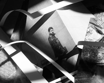

Since working on the series I’ve stumbled across other photographers who’ve done similar things. My knowledge of prominent photographers is pretty sketchy. I know a lot more about the history of painting. But in looking into it, I found I certainly wasn’t the first to play with the concept of a photo in a photo or meta-photography in general. And tapping into the internet has revealed an entire community of like-minded photographers.

Could you comment on a few of your favorites from the set?

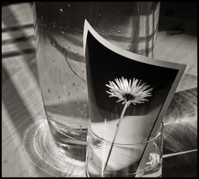
I’ve included the photo I mentioned above, as it was the inspiration for subsequent experiments. Not long afterwards I photographed a flower under similar morning light conditions. I took the print and put it in a glass of water. This became “Substitute.” Again, it plays with the notion of what’s real. There’s no attempt at illusion, and the setup is laughable. Mixed in there are thoughts about props and Hollywood-like smoke and mirrors. We’ve become quite acquainted, and maybe too comfortable, with the word “faux.”

Another of my favorites is “To Know You.” The initial photo was taken in the airport. My husband and I had just arrived in England, and while he dealt with some travel arrangements I struck up a conversation with a young Spanish man sitting next to me. We spent a couple of minutes talking and I asked if I could take his picture, which he agreed to. What struck me was the unselfconscious, pensive pose he took. I never do that when a camera is pointed at me; it makes me very uncomfortable...which of course is a completely different photography subject to cover. But anyway, once I got home and printed out his portrait I got to thinking about the notion of the stranger, and how much or how little we can know about a person. And is it possible to know much at all from a photo? I re-photographed him in several settings, even wrote a little poem. It comes across almost romantic, but I was thinking more along the lines of cultural differences.


Do you have any advice for some of my readers who may be trying to explore the "photo within a photo" theme? Any good sources of inspiration?

A year or two after photographing the stranger in the airport, I came across a group on flickr called “Your Picture Travels Around the Globe.” Talk about inspiration! Group members make a photo of themselves available, which other members print and take to various settings to re-photograph. So a Chinese man does various things in Texas, and an American woman winds up on the streets of The Netherlands or South Africa. Some of the illusions and visual puns are quite clever without using any Photoshop. I think the group is still active.

As far as advice, I would say a good way to start is by thinking in terms of the still life. Choose an object, print it out, and try inserting it into various groups of objects. This gets the brain thinking about shape, color and composition. Play with different types of paper. A gloss paper will photograph differently than a matte one. Try re-photographing both indoors and out. Take a small stack of photos with you (along with your camera) when you run errands. You’d be surprised what kinds of connections come up seemingly randomly. I happened to have a photo of a man’s face in a red and white target shape with me when I went shopping. As luck would have it, one of my stops was a Target store. I saw the visual connection and made a quick photo. So I got a creative experience out of my errand running. I love that kind of multi-tasking.


Thank you so much for your willingness to share your work and thoughts.

You can see more of Lorrie's work on her professional site and on her flickr photo stream.

Wednesday, August 20, 2008

A look at photos within photos around the web

No eye candy? No image in this post? Not on this page, but read on...

I've discovered some interesting work on the internet that fits perfectly with the August Monthly Special. This post will tell you about a few examples, and very soon we will have a guest appearance by a photographer who has done some great work on the photo within a photo theme. But until then...

Jens Windolf, a photographer I found on Flickr, has a series of photos called "Behind the Scenes" that puts together movie stills in unexpected ways. I won't post them here due to his copyright restrictions, but take a look.

5057 Productions ("My reputation is rooted in paradox."--OK, but how about some info when we click on the "About us" tab?) is full of photos within photos. Check it out, scroll down, browse a bit. And you can buy one for between $85 and *cough* *sputter* $10,000.
Or you can do this month's project and make your own.

And here's an idea from my diabolically clever and fiendish arch rival: Photojojo. Um. Mr. Jojo, sir? Could you lend me some of those reported "200,00 subscribers" please? (My Google reader says it's actually a paltry 117,310, but who's counting? I only need 117,286 more to overtake you, so Bwahahaha! Care for a little game of google analytics Risk? chicken?) The charitable thing to do, out of pity for photojojo's impending doom, would be to try their idea on how to use money or record album covers to create a new look . Now why didn't I think of that? (oh, maybe it was because I don't have albums or money)

And finally, I'm dying to make a Digital Picasso. What? Only six people did this great idea??? Maybe I won't feel so bad about the lack of participation in my (*sob* perhaps too postmodern?) monthly special. With all the devices that include cameras and screens these days, I'm sure you can round up a few and try this out. I have yet to see one that rearranges and multiplies parts the way Picasso did. Maybe my resident Picasso fan, Max (now taking a digital photography class in Junior High), will help me create something.

Monday, August 18, 2008

Eva at the Centre Pompidou


A quick post before I get back from California:
Although not quite a photo within a photo, I couldn't resist putting up this image of Eva looking at an art installation last year at the Pompidou Center in Paris. I took a series of her while she was inspecting and then imitating the projected image of a man dancing. I keep meaning to print some of them out.

The broader point, along the theme of the August Monthly Special, is that a photo (or in this case, a film) within a photo can be a way to show a person interacting with art.

Saturday, August 16, 2008

Photoshop Reading Suggestions

I'm off to California for a few days to shoot a wedding. Since I don't have another photo within a photo to post, I thought I'd give you Photoshop enthusiasts a few suggestions for further reading. Some of my top picks from my own bookshelf are:

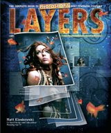
Matt Kloskowski's Layers: The Complete Guide to Photoshop's Most Powerful Feature.

Why I love it: It's the closest thing out there to the book I would want to write. I enjoy his writing style, and completely agree with his philosophy of teaching about the features he uses the most (as opposed to overwhelming you with all the things Photoshop can do). I wish this book had existed back when I was first learning Photoshop. It's perfect for beginners. But even though I consider myself an experienced Photoshop user, I recently bought the book knowing I would learn something new.

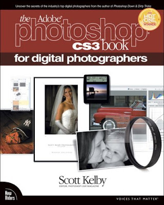
Pretty much anything written by Scott Kelby. I bought The Photoshop Book five years ago and loved it. There is now an updated edition for CS3 as well as one dedicated to Photoshop Elements (co-written with Kloskowski). Kelby knows how to stick to the most useful features and how to explain them clearly. Early on, I turned some of his techniques into actions and saved a lot of time. His recent 7-Point System for Adobe Photoshop CS3 would be great for a new photographer who wants to develop a good work flow. I am already happy with (entrenched in?) my work flow, so I haven't purchased the book, but five years ago I would have loved it. And if you own Lightroom (I use Aperture), he's got just the book for you.

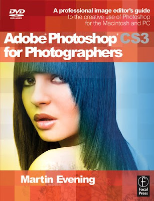
Martin Evening's Adobe Photoshop CS3 for Photographers is a good reference/training guide if you've invested in Photoshop and really want to start digging in. I open it when I need to learn about a feature I don't normally use. If you're one of those sit-down-and-read-the-encyclopedia types, you could read it from cover to cover. That's what I thought I'd do when I bought the book, but apparently I don't have that kind of attention span. His writing doesn't have as much attitude as Kloskowski or Kelby, but for a comprehensive Photoshop book specifically for photographers he's still a must-own.


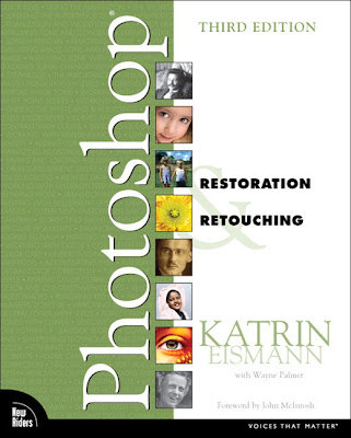
And finally, for the hard-core Photoshop fan, Katrin Eismann is simply amazing. Once you've read three or four Photoshop books, you start to see the same information over and over and you begin to crave something more advanced. Maybe the Martha Stewart fan in you isn't satisfied with just getting the job done. You want to know the exact perfect way to restore a photo no matter how excruciatingly difficult the process. If you're a glutton for punishment and you know it, if you're the type of person who stacks crepes between squares of parchment paper, who makes their own linen water with infused herbes de provence, and who monograms their child's paper lunch bags, then Restoration & Retouching and Masking & Compositing are your new best friends. But wait! What am I saying? I am recommending these books after all. The fact is, I have never made it all the way through Eismann's books because I am only sporadically that kind of person. Most of the time, I am far too disheveled and disorganized to indulge in perfectionism. But in those rare moments, reading these books is the photoshop equivalent to making a peach pie with a perfect pâte sucrée and home-made crème fraiche.

Thursday, August 14, 2008

Fix dark photos in Photoshop or PS Elements

The problem:
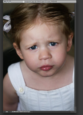
I love this photo of Eva that I took in Paris last year, but it's a little dark and it will look even darker as a print (without the benefit of computer monitor backlighting). And to top things off, the lighting in my home is not very bright, so a dark photo in a dark room will not stand out.

The TOP "starters" solution:
A quick disclaimer that I will try not to repeat every time I give Photoshop tips: Any given photo problem may have a dozen or more possible solutions. It's good to learn several methods, but since this is a "starter," I will stick to quick and easy ones. The following solution can be summed up in one sentence (Make a duplicate layer and choose "screen" to blend it.), but I don't want to assume prior knowledge, so I'll walk you through every step.

This works in both Photoshop and Photoshop Elements, but since I want you to learn keystrokes there is one step that Elements users will need to do that is not necessary in Photoshop.

Elements users (If you have Photoshop, skip to step 1):
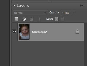
See how the photo you have opened says "Background" under the Layers Palette? Well, double click on it, then you'll see this:
Just click OK and it will now be called "layer 0" instead (Or, I just ran into a comment on a blog that says you can hold "alt" and double click on the background layer. This won't change the name of the background, but it will do the trick even faster). Now you're set for the actual instructions...

Step 1.
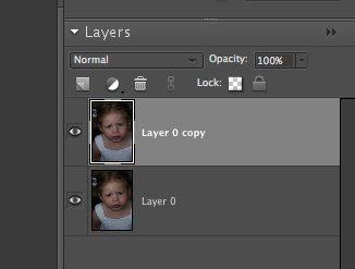
Press "command J" to duplicate the background layer. It will look like this for PS Elements 6:
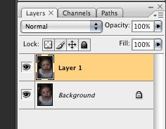
And like this for Photoshop:
Step 2.
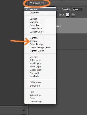
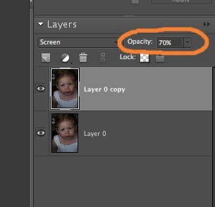
Make sure your top layer is active (see the images above). Now click on the arrow next to the word "Layers" and you will see a pull-down menu of blending options. We'll explore more of these in a future post. For now, choose "Screen"And watch what happens:
Your photo is about twice as bright.

Step 3.
Too bright? No problem. You can dial in the exact amount you prefer by adjusting the opacity. In the image below I decided to dial it down to 70%:
Step 4.
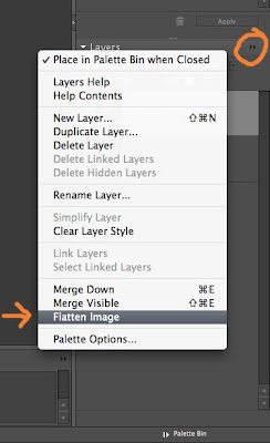
You want to end up with a regular .jpg file that you can print, so there's one more thing to do. Make sure you "flatten the image" before you save. There's another handy pull-down menu in the layers palette where you can select "Flatten Image" (see the image below):
Now you can save a print a much improved photo.

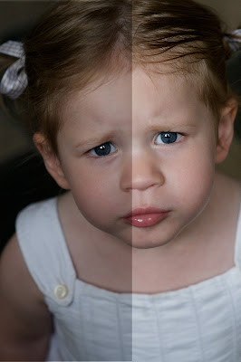
Here's a photo showing BEFORE and AFTER (with my final choice of a screen at 70% opacity):
Doesn't it look like a layer of grime has been removed? So much better and so easy to do.

Postscript tips
  • If you need to brighten even more than 100%, copy yet another layer (command J), blend with "screen" and dial the opacity as needed.
  • You can follow these same instructions and choose "Multiply" to make photos darker. Be warned, however, that blown-out highlights (parts that are pure white) won't get darker (a good reason that an underexposed shot is generally better than an overexposed one).

Wednesday, August 13, 2008

Photoshop and PS Elements help: TOP "Starters"

Max checking the view from the Louvre while everyone else photographs the Venus de Milo (Good move, Max!)

Take-Out Photo is adding a new feature: quick and easy tips for beginning users of Photoshop or Photoshop Elements. Although my blog is project-oriented and organized around monthly "Specials," I know many of you out there would appreciate some useful tips for improving your photos.

The problem: Even though there is no shortage of Photoshop-oriented web sites happy to teach you (I just googled this one, for example, and it seems pretty nice, and I just added this one to my google reader, and oh my gosh, here are no less than 62 tricks, and...), it is easy to get overwhelmed by too much information (seriously, the three previous links were just some of the tops hits from a google search). Many sites cater to experienced users or feature projects you might never use (Change the color of my car body, because, why exactly? I'm not saying the tutorial isn't excellent, I'm just saying...).

The take-out photo solution: I want to give you an ongoing supply of quick and easy tips you can use often. I welcome and encourage requests (e.g. "My photos always print out too dark. Help!"--An easy solution to that problem will be the first tip, by the way). Although I use Photoshop, I bought PS Elements 6 when I started this blog so I could help people who don't want to spend $600 on software. I will try to give tips that work with either program.

"Starters"
In keeping with the food metaphors on my blog, after much deliberation I've decided to call this new feature "Starters." Other contenders were "tips from the chef" (sounds too full of myself?), "tips from the kitchen," "appetizers," "entrées,"---you get the idea--and then, while eating at my favorite local restaurant (Pizzeria 712. Go there frequently if you live within 50 miles. Nobody's paying me to say this, I just want good, non-chain restaurants to succeed. They are rare around here.) I said to Michelle, "What about starters?" She agreed that it was the right name because it has the advantage of being a food metaphor AND of fitting my goal to help people get started improving their photos.

Help create the menu
As I said above, I welcome and encourage requests. If there are specific problems you'd like to solve, let me know and I'll see if I can offer a quick solution. If your request involves a lot of steps, maybe it will become a future Monthly Special, as you've seen with June's grid project. I will try to post at least two "Starters" a month. If I'm lucky, I may even have a guest photographer cook up a starter once in a while. And finally, once the menu of starters is looking full, we just may have to move on to a second course.

Tuesday, August 12, 2008

Other people's pictures in my home

A photo I found at a Paris flea market now sits on top of our armoire.

I watched the documentary "Other People's Pictures" and then took a look at my (very small) collection of photos rescued from flea markets.

First, my thoughts on the documentary. The film presents an even-handed glimpse of the world of snapshot collecting as seen through a flea market in Chelsea, NYC. I say "glimpse" because I would have loved to learn even more. The film does not show how the vendors acquire the photos they sell, for example. Instead, it focuses on a few collectors as they hunt for photos that resonate with them. A few I remember:
  • One man collects photos representing what he calls "the banality of evil"--scenes of Nazis in uniform enjoying a family dinner or out on a date. The man hangs the "banality of evil" photos on a wall in his home not 10 feet away from another photo wall that displays his own relatives, many of whom died in concentration camps.
  • A woman who works with disabled adults loves to find that rare photo of a child with down syndrome, happy at home during a time when most parents institutionalized children with mental disabilities.
  • A gay man sees his search for old homoerotic photos as a means of preserving a neglected history.
Other people are less specific, hoping simply for that serendipitous "find" that speaks to them--an attitude that I share.

Two more photos from a Paris flea market that are now part of our family.

Some of the people featured in the documentary have thousands of other people's photos packed into closets and containers under their beds. Unlike them, I own only a few, and have scattered them about my home and office. Family snapshots are my favorite. I find their spontaneity far more interesting than most posed portraits. The popularity of candid or "journalistic" photography at weddings suggests that I am not alone in my love of spontaneity. My own style of photography is greatly influenced by the aesthetic of snapshots and I prefer to go into a photo session without a checklist of standard poses.

For me, the old flea market photos represent a connection with the history of photography and they show me that images (like poems) have the power to create connections and meaning that transcends their original context.

Take a look at the photos around your own home. What role do they play in your life? You may want to document your use of photos as part of the Monthly Special (just a suggestion).

Saturday, August 9, 2008

Other People's Pictures or Who's down with OPP?

press photo from OPP

Have you ever purchased snapshots from other people's abandoned albums at a flea market? I have. And according to a blurb from The New York Post, that might make me part of the "little-known world of eccentric collectors." You down with OPP? (Yeah you know me). Kind of puts a new spin on the Naughty by Nature song, doesn't it?

While channel surfing, I noticed a documentary called Other People's Pictures, and given this month's theme, I had to watch it. But alas! The satellite feed for the Documentary Channel wasn't working properly, so all I can say is that it looks promising and I've set the DVR to record it tomorrow. (Incidentally, if you happen to get that channel, it also plays on the 19th, 20th, and 25th of this month)

another press photo from OPP

Why on earth would anyone collect family photos of another person's family? Is it creepy? pathetic? or just plain eccentric? I haven't examined the question for myself, but I will do it here in a future post. The question I have asked while sifting through piles of photos at the Vanves flea market is how did these photos get here? Why aren't they cherished by their rightful family? Seeing the photos makes me think of the heart-wrenching song from Toy Story 2, "When She Loved Me." Watch the video and tell me it doesn't make you verklempt:

via videosift.com

Friday, August 8, 2008

My Own Private Paris (Extreme Makeover, part 2)

For part 2 of my extreme makeover photo-within-a-photo project, I have transformed a few more local Utah sights. If only...

If that little canal near my house were a bit more like the Seine, I would take my dog on walks more often. (You've gotta love how that couple seems ready to stroll out of the picture only to become the tiny and unsuspecting victims of a quantum leap into Orem, UT. --Chérie, what is ziss place? Who is zat giant man?)

I like Cafe Rio as much as the next Utahn (Well, maybe not. I actually prefer Las Tarascas, or when in SLC, The Red Iguana), but I'd like it much more if were the Café de Flore.

And would a little more PDA (as in public display of affection, not personal digital assistant--we have WAY too many of those around here) destroy the moral fabric of our beloved Happy Valley?
The photo within the photo is at the Louvre pyramid designed in 1989 by I.M. Pei. The glass building behind it is the BYU library, expanded in 1999 and inspired by none other than I.M. Pei's Louvre project (or so I've been told).

Thursday, August 7, 2008

How do you use photos?

Because of the photo within a photo challenge, I have been thinking more about the photos around me--the ones in my office and at home sitting on shelves, hanging on walls and, well, in this case, sticking out of books.

I doubt I'm the only one out there to use just about anything for a bookmark. Some of my favorite makeshift bookmarks are snapshots back from before I went digital. I came across a small pile I took in Paris and London way back in the twentieth century. They're quirky photos of store fronts, street signs or candid scenes that I like, but what am I going to do with them? Put them back in the shoe box? Flylady them away for the sake of less clutter? Neither seems right, so I'm letting them get worn and used so they can die of natural causes rather than be buried alive.

The photo within a photo you see here documents one way I use photos. I bought a book about blogs yesterday, read the first seven chapters (it's a fast read, and as a new blogger I love learning from people who would slaughter me in google analytics risk) and picked a photo from the pile of surrogate bookmarks (fyi, it's a woman reading a newspaper next to a metro stop in Paris). Today, when I saw the legs popping out the top of the book, it made me laugh so I took a picture for this post.

This certainly isn't going to win any technical prizes (it has focus issues, noise--don't get me started), but the photo within a photo theme and blogging caught my eye and I wanted to save the moment. I have never taken many photos of how I use photos, but I think it's something worth exploring.

Tuesday, August 5, 2008

Photo puzzle or "il pirandellismo": another photo within a photo

Part 2 of my photo within a photo extreme makeover is coming soon, and I'm still waiting for someone to start the ball rolling on this month's challenge, but today I thought I'd post another puzzle-like photo within a photo. Can you figure out what's going on? Look at it for a moment (click to enlarge) before continuing.

The story behind the photo and why I like it
The Jardin du Luxembourg often features temporary art installations. Near the area where one usually finds people playing chess, a photographer had installed a life-sized photo of a typical chess-in-the-park scene, but had cut the photo into panels to create depth and to allow the real park to leak into her photo (and vice versa).

The photographer (I assume, or if not, then a very fastidious onlooker) was making sure her photo panels were shiny and clean when I took this shot. You can see her polishing the knee of the (photo of) a man playing chess.

Furthermore, to make things even more interesting, the front panel is hiding the woman's legs thereby creating the illusion that she is part of the photograph. Meanwhile, that spliced photo of a gray-haired man folding his arms and watching the chess game now seems to be watching the photographer. The photo looks back at its creator and the creator has now become part of her creation. I love the confusion between representation and reality and between author and subject. To me, it's like the photographic equivalent of il pirandellismo (hey! if you're going to use a pretentious literary term named after a nobel-prize winning Italian dramatist, you may as well say it in Italian)--which is just a fancy way of saying what I said in the previous sentence but with the added bonus of telling Professor Comollo (Ciao, Professore!) that I still remember a few things from his Italian lit class nearly 20 years ago.
Besides, it's not every day that you get to use the term pirandellismo in a sentence. Try it.
Use it at an art opening: I think this work expresses a certain ontological ambiguity unburdened by the weight of existential angst, a playful pirandellismo, if you will. Now go fetch me another drink.

Monday, August 4, 2008

Photo within a photo: Extreme Makeover (part 1)

Several of our neighbors have been remodeling their homes this summer. That would be nice, I think as I admire their inviting front porch and the new outline of their roof--not the work or the expense, of course, just the change. But I'm far too underpaid, overworked, and unskilled to join the neighborhood push for more curb appeal.

And so, using my resources as a photographer (in this case, just an inexpensive point-and-shoot digital camera), I decided to do a little remodeling project of my own, one that I'll call "Extreme Makeover: Provo/Orem Edition." This might give you some more "photo within a photo" ideas.

It's safe to say that most of the time I'd rather be in Paris. But what if I could bring Paris here?

The bus stops would become metro stations.

The local park/field would have all the trappings of the Jardin du Luxembourg.

The hideous unfinished construction monstrosity on State Street would turn into something Haussmann might appreciate.

My street would become a cobblestone-paved pedestrian walkway lined with great shops and even better food.

And our front yard might be a bit more formal.

There are a few more things I'd make over. Part 2 will be coming soon.

Until then, I'm still waiting for that daring first person to tackle the photo within a photo challenge. It can be a lot of fun.

Sunday, August 3, 2008

Photo within a photo: trompe l'oeil façade

Here's another "photo within a photo" example for the August Monthly Special. I took it in Paris last year. I was walking down the Champs-Elysées and I noticed at the end of a side street something that made me think my vision was distorted. I had to get pretty close before I figured out that the undulating building was in fact a photo façade that some renovators with a sense of humor had put up to cover scaffolding. It was raining, as you can see, and the two women holding red umbrellas (both real) were the perfect Magritte-like touch to the surreal scene.

How are photos (of varying scale) used in public spaces where you live? You may not find something quite this dramatic, but posters and billboards might give you some ideas. I recently found a great photo blog from Paris that just happened to have an example of a photo within a photo posted along with some thoughtful commentary. Check it out.