Friday, February 27, 2009

Change Background color in Photoshop

Introduction
When it comes to teaching you how to change the color of an object in Photoshop (my apologies to Elements users, this one is just for Photoshop), most tutorials make it look deceptively simple. A few clicks and it's done. Here is why it's deceptive:

They often use stock photos, such as the one above. The perfect definition between the red car and the white background means that making a selection is a piece of cake. Or let's say I wanted to change the background in this photo of a guy wearing a polo shirt:
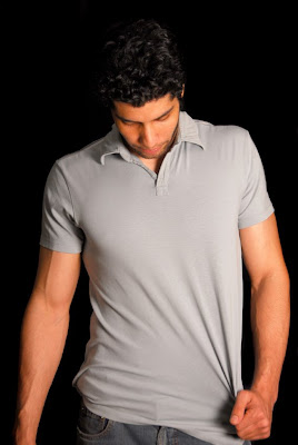
The studio quality of the photo makes it extremely easy to select the black and change it to whatever color I want (although I must admit that in this case the hair might pose a problem).

So let's get real. In your own non-pro, non-studio, real-world photos, you will have to deal with textures and color variations that make selecting and changing a color a lot more problematic than some would have you believe. My goal in this tutorial is to give you a way to change a background color in a real-life setting.

The tutorial
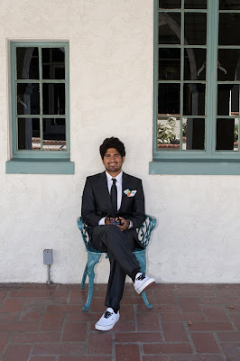
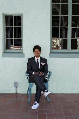
In the photo above, the wall has a stucco texture that gives it variation in color. The suit provides a fairly good contrast, but nowhere near what you get in a stock photo. Shadows from the guy and the chair create darker areas on the wall which will create a halo of the old color if not meticulously selected. If you read my last tutorial, you know that I want you to get results without the meticulous work routinely performed by pro retouchers. So here are the steps:

1. Open your image and copy the your background layer and work on that layer for good measure (Mac: Command—J; PC: Ctrl—J). From the top menu, choose Select-->Color Range and you will get the following dialog box:
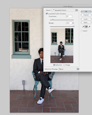
With the "Selection" option active (in the box below the photo), click in the photo (either the big one or the one in the dialog box—both work) on the color you want to change. Here is what one click got me:
Everything you see in white is selected. Clearly, I am not done.

2. Because the wall has variations in color, I need to add to my selection. In the dialog box, check the eyedropper tool with the + sign after it. This means that you can now click as many times as you like and add to the current selection. I clicked once on a darker part of the wall and got the following result:
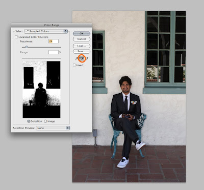
Not bad, but still not done.

3. At this point, you have two choices: continue to click until you have a good selection or play around with the "fuzziness" slider. Here is what happened when I increased the fuzziness slider to "60":
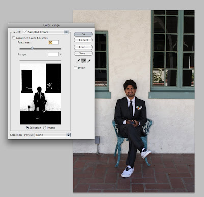
Better, but I still haven't selected all of the wall. Your best bet is to continue to add to your selection both by clicking AND by changing the fuzziness slider.

AN IMPORTANT NOTE: You will notice that my selection has already picked up the shoes, the pocket square, and the reflections in the windows. And as I continue to select more color variation in the wall, this problem will only get worse. But have no fear. Over-selecting is far better than under-selecting. We will deal with the problem areas later.

4. Once you have a good selection, click OK. You will now see the "dancing ants" (as they are sometimes called) all around your selected area. At this point, the selection still needs some fine tuning. In the toolbar at the left, click on one of the selection tools such as the lasso tool (L) or the quick selection tool (W). You aren't going to use those tools, but you are going to steal a feature that they activate. With one of those tools selected, look for the "Refine Edge" button in the menu bar at the top:
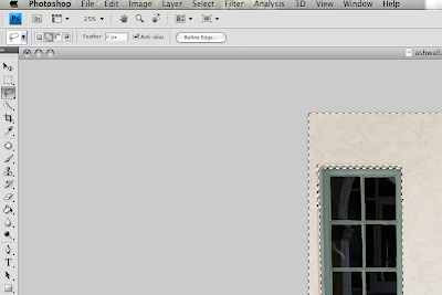
Click on it to get a dialog box that will help you better define your selection:
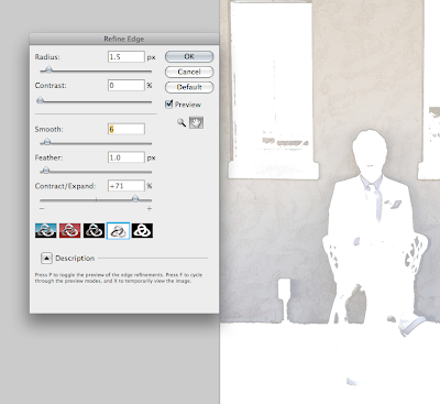
Here, you can see exactly what you have selected and you can adjust the radius of the edge, the contrast, the smoothness, etc. The nice thing about having a preview mode is that you can see the effects that the sliders produce. But why complicate things? I recommend sticking mainly to the "Contract/Expand" slider. What I want to do here is make sure that no shadow (say, around his hair) is left unselected. I expanded my selection a lot (71%), clicked OK, and was left with an even better selection of the wall and an even worse side-effect of unwanted selected elements (look at the shirt and tie, for example). What to do?

5. With those dancing ants still doing their thing, hit Command—J (Mac) or Ctrl—J (PC) to put your selection on a new layer. If you turn off visibility in the other layer(s), you will see exactly what you saw in the "Refine Edge" dialog box: the selected part of the image. As you do the next steps, you can toggle the visibility of the other layer(s) as needed.

6. Time to change the color. This is where it gets fun. With your top layer selected, go to Image-->Adjustments-->Hue/Saturation to get the following dialog box:
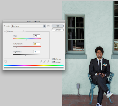
As you can see, I left the bottom layers visible so I could see what the wall color would look like against the windows. In the dialog box, make sure that "Colorize" is checked in the lower right-hand corner. You are now free to experiment with hue (i.e. the color), saturation (the intensity), and lightness/darkness (I'll stop insulting your intelligence on this one). This stage is simple and fun, but you will notice that I still haven't dealt with those shoes, shirt, and other areas I don't want to change. We'll take care of that next. First, settle on a color and click OK.

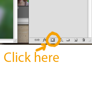
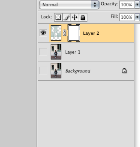
7. With your top layer selected, go to the layers palette and add a layer mask:
Now you will want to make only the colorized layer visible:
8. With the mask selected, choose a brush (sized according to the areas of color you want to eliminate) and simply paint out the parts of the image where the color change is unwelcome:
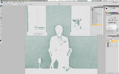
In the image above, I am painting (with black set as the foreground color in the left menu bar) over the shirt and tie. I will then paint out the shoes and the windows, and I am left with a new wall color that retains the texture and variations of the natural wall.

Here is the BEFORE:
And the AFTER:
Conclusion
Whether the actual color change is better or worse is up to you, but I hope I have given you some practical techniques that work for real-life photos.

A few final words of advice:
  • If your saturation and lightness/darkness settings are too extreme, you will begin to lose the natural texture and variation that make a background realistic.
  • My photo had a decent amount of contrast between the background and the person. Imagine if he had blond hair and was wearing a beige suit. Similar colors would require more precise selections and masking. Unless you are a person of infinite patience (and if so, consider a job as a retoucher), you might want to avoid such situations.
  • Experiment. Deviate. The beautiful thing about Photoshop is that there are a dozen ways to do almost anything. The important thing is to get a result that you like.

Thursday, February 26, 2009

Location Location Location...

Something I've been wanting to do for a long time now is to make a location book. The basic idea is to snap reference photos of good backgrounds for photo shoots. Whether it be for a client or just for fun, a book full of possibilities can be inspiring and can help plan the mood of a shoot on a moment's notice.
When I decided to backgrounds as the February Monthly Special I thought it would be the perfect time to finally make a location book. But sadly, what you see pictured above is not my actual book (because there is none) but rather a digital mock-up.
The recipe for a location book is very simple:
  • get a notebook or photo album
  • keep a small point-and-shoot camera with you and snap any good location you find
  • note the address of the location, the direction (or directions) that you would be facing when you take the photo (very important when considering time of day for best lighting), and any other notes that might be helpful
  • print you location photos and add them to your album/notebook along with your notes
So simple and so useful. I must do a real one soon.
With very little planning you can scout out locations during your daily activities. This is what happened just 20 minutes ago:

I decided to stop by Diego's Taco shop for lunch. I had my small point-and-shoot camera in the car. On the way back to work I saw this vibrant blue wall—a great background for an urban portrait. I pulled over, rolled down my window, and took a photo. I wrote the address on the back of a post-it and voilĂ ! A location.

Ideally, I would always keep my camera in my car (or pocket) and take a photo of possible locations. It is so easy to get in a rut. I can't tell you how many photo shoots I have done at what is called "The castle"—an old amphitheater with beautiful stone and various natural settings. It's nice, but it would be so much more fun to have 100 choices and pick (or if it's a client, let them pick) one that best suits the desired style.

By noting the direction that I would be facing when taking the photo, I avoid getting there and having everyone squinting into direct sunlight. Other notes will remind me of the general feel of the area, location fees (if applicable), etc.

You don't need to be a pro to have your own location book. Family photos will be so much easier with a book of choices.

Finally, I highly recommend taking a shot of the location all by itself. The reason? The photo becomes a blank canvas rather than something you associate with only one type of portrait.

I hope this inspires some of you to start your own location book. I know that I now plan to keep my camera ready for any new spots.

Monday, February 23, 2009

Clone out distracting backgrounds in Photoshop (and Elements)

As promised, I want to give you more detailed explanation of some the fixes for bad backgrounds that I mentioned in my last post. In this post I will show you how to get rid of a distracting background.

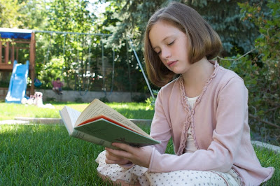
Let's say that in the photo above we don't like the swingset and the kid on the swing. Maybe instead of the juxtaposition of play and quiet reading, you just want to emphasize the solitary reader. I have to warn you that this kind of fix takes time and that I hate doing it. Consequently, I'm not going to do a pro-worthy retouch, but I'll do enough to give you the idea.

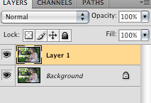
1. Open the document with the distracting background and duplicated the layer (Mac: Command—J or PC: Ctrl—J). You never want to work on the background layer.
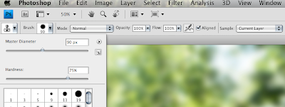
2. Select the clone stamp tool (S), and in the top menu bar select a medium-hard brush (at least 50%). Your opacity and flow should be set to 100% and the "Aligned" option should be checked (it's the default setting). Throughout the process you will change the brush size and shape (and possibly opacity) as needed.

You are about to begin the tedious process of cloning. The basic principle is simple: with the clone stamp tool selected you will set a source point and then clone that point wherever you want. Place your cursor in a part of the image you want to copy, hold down Alt and click to set a source point. Now (without holding down alt or anything) you can click anywhere in the image and clone from the source. Try it. Once your source point is set, anywhere you click will be aligned with that point and the surrounding area.

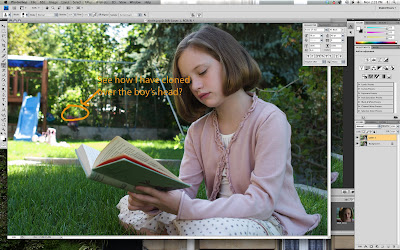
Time for tedium. This is why I hate cloning out things. See that clubhouse and swing set? I am going to set a source point on some nearby greenery and then clone leaves over the distracting parts of the image. It won't look convincing, but for now the main objective is to cover up the swing set with green. If you look at the image below, you will see that I have cloned out the boy's head. Now all I have to do is repeat that process about a hundred times. Ugh! To be fair, the number of times you have to choose new source points and the size of the brush you use vary greatly according to the size of the area you want to cover.

Check out a detail of my sloppy effort to cover the clubhouse:
So much for good bokeh. More careful cloning can get better results, but you will most likely not be happy at the stage.

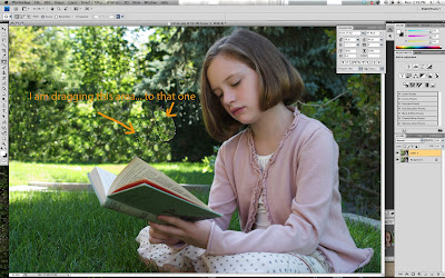
3. Let's assume you are not a pro retoucher (if you are, I'm flattered that you're reading my tutorial and all, but get back to work). Once you have cloned over your cluttered background, you may want to improve it with a two step touch-up. First, do more cloning to break up unnatural repeated patterns. Next (and Elements users do not have this option), you can select the patch tool (J)—the one above the brush tool that looks like a patch—and smooth out the rough spots. I love the patch tool because you can make really jagged and sloppy selections, drag those selections to a new spot, and presto! thanks to a complex algorithm the source and destination merge into a "healed" final product.
In the image above (click to see it larger), I clicked down and drew a circle around a light area, then dragged it over a not-so-smooth transition to a dark area, and then it created a better transition (not pictured).

I LOVE the patch tool. I use it all the time in portrait retouching (but more on that in another tutorial). The only thing you should watch for is that if you use it too close to something you don't want in the blended mix (for example, near the pink sweater), you will get an unappealing blog (say, a pinkish green leafy blur). There are ways around this, but they are too complex for (read: I am too lazy to write them in) this tutorial.

I used the patch tool until I was sick of it, and was left with a still unconvincing background.

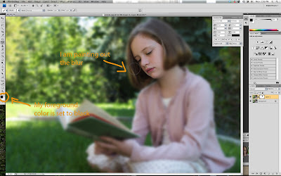
4. Blur to the rescue!
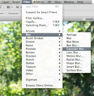
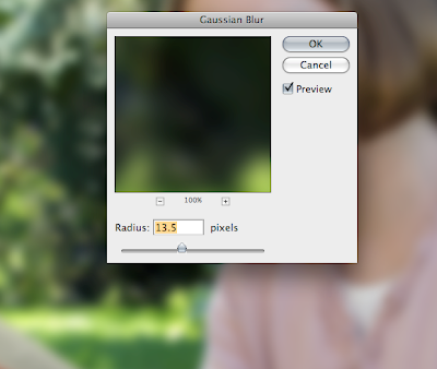
In order to beautify the bokeh, I selected Filter-->Blur-->Gaussian Blur, and dragged the slider until things began to look better:
Now the background has a better blur, but what about the girl?
5. Time for a layer mask. In the layers palette, click the layer mask icon to add a blank white layer mask:

NOTE to Elements users: Photoshop doesn't want you to have access to layers that aren't "Adjustment layers," so you have to do the following cheat:
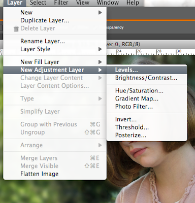
  • add a new adjustment layer such as Levels (we won't actually change the levels, we just want to steal its layer mask). When the dialog box comes up just click OK
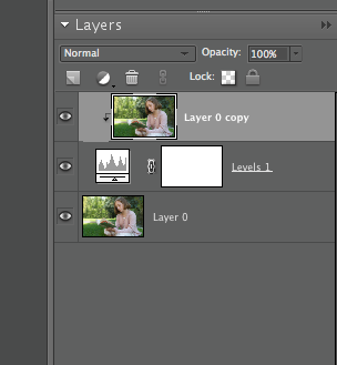
  • Now copy the photo layer and make an adjustment layer sandwich by dragging your new copy to the top like this:
  • Now create a clipping group:
What you have just done (you cheater, you) is make that layer mask in the middle work as a mask for the photo above it.
Now you can go back to following the Photoshop directions.

6. Time to mask out the blur where we don't want it. Select the brush tool (b) and then use a medium hard round brush at 100% opacity with your foreground color set to black (the squares at the bottom of the left toolbar should show black in front and white in back. If they have another color, just hit "d" to return to default.) Because the layer mask is white, you will be painting out the blur filter wherever you paint black. You can toggle between black and white by hitting "x" (if you want to add blur back in somewhere, for example).

Three helpful hints:
  • As you mask out the blur, you can use the right and left bracket keys to increase (right) or decrease (left) the size of the brush. Hold the shift key and use the bracket keys to make the brush harder (right) and softer (left).
  • Use a soft brush wherever you want a smoother transition between sharpness and blur
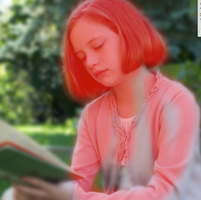
  • Hit the backslash key (\)to check your progress (This is called a "quick mask." See image below). Hit it again to return to normal view.

Anywhere you see red is where I have painted on black. You can leave it in quick mask mode as you paint. If the switch to quick mask mode has also switched from black to white (or vice versa), just hit "x" to get the color you want. You will have to watch out for that when switching between quick mask and normal view.

One last hint:
  • As you paint blur in or out, experiment with different opacities on transitional areas. Thanks to the mask, you can even experiment with that selective blur look that has been popular for a while now.
Finally, we're done. It was a lot of work, wasn't it? The whole thing would have been easier if the picture had been right from the start. But sometimes we don't think ahead, so it's good to know how to fix an image.

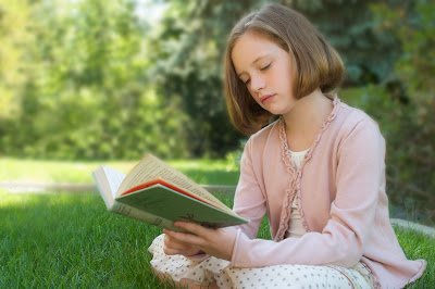
Here is the "before" image:
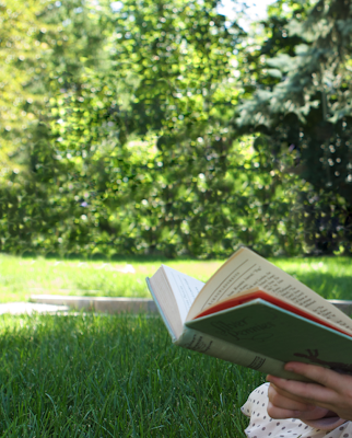
And here is the "after" (I warmed it up a little as well—see my "adjust tone and color" post):

Saturday, February 21, 2009

Background disasters and solutions

With Max as my bad photo model, I went out and shot some horrible pictures today on purpose. Specifically, I was trying to recreate background disasters that are unfortunately pretty common. Here are a few:

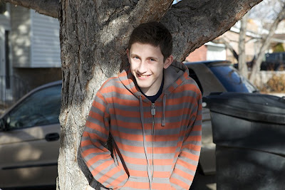
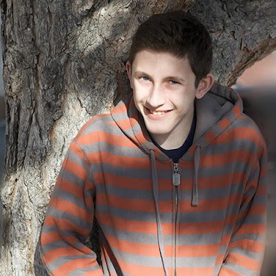
1. "Go stand by that tree..."

Why are we so conditioned to think that photos of people must be taken in front of trees? Here's what happens all too often. People automatically look for a tree. That tree may even be quite beautiful, but unless your subject is twenty feet tall, chances are you will only see the trunk.

Although this photo has many problems, I will focus on background issues. For starters, I would rather have him stand in the middle of the street, sit on the sidewalk, or lie down in the grass for the photo than lean against a tree trunk. And then there's that trash can, mini van, and house! Even if the lighting were wonderful, I would never want to frame this photo.

But what if this kind of photo is the only one you have of your best friend who is now far away in the Peace Corps? Can you do something to fix it?

BACKGROUND DISASTER SOLUTION 1: Blur and Crop


If you blur the background to smithereens it won't look particularly realistic, but at least you won't be looking at a trashcan. To further reduce ugliness, crop as close as possible. As I'm sure you can tell, I did a quick and sloppy job, but you get the idea. Also, I didn't try to improve the vampire-white skin that we have passed along to all of our kids. Like I said above, I'm just trying to give quick fixes for background disasters.

One more trick for this picture...

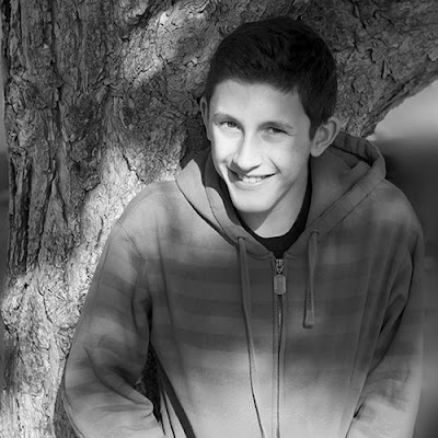
BACKGROUND DISASTER SOLUTION 2: Convert it to black and white

When you do a massive background blur, you are going to get some color bleed that doesn't belong in the background. His sweatshirt, for example, created some distracting orange tones. Eliminate the color and you've eliminated the distraction.

2. Teenager or teletubby? Nice antenna! Does it pick up pay-per-view?

I have seen so many pictures with everything from a telephone pole to the Eiffel Tower protruding from the back of a person's head.

BACKGROUND DISASTER SOLUTION 3: Clone and blur

With the clone stamp tool, you can get rid of objects, but not without effort. If your results are less than perfect, just add a bit more blur to the background to make imperfections less noticeable.

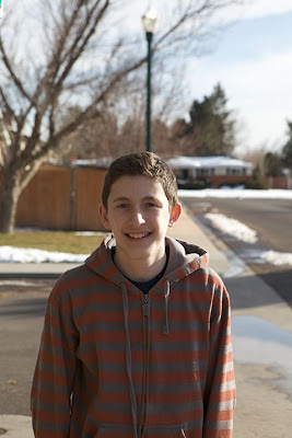
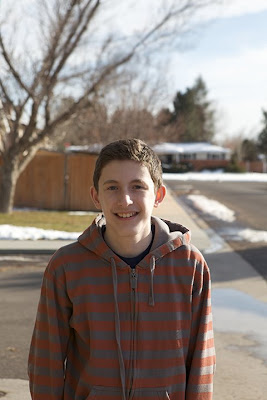
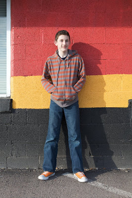
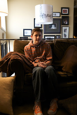
3. I know that the 80s are back, but do we have to have such clashing colors?

The orange converse sneakers and the muted orange and gray striped hoodie would be nice with a concrete wall, but in this photo I'm not wild about the overall color scheme.

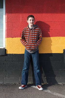
BACKGROUND DISASTER SOLUTION 4: Image-->Adjustments-->Replace Color

I will give you specifics on all of these techniques in a separate post, but for now, here is an example:

I could have changed the wall colors, but in this case I just changed the stripes on the hoodie, the color of the shoes, and did a quick curves adjustment. It's not a great finished product, but it's a step in the right direction.

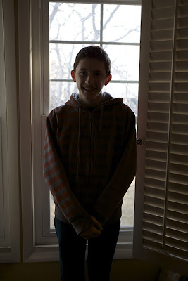
4. Backlit botch-up

Unless you want your friend to look like a Balinese shadow puppet, avoid backlighting. A flash could have fix this, but if you listen to Brad Slade (and you should), you would do better to keep the flash off. Why not turn your subject and use natural side lighting instead? But if it's too late to reshoot, the following tip can lighten things up:

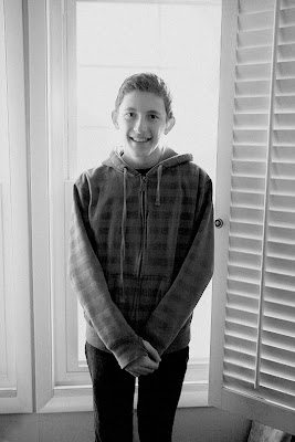
BACKGROUND DISASTER SOLUTION 5: Screen and screen and screen. Use the same technique I taught you in "Fix dark photos" to bring your subject out of the dark.


I added layer upon layer with the "Screen" blending mode, but those dark areas start to get a lot of noise (especially ugly chromatic noise) as they get lighter. To help hide the color noise, I converted to black and white and to make the other noise seem more intentional, I added some monochromatic noise [Filter-->Noise-->Add Noise and then select uniform monochromatic noise]. In spite of this fix, the noise still looks pretty bad, which leads to an important lesson:

Photoshop can help save complete background disasters, but you can save a lot of time by preventing them in the first place. Some mistakes are just more bother to fix than they're worth:


5. Ent-itis.
Nice 'fro, dude. Who does your hair? Treebeard?

This could be fixed, but it's certainly not as easy as cloning out a lamp post. I wouldn't waste my time.

6. Home clutter

This is just an all-around bad photo, but even if it were technically perfect the background would still look cluttered. Too much clutter=too much of a pain to fix. Of course, clutter can be an important part of a photo if you intend to use it, but unintentional clutter is distracting.

Hopefully this post will help avert some disasters. But if you want to fix some disaster photos, I will explain a couple of the techniques mentioned here during the next week.

Meanwhile, let's see some photos with backgrounds you love. Post them and then share them on the Monthly Special page.

Tuesday, February 17, 2009

Background blur and depth of field


In my post for the February Monthly Special, Ilan commented that a blurry background is one of the first styles of background most people use. That got me thinking that I should do a short post about depth of field, blur, and "bokeh."

I will make this short and sweet because I really hate getting mired in technical details, but I will give you a great link at the end of the post for more detail.

Depth of field and blur
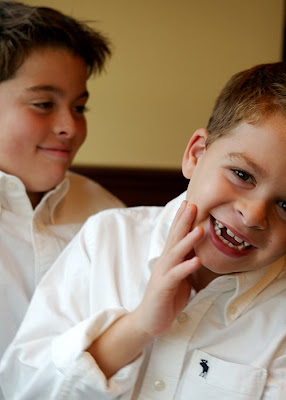
Take a look at the photo above of two brothers. The younger brother in front is in focus and the older brother behind him has some (in my opinion, pleasing) blur. I hate turning photography into math homework, but I need to give a few numbers to illustrate a very simple point:

The wider the aperture, the more shallow the depth of field.

"Aperture" describes the opening through which light passes to hit your camera's sensor or film. The lens of your camera will indicate the possible values of aperture in "f-stops." I used a canon 24-70mm L lens for the above shot at an f-stop of 2.8 (its widest aperture) with a shutter speed of 1/50 sec and an ISO of 100. Aperture, shutter speed, and ISO pretty much cover the technical aspect of a photo, and if you already shoot with manual settings my guess is you are already more than familiar with how the settings work.

But if you usually just let your camera make all of the choices and maybe you are not always happy with the result, you may want to experiment with the aperture settings (provided that your camera allows it). Most SLR cameras (cameras that have interchangeable lenses), for example, have an "aperture priority" mode which gives you the freedom to choose the aperture but to let the camera worry about the shutter speed. If you set the f-stop at a relatively low number, you are more likely to get background blur than if you leave the decision up to the camera.

But I just have a little point-and-shoot digital camera, you say.
Even in that case, you still have control. Look at those little icons on your camera dial or menu. Here's a shot of some standard icons:

Let's look at three of the five icons above (yours may vary slightly):
  • The flower is "macro" mode. It has the most shallow depth of field (i.e. most blurred background). The f-stop is probably 2.8 or slightly higher.
  • The profile of a portrait is "portrait" mode. The f-stop is a little bit higher—probably 5.6 or 8. This should mean less blur than macro.
  • The icon of a mountain is "landscape" mode. Now the f-stop is at its highest—maybe 11 or 16. In this mode, pretty much everything will be in focus.
My point is that you don't need to be taking pictures of flowers for "macro" mode or of mountains for "landscape" mode. Instead, think about depth of field when choosing a setting.

And now, for your word of the day: Bokeh.
Bokeh is an anglicized version of a Japanese word for blur. People use it to describe the quality of blur, especially in relation to different lenses. Higher quality lenses will usually produce better bokeh than low quality lenses. How does this help you? Not much. But it's good to know what it means when you hear it.

Want to know more?

A thorough technical explanation of bokeh and blur.

Wednesday, February 11, 2009

Interview with Brad Slade, Photographer for Seeing the Everyday Magazine

For Seeing the Everyday Magazine. "My mother has made bread as long as I remember, and the family remembers this was a good time to be with her. She always listened."

NOTE: All photos Copyright Brad Slade.

Marc: Tell me about how you got involved in the Magazine Seeing the Everyday?

Brad: An old friend, Daryl Smith, had been thinking of this magazine for a long time. We had done a few jobs together and he thought I would be a good fit for it. And as we talked about it, I became really excited about the idea of capturing the family and trying to show the everyday moments.

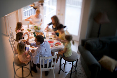
For Seeing the Everyday the Everyday Magazine. "We spend dinnertime with a different family each issue."

Marc: Seeing the Everyday has been described by one blogger as Saturday Evening Post for the modern reader. What do you think of that comparison?

Brad: You know, it’s interesting, because I always think of The Saturday Evening Post as a bit idealizing. We may be idealizing the family in a certain way, but we are more interested in celebrating the family in the nitty gritty of everyday life instead of trying to set up the perfect picture of what a family ought to be.

For Seeing the Everyday Magazine

Marc: How would you describe the look of the magazine and how does your photography fit into that look?

Brad: The thing that I like about the magazine is that without ads it looks clean and doesn’t get visually hampered, which makes the pacing work better. I have my own style and it is nice to have a forum for expressing it. I like to visually declutter and use selective focus to get to the heart of what’s going on.

Marc: You mentioned the lack of advertising in the magazine. A lot of people would say that you are missing out on a key source of revenue. How did you come to that decision?

Brad: Early on, we decided that we didn’t want the clutter that you get when you look at a small magazine with too many advertisements. But the biggest reason is that it tends to start to drive content, and with advertising we would be constrained and wouldn’t be able to say what we want to say as much.

For Seeing the Everyday Magazine. Don’t get mad, get the camera

Marc: Do you think other people should adopt your attitude toward advertising?

Brad: Well, that was a decision we made and I wouldn’t want to say that others have to follow it, but at the same time, I do think that advertising can overtake content. For example, a photography magazine that I subscribe to ran an ad on their cover.

That was one of the first times I’ve written a letter to the Editor, because to me, that’s one of those lines you just don’t cross. The same thing happens at college football games where even the waves are sponsored by local restaurant chains.

Marc: The magazine’s tag-line is “finding poetry in the prosaic.” How do you get inspired to do that as a photographer?

Brad: I think that’s how I’ve always thought. I think that’s what first drew me to photography. Even in the first photography class I ever took, it wasn’t like I wanted to take pictures of the Grand Canyon or something. I just liked looking around in my everyday life and finding the beauty there, because there is beauty everywhere.

For Seeing the Everyday Magazine. Don’t get mad, get the camera

Marc: Do you hope to inspire other people to the same things?

Brad: I think that we [at the magazine] have given up some things…I mean, I think when we started I thought this would be an opportunity to create some kind of an art piece. But I think that idea of creating “art” has given way to creating a really pro-family messeage, something we hope will be helpful to people in raising their own family. I would hope that people would be inspired to record their own family situation, but the biggest thing we want is to empower people to better.

Marc: What are your own sources of inspiration?

Brad: For me, personally, I love Wendell Barry and that whole school of thought around him. I love his thinking about bringing life down to the fundamental things and trying to appreciate the things that don’t cost money. Photographically, I have a lot of influences, but I wouldn’t know where to start.

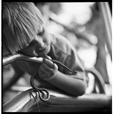
"My son caught a snake."

Marc: How do you see your work in relation to trends that you are noticing right now in photography?

Brad: I remember coming out of school and feeling like I was kind of hip and had a look that was pretty cool, and then at one point I realized that it’s always going to be a game of catch-up if you try to figure out “what’s the look now?” And it’s not that I don’t pay attention, but at the same time, I have tried to steer away from taking pictures that might look super dated—and I’m not sure if some people will agree that I’ve achieved that. Some people might think that my use of selective focus is already dated to a decade ago, but…[laughs] But I think that in art, you always have realism and the abstract, and the classical and the romantic all battling each other, and in photography, too, those impulses compete. In my work, I try to balance the two.

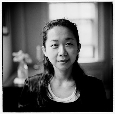
For Seeing the Everyday Magazine As a young girl, Yi-Chiun would rarely talk, which left people around her thinking she wasn’t very bright. Her dad had faith in her, and with his encouragement Yi-Chiun recently finished her graduate studies at Harvard.

Marc: Maybe you can comment on some of your work, both for the magazine and on your own.

Brad: I have a project of my own that started as me wanting to share the life of my family, to preserve this little moment and help my grandkids and their kids to see what it was like to be a part of our family. But then I’d show people, and they’d get excited, and so I started to think about doing a book project or something.

"On a morning hike with my daughters."

Marc: Do you imagine putting text with the photos?

Brad: I’m toying with adding some journal entries, but more as an abstract visual element. I’m kind of taking inspiration from Henri Matisse and his Jazz book where he includes notes in his own handwriting.

Marc: What is your process in shooting?
Brad: I mostly shoot digital, except when I shoot black and white. In that case, I scan the film. But I am kind of ambivalent about digital. I don’t like the way highlights blow out in digital, and I worry about losing digital files, whereas I still have negatives that I took in my first photo class in ’77. I wonder about migrating digital images from format to format as technology changes.

Marc: Do you do all of the photography for the magazine?
Brad: Basically, yes, but one of my favorite pictures we have published is one that my Dad took of my Mom.

Photo of Brad's Mom taken by his father.

Marc: Did your Dad do a lot of photography?
Brad: He did. That’s really what turned me on to it. He and I had a Leica back in the day and would take a lot of pictures when we traveled. I remember in ’76, we were in France up on the fourth floor of a building and my sister threw the camera out the window.

Marc: The Leica?

Brad: Yeah, the Leica and a Rolleiflex.

Marc: Ouch.

Marc: Any advice for people taking candid photos of their own family?

Brad: Turn off your flash. Pay attention to the light. It seems like a lot of times people don’t pay attention to what’s going on with the light.

Marc: Of course, if people are using a little point-and-shoot and they turn off their flash, won’t they have a lot of noise in their photos?

Brad: Maybe, but I would rather have noise than flash. One more thing about taking pictures, is that I think you’ve got to be in love with the subject. I think it’s got to be more about the subject than about creating art.

Marc: Which I guess makes your home life a good subject?
Brad: I’m not saying that everyone has to take pictures of their families, but that you need to take pictures of what you love. Often, when I tell people that I take pictures of my kids, they think that’s not serious, that I ought to be taking pictures of landscapes or different things. But, you know, I love my kids way more than—I mean, I love landscapes, but I love my kids best of all.