Tuesday, December 30, 2008

L'ange des bois...

click to enlarge

L'ange de...what? Titles sound more pretentious in French, don't they?

Time is almost up for the Brushes Monthly Special. Record low participation. Record high readership. I'm stumped.

In any case, I wanted to do one last brushes experiment with the set I made before moving on to a new theme for January. The photo was taken in Paris. How often do you just happen upon an angel walking down the street and into the woods? It was kind of like a scene from Wim Wenders' Wings of Desire (with a bit of Russ Meyer thrown in).

I'm not sure that I like the with-brushes version better than the toned and shaded base photo, but I do love playing with the depth and ambiguity that brushes can add.

Monday, December 29, 2008

Inspiration or just schadenfreude?

I spent hours today doing no less than FIVE head swaps for a family photo. The result is very convincing, but it took way too much time. It's my own fault for suggesting the head transplant in the first place (but five?). I blame myself for suggesting that a composite could make all 15 people look their best, but I also blame television and the movies for making Photoshop wizardry seem effortless.

The computer corollary, of course, is hacking. Ever watch Chloe Sullivan on Smallville (It's a guilty pleasure)? Sure Clark, let me just hack into the NSA on my iMac.. Frantic typing, wide-eyed intensity,and 5 seconds later...Done. Or Chloe O'Brian on 24? Sure Jack, let me just hack into the Chinese Embassy... Frantic typing, a look of consternation, and 5 seconds later... Done.
(Note to all parents-to-be: Name your daughter Chloe and there's a 95% chance she'll be a computer genius capable of thwarting terrorist attacks and/or Lex Luthor. The other 5% grow up to be waifish models-turned-actresses, so name at your own risk.)

But back to Photoshop. A blog that I find laugh-out-loud funny is Photoshop Disasters. They feature pro-level disasters that have somehow made it past teams of pros and into print. For example, a favorite recurring theme is the hand left in when removing a person from a photo as seen here (or does Kate Moss just have a very shy and skinny friend?):


Even Apple isn't immune from Photoshop disasters. Maybe I'm getting too much enjoyment from other people's mistakes. But somewhere buried in the schadenfreude is an inspirational message:

As Miss Frizzle from the Magic School Bus would say: Take chances, make mistakes, get messy! (A random reference, I know, but I'm a storehouse of useless trivia.) Instead of showcasing my best, polished work as part of a self-promotional campaign, I want to explore new themes and techniques, and in the process, I hope to inspire you to do the same. So don't be shy. Try out some Monthly Specials in the new year. If the pros are turning out enough disasters to fuel a blog (and it only picks on the pros, by the way), we can afford to make a few mistakes as well.

Hmm. Was that a dubious source for inspiration? Probably. But in any case, laughter is good for the soul.

Monday, December 22, 2008

Best wishes for Christmas...

My posts have been less frequent due to holiday business and a never-ending antibiotic-resistant sinus infection. Hopefully, I will have time for some more brushes posts before we move on to a new theme for January.

I kept things fairly simple in the photo above by adding two brushes. Eva likes to call herself "blue bug," so this seemed an appropriate way to express her imagination.

If there's any tip here, it's that your brushes project need not be complicated. I hope to see some of your work with brushes on the Monthly Special page before the month's end.

Tuesday, December 16, 2008

Hi-Res Paris Flea Market Brush Set

Christmas comes early at Take-Out Photo. For all my readers, I just made a free brush set of old manuscripts, post cards, maps, and official stamps all acquired at Paris flea markets. The above image is a small sample of some of the stamps—I mean, brushes (They really function more like digital stamps). Most of them go up to the maximum resolution of 2500 x 2500 px.

I made them in CS3, so I'm not sure about compatibility, but I did test it in Elements (6) and it worked!

As for the "Terms of Use"—I'm all about "free," so use the brushes for whatever you want. Obviously, I would love to get more people reading my blog, so I welcome any credit that points them my way. But that said, I know what a pain it is to track down info for every brush used. My only restriction is that there be no online redistribution of the brush set without my consent.

Thanks to dropbox (which I use every day and love), I can upload the .abr file of the brush set (I think there are 22 brushes in all) and share it with you through this link (fingers crossed). The file is pretty big. I am including both the uncompressed and the (disappointingly not-that-smaller) zipped version.

Monday, December 15, 2008

A very short post about making your own brushes

I had planned on doing a tutorial on how to make your own brushes in Photoshop, but December is quickly passing and there are already at least two really great tutorials about making your own brushes.

And so...rather than re-invent the wheel, I advise you to check out either this tutorial or this one.

You won't believe how easy it is to make your own brushes. I made a brush of the map above in about 30 seconds. And guess what? I tried to make one in Elements and it worked as well. Just remember to resize the image you want to turn into a brush to no larger than 2500 x 2500 px (or 1000 x 1000 px for early versions of Photoshop) first.

I'm thinking a Paris flea-market set of brushes (maps, buttons, manuscripts, and such) might make a nice Christmas present to all of my readers if I can just figure out how to deliver it to you via my blog. Is that possible? Anybody out there know?

In any case, take a break from the December madness and do the December Monthly Special—it's therapeutic. Really. Not frustrating at all. It's like finger painting without the mess.

Friday, December 12, 2008

Another PS Brush Style, Another Tip


This is a completely different look than yesterday's post. I'm still not sure what I think about it—except that it makes me think of the cheesy Tiffany rendition of "I think we're alone now." Probably a bad sign.

In any case, I wanted to try something that had less dimensionality and that was blatantly artificial. The whole thing was done with Fresh Foliage brushes. The bright brushed-on trees shield our young lovers from the passers-by above (hence, the song reference).

My tip—or observation:
There is something about brushes that seems to call out for monochromatic or toned photos. I did a hi-contrast grape tone on this photo because I didn't want too much realism with the brushes. In my last post, I didn't do any toning, but the photo was already very monochromatic. And my first brush experiment was also toned. But this is no rule (there are none), just an observation.

What do you think? Too strange? Just your style?
Post some of your own experiments and link back to the Monthly Special.

Thursday, December 11, 2008

Tips from Experimenting with PS Brushes

Here is a brush experiment with a photo I took in the Louvre. Some of the brushes I used are:
and no doubt others that I am forgetting to mention.

I realize that you may love or hate my brush experiment, but here are some lessons gleaned from the process:
  • Your photo rejects might deserve a second chance with brushes in mind. The photo I chose was not as sharp as I would have wanted, and I would never have used it for a regular print. Sharpness becomes less important, however, if you plan on layering textures over the photo.
  • New layer, new layer, new layer...I must have made at least 20 new layers. Why? Because I could have more control over opacity, color, and blending modes for each new element.
  • Change the opacity. Did you know that there is bright orange in my image? It just happens to be at about 8% opacity.
  • Blending modes. This is a good time to use that little pull-down menu of blending modes (in your layers palette, where it says "normal").
  • Erase. Do you remember the heyday of faux-finishing? Brushing (or ragging, or stippling, or whatever) the finish away was just as important as applying it. Try applying a texture with a stamp and removing some of it with another. Magical things happen. When you click on the Eraser tool (E) you can load and select different brushes just as you have done with the brush tool.
I had a lot of fun modifying the photo. The brushes create a pleasing depth. Perhaps, you say...but what does it mean?

Sunday, December 7, 2008

Free Photoshop Brushes Resources

I've been lagging behind on my posts (sickness, end of semester and holiday rush, etc.), but I hope to correct that very soon.

In the meantime, here are a few good sources of photoshop brushes to keep you working on the Monthly Special:

Smashing Magazine as a list of 50 must-have photoshop brushes

Photoshoproadmap lists 100 brushes (you will begin to see some crossover between lists).

Qbrushes lets you browse a decent selection by category.

Tutorial blog has a list with some good ones.

The talented Eduardo Recife shares some great brushes (under "goodies") and fonts. No previews, so you will just have to trust me that they are worth the download. And while you're there, check out his art. I love the handmade (i.e. no Photoshop) collages (see Illustrations--> Collage Book 1, for example).

and finally, there's the massive collection at deviantart.com.

Friday, December 5, 2008

Finding, Installing, Loading, and Using Brushes in Photoshop and Elements

Finding Brushes
Finding free brushes for Photoshop is easy. In fact, the number and variety of free brushes can be overwhelming. Google "free photoshop brushes" and you will see what I mean. I will do a future post with links to some of my favorites, but for starters, check out this list of 75 hi-res brushes picked by Elite by Design (I will be writing four posts for them in January, by the way). Once you have found some brushes that you want to download, pay attention to the following:
  • Compatibility. Not all brushes work in Elements or in every version of Photoshop, and many brush sets won't specify compatibility. If you like it, go ahead and try it. Either it will work or it won't, but it shouldn't crash your system or anything (Should I be putting a legal disclaimer here? hmm.), so give it a try.
  • Brush size. If you want to use brushes to create a new banner for your blog, pretty much any size will do. Larger images, however, may demand larger brushes. Look at the maximum pixel size of a brush to see if it's hi-, medium-, or low-res. 2500 px, for example, is hi-res.
  • Price. With so many free brushes out there, I would think twice before buying a brush set . If you see a must-have set that is not free, check places like deviantart to see if something similar is available for free. Another thing to consider: you can make your own brushes. I will teach you how this month.
Installing Brushes
The process is the same for Photoshop and Elements. Once you download (and unzip as needed) a brush set (should be a .abr file)...
Go to Applications-->Photoshop (or Elements)-->Presets-->Brushes and drop it in. That's it.


If you had Photoshop open at the time, you will have to quit and re-open before you can access your new brushes.

Loading Brushes
Select the brush tool (b), and look at the brush menu bar on top. In Elements, you will see (on the left side) a swoosh-like image of one of the basic brushes:
In Photoshop, you will see (second from left) a dot representing the active brush:
Click on the arrow to the right of your brush image (swoosh or dot) to get a menu with Thumbnails of your brushes. From there, click on the small arrow(s) for a menu that lets you change the size of the thumbnails (I like to make them larger so I can see the custom brushes more clearly). You will also see a "load brushes" command, but you will not use it because you have already put the brushes in their proper place. Instead, in Elements (I'm using Elements 6 for Mac), you will locate the pull-down menu just above the thumbnails...
where you will find a list of your brushes (including any that you dropped into the brushes folder before opening the application). Select a set you want to use, and you're ready .
In Photoshop, the brushes will all be listed in the menu that pops up when you click the small arrow. (In CS3, you can hit F5 and bring up a brushes palette on the right that will do the same things).
When you select one of the sets, a dialog box will ask if you want to replace the current brush set with the new ones. You do. No worries, your other sets will still be there in that same menu when you want to switch.

Using Brushes
This tutorial will only cover the basics, and in a future tutorial I will talk about some of the options.
  • Changing brush size: You can either use the slider in the brush palette, or (and I highly recommend this shortcut) use the left ([)and right (])bracket keys to change brush size. Also, for brushes that have hardness/softness settings (such as basic brushes), hold shift while pressing the left or right bracket keys.
  • Opacity: There is an opacity slider in the top brush menu, or you can make a new layer for your brushes and change the layer opacity—although the latter option will uniformly change the opacity while the former allows you more control.
  • Color: You can change the color of the brush by clicking the foreground color box and selecting a new color.
This should get you started on the December Monthly Special.

Monday, December 1, 2008

December Monthly Special: Photoshop Brushes

We are jumping into the ever-growing world of Photoshop brushes for the month of December. I can honestly say that until today I have never used brushes for anything other than masking. But brushes are hugely popular and easy to use, so why not give them a try?

I won't go into any full-fledged tutorial in this post, but I promise that several will be forthcoming in the next few days.

If you are new to brushes, let me tell you from my own experience as a brush novice that it was a lot of fun. In the case of the ever-popular grunge aesthetic, we get to abandon the less-is-more mantra and just go crazy. During the month, I will teach you the basics of installing and using brushes, creating your own brushes, finding the best brushes for your project, and achieving different looks with brushes.

Here is my first experiment with brushes...


Before the attack of the grunge brushes:
After grunge gone wild:

The brushes I used include:
dripping brushes
grunge brushes
grunge corners
grunge border brushes
grungy watercolor
more grunge brushes
and perhaps most importantly, a graffiti brush set (for which I can't find the reference—so if you know, please comment and I can give them credit).

The best thing about using brushes is that the results are fast and that you can't really get it wrong. I am hoping for a lot of creative experimentation this month, so be sure to post and link back here with your brush projects (see the FAQ is you have questions about how to do this).

Sunday, November 30, 2008

December Monthly Special Hint

The November "still life" theme is ending, but there is still time to post on the (rather lonely) Monthly Special page. For December we are back to Photoshop with a theme that will be a real challenge for me, but that should also be a lot of fun. In keeping with tradition, my still life above also serves as a hint for next month's theme (which I'm guessing will be a popular one). Do you think you know what it is?

Wednesday, November 26, 2008

Still Life on Flickr


1. Still Life with Pop-Tarts and Dirty Toaster, 2. Aula de fotografia - foto Still-life, 3. blood orange still life, 4. "Still" Life, 5. Green fruit still life, 6. Bodegón / Still life 005, 7. still life, 8. still-life-in-a-bath, 9. Just Domestic Still Life Or Somethink More...{nv}, 10. Still Life Class, 11. Simple Lunch Still Life, 2008, 12. Still-life with bottles, leaves, pinecone and marbles on windowsill, 13. Still life of toys, 14. Still life on table, 15. Still Life, 16. Still Life: Work Gloves

Here are some beautiful, delicious, witty, original, and clever examples of still life photography from Flickr. I would love to see some of these people participate in the Monthly Special on still life. As I have said before, I am new to still life. And looking at some of the great work on Flickr makes me want to spend more time working on it. The month is soon ending and I've seen surprisingly few people link back, especially considering this is not a Photoshop challenge (next month, we are returning to Photoshop). But there is still time. Maybe a still life of your Thanksgiving dinner prep?

Monday, November 24, 2008

My birthday wish...subscribers

(no, that's not me. but thanks, if you thought it was)

Today is my birthday, and I'm old enough to not care so much about presents—maybe this comes from the fact that the things I want are far too expensive to go on any wish list. Except this one. And it's free:

More subscribers.

No, I don't earn money from subscribers, and subscribing doesn't cost you anything. It just means that if you use a feed reader (like Google Reader, for example), you can see whenever I do a new post. At the top right of my sidebar, you can click the "subscribe to posts" and pull down to the appropriate reader.

So if I don't earn any money from subscribers, why do I care?

Well, it's just my nature to obsess over things like that. If you're a long time reader, you may remember my game of google analytics risk back in July. The update on that is that I only have a few countries in Africa left before I've reached global domination. But beyond my pointless but amusing game, I want to reach as many people as possible just because it is gratifying.

No ulterior motives?

OK. You got me. There is one. My goal is to do a Take-out photo book in two or three years, and it certainly wouldn't hurt my chances of getting it published if a publisher saw that I had a strong readership already. Right now, I have about 7,500 visitors in a month, but only 88 of them are subscribers. I would love to see more of those visitors decide to stick around and subscribe.

So, in conclusion....a brief anecdote and a plea:
Back in the days when we thought tanning was a good idea, Michelle went to sign up at a tanning salon. She encountered the most high-pressure sales guy you have ever seen. He tried to up-sell by bullying her with a repetitive: "C'mon c'mon! It's my birthday! Today is my birthday! C'mon. It's my birthday! Sign up! It's my birthday!" It was so obnoxious that to this day Michelle and I jokingly shout "It's my birthday!" whenever we want to be a badger about something.

I don't really want to be like tanning-salon guy, but...
It's my birthday! Today is my birthday! Help me get some more subscribers! C'mon. :)

Friday, November 21, 2008

Four Methods for Teeth Whitening in Photoshop

Introduction
As part of my series of basic portrait retouching techniques, I want to give you some options on whitening teeth—Photoshop options, that is. I'm not here to sell you white strips or bleaching trays. In fact, I don't want photos that end up with fluorescent blue/white 
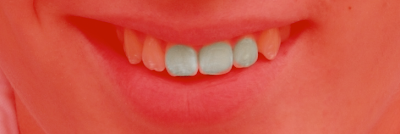
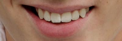
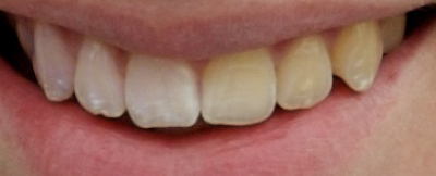
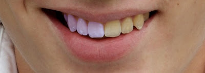
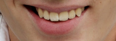
Regis Philbin teeth, just something realistic and a little less yellow. Here is the "before" picture:
This guy is wearing a white shirt, which only makes his teeth look more yellow. He also has some whiter spots (calcium deposits?) that we will only partially reduce. As I have said before, I think retouching is great, but I also believe in the philosophy that not all imperfections should be treated just because we can (If the "variations in the fabric should not be considered imperfections" is good enough for our clothes it should be good enough for our faces).

The subtext of this tutorial is that the more you experiment with Photoshop, the more you will find alternative approaches to any given problem. Below are four possibilities. Choose one that works for you, or use them as inspiration for other methods.

The Adjuster
Method: hue-saturation adjustment

1. Duplicate your background layer (Mac: Command–J; PC: Ctrl–J)

2. From the top menu bar, choose Image-->Adjustments-->Hue/Saturation
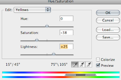
3. In the hue/saturation dialogue box, select Edit: Yellows. Desaturate the yellows somewhere between -20 and -40, depending on how yellow the teeth are. Then increase the lightness of the yellows by a fair amount. You can check and uncheck the preview box to see the changes, but remember to focus on the teeth and not the rest of the image.
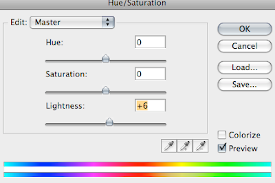
Do NOT click OK yet. First, change to "Master" from the pull-down edit menu and lighten the Master by a small amount (I did +6):
Now you can click OK.

4. Next, you are going to add a black mask over the layer you just adjusted and then paint the teeth back in so that the effect applies only to the teeth.
NOTE: Some people would tell you to select the teeth first and save yourself the step of painting later. Personally, I prefer painting, but this is just one example of how many variations there can be in method.
To create the black mask, hold down the option/alt key while clicking on the mask icon at the bottom of the layers palette.

5. Select the brush tool (b). With a medium-hard brush, and with white as your foreground color, paint over the teeth (but not the gums) to reveal the hue/saturation changes you just made.
(insert brush teeth image)
NOTE: If you want help seeing where you are brushing, you can turn on a red overlay by hitting the backslash (\) key:
You can click hit backslash again to return to a normal view.

6. Once you have painted the teeth, you can play with the opacity of that layer to tone down the effect as needed:
OPTIONAL: If you want to eliminate small white spots or discolorations, you can do so with the patch tool or the clone stamp tool.

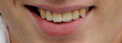
Once again, here is the before:
and here is the after:
Conclusion for The Adjuster: This is the technique I most often use. It's quick, it doesn't look painted on, and it gets the job done.

The Hygenist
Method: Dodging

1. Duplicate your background layer (Mac: Command–J; PC: Ctrl–J)

2. In the layers palette, change the view to Channels and click on the Blue channel:
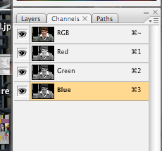
You will probably want to keep all of the channels visible, but only work on the Blue channel.

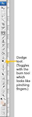
3. Select the dodge tool and set it to a low exposure (7-10%)

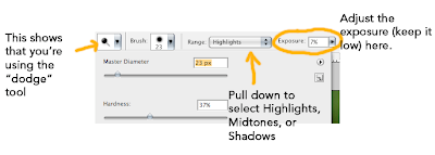
Now, following the natural lines of the teeth, brush away the yellow with the dodge tool. Most of the time you will want the tool set to "Midtones," but near the gum and edges of the teeth you might also want to set it to "Shadows." Here is an image midway through the process:
When you are finished (i.e. when your eyes start to bleed), you can change the opacity as needed.
Here is the before:
and the after:

Conclusion for The Hygenist: I call this technique "The Hygenist" because it really starts to feel like you are cleaning the person's teeth. Pro retouchers swear by (and at) dodge and burn. They can use it in amazing and diverse ways, but they also talk about doing it until their eyes bleed (not unlike that lame character on Heroes). You have the potential for the best results (and don't judge that solely by the above image, because as I have stated, I use "The Adjuster."), but the learning curve is relatively high.

The Fluorescent Fix or The Tamed Regis
Method: Channel Mixer

1. Duplicate your background layer (Mac: Command–J; PC: Ctrl–J)

2. From the top menu select Image-->Adjustments-->Channel Mixer
and in the dialog box, select Blue as your Output Channel:
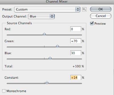
3. With the preview box checked, you will see the changes (just look at the teeth) as you adjust the green and blue sliders. You probably want to keep the total between the green and blue at 100% (and keep red at 0%). Then adjust the constant. You can see the settings that I used above, but you will have to experiment to find the right ones for each image. Once you click OK, you will have frightening, Regis-like teeth.

4. Mask out the effect and then paint in the teeth as in steps 4 and 5 of "The Adjuster." Here is the frightening smile midway through:
5. Once you adjust the opacity to the right level (pretty low), you will have counterbalanced the yellow and you will have whiter (but not glowing) teeth.

Here is the before:
and the after:
Conclusion for The Fluorescent Fix:
Not bad for something I made up this morning. With more fine-tuned adjustments this could be a reasonable and quick fix. The one problem: it seems easier to over-correct on this one.

The Painter

Method: Painting

1. Duplicate your background layer (Mac: Command–J; PC: Ctrl–J), but set your blend mode to "lighten."

2. Use the paint brush (b) on your duplicate layer to paint over the teeth. You will need to double click in the foreground color box and select a good tooth color. You may even want to change and use more than one color. I used some colors from a 
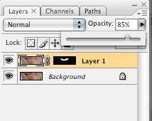
"long in the tooth" palette on Colourlovers. My choices yielded pretty extreme results. You can even tell from the tiny thumbnail in the layers palette:

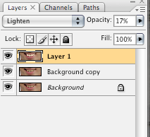
But once I lowered the opacity (to 17%), it looked pretty decent.
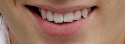
Here is before:
and after:
Conclusion for The Painter: For someone with more skill in painting, I'm sure this could get better results. However, it was harder to maintain the natural look of the teeth without substantially lowering the opacity, which meant the teeth stayed more yellow. The paint seemed to flatten the teeth and cover up some of their texture.
Overall, the painting brought memories of the tacky "photo" plate of my older sister that some creepy guy stationed in Korea once sent to woo her (What is that even trying to say? I hope that each time you look at this photo of yourself on a plate, you will think of me?). Her eyes had changed from blue to brown; her bottom lip had been moved to create what someone must have imagined to be a more demure smile, and her teeth were cartoon-white. Like I said, I am sure that someone with more skill in painting could achieve better results, but I couldn't get the teeth as white as I wanted to without having the image of the Korean photo plate pop into my mind.

Wednesday, November 19, 2008

Still life bowl

I don't usually do design posts (although I love to read them on other sites), but I was browsing Design Public and checking out various and sundry goods when I came across this witty still life bowl. I want to post a photo of it, but the copyright restrictions are too intimidating. The framed bowl is a fun idea, although I haven't quite decided if its too clever for its own good. What do you think? Love it? Hate it? With apologies to designer Thorsten van Elten, I think I would be tempted to make my own less expensive knock-off with a different bowl and and vintage frame. I'm guessing that the flattery of DIY knock-offs would be lost on van Elten or Design Public, but it could be worse. At least I'm not creating a $20 version for Target.

What do you think? If you like it and have DIY skills (In my case, anything beyond a drill is foreign territory.) would you make your own version? If you do, take a photo and link back to the November Monthly Special.

Disappearing comments and linkies--grrrr.

As much as I love using Mister Linky—the widget that allows me to let you do Monthly Specials and link back your finished work—it gets frustrating when they have service outages. So if you were going to comment or if you were finally going to post that still life project, please try again soon.

A stylish holiday card from Walmart?


Meet Esmé and Finn.

Esmé just finished her residency at Johns Hopkins. She dabbles in auto repair in her spare time. She adores sushi, strolls in the park, and vintage vinyl.

Finn knits (yes, knits) when he's not teaching sign language to underprivileged children. He loves pasta, and always loads up on carbs before a marathon in spite of what Esmé says about current research on the topic. Much to Esmé's chagrin, his idea of the perfect date includes three or four lively hours at a local Karaoke bar.

Esmé and Finn's favorite colors (this season, anyway) are purple and orange.

Aren't they adorable. No one has to know that the New Year's cards they just sent out were printed at—gasp!— Walmart.

Esmé and Finn aren't real, but I did have fun inventing them. My point in so doing is to suggest some photo-based card alternatives to the family newsletter approach.

No offense to anyone who sends one of those typed brag-fest missives touting everyone's accomplishments throughout 2008. But here is my opinionated take on it: The people you keep in contact with already know what you've been doing, and the ones you only send cards to once a year are probably wondering why you only give them this information once a year—or so I imagine.

Maybe visual clues could replace the newsletter this year. A picture is worth a thousand words, right?

Besides, if you blog, the full story is all there for the reading (and you could always have your blog address printed on the back of the card). So why not send a "year in photos" card or some variation thereof. We might be doing a less-hipster version for our own family card, but I may have said too much already. When I did the Christmas "dots" card tutorial in October, Michelle said she liked it but that now that everyone had seen it...

So, at the risk of ruining another card idea for our own family, let me tell you how easy it is to do something like this.

It's all based on a grid. Back in June, I did a grid tutorial that teaches the basic principles behind creating a grid. I used some of those same methods in creating this card. In a nutshell, here is what I did:

1. I created a document that was 5x7 inches at 320 dpi.
2. I went to Preferences-->Guides, Grid (etc.) and set the grid lines to appear every inch:
3. Now it was just a matter of selecting photos, cropping them, and dragging copies to a space in the grid. All of my photos are either 1x1 in or 1x2 in, so it was very easy to just drag each one to a square in the grid (easy, provided you selected View--Grid so you can see the grid).

4. For the colors, I used the rectangle shape tool and changed colors using the menu at the top. Look at step 10 in my dots grid tutorial if you don't remember how to do this.

5. For the text, I just added it the same way that I have explained in the "add text to photo" starter.

6. Those black lines around the photos were created by adding a "stroke" in the layer styles box. Just double click the thumbnail image of the layer in the layers palette to get the "Layer Style" box. Highlight "stroke" and adjust the settings/color to your liking. These were my settings:
Once you have the stroke on one layer, you can copy and paste it in the layers palette or simply drag it onto another layer (rather than go through the process each time).
It was really pretty easy.

And here's the great thing...
No assembly required. Once you prepare a file, you can have a 5x7 card printed at your local Walmart (I assume they have taken over the world by now, haven't they?). What is great about the cards is that you have the option (unlike Costco, for example) of uploading your own photo to a 5x7 folded card without using one of their holiday-themed templates. This means total control (perfect for fellow control freaks). They happen to have a 12 photo collage option (for which I applaud them), but I would rather have the freedom to design something exactly as I please.

I braved the stench of cheap hairspray this morning (I'm not kidding, that was the smell of our local Walmart) to check out the quality. They couldn't show me a finished sample, but they showed me the paper and it was a bit on the flimsy side. But at $1.42 per card including the envelope, it is still at least as inexpensive as something you would make with photos and card stock. And the bonus is that you will save a lot of time.

If you want to bump the quality up a notch, try the Moo Holiday Cards option. The printing and paper quality is unbeatable for the price. Two possible deterrents: increase in price, and the 4.1 x 5.8 inch size that is less neat and tidy for a grid. And one more: less time to procrastinate. They ship from England and take about 10 working days to arrive. Of course, any printing place will do as long as it will let you print photo cards from a full photo instead of a template. Just be sure to get the dimensions and design accordingly.

Let your imagination run wild and think of alternatives to the family newsletter this year.

Monday, November 17, 2008

Praise for the Periodic Table of Colorments

This is not photography, but...I am loving this "periodic table of colorments" project created by Joanielspeak at Colourlovers.
Click on it to see the large version in all its splendor.


To paraphrase Kai-lan, it makes my heart super happy.

Sunday, November 16, 2008

First Rude Comment


It's a landmark moment! My first rude comment. I'll take it as a good sign that I have attracted enough readers to draw some resentment.

That said, I try to keep things upbeat around here, so all future negative/not constructive comments will be deleted. But this one stays—kind of like that framed dollar bill you see on the wall of a small business.

So, thanks, anonymous "Io", for the dollar bill of rudeness.

Let me explain one thing (to my less venomous readers—I'm sure "Io" won't be changing his/her mind): I am a strong believer in a person's capacity for life-long learning. I believe that we can become many things and cultivate a variety of talents through hard work and the application of intelligence. I happen to have a PhD in French Literature, for example, and I teach in a French Studies program. But I also teach an Honors European cinema class, and (oh the horror!) will be teaching an upper division photography class in Paris next fall.

At the University of Washington (where I got my MA and PhD), I was blessed with professors that encouraged cross-disciplinary studies. One of them was a Freudian/Lacanian specialist (who now teaches comp lit and French). Another was a world-famous French medievalist (whose degree was actually in English). In my experience, the "valuing diversity" atmosphere at UW helped foster an inclusive brand of intellectualism. In other words, maybe disciplines CAN make contributions outside of their specialty. Maybe we can apply our minds to anything.

(Note: I realize this next bit seems defensive, but I guess it is, so... Oh, well.)
Most people I have dealt with on a professional level are very open to that kind of thinking. The Johns Hopkins University Press featured an article I wrote on photography because it had something to say, and not because of the degree I hold. Similarly, when I was asked to curate an exhibition about Nostalgia & Technology, or invited to the Oxford Museum of the History of Science to lecture on microscopy, it was not because of my degree in French. I have done a wide variety of things in my life, from singing telegrams (pretty embarassing) to presentations about horror films (pretty gorey)—oh, and I've done photography since I was seven.

Legitimacy can be achieved in many ways. Clearly, "Io" has expressed the opinion that only a degree can bestow upon someone the title of "photographer." I suppose I could argue that my business and clients beg to differ. But I don't think my photography business made me a photographer; I think my interest in seeing and capturing the world made me one. I also happen to have a diploma from a French music conservatory, but I was a singer long before someone gave me that certificate. Certain professions require specific licenses; "photographer" or "artist" is not one of them.

Take-out photo is meant to inspire creativity in people of all skill levels, whatever their educational background. It helps me push myself in new directions (I am certainly no still life photographer, that's for sure, but why not try?). When I created my blog, I wanted to do something different. I wanted to help myself and others learn new skills through projects and themes. I wanted to demystify some tricks of the trade and create a place where people can share their work (although participation in the "Monthly Special" is not yet what I would have hoped, in spite of a growing readership). I aspire to do a "Take-Out Photo" book one day, because I think there is a place for what I have to offer.

So thanks for the dollar bill of rudeness. And there's my two cents.

As I said before, aside from this little historic moment, I don't see any use for rudeness and I will delete any future comments that are not constructive.

p.s. You can view the actual rude comment in my previous post, just above the comment that reads:
Photoshop Tutorials Room wrote...
Good Tutorial! It was chosen for the home page of http://www.tutorialsroom.com
Keep on the good work ;)

Friday, November 14, 2008

Vibrant, Sparkling, and Sharp Eyes

Introduction
If we look at poetic excess as an indicator of importance, the eyes may very well be the most important part of the body. Here are a few overwrought gems of proof:

There are whole veins of diamonds in thine eyes,
Might furnish crowns for all the Queens of earth
.
(Philip James Bailey)

Thine eyes are springs in whose serene
And silent waters heaven is seen.
Their lashes are the herbs that look
On their young figures in the brook.
(William Cullen Bryant)

Eyes, that displaces
The neighbor diamond, and out-faces
That sun-shine by their own sweet graces.
(Richard Crashaw)

You get the idea.

Can the eyes in a photo possibly live up to such elevated language? It's a tall order. For one thing, photo paper tends to steal some of the life from eyes. This tutorial is meant to help you bring that sparkle back while remaining true to life. I don't promise eyes of diamonds and silent waters of heaven, but I do guarantee that these easy steps will make your portraits better represent what you see when you look into someone's eyes.

Here is a the same (bridal) portrait I used in a very stylized dot project.
The eyes don't quite do justice to what I saw in real life when I took the picture. So my goal is to restore some of that brightness and clarity. I don't want to change the color of her eyes. I just want to bring out what the camera didn't quite capture. I am going to do this in two parts. First, dodging and burning, then, sharpening.

PART I: Dodge (and Burn)
1. Duplicate the layer (Mac: Command–J. PC: Ctrl–J). It's just a good habit.

2. Create a new layer. In the New Layer dialog box, pull down the "mode" menu and select "overlay" and check the box that says "Fill with Overlay-neutral color (50% gray)."
In the layers palette, the new layer will look gray like this:
It's gray because it doesn't actually contain the image, it will simply overlay the effect.

3. Now it's time to dodge—or lighten—the eyes. Select the dodge tool from the toolbar on your left. Next, look at the dodge tool menu bar at the top. Here, you can select brush type (you will want a basic round brush), hardness (somewhere in the middle will work well), size (depends on your photo), as well as the "range" (shadows, midtones, highlights) and exposure (the intensity of the effect, which you should keep very low, such as 7%).
Let's start with the highlights. Zoom in on the eyes and look for the catchlights (the whitest reflections that go across the pupils).
The photo I am using was done in natural light. If I had used studio lighting, you might see circles (from an umbrella reflector) or a more rectangular shape (from a softbox) or the tell-tale doughnut shape of a ring flash. But these natural catchlights are less uniform and not as intense as studio lighting. To make the lights stand out a little more, just use the dodge tool set to "highlights" (with a small brush size to match the catchlights) and paint over the light parts until they stand out a little more.
You can click the layer visibility on and off to see the change as you go. Don't overdo it. If you so desired, you could paint little half-moon shapes as faux catchlights, but that can quickly lead to a fake-looking retouch.

4. Now let's improve the whites of the eyes. Start with the "midtones" selected from the dodge tool menu (but feel free to alternate between highlights, midtones, and shadows as needed), and brush along the whites of the eyes to lighten them up. But beware! Too much dodging and you're headed for Village of the Damned territory.
Keep it subtle and let it get darker toward the edges.

5. The last step of our dodging is to lighten the iris. With a brush size that fits between the iris and the pupil, paint around each iris to lighten it. Steer clear of the edges, which look better against the whites if they stay dark. You will have to experiment with highlights, midtones, and shadows. Your goal is to lighten while keeping a natural look.

That's the end of our dodging step. If you want to burn (make darker) anything (for example, the pupil), you can do so by switching to the burn tool. But for the most part, you will want to brighten the eyes. When you are happy with your work, you can merge down or flatten the layers. So here is the BEFORE so far:

and here is the AFTER:


PART II: Sharpen
1. To really make the eyes come to life, you can sharpen them. Sometimes, if the eyes are already bright enough, you can skip the dodging and go straight to this step. Duplicate your layer.

2. From the top menu, select Filter-->Sharpen-->Unsharp Mask. It's counterintuitive (a relic term from a darkroom process), but the unsharp mask will make your image sharper (by increasing contrast).

A dialog box will let you adjust the amount (intensity) of sharpening, the radius (how many pixels are grouped together as units to be sharpened), and the threshold (how much a pixel needs to differ from its neighbors in order to get sharpened). The settings depend on your photo, but there is a lot of room for variation. Do whatever you think looks best. Try starting with an "Amount" between 80 and 180 percent, a "Radius" between 1 and 5 pixels, and a "Threshold" between 1 and 4 levels. If the preview box is checked, you will see the effects (you can click on the eye in your image to make it appear in the box, and you can zoom using the + and - boxes just below the preview window). In the preview window, you can also click and hold to see the "before" and release to see the "after." Note the difference between these settings...
and these ones...
When making your sharpening choices, focus on the iris and ignore the rest of the picture. The increased radius is making the effect stronger, and the area around the eye is looking oversharpened. But if you only look at the iris (and pupil), it looks good, so I'm sticking with those settings.
Click OK when you like what you see.

3. You will now add a black layer mask to your sharpened layer. Click on the layer mask icon at the bottom of the layers palette while holding option/alt to add a black layer mask on your sharpened layer.
4. Your sharpened effect is now hidden and you can paint it back in selectively by making the black mask active (click once on it) and then using the brush tool (b) set to white (If black is in the foreground, just click "x" to switch it to white. If your colors are set to something other than black and white, click "d" first) to paint over the middle of each eye:
I would avoid the whites, because veins will become more prominent. But you might want to sharpen the inner corners (what are those called, anyway?). Since you have done all of this on a separate layer, you can dial down the opacity if it looks too sharp.

That's it. In very little time (once you get the hang of it) you will have vibrant, sparkling, and sharp eyes (Well, not your eyes, sorry. You've been staring at a computer monitor for too long and your eyes are looking red and tired.)
Here are the eyes BEFORE:


and AFTER:


Here is the finished retouch (I recommend that you click to enlarge):
The "after" actually looks more like her real eyes than the "before." The change is subtle and realistic.