Saturday, August 29, 2009

Saints and Sinners


Penance
My posts have been less frequent than ever this month, so I thought I'd do penance with a triptych called "saints and sinners." The width of the photo is such that I can't post it larger than this, but what you see is a scene from a Salt Lake City street. Let me break it down...

The "Temple City" motel sign caught my eye. The photo at right captures a sort of nostalgia for a very different Salt Lake City than the one that has clubs like the aptly named "Saints and Sinners" one right next door to the motel.


The photo at left better illustrates decay—both in the sign itself (because the close up shows the worn paint much better) and, more obviously, in the juxtaposition of the religious theme and the billboard for a peep show behind the sign.


The bouncers at the "Saint and Sinners" club (incidentally the "A private club for members" subtitle is rife with irony for those who know Utah Mormon culture) were wary of my photo taking. When that happens, I tend to go straight to the person rather than retreat. So I walked up to the bouncers and told them that I thought the best-named club in Utah. They laughed and that was that. My great regret was not getting the picture with the bouncers in front.

Projects
My triptych is not only my ironic penance for a lack of posts recently, it also represents one of the reasons: namely, that I am working on a project about Utah culture that I hope to complete within a year. The other main reason for my lack of posts is that my family and I are getting ready to spend three months in Paris. We leave next week and we still have loads to do before then. I will be teaching a photography class to study abroad students in Paris so I'm sure there will be fun things to share.

A lesson to be learned?
I have a strong attachment to Paris and have had practically no attachment whatsoever to Utah until recently. Working on a Utah-based photo project has helped me appreciate the state on its own terms. This is one of my favorite things about photography. Whenever I have a project, I am forced to pay attention to my surroundings and I come to appreciate them more.

My "Monthly Special" format makes me focus my attention on different things each month. Even when I'm less productive with posts, my in-between moments (like driving to work) are often occupied with thoughts of the month's theme.

And speaking of "Monthly Special" themes....this post is also a hint about next month's project. No, it's not religion (although that would be a good theme). Comments? A guess?

Friday, August 21, 2009

Interview with Medieval Scholar Jesse Hurlbut

I am pleased to interview Jesse Hurlbut today about triptychs. My interview with him will help give historical context to this month's theme. I am a firm believer in the cross-pollination of art forms. In other words, I think photographers can gain much by looking at other forms of representation.

Jesse has been teaching French Medieval culture for 20 years at the University of Kentucky and at BYU. He received his PhD from Indiana University. In addition to his scholarly pursuits, Jesse is a longtime photo enthusiast. He specializes in landscapes, and his sense of color has been influenced by the sunsets of the Arizona desert, where he was raised. Southern Utah and Southern France are his two current favorite places to take his camera. Lately, he has been energetically exploring the capabilities of the Foveon sensor in his Sigma SD14.


I have to admit that I don't know a lot about the history of triptychs, and I'm guessing that I'm not alone. I have seen some Medieval religious triptychs, but I would love to know how this art form emerged. Is it linked to Christian doctrine of the Trinity in some way?


Medieval triptychs belong to the tradition of adorning the sacred altars in churches starting in the twelfth century. More than just decoration, these altarpieces provided a visual metaphor for the sacred ritual performed in front of them. Altarpieces were typically made of stone, metal, ivory, tapestry, or painted wood panels, often covered with jewels or precious metals. Many altarpieces consist of a single panel depicting a scene from religious history, typically from the life of Christ. In the later middle ages, wealthy patrons commissioned artists to produce small altarpieces that could be folded on hinges, convenient for personal devotions and for transporting. Diptychs consist of two panels, that close like a book. Triptychs have three panels and usually have two ½-size wing panels that fold over a full-size central panel. Each panel would contain a different scene. Indeed, the theological premise of the Trinity (three in one) is nicely represented in the triptych since it contains three images in a single, unified piece of art.

Diptych of Jean de Cellier

By the fifteenth century, huge hinged altarpieces are permanently installed above or behind the altar and could include a dozen or more panels with multiple wings. Even with more panels and wings, these elaborate constructions (called polyptychs) were still usually organized around a tripartite composition. The wings were painted on front and back, although the most spectacular paintings were reserved for the inside panels. It is thought that, in some cases, the wings were opened to reveal the inside only on special feast days. Since portability was no longer an issue, we can imagine that the frame divided into three sections persisted as a convenient way to present and to compartmentalize different scenes.

Polyptych, 1478

Is there a set method for "reading" a triptych or does it vary greatly from one to the next?


While there is plenty of variation in what to look for from one altarpiece to another, there was a fairly unified method of interpretation that medieval scholars applied not only to religious art, but also to every aspect of daily life. Called exegesis, the technique originally derived from the interpretation of scripture and involved four stages:

1) The historical approach looks for the literal meaning of the thing being studied. For example, the story of Noah’s Ark is about a prophet who saves his family by building a boat.

2) The allegorical approach looks for connections between literal and divine history. Noah’s flood might be viewed as an allegory for Christ’s baptism.

3) The tropological approach studies the moral lesson to be learned from a story. In the example of Noah, one lesson might be that those who obey God as Noah did will be preserved by God.

4) The fourth level of interpretation is the most mystical, requiring deep spiritual contemplation. This anagogical approach leads the soul upward from the materiality of this existence to the immateriality of spiritual understanding.

A triptych can easily incorporate each of these four levels. If the central panel depicts a story from the life of Christ; one of the wing panels might show the allegorical connection of that story to an Old Testament event; the other wing panel might show the donors of the painting contemplating the moral lessons of the two other scenes. The person participating in a sacred ritual at the altar may fulfill the fourth level of interpretation by means of their personal spiritual experience.


The Mérode Altarpiece by Robert Campin (in the Cloisters Museum in New York) is a straightforward example of what I have just described. In the central panel, Angel Gabriel announces to Mary that she will be the mother of the Messiah. In the right panel, Joseph is making mousetraps in his workshop. Allegorically, this refers to the way Christ will ensnare the devil. In the left wing panel, we see the donors who commissioned the artwork peering at the two scenes through a door, as they contemplate the moral implications for themselves (tropological). It is interesting to note that through the windows of the central panel, we see only the sky, while in the two wing panels, we see the world at street level. This is a way of indicating the anagogical or spiritual significance of the central panel over the other two.


What influence do you think the triptych has had on other art forms?

One of the qualities of the triptych is that it juxtaposes images that share something in common, but the thing they have in common may not be apparent until they are placed side by side. Other art forms that exploit this same technique include cinema, where a director may create an association between two otherwise unrelated scenes by placing them one right after the other. This is called montage, and it has become such a strong convention that we often don’t even notice how different the scenes are, because our imagination is so well trained to fill in the gaps.


Another art form that exploits sequential images and the gaps between them are comics. We usually think of comics as telling a story in a chronological sequence that moves from one panel to the next, but the relationships between panels—typically separated by literal gaps—can express much more than progress through time. Scott McCloud, comic book artist and theorist, uses the term closure to talk about how our imagination fills in the spaces between panels. In his analytical comic book, Understanding Comics, he has proposed a short list of some of the possible connections between scenes.

(I’ll quote from an on-line summary, but the fully-illustrated version in his book is worth a look.)


1. Moment-to-moment

The same subject is displayed in adjacent instants, like a movie running jerkily on a slow computer. Very little closure is required.

2. Action-to-action

The focus remains on a single subject, but this time, two separate, consecutive actions are displayed (for example, the first panel might contain a car speeding along, the 2nd the car smashing into a tree).

3. Subject-to-subject

Both panels are within the same scene or idea, but each portrays a different subject. ("John: What more could go wrong? || Catherine: Well, at least Jerry never called! || Telephone: R-ring")

4. Scene-to-Scene

Just what it sounds like: great leaps in time or space. ("Detective: He can't outrun us forever. || Image of darkened house with caption: Ten years later...") Lots o' closure -- deductive reasoning, even -- is often required to link the panels into a single narrative.

5. Aspect to aspect

"Bypasses time for the most part and sets a wandering eye on different aspects of a place, mood, or idea."

6. Non-Sequitur

Panels with no logical relationship. (McCloud argues, though, that any panels placed side by side will inevitably generate the impression of some sort of relationship in the reader's mind. "--alchemy at work in the space between panels which can help us find meaning or resonance in even the most jarring of combinations."


Since we are trying to do photographic triptychs this month at Take-out Photo, I wonder if you could comment on what a photographer might glean from the tradition of triptychs. Any ideas or inspiration for my readers?


I think it’s most important to think about the relationship between the images you put together. What brings these pictures together? Is it shape, line, color, light, or texture? Is it some symbolic connection? Three siblings? Three fruits? Three animals? Perhaps the relationship is one of difference, as in an example of the three states of water: a river, an ice cube, and steam.


My second suggestion is related to the first, but has to do with order. Do you want your images to be read from left to right (as with a comic book) or do you want the outside photos to provide a symbolic frame for the center photo (as with a religious triptych)? What visual clues can you give your audience to make sure they correctly perceive the order?


Third, just as composition is important for individual photographs, the overall composition of the combined triptych is essential to consider. Will all three photos be the same size and shape? How does my eye travel from one image to the next? Symmetry is easy with three, but perhaps an overall asymmetrical composition fits your subject better.


To see more triptychs, search the online collection of the Web Gallery of Art.

Friday, August 7, 2009

How to create a triptych in Photoshop or Elements


Intro
Triptychs date back to the Middle Ages, but that doesn't mean that creating one should be a years-long quest.

I perused a few forums and here are some of the suggestions for making triptychs:
  • use a program that does collages for you (such as Picasa)
  • use an action (from some action site or other)
  • use the Photoshop picture package option
  • print your photos and physically cut and paste
Any of those suggestions will work, but I wouldn't choose them because:
  • I'm a control freak and I really like Photoshop.
  • Most actions aren't very flexible and I don't want to download, install, and try out a dozen just to find one that suits my needs (especially when triptychs are so easy to make).
  • "Picture packages" make me think of school pictures—and that's never good.
  • I don't like getting glue on my hands.
So why not learn a few basic Photoshop tricks that will help you with any type of photo collage? Don't answer that. Just a rhetorical question. Read on...

The tutorial
To make a triptych (or diptych or polyptych or...) you need only do a few things:
  1. Choose your photo(s).
  2. Choose the size of your triptych and of each section.
  3. Put the photos on one digital canvas.
  4. Add a border. Or don't. Whatever works for you.
I will leave step 1 and most of step 2 up to you. Step 3 is almost embarrassingly easy, and I will give you several ways to do step 4. Once you do this, you, too, can be a control freak who lazily shuns actions, mocks picture packages, and never touches a bottle of glue.

Part 1: Choose your photos
Hey! I said I wasn't going to do this part, but since we're on the subject, here are a few things to consider: Do you want one photo broken into three parts? Three separate photos? Do you want your photos to tell a story or to have a different connection? Do you want to use color, black and white, or a combination of the two? You decide.

Part 2: Choose the size of your triptych and the size of each section.
You can either decide in advance what size your finished triptych will be and then make the photos fit, or you can decide the ideal size of each part and then make the canvas fit. In either case, you will:

a. create a blank canvas,
b. probably do some cropping, and
c. drag photos onto the canvas.

a. create a blank canvas
I prefer to make the blank canvas first and then crop the photos to fit it. Why? Because I want my finished product to correspond to a certain print size (such as a panoramic frame).

Let's pretend I just bought this panoramic frame from Target (which I didn't because it's $69):
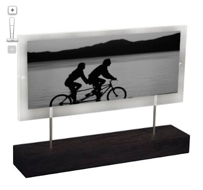
It fits a 4 x 11 inch photo, which means that I will want to create blank photoshop document that measures 4 x 11.

Whether you're in Elements or Photoshop, all you have to do is create a new document (at 300 dpi) with those measurements:


b. do some cropping (if necessary)

Open the photos you want to use in your triptych:
If I want the three photos distributed evenly across my 4 x 11 inch canvas, they will each need to be 4 inches high and 3.67 (or better yet, 3.6666666) inches wide—definitely NOT a standard size.

So we crop...

Select the crop tool (c) and enter the proper width, height, and resolution in the toolbar at the top. You can now crop each photo (click and drag, then hit return when you like what you see) in preparation for your penultimate step!


c. (the embarrassingly easy step): Put the photos onto the digital canvas.
Your one obstacle to moving the photos to your blank canvas is that annoying little lock on your background layer:
To get rid of it, double click on the thumbnail-sized photo in the layers palette. This will bring up a dialog box:
Don't even worry about renaming it. Just click "OK" and now you are free from the shackles of the insidious lock.

Now you can use the move tool (v) to drag each photo onto the canvas. With the move tool selected, just click on the photo you want to move and drag it onto your triptych canvas.

Repeat with your other photos, dragging each into position with the move tool. Each photo you drag will be on its own layer. To change the order of the photos, make sure the proper layer is active.

Now you have a triptych on your canvas!


You could flatten and save your new triptych right now OR you could keep those layers (i.e. don't flatten yet) and add a nice border.

Part 4: Add a border
This step is optional, but I usually prefer at least a small border. There are several ways to do this, but I will use the "stroke"—a word which here means "border" and should in no way make those of you who are old enough to remember Billy Squire burst into song. Some things are best left to drunken karaoke.

Option 1: the stroke
This works differently in Elements and in Photoshop, so I will show you the Elements way first and then note this Photoshop differences at the end:

ELEMENTS

Select the photo to which you want to add a border. Then, in the top menu, choose Edit-->Stroke:
You will then see a dialog box like this:

You can now choose:
a width for your outline (I used 10 pixels in this case),
a color (click on the box and bring up a color picker. If you drag outside of the box you will see an eyedropper tool that lets you sample a color from your image. I sample his shirt, for example.),
a location (center, which means that half the line is inside and half is outside the photo.), and
opacity (100% for solid; less for a more subtle look)

BUT WAIT! There's a catch. If you apply a stroke to the center of each photo, the lines in the middle are perfect, but everywhere else you are losing half of your stroke off the edge of the canvas (i.e. you are only getting the half on the inside):

Luckily, there's an easy fix. Select your three picture layers (you can leave the background layer alone) and then click the little arrows at the top right of your layers palette to get this menu:
Select merge layers. Now you can add a stroke all around your image (remember to select "inside" from the stroke dialog box), and everything will be perfect (Although my example is admittedly thin and hard to see on screen here).


PHOTOSHOP users:
Same principles as above, except you will be doing the strokes as layer styles.
Double click on the thumbnail photo in a layer to bring up the layer style box:

Make sure that "stroke" is both checked and selected (i.e. highlighted). You can then set the width, position, and color of your stroke. Just so you can see the results better, I chose 25 pixels, center, and red.

Click OK, and then either repeat the process, or copy and paste the layer style by right-clicking in the layer.

When finished, you will merge the three layers and repeat the stroke—but on the inside—for an evenly framed triptych.


Variations
You can use the same principles for any photo that needs a border and for any kind of collage. Don't feel like you have to make the photos the same size. Experiment with proportion and with horizontal and vertical layout.

Try it out, and when you do, share your results by linking back in the comments section of the Monthly Special.

Saturday, August 1, 2009

August Monthly Special: Triptych Montage

July went by too quickly and I never had a chance to do more than half of what I had planned. But it's time to move on...

This month I am blending the project-oriented mode of my very first monthly special with the theme-oriented mode of some recent months. My ideal monthly special is something that is simple enough for any beginner but that has enough artistic potential to inspire the experienced photo bloggers out there. My attempt at achieving that ideal this month is to explore the possibilities of triptych photo montage.

The triptych as an art form is rooted in early Christianity. Triptych altarpieces have stood in Catholic cathedrals since the Middle Ages. My personal favorite is the famous Isenheim Altarpiece which dates to the early 16th century and really has to be seen in person to be fully appreciated. I once took a group of students on a seemingly endless bus ride from Paris to Colmar just because Rick Steves said it was worth the trip. Lucky for me and my students, Steves was right.

But let's leave the religious history to an interview I hope to do with a certain expert medievalist whose office is next to mine.

How might we use triptychs in photography? In it's broadest definition, all we have to do is put three photos together side-by-side and voilà! you've got yourself a triptych. You have probably seen wedding announcements or greeting cards that do this. If you don't know how to do this in Photoshop or Elements, a tutorial is on the way. So you have no excuse. Start thinking of how you will adapt the time-honored art form for your project.

It's a fun way to showcase kids...
If you have one child, you can do a couple of "fragmentary portraits" and have them flank a more traditional portrait in the middle. If you have two, you could put a photo of the two together in the middle and one of each child on the sides.

A triptych can tell a beautiful story...


or a not-so-happy story...

Wedding layouts use them all the time. The montage of the happy couple seen in the second triptych uses the layout often seen in altarpieces: a larger center image flanked by two smaller ones that could theoretically fold in like panels to cover the middle. The third triptych is more of a storyboard format. (Incidentally, the scene was real. It happened at the periphery of a fashion shoot in Paris and caught everyone's attention.) A triptych can tell a story sequentially, or through more poetic and less evident associations between images.

I'm sure you can think of some more ideas. But if you need more inspiration, it's on its way. I will try to post more often this month. Meanwhile, for more reading, check out this excellent post on triptychs from Japanorama that I stumbled upon late last night.