Friday, December 7, 2012

Blue Paris

Blue Paris, Marc Olivier

Texture, texture, and more texture.
I put enough layers of texture over this that it began to remind me of those metallic Kleenex boxes with abstract patterns on them from the 1970s.
Anyway, I'm doing all kinds of crazy stuff about texture in my other life as an academic right now which is distracting me from photography. I'll try to merge some of it into my blog soon.

Tuesday, December 4, 2012

Sotheby's catalogue app


Until tonight I had no idea that Sotheby's had an app (turns out they have several). Since I am not in the income bracket to bid on art auctions as a hobby (unless you want to count ebay), I had never sought out Sotheby's. Herbert Bayer's "Lonely Metropolitan" 1932 (the eye/hand collage pictured above) is expected to sell for somewhere between $300,000-$500,000. It's part of an amazing photography collection by Henry Buhl grouped around the theme of hands. It's a drool-worthy collection that includes photography by Walker Evans, Robert Doisneau, Man Ray, Edward Steichen, Alfred Stieglitz, Robert Frank, Irving Penn, John Baldessari, Richard Avedon, Helmut Newton, William Eggleston etc. etc. It would be difficult to overstate how amazing this collection is. And how to I know? Because I just downloaded the free app and looked at the free catalogue in all its glory on my iPad. After registering, submitting a pedigree demonstrating noble lineage (kidding), you can access  and download free catalogues such as "A Show of Hands," which is like getting free photo/art books. Most of the photos allowing zooming, and there are even short videos about some key pieces. I'm an instant fan and am thrilled that Sotheby's is willing to share this work with lowly Plebs who will not be getting a $600,000-$800,000 Jeff Wall photo in their stocking this Christmas.


update: If you want to see some of the collection in book form, your best bet is to get Speaking With Hands —a catalogue from the 2004 Guggenheim show of Buhl's collection. I snatched up a "very good" used hardcover about two minutes ago for around $20.

Thursday, November 29, 2012

Your 2013 Calendar: Michael Kenna


I'm not into calendars other than the one on my phone, but I'm coveting the 2013 Michael Kenna calendar because 1. I love Michael Kenna's photography and 2. it's all France this year.

Nazraeli Press puts out a new Kenna calendar every year and they are very popular (and collectible—2010 calendar for $100-$400!). It's kind of like the Maxfield Parrish calendars of yore—crowd-pleasing and enduring in appeal.

Something for the holiday wish list.


Thursday, November 8, 2012

Faking It: Manipulated Photography Before Photoshop

Wanda Wulz, Italian, 1903-1984, Gelatine silver print, 1932

If you use Photoshop or Instagram or manipulate images in any way, then Faking It is a must-have. Faking It is a 280 page hardbound catalog to accompany an exhibition at the Met that runs through the end of January. The first major exhibition to deal with manipulated photography before the digital age, Faking It gives some much needed historical grounding to practices that many people seem to think were invented by Adobe. To quote the last lines of the well researched catalog:
The tradition of photographic manipulation that began in the 1840s is bound to continue far into the future. Let us follow it armed with a truer picture of photography's past. (203)
One of the things I love most about the book is that it leaves you well armed with historical knowledge. This is no lazy quick "scholarly essay" intro followed by a bunch of images with captions. Mia Fineman's work represents an important resource with seven chapters that develop the theme of photo manipulation in a variety of manifestations including pictorialism, politics, spirit photography, vernacular novelty photography, journalism, surrealism, and the move toward Photoshop. Having once spent six years working as a guest curator, I have come to respect the delicate balancing act of museum curators and educators who must produce works of scholarly integrity that can also appeal to groups of school children. 

Good exhibition catalogs tend to shy away from academic jargon (thank heavens!) as well as from controversial academic debates (a "safe" choice). In the spectrum from pure description to theory-heavy analysis, museum catalogs tend to adopt a conservative stance. I didn't come away from reading the catalog with a strong sense of a central thesis. Instead, I enjoyed a content-rich experience that makes me want to revisit the material and see where it leads my own research. There were so many interesting moments/facts/quotes that I have vowed to go back and reread the whole thing, next time taking notes.

Why should you buy it? Context.You probably already have strong opinion about Instagram and Photoshop, but "armed with a truer picture of photography's past" you will be able to think about and discuss debates on photography with more nuance. Context always results in better thinking, and I believe, in better art.


To use a literary example, we can look at 19th-century French romanticism and find themes of unattainable love, a troubled relationship with time and the past, and a highly subjective relation to nature. If you know the context of the French political climate of the  time, you can appreciate how those themes relate to the loss of "old regime" beliefs in transcendent systems of government and religion, etc.  If you strip romantic themes from their historical context instead of Les Misérables you end up with Twilight. In photography, more context could improve/add depth not just to your understanding of photography, but also to your own aesthetic decisions.


I can't imagine that a person could read Faking It and not be inspired. Even if you're not a big collector of photo books, I highly recommend that you buy this one.

Friday, November 2, 2012

Hi-res textures vs. not-so-high-res free textures

Free Photoshop textures are everywhere, so why bother buying any? And why on earth did I decide to start selling some?

Here's my story of a quest for good textures and how it led me to open up shop...

The Problem
We'll blame it on Instagram. Some of my latest commercial art projects called for that Instagram grunged up look (or rather, my version of it done in Photoshop). I had brushes, but I needed some film textures to help out. I looked up some of the lists of free Photoshop textures, many of them touting "hi-res" large files. Well, it turns out that what they call "hi-res" might have seemed so circa 1999. I mean, is 1500 px hi-res? I think not. That's great if you're doing web design work, but I need files that will work for print. If you only post photos on Facebook, then there's no need to ever buy textures, but what if you do portraits and a client wants a textured photo to blow up for their walls? 1500 px gets you a whopping 5 inches at 300 dpi. Yes, you could resize and pray for the best, but there are limits.

So, maybe my Google search skills are limited and I have missed the great treasure trove of truly hi-res textures (let's say, somewhere in the range of 5000 px). If so, feel free to add a link in a comment. But for my purposes (namely, to find film-related textures), I only found one good source: 11 grungy film textures at Lost & Taken. They're more in the 3000-range, but that's workable enough. But I needed more. Next stop: iStock. I found one that I quite liked (that's one, mind you, ONE, not an entire pack of textures) for a mere $42 (in the 4132 x 3960 px size). Tempting, but I'd rather buy four albums on iTunes.

The Good Sources
Finally, I found a great source: the French Kiss Collections. I bought the Glorious Grunge texture pack for $35. I have been very happy with them and I will definitely buy more from them in the future even though I am also making my own.

Honestly, I only found one other decent source: Flypaper textures. They have a Classic Grunge pack for $35, but it wasn't based on film like the French Kiss collection, so I didn't get it (not that I wouldn't in the future). Their Antique Edges pack ($40) is closer to what I would want, but ideally, I would love to just buy individual files rather than a whole pack. Both French Kiss and Flypaper also offer gorgeous painterly textures that set my mind racing with creative ideas.

The Take-Out Photo Toolbox
All of this go me thinking...Hey! I just bought a huge box full of old photos, negatives, and who knows what else at my favorite Paris flea market (it's Vanves, by the way) last summer and I haven't even had time to look through any of it! 

old paper with scratches and (fingerprints?)


Since it was Friday, I thought I may as well do something fun and start to sort through the goods. I didn't discover the next Vivian Maier or anything, but there are some pretty amazing photos and enough negatives to keep me busy for years. When I bought the lot, the vendor threw in a bunch of old photo paper and other things I didn't think I needed (such as a bottle of developing fluid that's about 80 years old). The paper is unusable, but turns out to be great for borders/textures/backgrounds.  Some of them have a crazy painterly look like this:


My current favorite is the creepy-cool grunge look of this ghostly family snapshot faded beyond recognition (hint: it really should be landscape orientation):


I decided that since I'm in the year of shameless commercialism (which you know if you follow my blog), I may as well start offering some of my own for sale. In fact, I decided that I would sell individual downloads (so you don't have to buy packs) for dirt cheap. What's "dirt cheap"? Well, for the smallest size (but honestly, why bother?) it's 50 cents. The massive 4800 px wide (and 6000-something tall) is $2 for personal use or $5 for commercial use (You can read the commercial license on the site, but in short, it's basically that you can't just resell them as is or in slightly altered versions. You need to actually make your own art of which my files are but a part. No credit to me needed).

So much more to come....
Gradually, the Take-Out Toolbox of goodies for photographers and designers will include other useful goods—many of them from things I've purchased in Paris flea markets over the years. If you buy any and create something with them, let me know and perhaps we can showcase it here. I'll do some projects of my own in future posts.

Take-Out Photo texture toolbox

An extremely quick texture project with two textures from the Take-Out Photo toolbox


This isn't a full-on tutorial, but I wanted to show you how quick and easy it is to play with texture.
I opened a photo...


I converted it to black and white...


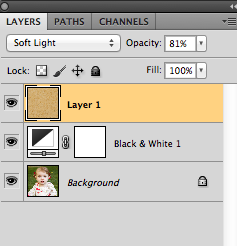
I took one of my new textures from the Take-Out Toolbox and pasted it in a new layer on top of the photo, with the blending mode set to soft-light (I lowered to opacity just because I felt like it).


I decided that I liked the sepia that was created by the overlay...


but for reasons I won't get into in detail right now, I decided to sample the color, create a new layer, and use that layer as a soft light overlay to get the effect. This left me free to desaturate the texture layer and then brush it out on a section of the skin without changing the color. In my layers palette, you can see what I ended up with:

 Below, you can see (in red) the area that I masked out on the texture layer (the middle layer in the screen shot above).

Then, I decided to add one more layer of texture, make some adjustments on it, and mask out some of it. You can get an idea of what I did from this screenshot of my final layers palette:


This is the first texture layer that I added. It comes from the paper used to separate pictures in a pack of photos circa 1920 that I bought at my favorite Paris flea market.


The second layer of texture also comes from the flea market, but it is from an actual sheet of film that was never exposed, except by light leaks over time.


I'm selling those an others (many more to be added soon) on my new Take-Out Toolbox gallery. You buy them for personal or commercial use (see details on the site) for a really great deal. Check them out.

You'll get the full story behind the new Take-Out Toolbox in my next post.

update: So, I got home, looked at the post on a smaller screen, and realized that it's hard to see the texture. Here's a more detailed screenshot to better show you:


Looking at the background, you'd never know that I just took the photo in their backyard. Here'a another detail screenshot:


Tuesday, October 23, 2012

Textures and masks in Photoshop

I've been doing some textures work that I might talk about in a future post. I could do a tutorial, but instead, I'll point you in the direction of a really great tutorial written by Joshua Johnson found on Design Shack. Check it out.


Wednesday, October 17, 2012

Youtube video on creating "Early Bird" Instagram effect

I always like watching how other people use Photoshop because there are so many different ways to achieve the same effect. In this tutorial, for example, I might have used curves more, not that it matters. If you decide to replicate the results, I highly recommend creating an action so you don't have to go through all those steps the next time you want to create the effect.

Monday, October 15, 2012

Friday, October 12, 2012

Triangular Desire: A Portrait Posing Tip

In 2009, I did a "Composition 101" post that used album covers to demonstrate how strong diagonal lines impact photos. Today, I want to show how every hipster's favorite shape—the triangle—can create stunning portraits.  Look for the triangles in the gorgeous portraits below for inspiration on your next shoot:

Rodney Smith


Maria Callas (c) Cecil Beaton, 1957


Reese Witherspoon. Photography by Michael Thompson


Jeanloup Sieff


Ida Wyman, Girl with Curlers, 1949


“Butterfly Boy” (1949) by Jerome Liebling.


(I'm not sure who did this portrait of Bowie)


August Sander


Loretta Lux
Source: google.com via Marc on Pinterest


Alberto Giacometti (by Irving Penn)Source: google.com via Marc on Pinterest

Wednesday, October 10, 2012

5 useful photo tutorials

I haven't felt too inspired to post since I've been busy working on other projects, so I'm going to share 5 of my favorite tutorials from Pinterest, in no particular order (NOTE: Clicking once gets you to the pin on my pinboard, from there, click again to see the actual tutorial):

1. Improve focus in photography by enabling Autofocus Point Display. Get instant feedback on where your camera focused. Sometimes it can be annoying to have a little red dot on screen indicating where you focused, but it can also be extremely helpful. Check out the tutorial by clicking through the link.


2. Back button focus. I actually have three of these tutorials pinned on my tutorials board, but this one is a great place to start.


3. Straighten and crop in Photoshop CS5. Did you know you that you can straighten and crop in a single click? This tutorial shows you the more traditional way (the way I've always done it) and then a little trick to speed things up.


4. Selective sharpening in Photoshop. This Youtube video shows you how to use the selective sharpening tool. Sometimes when a tool sucks in an earlier version of Photoshop (like dodge and burn once did), we just never use it. Here is a case where in CS5 things got better.


Source: youtube.com via Marc on Pinterest


5. This is actually five in one, but I was particularly interested in the fifth of the "non-destructive photoshop techniques" in this tutorial. Check it out and see.


Wednesday, September 19, 2012

Dictionary Print Photoshop Tutorial

As promised, I'm going to show you how to make cool-looking overprinted dictionary (or other text) pages in Photoshop. This eliminates the need to try to feed dictionary pages into your finicky printer. Plus, it means you can use your favorite pages over and over.

You can see some of my own prints in various stores and online (art.com has a good selection). At first, I was hesitant to do the tutorial, even though a lot of people who know Photoshop probably already know how to do it. I wondered if it would hurt retail sales of my own prints, for example. But finally, I concluded that the DIY audience and the print-buying audience are probably two distinct groups. And of course, there's the fact that the print-buying audience is paying for my work, not for a tutorial. So here we go:

Step 1. Find a photo you want to use, and convert it to black and white. I highly suggest that you do something high contrast, with some white space to avoid a muddy final product. Now is not the time to get all Ansel Adams about things. Go ahead and blow out the highlights and destroy those details in the shadows. It's OK.

Step 2. Find a page of text that you want to use. When I first did these for my home with a printer and actual pages, I used pages from an old dictionary. Then, I dug up some art magazines (circa 1899) I bought years ago at a Paris flea market and started using those.
Once you have chosen your page, scan it at a fairly high resolution. Because I make 27x27" prints, my files end up being huge. If your page is roughly the same size as the print you want to make, you can scan it at 300dpi. If it's smaller, go higher.

Step 3. Open both digital files in Photoshop. You might want to crop your photo to the size you want before you add the text. Then, you are going copy and paste one of your files onto the other. I usually copy the page (select all and then copy) and then paste it over my photo. It will appear as a new layer that completely covers your photo.

 If your file is too large (like mine was), then you can use the transform tool (command-T for Mac users), find a corner (see those lines in the gray area? that's where the little boxes are), hold shift (to make sure you don't skew the perspective) and drag until you get a size that works. Then hit return to apply the transformation.


Step 4. Last step. Already. Make sure that your top layer is active. Now, look in your layers palette and change the blend mode (see where it says "Normal"?) to "multiply."

And magically, you can now see your black and white photo as if it were printed on top of the page.

And that, my friends, is one of the fastest tutorials ever.

UPDATE: And of course, if you want to buy some of the ones I've done in virtually any size print, you can get them at my site for very reasonable prices.

Sunday, September 9, 2012

An Art Print and Licensing Story

A few posts ago I mentioned the dilemma of how much commercial stuff to share. But then I also said that my impulse tends toward disclosure, so I'm going to give you a true story of a commercial endeavor and in my next post, a tutorial.

And now, the true story of the commercial endeavor.

Remember this post?


No? Well, it's been repinned a billion times on Pinterest. The summer of 2011 my wife and I bought an old window frame and I knew that I wanted to use it for photos. It just so happened that a massive old dictionary I have had pages that fit nicely. I printed some black and white Paris photos directly onto select pages, tacked them onto the wall with old upholstery pins, and hung the window frame on top. I posted a tutorial on it, which subsequently got pinned an re-pinned on Pinterest.

From my wall to the mass market
Obviously, I liked them enough to put them in my own house, so I decided I might as well try out their commercial appeal. I am under exclusive contract with Wild Apple Graphics for all things mass-market, so I sent a link of the blog post to the art director along with some sample images. And I figured it couldn't hurt to mention that it was "trending on Pinterest."

The submissions process is somewhat mysterious. From my end, it goes like this: I make some art, I send it (usually via email), they get back to me (mostly) and tell me if they think it fits their needs (I'm sure they know the market better than I do. It is their job, after all.) Next, I prep the files in the appropriate size (often, this has been either 27x27 inch for the square ones and 16x20 for portrait) and then upload them via ftp.

On their end...who knows? Do they print them out and throw them in the air and read them like tea leaves? Do they meet in a boardroom and decide what they like? Does the owner's pet llama have any influence? I couldn't tell you. I know that they work (selling wholesale) with hundreds of clients and go to various trade shows. I know that they run things by some clients to test the waters. Some of the photos they have me upload are never seen again (such as some book prints that I love), and others make it into the catalog. More on that mystery in the future...
A file I once submitted that apparently failed to impress. Source: takeoutphoto.blogspot.com via Marc on Pinterest

Finally, after a few months, a royalty check arrives with an itemized statement that shows me how many of which prints have sold (but it doesn't say which companies have purchased them, for whatever reason). Art licensing royalty rates are not high, but I have no complaints because I realize how many people (and possibly, llamas) are involved in the marketing, printing, and distribution of my photos. In January, for example, about 11,000 of my prints sold. If I thought there were any way I could sell that many prints by myself, I probably would, but that is hard to pull off as one person. Even when my ABC Paris photos were featured on Design*Sponge (which, incidentally, is what got me the contract in the first place), the sales from all of that publicity were relatively modest.

A Paris dog print that has done well.


From printer to digital files
Back to the dictionary print story...I shipped a bunch of actual prints on dictionary paper (and others on paper from old art magazines (circa 1899) that I bought at a Paris flea market years ago. The printing was a nightmare. The printer heads often hit against the edges of the old paper (the dreaded "head strike" that made the manager of the print lab cringe) and I lost of few of my favorite pages to misfeeds, margin errors, etc. One day, I sent my assistant to run off some prints and half of them came back upside-down (not his fault). The ones that worked were shipped off to Wild Apple, where the best of those were digitized. I don't have the files on hand, but you can see an example here.

Source: art.com via Marc on Pinterest

That was the hard way. Once I started to prepare new files, I did it digitally, as in the "Paris" typographic photo above. This was so much easier to do. If you are pretty good with Photoshop, you can easily figure out how I did it. If you're wondering how to save yourself from the headache of misfeeds and other printing nightmares, stay tuned. In my next post, I'll show you how it's done.

If you want to see more, you can check out some of my prints at art.com.

Wednesday, September 5, 2012

5 Smugmug Pro Alternatives

I recently renewed my Smugmug account, so I've got months to think about whether it's worth it to jump ship. Here are five alternatives to Smugmug that are popping up in discussions among the disgruntled:

1. Zenfolio

Advantages: A "Premium Account" is only $120/yr. That includes way better templates than Smugmug, unlimited storage, reasonable lab fees (12% for partner labs as compared to 15% on Smugmug), and most of the features a pro would need. See their pricing for details.
Disadvantages: You only get access to the pro labs with the "Premium Business" plan, which at $250/yr, is comparable to Smugmug. Some say the customization is more limited, but from what I see the templates would be sufficient for me.

2. Photoshelter
Advantages: Nice templates, SEO and marketing tools built in, a large network of labs for worldwide print sales, takes RAW, PSD, and all the other file formats you could want, and many other features you can see on their site tour.
Disadvantages: Price. A Pro account is $549.99/yr. It's just the kind of thing that makes Smugmug's price increase seem reasonable.

3. Photoswarm
Advantages: Unlimited photos, customization, your own domain name, commission-free Paypal sales. $99/yr for Pro account
Disadvantages: Frankly, I find their site confusing and their sample galleries uninspiring. Compared to the sites above, it seems to be lacking in features.

4. Exposure Manager
Advantages: Unlimited storage/uploads, packages, automated email campaigns, only 10% commission fee (compared to 15% on Smugmug), pro lab or self-fulfillment, etc. See more features on their site.
Disadvantages: Premium account is $25/month, customization is apparently limited to simple changes like headers/footers, colors.

5. Pictage
Advantages: Full spectrum of service, from scheduling and contracts to print fulfillment. Album design service, packaging, and many others you can see by scrolling down on their plans page.
Disadvantages: Price. The cheapest plan is $29/month. The Pro plan is $99/mo.

Disclaimer: I haven't used any of the above. However, these are alternatives that I see mentioned in discussions on forums, facebook, etc. All of the above offer sales and galleries. I have chosen to ignore standard website options or photo sharing sites (such as Flickr), because I am interested in exploring comparable alternatives to the Pro Smugmug plan.

My conclusion:
As much as I hope the Smugug caves to the pressure and cuts the price hike, the proposed price point does not seem unreasonable compared to what I've found elsewhere. The plan I would most likely choose would be the Zenfolio "Premium Business" plan.

Please add to the list in the comments if you have other suggestions. If you've used any of the above sites, what was your impression?