Showing posts with label Photoshop. Show all posts

Friday, December 7, 2012

Blue Paris

Blue Paris, Marc Olivier

Texture, texture, and more texture.
I put enough layers of texture over this that it began to remind me of those metallic Kleenex boxes with abstract patterns on them from the 1970s.
Anyway, I'm doing all kinds of crazy stuff about texture in my other life as an academic right now which is distracting me from photography. I'll try to merge some of it into my blog soon.

Thursday, November 8, 2012

Faking It: Manipulated Photography Before Photoshop

Wanda Wulz, Italian, 1903-1984, Gelatine silver print, 1932

If you use Photoshop or Instagram or manipulate images in any way, then Faking It is a must-have. Faking It is a 280 page hardbound catalog to accompany an exhibition at the Met that runs through the end of January. The first major exhibition to deal with manipulated photography before the digital age, Faking It gives some much needed historical grounding to practices that many people seem to think were invented by Adobe. To quote the last lines of the well researched catalog:
The tradition of photographic manipulation that began in the 1840s is bound to continue far into the future. Let us follow it armed with a truer picture of photography's past. (203)
One of the things I love most about the book is that it leaves you well armed with historical knowledge. This is no lazy quick "scholarly essay" intro followed by a bunch of images with captions. Mia Fineman's work represents an important resource with seven chapters that develop the theme of photo manipulation in a variety of manifestations including pictorialism, politics, spirit photography, vernacular novelty photography, journalism, surrealism, and the move toward Photoshop. Having once spent six years working as a guest curator, I have come to respect the delicate balancing act of museum curators and educators who must produce works of scholarly integrity that can also appeal to groups of school children. 

Good exhibition catalogs tend to shy away from academic jargon (thank heavens!) as well as from controversial academic debates (a "safe" choice). In the spectrum from pure description to theory-heavy analysis, museum catalogs tend to adopt a conservative stance. I didn't come away from reading the catalog with a strong sense of a central thesis. Instead, I enjoyed a content-rich experience that makes me want to revisit the material and see where it leads my own research. There were so many interesting moments/facts/quotes that I have vowed to go back and reread the whole thing, next time taking notes.

Why should you buy it? Context.You probably already have strong opinion about Instagram and Photoshop, but "armed with a truer picture of photography's past" you will be able to think about and discuss debates on photography with more nuance. Context always results in better thinking, and I believe, in better art.


To use a literary example, we can look at 19th-century French romanticism and find themes of unattainable love, a troubled relationship with time and the past, and a highly subjective relation to nature. If you know the context of the French political climate of the  time, you can appreciate how those themes relate to the loss of "old regime" beliefs in transcendent systems of government and religion, etc.  If you strip romantic themes from their historical context instead of Les MisĂ©rables you end up with Twilight. In photography, more context could improve/add depth not just to your understanding of photography, but also to your own aesthetic decisions.


I can't imagine that a person could read Faking It and not be inspired. Even if you're not a big collector of photo books, I highly recommend that you buy this one.

Friday, November 2, 2012

Hi-res textures vs. not-so-high-res free textures

Free Photoshop textures are everywhere, so why bother buying any? And why on earth did I decide to start selling some?

Here's my story of a quest for good textures and how it led me to open up shop...

The Problem
We'll blame it on Instagram. Some of my latest commercial art projects called for that Instagram grunged up look (or rather, my version of it done in Photoshop). I had brushes, but I needed some film textures to help out. I looked up some of the lists of free Photoshop textures, many of them touting "hi-res" large files. Well, it turns out that what they call "hi-res" might have seemed so circa 1999. I mean, is 1500 px hi-res? I think not. That's great if you're doing web design work, but I need files that will work for print. If you only post photos on Facebook, then there's no need to ever buy textures, but what if you do portraits and a client wants a textured photo to blow up for their walls? 1500 px gets you a whopping 5 inches at 300 dpi. Yes, you could resize and pray for the best, but there are limits.

So, maybe my Google search skills are limited and I have missed the great treasure trove of truly hi-res textures (let's say, somewhere in the range of 5000 px). If so, feel free to add a link in a comment. But for my purposes (namely, to find film-related textures), I only found one good source: 11 grungy film textures at Lost & Taken. They're more in the 3000-range, but that's workable enough. But I needed more. Next stop: iStock. I found one that I quite liked (that's one, mind you, ONE, not an entire pack of textures) for a mere $42 (in the 4132 x 3960 px size). Tempting, but I'd rather buy four albums on iTunes.

The Good Sources
Finally, I found a great source: the French Kiss Collections. I bought the Glorious Grunge texture pack for $35. I have been very happy with them and I will definitely buy more from them in the future even though I am also making my own.

Honestly, I only found one other decent source: Flypaper textures. They have a Classic Grunge pack for $35, but it wasn't based on film like the French Kiss collection, so I didn't get it (not that I wouldn't in the future). Their Antique Edges pack ($40) is closer to what I would want, but ideally, I would love to just buy individual files rather than a whole pack. Both French Kiss and Flypaper also offer gorgeous painterly textures that set my mind racing with creative ideas.

The Take-Out Photo Toolbox
All of this go me thinking...Hey! I just bought a huge box full of old photos, negatives, and who knows what else at my favorite Paris flea market (it's Vanves, by the way) last summer and I haven't even had time to look through any of it! 

old paper with scratches and (fingerprints?)


Since it was Friday, I thought I may as well do something fun and start to sort through the goods. I didn't discover the next Vivian Maier or anything, but there are some pretty amazing photos and enough negatives to keep me busy for years. When I bought the lot, the vendor threw in a bunch of old photo paper and other things I didn't think I needed (such as a bottle of developing fluid that's about 80 years old). The paper is unusable, but turns out to be great for borders/textures/backgrounds.  Some of them have a crazy painterly look like this:


My current favorite is the creepy-cool grunge look of this ghostly family snapshot faded beyond recognition (hint: it really should be landscape orientation):


I decided that since I'm in the year of shameless commercialism (which you know if you follow my blog), I may as well start offering some of my own for sale. In fact, I decided that I would sell individual downloads (so you don't have to buy packs) for dirt cheap. What's "dirt cheap"? Well, for the smallest size (but honestly, why bother?) it's 50 cents. The massive 4800 px wide (and 6000-something tall) is $2 for personal use or $5 for commercial use (You can read the commercial license on the site, but in short, it's basically that you can't just resell them as is or in slightly altered versions. You need to actually make your own art of which my files are but a part. No credit to me needed).

So much more to come....
Gradually, the Take-Out Toolbox of goodies for photographers and designers will include other useful goods—many of them from things I've purchased in Paris flea markets over the years. If you buy any and create something with them, let me know and perhaps we can showcase it here. I'll do some projects of my own in future posts.

Take-Out Photo texture toolbox

An extremely quick texture project with two textures from the Take-Out Photo toolbox


This isn't a full-on tutorial, but I wanted to show you how quick and easy it is to play with texture.
I opened a photo...


I converted it to black and white...


I took one of my new textures from the Take-Out Toolbox and pasted it in a new layer on top of the photo, with the blending mode set to soft-light (I lowered to opacity just because I felt like it).


I decided that I liked the sepia that was created by the overlay...


but for reasons I won't get into in detail right now, I decided to sample the color, create a new layer, and use that layer as a soft light overlay to get the effect. This left me free to desaturate the texture layer and then brush it out on a section of the skin without changing the color. In my layers palette, you can see what I ended up with:

 Below, you can see (in red) the area that I masked out on the texture layer (the middle layer in the screen shot above).

Then, I decided to add one more layer of texture, make some adjustments on it, and mask out some of it. You can get an idea of what I did from this screenshot of my final layers palette:


This is the first texture layer that I added. It comes from the paper used to separate pictures in a pack of photos circa 1920 that I bought at my favorite Paris flea market.


The second layer of texture also comes from the flea market, but it is from an actual sheet of film that was never exposed, except by light leaks over time.


I'm selling those an others (many more to be added soon) on my new Take-Out Toolbox gallery. You buy them for personal or commercial use (see details on the site) for a really great deal. Check them out.

You'll get the full story behind the new Take-Out Toolbox in my next post.

update: So, I got home, looked at the post on a smaller screen, and realized that it's hard to see the texture. Here's a more detailed screenshot to better show you:


Looking at the background, you'd never know that I just took the photo in their backyard. Here'a another detail screenshot:


Tuesday, October 23, 2012

Textures and masks in Photoshop

I've been doing some textures work that I might talk about in a future post. I could do a tutorial, but instead, I'll point you in the direction of a really great tutorial written by Joshua Johnson found on Design Shack. Check it out.


Wednesday, October 17, 2012

Youtube video on creating "Early Bird" Instagram effect

I always like watching how other people use Photoshop because there are so many different ways to achieve the same effect. In this tutorial, for example, I might have used curves more, not that it matters. If you decide to replicate the results, I highly recommend creating an action so you don't have to go through all those steps the next time you want to create the effect.

Wednesday, September 19, 2012

Dictionary Print Photoshop Tutorial

As promised, I'm going to show you how to make cool-looking overprinted dictionary (or other text) pages in Photoshop. This eliminates the need to try to feed dictionary pages into your finicky printer. Plus, it means you can use your favorite pages over and over.

You can see some of my own prints in various stores and online (art.com has a good selection). At first, I was hesitant to do the tutorial, even though a lot of people who know Photoshop probably already know how to do it. I wondered if it would hurt retail sales of my own prints, for example. But finally, I concluded that the DIY audience and the print-buying audience are probably two distinct groups. And of course, there's the fact that the print-buying audience is paying for my work, not for a tutorial. So here we go:

Step 1. Find a photo you want to use, and convert it to black and white. I highly suggest that you do something high contrast, with some white space to avoid a muddy final product. Now is not the time to get all Ansel Adams about things. Go ahead and blow out the highlights and destroy those details in the shadows. It's OK.

Step 2. Find a page of text that you want to use. When I first did these for my home with a printer and actual pages, I used pages from an old dictionary. Then, I dug up some art magazines (circa 1899) I bought years ago at a Paris flea market and started using those.
Once you have chosen your page, scan it at a fairly high resolution. Because I make 27x27" prints, my files end up being huge. If your page is roughly the same size as the print you want to make, you can scan it at 300dpi. If it's smaller, go higher.

Step 3. Open both digital files in Photoshop. You might want to crop your photo to the size you want before you add the text. Then, you are going copy and paste one of your files onto the other. I usually copy the page (select all and then copy) and then paste it over my photo. It will appear as a new layer that completely covers your photo.

 If your file is too large (like mine was), then you can use the transform tool (command-T for Mac users), find a corner (see those lines in the gray area? that's where the little boxes are), hold shift (to make sure you don't skew the perspective) and drag until you get a size that works. Then hit return to apply the transformation.


Step 4. Last step. Already. Make sure that your top layer is active. Now, look in your layers palette and change the blend mode (see where it says "Normal"?) to "multiply."

And magically, you can now see your black and white photo as if it were printed on top of the page.

And that, my friends, is one of the fastest tutorials ever.

UPDATE: And of course, if you want to buy some of the ones I've done in virtually any size print, you can get them at my site for very reasonable prices.

Wednesday, September 21, 2011

Basics of the Photoshop Text Toolbar/ Character window

This is not a tutorial that is going to throw around terms like "ligature" and "kerning" and "tracking" and so on. For those kind of typography basics you can read elsewhere. My purpose is simply to make you aware of the existence of the character window and to show you that working with type in Photoshop is not as complicated as you might think.

So for the sake of demonstration, I took this photo of my daughter's stuffed dog (who apparently can't rest without a sleeping mask)...

and then I took a random "sleep"-related quote (by William Blake, I think) to use as text. I have pretty ambivalent feelings about the result, but it does show that you can manipulate text in a lot of ways without even creating a bunch of different text layers.

There is a good chance that you don't have the handy little "character" window visible, so first you will need to make sure it is selected from the window menu:
Now you will see all kinds of options that will help you work with text. Here, I have highlighted just a few (I warned you about the lack of official terminology):
So we're ready to type something and play around with those settings. First, hit "T" to get the text tool. Then, click and drag (as opposed to just clicking) to create a text box that will help contain your text. Whenever your text box is active you can drag the handles to resize it.

The first thing I do is simply enter the text in a size you can read. Don't worry about formatting yet:

When you start adjusting words, remember that you are free to change individual words within the group without creating separate text layers for each word. Just highlight whatever word (or letter or group of words) you want to change, and then adjust the settings for your highlighted selection in the character window.


I decided to highlight "Think" and increase the font size.


(Note: You aren't stuck with 72 pt as your highest setting. You can type any number at all in the box)
Then I did the same for the other imperatives and also added a return at the end of each sentence.


At this point, I know I will want to make more changes (colors, fonts, etc.)  I know that the automatic spacing between those returns is not to my liking, so I can highlight those four lines (I could just as easily do two or three) and make adjustments. Make sure you highlight what you want to change first:


Now, instead of "auto," I can adjust the settings from the pull-down menu or type in whatever number I want:

Look what happens when I set it at 20 pt:


And here is what 72 pt looks like:


Type in various numbers and you quickly get a feel for the effect.

Not only can you adjust settings of individual letters and words, you can even select and adjust the spaces between words. You really just have to experiment, as I did below:
You can see that I highlighted individual words and changed their color by clicking in the color box in the character window. I also changed fonts and experimented the spacing between lines. You can see, for example, that the "Think/Act" lines and the "eat/sleep" lines are close together, but that I made more space between the two groups. All of these changes were made within a single text box, just by messing with the settings in the character window:

You can see in the layers shot above that I added a white layer as the background and then decreased the opacity of the photo layer to 35% so the image wouldn't compete too much with the text. Then, above that layer is the text, and finally, the curves layer was just an afterthought. Final result? meh. whatever. I'm not sure that quote even makes sense to me. Mine would be more like "Be groggy in the morning. Eat in the noon. Eat again in the evening. Stay up way too late writing blog posts at night."

There are all sorts of cringe-worthy errors that I'm sure you typographers are noticing (but seriously, if you're a typographer, why would you still be reading this?), but hopefully my little tutorial has helped demystify that character window.

Friday, July 22, 2011

Create that sun bleached look in Photoshop using nothing but curves

Before and after a quick sun bleaching with curves

First, a disclaimer: I actually like the "before" pic at least as much as the "after." But since the whole sun bleached style is so popular, I thought I'd show you how easy it is to do with nothing but curves in Photoshop. In a future tutorial, I'll show you how you can experiment with your own photo effects and make them into actions instead of paying for them.

step 1: It should go without saying, but I think it makes more sense to choose a photo that is actually outside and in the sun, preferably with some nice backlighting or some sun streaks or flares (I'm not a fan of adding fake flares, so I won't do it here).

step 2: open your photo and duplicate the layer. It's not absolutely necessary, but I like to use the duplicate layer for the "after" and keep the background for the "before" just so I can toggle the two on and off and maybe mess with the opacity of the "after" layer before I commit to flattening the final image.

step 3: add a curves adjustment layer
I'm going to end up doing 3 separate curves adjustment layers (the better to show my thought process. you can do it in fewer or more once you know what you want). On this first curves layer I am going to click to create a control point in the middle of the grid and pull it up and to the left in order to lighten the photo pretty dramatically:
It's lighter. It's pretty. But it's not really "sun bleached" yet.

step  4: add another curves adjustment layer, bleach and warm. You will probably have to make your photo layer (not the curves 1 layer) active before adding the curves layer 2, and then you will want to drag the curves layer 2 above curves layer 1. On this new curves layer, the adjustments are going to tweak the color by making it warmer and less contrasty. Instead of just moving the main (rgb) curve, you are going to do adjustments separately (note: this is still all done on your curves 2 layer. no need to create more and more curves layers) for "red" "green" and "blue" channels.  It's going to be like my "adjust tone and color" tutorial, but more extreme. Using the pull down menu (right above the curves grid where it says "rgb", select the blue layer. If you put a control point in the middle ("ish"--just experiment) and pull towards the lower right corner, you will make the color more yellow. 
You can see that I only yellowed it a little. I also took the control point in the lower left corner and dragged it straight up. You can get a really fantastic in-depth explanation of curves here, but to be brief, I'll just say that you are basically lowering the contrast as you pull that bottom corner control point up. Don't feel like you have to have one channel perfect before you move to the next. In fact, the best thing to do is to mess with each channel and go back and forth between the three channels experimenting with changes until you're happy. It's just like adding salt and pepper to soup, except you can actually take the salt back out if you use too much. Here's what I did to the red channel:
I pulled that lower left control point up higher than I did on the blue channel and that's it.
Then I did the green channel a bit:

C'est pas sorcier! as we say in French. "It's not witchcraft" (do we say that in English?) Just eyeball your photo to decide how much you want to change each channel. 

Guess what? You could stop right here and you've got a nice warm photo that's a big change from the "before." It's warm, light, and dreamy.
But why leave well enough alone? I decided that I would like to make the background even lighter, but I don't want to wash her out completely. So...

Step 5 I added a third curves layer (be sure to put it on top), lightened it the same way I did with my first curves layer, and then brushed out the adjustment selectively on the bride.

Once you have lightened it, just select your brush tool (b)
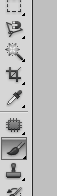
, look in the menu bar to adjust the softness and size (which you can also do with the [ and ] keys—clicking the right bracket makes it bigger, the left makes it smaller. doing the same thing with "shift" makes it harder or softer). I like to bring the softness down to "0" because I want really gradual, diffused effects here. 

Then I adjust the "opacity" setting (up in the top brush menu bar) WAY down (like 10% or so) so I can gradually paint the effect out. NOTE: make sure that black is selected as your foreground color.

If it's some funky color just hit "d" to make them black and white and use "x" to switch which color is in front. Now just paint the effect out to varying degrees as needed. I decided that I didn't want to over-lighten the hair, the lips, or too much of the face. (It's the same basic principle at work in my tutorial, "layer adjustment masks for the lazy, artsy slob").

step 6: Mess with opacity to fine tune your effect. Too much change on a given layer? Just dial down the opacity. When you like what you see, click the eyeball icon to turn off your background layer (this is assuming you copied your background layer way back in step 1) then select "merge visible" from the layer menu (the little triangle at the top of the layers palette brings up the menu). Now you have the "after" layer merged on top and the "before" on the bottom. If you love the "after" then flatten the things and be happy. If you don't, well, ask a friend if you're just being too picky.

bonus stuff:
Want to change things even more? Create a blank new layer, fill it with some sunny color using the paint bucket (double click the foreground box mentioned earlier to bring up the color picker and then just choose some peachy sunny color),  and then experiment with blending modes. Choose "soft light" or "overlay" from the pull down menu in the layers palette instead of "normal" and then lower the opacity of your overlay color until you have the king of tinted, washed out look you like.
 I did it, and then went "meh. don't need it."

Here's the lovely final image once again:
VoilĂ ! Easy, right?
