Showing posts with label August Monthly Special. Show all posts

Saturday, August 29, 2009

Saints and Sinners


Penance
My posts have been less frequent than ever this month, so I thought I'd do penance with a triptych called "saints and sinners." The width of the photo is such that I can't post it larger than this, but what you see is a scene from a Salt Lake City street. Let me break it down...

The "Temple City" motel sign caught my eye. The photo at right captures a sort of nostalgia for a very different Salt Lake City than the one that has clubs like the aptly named "Saints and Sinners" one right next door to the motel.


The photo at left better illustrates decay—both in the sign itself (because the close up shows the worn paint much better) and, more obviously, in the juxtaposition of the religious theme and the billboard for a peep show behind the sign.


The bouncers at the "Saint and Sinners" club (incidentally the "A private club for members" subtitle is rife with irony for those who know Utah Mormon culture) were wary of my photo taking. When that happens, I tend to go straight to the person rather than retreat. So I walked up to the bouncers and told them that I thought the best-named club in Utah. They laughed and that was that. My great regret was not getting the picture with the bouncers in front.

Projects
My triptych is not only my ironic penance for a lack of posts recently, it also represents one of the reasons: namely, that I am working on a project about Utah culture that I hope to complete within a year. The other main reason for my lack of posts is that my family and I are getting ready to spend three months in Paris. We leave next week and we still have loads to do before then. I will be teaching a photography class to study abroad students in Paris so I'm sure there will be fun things to share.

A lesson to be learned?
I have a strong attachment to Paris and have had practically no attachment whatsoever to Utah until recently. Working on a Utah-based photo project has helped me appreciate the state on its own terms. This is one of my favorite things about photography. Whenever I have a project, I am forced to pay attention to my surroundings and I come to appreciate them more.

My "Monthly Special" format makes me focus my attention on different things each month. Even when I'm less productive with posts, my in-between moments (like driving to work) are often occupied with thoughts of the month's theme.

And speaking of "Monthly Special" themes....this post is also a hint about next month's project. No, it's not religion (although that would be a good theme). Comments? A guess?

Friday, August 21, 2009

Interview with Medieval Scholar Jesse Hurlbut

I am pleased to interview Jesse Hurlbut today about triptychs. My interview with him will help give historical context to this month's theme. I am a firm believer in the cross-pollination of art forms. In other words, I think photographers can gain much by looking at other forms of representation.

Jesse has been teaching French Medieval culture for 20 years at the University of Kentucky and at BYU. He received his PhD from Indiana University. In addition to his scholarly pursuits, Jesse is a longtime photo enthusiast. He specializes in landscapes, and his sense of color has been influenced by the sunsets of the Arizona desert, where he was raised. Southern Utah and Southern France are his two current favorite places to take his camera. Lately, he has been energetically exploring the capabilities of the Foveon sensor in his Sigma SD14.


I have to admit that I don't know a lot about the history of triptychs, and I'm guessing that I'm not alone. I have seen some Medieval religious triptychs, but I would love to know how this art form emerged. Is it linked to Christian doctrine of the Trinity in some way?


Medieval triptychs belong to the tradition of adorning the sacred altars in churches starting in the twelfth century. More than just decoration, these altarpieces provided a visual metaphor for the sacred ritual performed in front of them. Altarpieces were typically made of stone, metal, ivory, tapestry, or painted wood panels, often covered with jewels or precious metals. Many altarpieces consist of a single panel depicting a scene from religious history, typically from the life of Christ. In the later middle ages, wealthy patrons commissioned artists to produce small altarpieces that could be folded on hinges, convenient for personal devotions and for transporting. Diptychs consist of two panels, that close like a book. Triptychs have three panels and usually have two ½-size wing panels that fold over a full-size central panel. Each panel would contain a different scene. Indeed, the theological premise of the Trinity (three in one) is nicely represented in the triptych since it contains three images in a single, unified piece of art.

Diptych of Jean de Cellier

By the fifteenth century, huge hinged altarpieces are permanently installed above or behind the altar and could include a dozen or more panels with multiple wings. Even with more panels and wings, these elaborate constructions (called polyptychs) were still usually organized around a tripartite composition. The wings were painted on front and back, although the most spectacular paintings were reserved for the inside panels. It is thought that, in some cases, the wings were opened to reveal the inside only on special feast days. Since portability was no longer an issue, we can imagine that the frame divided into three sections persisted as a convenient way to present and to compartmentalize different scenes.

Polyptych, 1478

Is there a set method for "reading" a triptych or does it vary greatly from one to the next?


While there is plenty of variation in what to look for from one altarpiece to another, there was a fairly unified method of interpretation that medieval scholars applied not only to religious art, but also to every aspect of daily life. Called exegesis, the technique originally derived from the interpretation of scripture and involved four stages:

1) The historical approach looks for the literal meaning of the thing being studied. For example, the story of Noah’s Ark is about a prophet who saves his family by building a boat.

2) The allegorical approach looks for connections between literal and divine history. Noah’s flood might be viewed as an allegory for Christ’s baptism.

3) The tropological approach studies the moral lesson to be learned from a story. In the example of Noah, one lesson might be that those who obey God as Noah did will be preserved by God.

4) The fourth level of interpretation is the most mystical, requiring deep spiritual contemplation. This anagogical approach leads the soul upward from the materiality of this existence to the immateriality of spiritual understanding.

A triptych can easily incorporate each of these four levels. If the central panel depicts a story from the life of Christ; one of the wing panels might show the allegorical connection of that story to an Old Testament event; the other wing panel might show the donors of the painting contemplating the moral lessons of the two other scenes. The person participating in a sacred ritual at the altar may fulfill the fourth level of interpretation by means of their personal spiritual experience.


The Mérode Altarpiece by Robert Campin (in the Cloisters Museum in New York) is a straightforward example of what I have just described. In the central panel, Angel Gabriel announces to Mary that she will be the mother of the Messiah. In the right panel, Joseph is making mousetraps in his workshop. Allegorically, this refers to the way Christ will ensnare the devil. In the left wing panel, we see the donors who commissioned the artwork peering at the two scenes through a door, as they contemplate the moral implications for themselves (tropological). It is interesting to note that through the windows of the central panel, we see only the sky, while in the two wing panels, we see the world at street level. This is a way of indicating the anagogical or spiritual significance of the central panel over the other two.


What influence do you think the triptych has had on other art forms?

One of the qualities of the triptych is that it juxtaposes images that share something in common, but the thing they have in common may not be apparent until they are placed side by side. Other art forms that exploit this same technique include cinema, where a director may create an association between two otherwise unrelated scenes by placing them one right after the other. This is called montage, and it has become such a strong convention that we often don’t even notice how different the scenes are, because our imagination is so well trained to fill in the gaps.


Another art form that exploits sequential images and the gaps between them are comics. We usually think of comics as telling a story in a chronological sequence that moves from one panel to the next, but the relationships between panels—typically separated by literal gaps—can express much more than progress through time. Scott McCloud, comic book artist and theorist, uses the term closure to talk about how our imagination fills in the spaces between panels. In his analytical comic book, Understanding Comics, he has proposed a short list of some of the possible connections between scenes.

(I’ll quote from an on-line summary, but the fully-illustrated version in his book is worth a look.)


1. Moment-to-moment

The same subject is displayed in adjacent instants, like a movie running jerkily on a slow computer. Very little closure is required.

2. Action-to-action

The focus remains on a single subject, but this time, two separate, consecutive actions are displayed (for example, the first panel might contain a car speeding along, the 2nd the car smashing into a tree).

3. Subject-to-subject

Both panels are within the same scene or idea, but each portrays a different subject. ("John: What more could go wrong? || Catherine: Well, at least Jerry never called! || Telephone: R-ring")

4. Scene-to-Scene

Just what it sounds like: great leaps in time or space. ("Detective: He can't outrun us forever. || Image of darkened house with caption: Ten years later...") Lots o' closure -- deductive reasoning, even -- is often required to link the panels into a single narrative.

5. Aspect to aspect

"Bypasses time for the most part and sets a wandering eye on different aspects of a place, mood, or idea."

6. Non-Sequitur

Panels with no logical relationship. (McCloud argues, though, that any panels placed side by side will inevitably generate the impression of some sort of relationship in the reader's mind. "--alchemy at work in the space between panels which can help us find meaning or resonance in even the most jarring of combinations."


Since we are trying to do photographic triptychs this month at Take-out Photo, I wonder if you could comment on what a photographer might glean from the tradition of triptychs. Any ideas or inspiration for my readers?


I think it’s most important to think about the relationship between the images you put together. What brings these pictures together? Is it shape, line, color, light, or texture? Is it some symbolic connection? Three siblings? Three fruits? Three animals? Perhaps the relationship is one of difference, as in an example of the three states of water: a river, an ice cube, and steam.


My second suggestion is related to the first, but has to do with order. Do you want your images to be read from left to right (as with a comic book) or do you want the outside photos to provide a symbolic frame for the center photo (as with a religious triptych)? What visual clues can you give your audience to make sure they correctly perceive the order?


Third, just as composition is important for individual photographs, the overall composition of the combined triptych is essential to consider. Will all three photos be the same size and shape? How does my eye travel from one image to the next? Symmetry is easy with three, but perhaps an overall asymmetrical composition fits your subject better.


To see more triptychs, search the online collection of the Web Gallery of Art.

Friday, August 7, 2009

How to create a triptych in Photoshop or Elements


Intro
Triptychs date back to the Middle Ages, but that doesn't mean that creating one should be a years-long quest.

I perused a few forums and here are some of the suggestions for making triptychs:
  • use a program that does collages for you (such as Picasa)
  • use an action (from some action site or other)
  • use the Photoshop picture package option
  • print your photos and physically cut and paste
Any of those suggestions will work, but I wouldn't choose them because:
  • I'm a control freak and I really like Photoshop.
  • Most actions aren't very flexible and I don't want to download, install, and try out a dozen just to find one that suits my needs (especially when triptychs are so easy to make).
  • "Picture packages" make me think of school pictures—and that's never good.
  • I don't like getting glue on my hands.
So why not learn a few basic Photoshop tricks that will help you with any type of photo collage? Don't answer that. Just a rhetorical question. Read on...

The tutorial
To make a triptych (or diptych or polyptych or...) you need only do a few things:
  1. Choose your photo(s).
  2. Choose the size of your triptych and of each section.
  3. Put the photos on one digital canvas.
  4. Add a border. Or don't. Whatever works for you.
I will leave step 1 and most of step 2 up to you. Step 3 is almost embarrassingly easy, and I will give you several ways to do step 4. Once you do this, you, too, can be a control freak who lazily shuns actions, mocks picture packages, and never touches a bottle of glue.

Part 1: Choose your photos
Hey! I said I wasn't going to do this part, but since we're on the subject, here are a few things to consider: Do you want one photo broken into three parts? Three separate photos? Do you want your photos to tell a story or to have a different connection? Do you want to use color, black and white, or a combination of the two? You decide.

Part 2: Choose the size of your triptych and the size of each section.
You can either decide in advance what size your finished triptych will be and then make the photos fit, or you can decide the ideal size of each part and then make the canvas fit. In either case, you will:

a. create a blank canvas,
b. probably do some cropping, and
c. drag photos onto the canvas.

a. create a blank canvas
I prefer to make the blank canvas first and then crop the photos to fit it. Why? Because I want my finished product to correspond to a certain print size (such as a panoramic frame).

Let's pretend I just bought this panoramic frame from Target (which I didn't because it's $69):
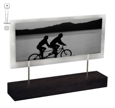
It fits a 4 x 11 inch photo, which means that I will want to create blank photoshop document that measures 4 x 11.

Whether you're in Elements or Photoshop, all you have to do is create a new document (at 300 dpi) with those measurements:


b. do some cropping (if necessary)

Open the photos you want to use in your triptych:
If I want the three photos distributed evenly across my 4 x 11 inch canvas, they will each need to be 4 inches high and 3.67 (or better yet, 3.6666666) inches wide—definitely NOT a standard size.

So we crop...

Select the crop tool (c) and enter the proper width, height, and resolution in the toolbar at the top. You can now crop each photo (click and drag, then hit return when you like what you see) in preparation for your penultimate step!


c. (the embarrassingly easy step): Put the photos onto the digital canvas.
Your one obstacle to moving the photos to your blank canvas is that annoying little lock on your background layer:
To get rid of it, double click on the thumbnail-sized photo in the layers palette. This will bring up a dialog box:
Don't even worry about renaming it. Just click "OK" and now you are free from the shackles of the insidious lock.

Now you can use the move tool (v) to drag each photo onto the canvas. With the move tool selected, just click on the photo you want to move and drag it onto your triptych canvas.

Repeat with your other photos, dragging each into position with the move tool. Each photo you drag will be on its own layer. To change the order of the photos, make sure the proper layer is active.

Now you have a triptych on your canvas!


You could flatten and save your new triptych right now OR you could keep those layers (i.e. don't flatten yet) and add a nice border.

Part 4: Add a border
This step is optional, but I usually prefer at least a small border. There are several ways to do this, but I will use the "stroke"—a word which here means "border" and should in no way make those of you who are old enough to remember Billy Squire burst into song. Some things are best left to drunken karaoke.

Option 1: the stroke
This works differently in Elements and in Photoshop, so I will show you the Elements way first and then note this Photoshop differences at the end:

ELEMENTS

Select the photo to which you want to add a border. Then, in the top menu, choose Edit-->Stroke:
You will then see a dialog box like this:

You can now choose:
a width for your outline (I used 10 pixels in this case),
a color (click on the box and bring up a color picker. If you drag outside of the box you will see an eyedropper tool that lets you sample a color from your image. I sample his shirt, for example.),
a location (center, which means that half the line is inside and half is outside the photo.), and
opacity (100% for solid; less for a more subtle look)

BUT WAIT! There's a catch. If you apply a stroke to the center of each photo, the lines in the middle are perfect, but everywhere else you are losing half of your stroke off the edge of the canvas (i.e. you are only getting the half on the inside):

Luckily, there's an easy fix. Select your three picture layers (you can leave the background layer alone) and then click the little arrows at the top right of your layers palette to get this menu:
Select merge layers. Now you can add a stroke all around your image (remember to select "inside" from the stroke dialog box), and everything will be perfect (Although my example is admittedly thin and hard to see on screen here).


PHOTOSHOP users:
Same principles as above, except you will be doing the strokes as layer styles.
Double click on the thumbnail photo in a layer to bring up the layer style box:

Make sure that "stroke" is both checked and selected (i.e. highlighted). You can then set the width, position, and color of your stroke. Just so you can see the results better, I chose 25 pixels, center, and red.

Click OK, and then either repeat the process, or copy and paste the layer style by right-clicking in the layer.

When finished, you will merge the three layers and repeat the stroke—but on the inside—for an evenly framed triptych.


Variations
You can use the same principles for any photo that needs a border and for any kind of collage. Don't feel like you have to make the photos the same size. Experiment with proportion and with horizontal and vertical layout.

Try it out, and when you do, share your results by linking back in the comments section of the Monthly Special.

Saturday, August 1, 2009

August Monthly Special: Triptych Montage

July went by too quickly and I never had a chance to do more than half of what I had planned. But it's time to move on...

This month I am blending the project-oriented mode of my very first monthly special with the theme-oriented mode of some recent months. My ideal monthly special is something that is simple enough for any beginner but that has enough artistic potential to inspire the experienced photo bloggers out there. My attempt at achieving that ideal this month is to explore the possibilities of triptych photo montage.

The triptych as an art form is rooted in early Christianity. Triptych altarpieces have stood in Catholic cathedrals since the Middle Ages. My personal favorite is the famous Isenheim Altarpiece which dates to the early 16th century and really has to be seen in person to be fully appreciated. I once took a group of students on a seemingly endless bus ride from Paris to Colmar just because Rick Steves said it was worth the trip. Lucky for me and my students, Steves was right.

But let's leave the religious history to an interview I hope to do with a certain expert medievalist whose office is next to mine.

How might we use triptychs in photography? In it's broadest definition, all we have to do is put three photos together side-by-side and voilà! you've got yourself a triptych. You have probably seen wedding announcements or greeting cards that do this. If you don't know how to do this in Photoshop or Elements, a tutorial is on the way. So you have no excuse. Start thinking of how you will adapt the time-honored art form for your project.

It's a fun way to showcase kids...
If you have one child, you can do a couple of "fragmentary portraits" and have them flank a more traditional portrait in the middle. If you have two, you could put a photo of the two together in the middle and one of each child on the sides.

A triptych can tell a beautiful story...


or a not-so-happy story...

Wedding layouts use them all the time. The montage of the happy couple seen in the second triptych uses the layout often seen in altarpieces: a larger center image flanked by two smaller ones that could theoretically fold in like panels to cover the middle. The third triptych is more of a storyboard format. (Incidentally, the scene was real. It happened at the periphery of a fashion shoot in Paris and caught everyone's attention.) A triptych can tell a story sequentially, or through more poetic and less evident associations between images.

I'm sure you can think of some more ideas. But if you need more inspiration, it's on its way. I will try to post more often this month. Meanwhile, for more reading, check out this excellent post on triptychs from Japanorama that I stumbled upon late last night.

Friday, August 29, 2008

Photos I didn't take this month...

I heard about the unphotographable blog from Michelle a while back. Many of you may already be familiar with it. After all, the photoless photo blog about pictures not taken and missed opportunities has been featured in USA Today, the L.A. Times, etc.--so this is hardly breaking news. But I have been thinking about the photos (specifically those that match the Monthly Special) that I never took this month, and I thought I'd share some of them with you in "unphotographable" style:
  • This is a picture I did not take of an elderly woman contemplating an image from her childhood.
  • This is a picture I did not take of a child holding a picture of her father who is in Iraq.
  • This is a picture I did not take of Eva looking at unrealistic beauty ideals in a fashion magazine (Rest assured, it would have been staged for the social message. Thankfully, we don't have any of those magazines in our home.)
  • This is a (horribly manipulative) picture of a child's small hands trying to tape together the torn wedding photo of his parents. (Not pretty, but I was imagining it as a good stock photo for an article on the effects of divorce on children.)
  • This is a picture that I DID take but decided not to post for fear the content would alienate/offend readers (what do you think? good call? bad call?). It shows a homeless man sleeping underneath a huge image (billboard-sized ad in the Paris Metro for a sale at the department store Galeries Lafayette) of a mostly-naked woman stretched out and dangling her bikini bottom playfully from her foot.
Looking at the list I realize that those photos don't fit the generally upbeat nature of my blog, but I think they demonstrate the variety of possibilities that a "photo within a photo" can offer. Judging from the number of participants so far, I think this month's theme may have been too....too what? postmodern? bizarre? intimidating? You tell me. But at the same time, even though the participation has been lower the readership has been great so I'm still glad to have done this topic.

Next month, we have a new challenge complete with multiple Photoshop tutorials, a couple of creativity-inspiring posts about artists/photographers, and hopefully, another interview. Stay tuned.

Wednesday, August 27, 2008

Things we lost in the expansion: remembering the orchards

Anyone who knows me well knows that I'm a big fan of civilization. I love traveling and exploring cities the same way that some people love hiking and camping. My favorite way to view nature: from a loft apartment overlooking Central Park. Nevertheless, with all of the construction going on in my small city of Orem, Utah, I am feeling nostalgic for the things that disappear to make way for city growth. And in Orem, new construction often means the death of an orchard or two.

My city was once blanketed in orchards. Many were destroyed before I lived here, and many have been uprooted to make way for more lucrative land use since I arrived ten years ago. I'm not going to burst out into the Joni Mitchell "paved paradise and put up a parking lot" song, but I will miss the fruit stands when they're gone. These photos-within-photos are my way of remembering a piece of our local history. Instead of making the past black-and-white, I decided to leave it in color to better express the beauty of what has disappeared. For the image representing the present, I chose a muddy warm gray.

Dream homes and McMansions have eclipsed the orchards near my home, the only reminder being the black widows that once fed on the fallen fruit.

My oldest son attended Orchard Elementary. A small remnant of an orchard and a few confused farm animals stand behind a chain-link fence that borders the playground, like a living diorama of life in Orem a couple decades ago.

Why do we name constructions after the things they replace? "The Orchards" strip mall has a gas station, a supermarket, a spray-on tan store, a dry-cleaner, a cheap hair salon, and a Mexican restaurant. The large sign reminds me of a tombstone in memory of the trees that have been uprooted.

It's not too late to do your own photo within a photo for the August Monthly Special. Even if you decide not to do one, check out what others have done.

Tuesday, August 12, 2008

Other people's pictures in my home

A photo I found at a Paris flea market now sits on top of our armoire.

I watched the documentary "Other People's Pictures" and then took a look at my (very small) collection of photos rescued from flea markets.

First, my thoughts on the documentary. The film presents an even-handed glimpse of the world of snapshot collecting as seen through a flea market in Chelsea, NYC. I say "glimpse" because I would have loved to learn even more. The film does not show how the vendors acquire the photos they sell, for example. Instead, it focuses on a few collectors as they hunt for photos that resonate with them. A few I remember:
  • One man collects photos representing what he calls "the banality of evil"--scenes of Nazis in uniform enjoying a family dinner or out on a date. The man hangs the "banality of evil" photos on a wall in his home not 10 feet away from another photo wall that displays his own relatives, many of whom died in concentration camps.
  • A woman who works with disabled adults loves to find that rare photo of a child with down syndrome, happy at home during a time when most parents institutionalized children with mental disabilities.
  • A gay man sees his search for old homoerotic photos as a means of preserving a neglected history.
Other people are less specific, hoping simply for that serendipitous "find" that speaks to them--an attitude that I share.

Two more photos from a Paris flea market that are now part of our family.

Some of the people featured in the documentary have thousands of other people's photos packed into closets and containers under their beds. Unlike them, I own only a few, and have scattered them about my home and office. Family snapshots are my favorite. I find their spontaneity far more interesting than most posed portraits. The popularity of candid or "journalistic" photography at weddings suggests that I am not alone in my love of spontaneity. My own style of photography is greatly influenced by the aesthetic of snapshots and I prefer to go into a photo session without a checklist of standard poses.

For me, the old flea market photos represent a connection with the history of photography and they show me that images (like poems) have the power to create connections and meaning that transcends their original context.

Take a look at the photos around your own home. What role do they play in your life? You may want to document your use of photos as part of the Monthly Special (just a suggestion).

Saturday, August 9, 2008

Other People's Pictures or Who's down with OPP?

press photo from OPP

Have you ever purchased snapshots from other people's abandoned albums at a flea market? I have. And according to a blurb from The New York Post, that might make me part of the "little-known world of eccentric collectors." You down with OPP? (Yeah you know me). Kind of puts a new spin on the Naughty by Nature song, doesn't it?

While channel surfing, I noticed a documentary called Other People's Pictures, and given this month's theme, I had to watch it. But alas! The satellite feed for the Documentary Channel wasn't working properly, so all I can say is that it looks promising and I've set the DVR to record it tomorrow. (Incidentally, if you happen to get that channel, it also plays on the 19th, 20th, and 25th of this month)

another press photo from OPP

Why on earth would anyone collect family photos of another person's family? Is it creepy? pathetic? or just plain eccentric? I haven't examined the question for myself, but I will do it here in a future post. The question I have asked while sifting through piles of photos at the Vanves flea market is how did these photos get here? Why aren't they cherished by their rightful family? Seeing the photos makes me think of the heart-wrenching song from Toy Story 2, "When She Loved Me." Watch the video and tell me it doesn't make you verklempt:

via videosift.com

Friday, August 8, 2008

My Own Private Paris (Extreme Makeover, part 2)

For part 2 of my extreme makeover photo-within-a-photo project, I have transformed a few more local Utah sights. If only...

If that little canal near my house were a bit more like the Seine, I would take my dog on walks more often. (You've gotta love how that couple seems ready to stroll out of the picture only to become the tiny and unsuspecting victims of a quantum leap into Orem, UT. --Chérie, what is ziss place? Who is zat giant man?)

I like Cafe Rio as much as the next Utahn (Well, maybe not. I actually prefer Las Tarascas, or when in SLC, The Red Iguana), but I'd like it much more if were the Café de Flore.

And would a little more PDA (as in public display of affection, not personal digital assistant--we have WAY too many of those around here) destroy the moral fabric of our beloved Happy Valley?
The photo within the photo is at the Louvre pyramid designed in 1989 by I.M. Pei. The glass building behind it is the BYU library, expanded in 1999 and inspired by none other than I.M. Pei's Louvre project (or so I've been told).

Thursday, August 7, 2008

How do you use photos?

Because of the photo within a photo challenge, I have been thinking more about the photos around me--the ones in my office and at home sitting on shelves, hanging on walls and, well, in this case, sticking out of books.

I doubt I'm the only one out there to use just about anything for a bookmark. Some of my favorite makeshift bookmarks are snapshots back from before I went digital. I came across a small pile I took in Paris and London way back in the twentieth century. They're quirky photos of store fronts, street signs or candid scenes that I like, but what am I going to do with them? Put them back in the shoe box? Flylady them away for the sake of less clutter? Neither seems right, so I'm letting them get worn and used so they can die of natural causes rather than be buried alive.

The photo within a photo you see here documents one way I use photos. I bought a book about blogs yesterday, read the first seven chapters (it's a fast read, and as a new blogger I love learning from people who would slaughter me in google analytics risk) and picked a photo from the pile of surrogate bookmarks (fyi, it's a woman reading a newspaper next to a metro stop in Paris). Today, when I saw the legs popping out the top of the book, it made me laugh so I took a picture for this post.

This certainly isn't going to win any technical prizes (it has focus issues, noise--don't get me started), but the photo within a photo theme and blogging caught my eye and I wanted to save the moment. I have never taken many photos of how I use photos, but I think it's something worth exploring.

Tuesday, August 5, 2008

Photo puzzle or "il pirandellismo": another photo within a photo

Part 2 of my photo within a photo extreme makeover is coming soon, and I'm still waiting for someone to start the ball rolling on this month's challenge, but today I thought I'd post another puzzle-like photo within a photo. Can you figure out what's going on? Look at it for a moment (click to enlarge) before continuing.

The story behind the photo and why I like it
The Jardin du Luxembourg often features temporary art installations. Near the area where one usually finds people playing chess, a photographer had installed a life-sized photo of a typical chess-in-the-park scene, but had cut the photo into panels to create depth and to allow the real park to leak into her photo (and vice versa).

The photographer (I assume, or if not, then a very fastidious onlooker) was making sure her photo panels were shiny and clean when I took this shot. You can see her polishing the knee of the (photo of) a man playing chess.

Furthermore, to make things even more interesting, the front panel is hiding the woman's legs thereby creating the illusion that she is part of the photograph. Meanwhile, that spliced photo of a gray-haired man folding his arms and watching the chess game now seems to be watching the photographer. The photo looks back at its creator and the creator has now become part of her creation. I love the confusion between representation and reality and between author and subject. To me, it's like the photographic equivalent of il pirandellismo (hey! if you're going to use a pretentious literary term named after a nobel-prize winning Italian dramatist, you may as well say it in Italian)--which is just a fancy way of saying what I said in the previous sentence but with the added bonus of telling Professor Comollo (Ciao, Professore!) that I still remember a few things from his Italian lit class nearly 20 years ago.
Besides, it's not every day that you get to use the term pirandellismo in a sentence. Try it.
Use it at an art opening: I think this work expresses a certain ontological ambiguity unburdened by the weight of existential angst, a playful pirandellismo, if you will. Now go fetch me another drink.

Monday, August 4, 2008

Photo within a photo: Extreme Makeover (part 1)

Several of our neighbors have been remodeling their homes this summer. That would be nice, I think as I admire their inviting front porch and the new outline of their roof--not the work or the expense, of course, just the change. But I'm far too underpaid, overworked, and unskilled to join the neighborhood push for more curb appeal.

And so, using my resources as a photographer (in this case, just an inexpensive point-and-shoot digital camera), I decided to do a little remodeling project of my own, one that I'll call "Extreme Makeover: Provo/Orem Edition." This might give you some more "photo within a photo" ideas.

It's safe to say that most of the time I'd rather be in Paris. But what if I could bring Paris here?

The bus stops would become metro stations.

The local park/field would have all the trappings of the Jardin du Luxembourg.

The hideous unfinished construction monstrosity on State Street would turn into something Haussmann might appreciate.

My street would become a cobblestone-paved pedestrian walkway lined with great shops and even better food.

And our front yard might be a bit more formal.

There are a few more things I'd make over. Part 2 will be coming soon.

Until then, I'm still waiting for that daring first person to tackle the photo within a photo challenge. It can be a lot of fun.

Sunday, August 3, 2008

Photo within a photo: trompe l'oeil façade

Here's another "photo within a photo" example for the August Monthly Special. I took it in Paris last year. I was walking down the Champs-Elysées and I noticed at the end of a side street something that made me think my vision was distorted. I had to get pretty close before I figured out that the undulating building was in fact a photo façade that some renovators with a sense of humor had put up to cover scaffolding. It was raining, as you can see, and the two women holding red umbrellas (both real) were the perfect Magritte-like touch to the surreal scene.

How are photos (of varying scale) used in public spaces where you live? You may not find something quite this dramatic, but posters and billboards might give you some ideas. I recently found a great photo blog from Paris that just happened to have an example of a photo within a photo posted along with some thoughtful commentary. Check it out.

Thursday, July 31, 2008

August "Monthly Special": Photo within a photo

Dog shopping for a photogravure at a Paris flea market.

Intro
Stories within stories alter our perspective. When a new level of fiction appears, it can change our outlook, emotions, and ideas. Think about Shakespeare's use of the play-within-a-play. Or if you have a three-year-old obsessed with "Monsters, Inc." as I do, you might remember how the opening scene of that movie shifts from horror (the classic childhood bedtime fear of the monster in the closet) to comedy as the sudden wider perspective reveals the video monitors and the sets surrounding Mr. Bile's failed scare simulation. Incidentally, the revelation of Mr. Waternoose's corruption gets its dramatic impact from the same video-within-a-film set-up (I have seen that movie WAY too many times.) In any case, if you take a minute, I bet you can come up with other examples of art-within-art, both high- and low-brow, each with its own effect and function.

My last post hinted at this new theme with a photo of a man painting at the Oregon Coast. The photo showed what he was seeing/painting as well as what I was seeing/photographing. His painting and my photo offer two different perspectives. But as I said, my photo only touches on the theme (in the general sense of art within art), but does not quite fit this month's project.

The challenge
This month I propose the theme of "photo within a photo" as a way of exploring how we interact with photos and how photography affects our perspective. If you blog, please share the story behind your photo and link back to this page (remember to link to the URL of that specific post, not just your general blog address).

Countless variations or How two images can be better than one
The opportunities for storytelling increase with multiple photos. For example, your photo within a photo might use juxtaposition and/or repetition to do any of the following:
  • create humor or satire
  • look at change (now vs. then)
  • transcend time or place (e.g. make the absent become present)
  • reveal how your family uses photos (or doesn't)
  • make a political or social statement
  • change scale
  • play with trompe l'oeil illusions
...so many possibilities for just one month. Are you getting ideas? I am. In fact, as usual, I can't even wait until the first day of the month to post the new challenge. Plan on a lot of posts from me this month. I hope to see a lot links from you as well.

Let the creativity begin!

Monday, July 28, 2008

A hint about the next Monthly Special?

One last photo from the Oregon coast. It's not architectural, but it hints at what is to come.

The August Monthly Special will soon be here. Meanwhile, I would still love to see more results from the July Special. If you haven't checked it out recently, there are some new links to enjoy.

A disclaimer for the coming August Special: Although I had planned on doing a Photoshop-based challenge for next month, I changed my mind. So, the good news is that you won't need any special software to participate. And there's no bad news. If you're dying to learn some Photoshop tricks (as you did in June's grid project), I promise to post a Photoshop trick or two within the context of the August Special.

And now for the hint: The photo above would NOT work for the August special, but it touches on the theme.
