screenshot of sample Flickr galleries
Recently I've been thinking about how the size of most photos I view (and post) online ranges from postage stamp to postcard. On most photo sharing sites, you start with a thumbnail view and if the mini-sized photo has enough appeal, you click to see a larger size. It's the digital version of a contact sheet. In the analog version, a photographer prints the negatives on a sheet and then inspects them with a magnifying glass or loupe in order to decide which photos are worth the investment of time and money required to do a larger print.
Now, think about what you do with digital photos. If you take them to a big store like Costco, you put in your memory card (or CD or whatever) and you get a bunch of little thumbnails from which you will order. On your computer, you can also view photos in some form reminiscent of a contact sheet. And then there are all of those online galleries. But why bother if it's no longer about saving paper? A few answers:
example of a contact sheet via Wikipedia
If you are printing in a darkroom rather than taking film to Walmart, you can see why it makes sense to make little previews of your photos first.
- You are saving time because you can see a lot more at once
- Your computer is saving processing time because it doesn't have to produce a large version of the thumbnail image until you click on it
- Your online galleries are saving you time, saving your computer and internet connection time, and saving themselves money
If you submit photos to contests, you will also notice restrictions like "the longest side should be no more than 1000 pixels." All of this downsizing changes how we assess photos.
Take this thumbnail image:
If you were looking at galleries on Flickr or JPG would you click on it? Here's the same image in a size that fits the dimensions of my blog:
Unfortunately, I can't show you what this photo looks like on a big flat screen TV, but here a few quick screenshots on my laptop of details you might notice:
Even if I were to make a print at 20x30 inches, it would still be on the small side. In practical terms, this means that photos like this one are bad choices for online contests. If I were to make some hasty generalizations based on what I see getting noticed on JPG, I would have to conclude that simplicity, clear geometry, saturated colors, and whatever else can grab your attention in a split second is what will get you noticed.
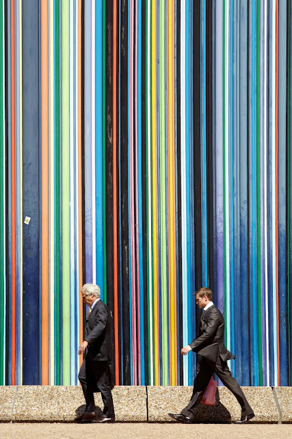
I uploaded the following photo just last night, knowing that it better suits (no pun intended) the online viewing experience:
Of course, I really like the photo. I like the colors, the contrast, and the fact that there is a "survival of the fittest" story going on as the younger businessman walks to overtake the older one. I like the chaos of a riot and the symmetry of the decisive moment. In art, I like baroque and classicism. But the internet seems to have more definite preferences. You know that saying about how the person who sets the terms for the debate has already won? (yeah, either do I or I would have just quoted it) Well, I think that what I will call "thumbnail aesthetics" has set the terms.
What does this mean for visual culture? How much does the typical viewing size affect what we produce and consume visually? Think about how "thumbnail aesthetics"might influence your taste. Does it affect how you crop? what you photograph? what you choose to post? Is it something you have already considered, and if so, did thinking about it lead to any conclusions?


4 comments:
You always have the most interesting thoughts to chew on. LOVE that last picture. Wowzers.
I love this post. I hadn't considered this before you told me about it, but it's interesting. I think I have always been drawn to the tighter shots anyway.
All of those are very professional . Thank you so much for sharing us.
Clipping Path
Hey
I just wanted to say that I am very impressed with your photos and you’re photography on Instagram so far!
This company is currently looking for photos like yours and was wondering if you would like to sell some of them?
Your photos will be used for websites, catalogs, books, magazines and ads.
If you’re interested, register here now as spaces are filling fast.
Regards,
P.S. You don’t need to be a professional photography to get started. >> Sign up here
Post a Comment