Sunday, September 7, 2008

Peter "Awilo" Kithene: Hero

I wanted to try another example of a photo in text using clipping masks, so I thought of Peter—Awilo to us—who was named CNN's "Medical Marvel" hero in 2007. I did a photo session of him back in 2003 not long before he married our longtime friend, Katrina.

"Hero" is a fitting word to describe Awilo. As an orphan (at age 12) in a small Kenyan village, he not only found the strength to raise his siblings, but went on to pursue an education in order to help others. He studied pre-med and psychology at the University of Washington, but not for the purpose of building his own wealth. Instead, he devotes his time and energy to the improvement of medical care in Kenya. Along with Katrina, he founded Mama Maria—a nonprofit organization that brings needed resources to people like Awilo, people who may one day follow his example of service. Read more about Peter's remarkable life and their organization when you have a minute.

And now for a few technical comments...
You can see that a simple one word clipping mask can be very powerful. All I did was type the word "HERO" in a big font and then used the clipping mask technique explained in my Monthly Special post. I used the text formatting palette to bring the letters closer together and then I added a black background layer. That's it. Very simple and appealing. It would make a good graphic for, say, a New York Times Magazine cover story. (hint. hint. NY Times editorial board. Just a suggestion.)

Friday, September 5, 2008

Photoshop Express


Since I announced that September would be a "back to Photoshop with a vengeance" month, it's only fair that I point you in the direction of Photoshop Express (beta). No, it's not another piece of software to buy. It's a slick new service that gives you two gigs of space for your photos, and even more importantly, intuitive tools for quick retouching right from your web browser. And did I mention that it's free?

I checked out the video tutorials (see screen grab above) and was so impressed that I can't wait to give it a try (even though I'm never on a computer that doesn't have Photoshop). When making adjustments (such as fixing exposure or converting to black and white), the interface presents you with a series of preset choices. Just select the one you like, then move on to the next adjustment. The options are many and even include some special effects that kids will love (although I'm not a big fan of silly warping and pseudo comic book filters). The most useful feature, in my opinion, is the ability to apply multiple adjustments for more sophisticated results. You can even remove blemishes (unless, of course, you wanted to remember that zit).

Bottom line
The good news: Not only can you do almost every basic retouch imaginable, you can store up to two gigs of photos for free and fix photos from any computer (no software needed other than your web browser).

The bad news: No text tool, so it won't help you do the September Monthly Special.

Wednesday, September 3, 2008

September Monthly Special: Text + Photo

Thanks to all those who braved the "photo within a photo" special last month. This month we're back to Photoshop with a vengeance. I have already posted a "starter" about the basics of adding text to a photo, and feel free to use the starter as the basis for your September project, but in this post I'm trying a more complex two-part tutorial. Please note that any use of Text + Photo will fit this month's theme. The following is just one of many possibilities.

The backstory
Have you ever seen a photo inside text? At a whale watching place in Oregon, for example, I saw a poster that said "Whale Watching" but with photos of—you guessed it—whale watching inside each letter. For some reason, I thought the whole photo-in-text thing would make a good August Monthly Special, but there were two major deterrents:

1. I realized that every time I see a text made of photos it is HIDEOUSLY TACKY (Sorry, but I have strong opinions, so no offense if you are itching to spell out PUPPY LOVE using photos of your new pet terrier. I will teach you how to do it, but please, for the love of taste, don't go there.)

My eyes! They're melting from too much cuteness!!! Make it go away!

2. I try to make things Elements-friendly, and as it turns out, Elements does not treat the process in the same way as Photoshop.

But who am I to back down from a challenge? I just delayed it a month. My lofty goal to kick September: to create a photo-in-text project that I like. Wish me luck.

The tutorial for Photoshop and Elements
I will go through the basic steps to add photos inside text and then I will attempt to apply those principles to a project. In a future post, I might get even more ambitious. Be very afraid. I am.

The following is oh-so-easy. The hard part will be coming up with a finished product that isn't tacky (see above).

Step 1.
Create a new document with a white background. The document can be any size you want—see the grid tutorial for some basic principles. Also, you can change the background color at any time by using the paint bucket tool, selecting a color, and dumping the paint into the background layer.

Step 2.
Create a Type layer and type in whatever you want. See the Starter if you're not sure how to do this.

Step 3.
Open a photo that you want to use and put it on a layer above your text layer (the grid tutorial will help you if you don't know how to bring a photo into a new layer).

Step 4 (Photoshop).
Now you are going to create a "clipping mask," which means that the photo above will only be visible through the shape below (in this case, text). To create the mask, make sure your top layer (the one with the photo) is selected and then hold down Command-Option-G (Mac) or Ctrl-Alt-G (PC). And voilĂ , photo inside text. You can still change the text on its layer or move/transform the photo on its layer as long as you don't merge/flatten the image.

Step 4 (Elements).
Why this is different in Elements, I don't know, but you are going to create a clipping "group." Make sure your top layer (the one with the photo) is selected and then hold down Command-G (Mac) or Ctrl-G (PC). And voilĂ , photo inside text. You can still change the text on its layer or move/transform the photo on its layer as long as you don't merge/flatten the image.


Superfluous note for Photoshop: If you're not a fan of keystrokes, then you can choose "Clipping Mask" from the pull-down menu in the right of the layers palette. Or, if you like compromise, you can hold down the two keys without the "G" and move your cursor in between the photo layer and the text layer until you see the arrow change into a clipping mask icon. Any way you do it, you end up with a clipping mask.

Superfluous note for Elements: If you love using your mouse, go to Layer--Group with previous for the same result.

Part II: My attempt at photo in text
With my critique of all the tacky photo-in-text layouts, I have really set myself up for critical scrutiny. This is not exactly a step-by-step account, but here's an explanation of what I did.

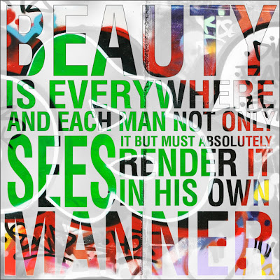
Remember the graffiti "B" and the quote about beauty from the starter postscript tip? Well, since I already intended the image and the quote to be read together, I thought it might be fun to merge the two. So I opened the graffiti photo and used the type tool to start adding in text.
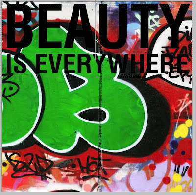
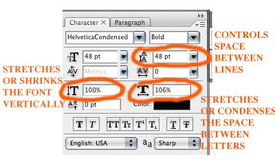
You can see that I messed with the font formatting in ways beyond what the starter taught. I should also note that I did this in CS3. Once you started playing with the text formatting, you get a feel for how you can play with text:
I quickly learned that life would be easier (i.e. more control) if I didn't put all my text on one text layer. In the screen grab below, I was highlighting a altering a separate text layer until I got it to match the proper width.
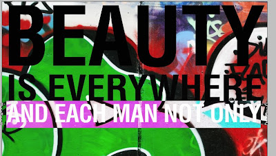
But I needed to duplicate the clipping mask over each layer of text:
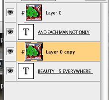
It's easy to do, but it starts to look like a mess with each added layer:
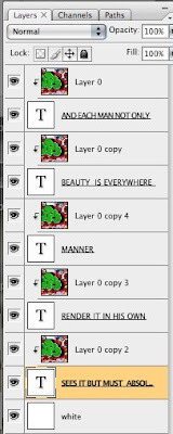
Eventually, I finished and had all the photo/text on a white background. It looked too stark and wherever the graffiti was white the text seemed to disappear. So I did a few things:
First, I copied a layer of the photo and dragged it to the bottom just over the white background, and instead of "Normal" blend mode I selected "Luminosity." This made a black and white version of the entire photo that could show through between the text. I dialed the opacity down so it wouldn't overwhelm the already complicated image. Still wanting more definition, I highlighted all the layers except the two background ones and selected "Merge Visible" from the pull-down menu at the right of the layers palette. Now I could easily make one final edit on my merged layer.

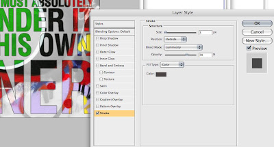
I double-clicked on the merged layer to bring up a "Layer Styles" box. I won't give a tutorial on all the options here, but I will show you that I selected "stroke" to create a line around the text, and I adjusted that line's opacity so it wouldn't be too intense:
The end result may make your eyes hurt more than the cutesy puppy and kitten image that I mocked, but I think it has a nice urban album cover sort of feel. The words take time to decipher. The image demands concentration. The message about the subjectivity of beauty certainly hits home. What do you think? Love it? Hate? Whatever?
Your challenge
The Text+Photo theme this month invites you to explore the marriage of text and photography in any way—even without Photoshop. I may have another go at the image-in-text thing, but I will also explore other possibilities and give new tutorials. I can't wait to see your own work. Come back here to link and share your own work and to see what others have done.

Monday, September 1, 2008

Add text to a photo

Introduction
Like all the "starters" the following tutorial illustrates a very simple concept—in this case, how to add text to a photo. The internet abounds in complex tutorials, but sometimes the easy things get ignored because the pros think they're too obvious. I fell into that trap until Michelle said, "I know a lot of people who don't know how to put text on a photo." So here's hoping those people read my blog...

The example
As an example, I will use a page from a wedding album I designed a couple of years ago. In this case I wanted to use a vertical image of the cake, but I thought the square page looked too plain with just the photo. My solution: put the name of the bride and groom next to it. I think the final result is much better than just the photo alone:

The steps
Let's look at how I got there while we learn basic principles you can apply to your own projects.

step 1. Open the photo you want to which you want to add text. Here's the wedding cake all by its lonesome:

Note that all my screen grabs are from CS3 this time, but you can also do it in Elements, I promise.

step 2: Hit "T" for text or click on the icon in left toolbar that looks like a "T". (In Elements you may have to double click the background layer and click "OK" to rename it to an editable "layer 0."). If you click on the "T" in the toolbar, you will notice that you have options like "Horizontal type tool," the pointless "Vertical type tool" (pointless, because you can make the horizontal type vertical anyway) and others that we'll save for another time (or not). Once you have selected the type tool, a menu bar will appear at the top:

If you have done any word processing, the menu will not be intimidating: a pull-down list of fonts, a place to adjust the font size, right, left, or center justification...pretty standard. You will also notice an icon (at far left for Photoshop and at right for Elements) that allows you to change between vertical and horizontal type with a simple click. And then there's the box you can click to change color (we'll use this later).

step 3: Now go ahead and click somewhere in the photo. You will notice that when you use the text tool, you automatically create a new layer. Now type away (hint: If ever you type and can't see your text, chances are, your color box matches your background or the font size is super small)
I typed the name of the bride.

But the size you select may not be right so....

step 4: Change the size of text as needed by highlighting the text (double click on it or on the text layer in the layers palette—the "T" thumbnail icon, not the layer name) and selecting a new font size in the menu bar. Alternately, you can bring up a some free transform handles by holding the command key (Mac) or Crtl for you Windows folks. Those little handles will let you drag and distort the font as you like, the disadvantage of this latter technique being that you can't make it constrain the proportions (experts please correct me if I'm wrong). You can see the highlighted text (now looking too big) with the transform handles below:

step 5: Add more text on another layer. We can't forget the groom, so we'll make sure the text tool is selected and create a new text layer by clicking somewhere else in the photo. (Just for the fun and frustration of it, try clicking near a word you have already typed and it will snap back to that layer instead of creating a new one. If this ever happens, you can avoid it by holding "Shift" while clicking.) When the text is highlighted you can move it wherever you like (your cursor will become a move tool when it's outside the highlighted part—just click and drag).

step 6: Move the groom into a good place...say, in a subordinate position to the bride? How's that?

Step 7: On yet another text layer (you know how), add a giant fancy ampersand (much cooler than boring old "and"), and then use the text menu bar to change the size and the color.

How about a buttery yellow?

Step 8: Final adjustments. First, I moved the ampersand to a more logical place. Next, in the layers palette, I dragged it under "Courtney" and "Carl" so their names would not get buried. And finally, since the ampersand was too intense (This wedding is brought to you by the symbol for "and"! ) I lowered the opacity.
Before printing, you can flatten and save as a jpg for printing. That's it. Now you can start doing cool things with text and photos.

Postscript tip
One more thing. What if you want to add a big chunk of text and you don't want it to run wildly off the screen? You can create a text box to keep your text where you want it. After selecting the text tool, click and drag to define the size of the text box (hint: if you want a perfect square, hold down the shift key). Now you can type away and everything will stay within the box. Here's a section of a book layout where I wanted to add a quote:
After typing the quote in the text box I can move the text around as one chunk until I like the layout. Here's the finished two-page spread:
