I first happened upon
Elaine's blog back in August when I was doing the "
photo within a photo" theme. As is the case with all good French people, Elaine was taking a four-week vacation in August. Luckily, she had posted
a great photo within a photo shot on her site. I have been admiring her work ever since, so I am happy to share some of it with you in this brief interview
(NOTE: As always, my guests hold the copyright to their work. Please respect it.)
Most of your photography on your blog and website is black and white, is there a reason that you favor black and white photography over color?My first approach to photography was in black and white, through my father’s photos as a kid, seeing them appear on paper in an improvised darkroom in our flat. Then, I discovered the b&w humanist photographers such as
Cartier-Bresson or
Ronis and the work of
Magnum agency journalists by whom I have been very much influenced.
Besides, I find it easier to convey the sense of a moment without the interference of colors and also because monochromatic settings leave more space for graphics, shadows, lights and contrasts which are very dear to me and I have to admit also much easier to shoot. As far as I’m concerned, colors are terribly difficult to handle…
 Here, the use of b&w gives a sense of unity between the boy, shadow and reflection
I hardly ever use film cameras but if I do, it is with b&w films, so that I can do the printing myself in a darkroom, which I find fascinating.
Otherwise, I use my canon digital camera (
rebel Xti), taking most of my photos in RAW, for the flexibility of the format. Yet my camera is always on b&w settings, so that I get direct b&w screen control. I have gotten used somehow to thinking in b&w, anticipating what a scene will look like once captured, focusing on lights and shadows.
Nevertheless, I can change back to colors on the computer and sometimes I am pleased with the result and decide to leave it that way, especially when there is one main color in the scene, as a sort of “bichromatic” picture. If you have a look at my galleries, all the color pictures have a clear dominant tone.
 This would be more of a “black and blue” picture than a full “color” picture
As I have said before, my camera is always on b&w settings, so when I upload the photos onto the computer they are already in b&w. I work on the RAW files with Canon’s software DPP and most of the time I adjust the levels or curves a little to sharpen the contrast. I also enjoy very much the filters effects, especially the red one that is always very efficient on skies and reflections.
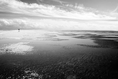 Here the red filter effects make the clouds stand out and the light appear darker.
When I need a bit more processing, I use Photoshop to create layer masks so as to work on a selected part of the photo. And that is about it really, as I am not very good with computers and not willing to spend too much time on processing.
Do you have any advice for people who are new to black and white photography?I got into b&w photography because I was moved by some photographers’ work. I remember the emotional shock it was for me to discover
Sebastiao Salgado’s collection or “reading”
Abbas’s Children of Abraham book. So I guess it mainly depends on one's sensitivity. People around me keep asking why I don’t take color pictures and the only thing I can say is that I shoot in b&w because this is the way I feel it, because this is what I find “beautiful.” So, if I were to give advice to someone, with my very small experience, it would be to shoot what you like, because it moves something in you that you want to share. The main key to a strong b&w photo is obviously the light and the shadows it creates, but it is also easy to play with transparencies, reflections, smoke etc. Marc’s rules for b&w are just the most important things you have to bear in mind. :)
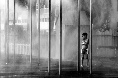 The artificial mist creates a particular mood around the boy and makes him stand out in this graphic environment.
What do you hope to share with others with your photography? This is a very tricky question actually. I guess I just want to provoke emotions in others the way some photos do for me, either because it tells a story (funny, tragic, informational...) or because the aesthetic or the mood in the picture gets at you. It is mainly about sharing a point of view on one moment in time. The theme that keeps coming back in my photos is the isolation of men in their self-made environment, and my photos are probably my way to show that I care....
Could you comment on a few of your favorite black and white photos?There are a few of my pictures that are important to me for the moment they represent or for the time I put into them or simply because I was lucky to be there at the right moment.
 "Adieu"
Adieu was taken in New York City. There was a big puddle on the ground and some NYC-style buildings were reflecting in it. It took me a while to figure out what I wanted to do with this and I put my hand over my eyes to protect them from the sun. This is when I realized my hand appeared in the sky, as if coming out from the cloud. It is one of my first water reflection experiences and it has opened up lots of new perspectives to my photographic habits. I didn’t do any processing on it. (1/400 sec f 3.5)
 "Rrrrr"
I like the story in this picture which I find quite funny, this little boy escaping from the roaring man on the poster. This is a photo I had to process bits by bits to get the poster up front bright enough and to get rid of the reflections on it. I also appreciate the general graphic of the composition.
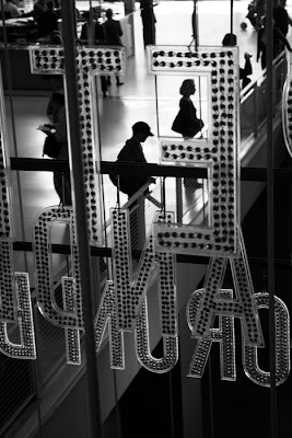 "Grand Ecran"
"Grand Ecran" is an example of human isolation in big cities, everyone in his box, letter ...no communication… and yet a beautiful surrounding. Here I used the red filter to make the letters stand out (as they were red lights) and the light coming from the back helped a lot to darken the silhouettes.
Thanks Marc for having me on take-out photo.
Thank you, Elaine, for sharing your work and insight.
As a side note to my readers, I have to say how impressed I am with both
Marcel and Elaine for their willingness to talk about their work and their ability to discuss it so eloquently in a second language. Ever since my interview with
Lorrie McClanahan in August I have been wanting to do more interviews, so being able to do two this month has been great.
The month is almost over, but there is still time to
post your own black and white work as part of the Monthly Special. [New to Take-out photo?
Check out the FAQ page.]

 The stylized crop is actually my way of not showing that one sleeve was up and one down:
 But on the other hand, the disheveled look suits his style.
 If I had not told him to change into a white shirt, his clothes would have clashed with this beautifully textured shed.
 Even a head-and-shoulders shot benefits from a good background. And speaking of basic shots...
 Your standard mug shot à la school photos is way better with a real-world background.





