Showing posts with label October Monthly Special. Dots. Show all posts

Wednesday, October 29, 2008

Wrapping up our October "Dots" theme: another IKEA idea

This simple IKEA-based idea is in honor of the October Monthly Special. I haven't had time to do this one myself, but I wanted to suggest it before the month ends. If you have done a dots grid and want to recreate it as an art statement/storage device, just get yourself enough grundtal round magnetic containers ($4.99 for a pack of 3) to recreate your dot grid....
and put a photo (or colored paper) under each glass cover to form your "dots". You can crop your photos in Photoshop (the web site claims the diameter is 3 3/4", but it wouldn't hurt to measure) or you can print 4x6 photos and crop by hand.

Since the containers are magnetic, you can arrange them on a "Spontan"...
or a "Bits"...
or your refrigerator or anything else a magnet sticks to.

Your magnetic dot grid will be both attractive and practical (good qualities in humans and objects alike, if you ask me). For a craft room or an office, it would make a good piece of storage art. The style could range from modern minimalism to glam and girly depending on your design.

And for Christmas, you can make a very bold advent calendar (you would have to come up with a larger surface), you could alter 25 grundtal containers. Too many? Maybe a "12 days of Christmas" thing might be better.

Other variations and ideas? Please add your comments.

Meanwhile, there's still time to do the October Special.

Saturday, October 25, 2008

Pointillism and a rant about how poorly filters imitate art

Seurat's most famous painting, "Un dimanche après-midi à l'île de la grande jatte,"as seen on Wikipedia.

Since we're focusing on "dots" this month, I thought a post about pointillism might be in order. But somewhere in my twisted thought process this led to an internal rant about how much I hate the "artistic" filters in Photoshop. I try to keep things positive on my blog, but I should clarify (à la Lemony Snicket) that although I generally intend "positive" to convey a sense of upbeat and encouraging affirmation, unfortunately, I must tell you that "positive" is a word which here means "absolutely certain," as in I am absolutely certain that many of the filters in Photoshop are relics from computing's less sophisticated days which should have been discarded along with floppy disks or bundled into some cheap art program for "kidz" (oh yes, that's kids with a Z).

Before I explain myself, let's get back to pointillism. Look at this lovely detail of a Seurat painting found on Wikipedia (you can click to make it larger):
Like the impressionists before him, Seurat studied how the eye perceives color. But rather than blend, blur, and smudge pure color with brush strokes, Seurat preferred optical blending. In other words, he believed that side-by-side dots (also called stippling) of blue and yellow, for example, could make a more vibrant green than mixed paint. Many definitions of pointillism (Wiki included) claim that Seurat's dots were made only of primary colors, but that is only the case if you look at the broadest definition of "primary color," one that might include red, green, blue, orange, violet, magenta (incidentally, Seurat grew up on "Magenta Street"), cyan, and yellow.

To argue that CMYK printing, RGB projectors, CRT monitors, and the like are essentially pointillist in nature makes a lot of sense. If you blow up a photo in a magazine (or look closely at a billboard), for example, you will see dots of color that your eye naturally blends at the intended viewing distance. Pixels are also dots of color that our eye blends.

Why then, is Photoshop so bad at "pointillizing" this photo of my friend, Ash? It's no Seurat, that's for sure.
Some computer science experts claim to have found a better way, but I'm not ready to pay $25 to read the article. So here are two (of many) reasons why I think that Photoshop is no replacement for Seurat.

1. Its images are made of square pixels, not hand-painted dots. Look at this detail of "pointillized" Ash and just try to convince me that it looks like dots made from a paint brush:
and 2. human subjectivity plays such an important role in art that user-end control is paramount—expert algorithms notwithstanding. The "pointillize" filter limits your input to one thing: select cell size.

I am picking on "pointillize," but I could rant just as easily about the filters that supposedly create charcoal sketches, watercolor paintings, and so on. Maybe there is a challenge in all of this. Maybe I should dedicate a month to discovering how to make something beautiful from those filters. But I don't think I will undertake that challenge any time soon. The thought of creating an impressionist painting or a charcoal sketch in Photoshop makes me think of those hideous services that will turn your photo into "art." For the love of taste, don't do it—or at least not with the same amount of irony as someone must have to display paint-by-numbers art. Photos ARE art. If you want a watercolor portrait of your child, hire an artist. If you want to use an "artistic" filter, just be sure to add your own artistic vision to your work. One-step filter conversion is not artistry.

If I were to try to make some "take-out photo" lessons out of this they might include the following:
  • There is nothing wrong with imitation. If I thought so, I wouldn't have done the Barbara Kruger tutorial, and wouldn't have told you to look for design inspiration on Criterion dvd covers. Just don't let your computer make all of the choices.
  • Computer programs that imitate humans need to imitate human "imperfections"
  • (I'm speculating here) The only way to make those bad artistic filters into something good just may be finding a use for them not indicated by their name (i.e. don't do a charcoal sketch with the charcoal sketch filter; do something other than a pointillist "painting" with "pointillize," etc.)

Wednesday, October 22, 2008

Retro pop art dot photo

Another idea for the October Monthly Special—I made this retro dot art by using a free brush set that my son Max showed me. In the not-too-distant future I will do an entire month about brushes. But for now, if you want to experiment with brushes, here's the quickie explanation: Download a brush set. Drag it into Photoshop-->Presets-->Brushes. Select the brush tool when in Photoshop and click on the little arrow in the brush pull-down menu (see image below) and select "load brushes," at which point you can locate and "replace current brush set" with the new one (and yes, many brush sets—including the one I used here— work in Elements).

I won't do an entire tutorial on this, but here's a basic outline of how I got this look:
  • I selected the brush from the set in the link above and put in on its maximum size before stamping it on the blank document.
  • I found a photo that had the right feel for this kind of treatment (it happens to be of my sister-in-law), converted it to black and white, and then added a toned gradient.
  • Using Select-->Color Range, I selected the circle and square pattern so I could copy it (minus the white) onto its own layer.
  • I brought the photo into my "dot" document, resized it as needed, and used the same clipping mask technique you saw in this month's special to make the photo come through.
  • Finally, on a new layer I selected some rectangular areas, filled them with various colors, and then lowered the opacity of that layer to create an overlay effect.
I realize that the above explanation is not going to help you if you're new to Photoshop, but I'm hoping it will give you more "dot" ideas for this month. The main lesson here is to experiment using some of the techniques you've learned.

Monday, October 20, 2008

Personality Pie Chart 2

I'm liking the personality pie chart, so I wanted to do another one. I think it would make a fun series. I did a bleach bypass look on this one instead of black and white.

The photo is of a friend/struggling actor who lives in Paris (and if you're looking at this, Nico, let's just say I boiled you down to five attributes for the sake of art). We did the shoot in the Jardin du Luxembourg until a park official told us to stop. "But I'm just taking photos of a friend," I told him. "Not with that camera," he replied. This was one of those times having a pro camera gets you fewer privileges.

Saturday, October 18, 2008

Variation on the October Monthly Special: Personality Pie Chart

Click to enlarge. Then you can see the words as well as my imperfect pie chart (made with the help of the pen tool—something I never use).

If you're not into the dot grid thing, but you still want to do the October Monthly Special...get creative and do anything involving a circle or circles.

Explore circular patterns in any way. I was flipping through a book with pie charts and suddenly got the idea for this. What do you think? I'm not sure everyone would love to have their personality dissected, but Lucas is a good sport.

Check out Max's second submission, for an example of something experimental. And be sure to look at the projects other people have posted so far this month. Their work may inspire you.

October is more than halfway over, hope to seen your own experiments soon.

Sunday, October 5, 2008

Selecting a color palette with the help of Colourlovers

A sample of the colourlovers pack of Moo minicards. So much cooler than stealing Martha Stewart paint chips.

If you plan on doing the "Dots" October Monthly Special (and I hope you do), you will find yourself thinking about color. Not that you have to reserve some of the dots for color, but either way you will be making color choices. If you use color photos and the palette clashes from one image to the next, the end result may seem a bit "off." And you don't have to be a designer to sense the discord.

But how confident are you at choosing colors? Unless you're like my color-genius mother-in-law (who seems to have perfect recall of multiple paint decks and fabric swatches in the same way that some people have perfect pitch), you may find yourself stumped when faced with a color choice. And that's where Colourlovers comes in...

screen grab from colourlovers.com

Colourlovers.com is an amazingly rich site, complete with a blog that I have subscribed to ever since I finally got with the whole blogosphere thing. I especially love the palettes. Readers have submitted well over a half million palettes (you heard me right, more than 563,266 and counting) for your consideration.

The inventive color names are fun in their own right. I have always found the names of my wife's beauty products amusing (e.g. "I'm not really a waitress" nail polish), but with more than 500,000 palettes, the colourlovers site has got quirky names way beyond your standard beauty store fare. Here's a sampling:
You get the idea.

When you find a palette you like, you can click on it and see the HEX and RGB values for each color. Don't know what to do with those numbers? Check back for my next post: a "Starter" about sampling and changing colors.

Postscript:
Thanks to Lindsay, for pointing out the Adobe Kuler site/app. Check out the video intro about it.

Tuesday, September 30, 2008

October Monthly Special: Dots

Introduction
Our theme for October: Dots!
Not the candy. Sorry. The ubiquitous design theme. The ever-popular polka dot. The Hyatt place has a logo made up of polka dots. So does the Reelz channel. So does one of the world's top wedding photographers. And so on. If you've been following my blog, it will come as no surprise to you that my original inspiration for this "Monthly Special" came from a Criterion DVD cover.

In this (completely revised) tutorial, you will learn how to make a 5x5 inch polka dot photo card (see below). You can apply the principles you learn to other sizes as well, and best of all, you can use the project as a template to save time on future variations.
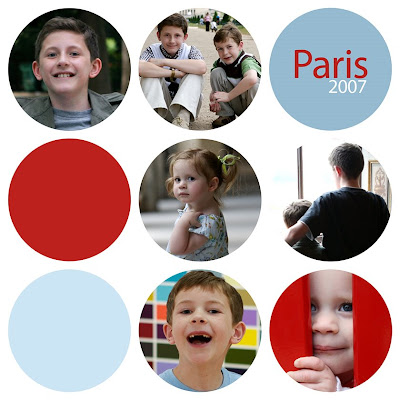
The tutorial

I have written this for Photoshop Elements or Photoshop. If a step differs in Photoshop, I will indicate the change in parentheses (screenshots come from a mix of the two due the changes).

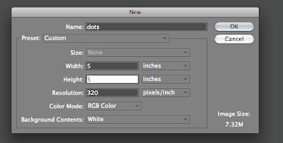
1. Create a new document, 5x5 inches at 320 dpi. (I use 320 dpi because it's what big chains like Costco use, and I know that Costco will print on 5x5 paper for you).
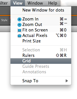
2. Turn on the grid by selecting View-->grid (or in PS, Mac: Command+H, PC: Ctrl+H)
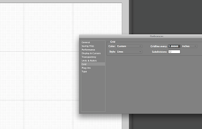
3. Customize your grid by opening Preferences-->grids. Before typing in any numbers, you will decide the number of dots you want across each row (here, it will be 3). Next, get out your calculator (if you're as bad at math as I am) and divide the number of inches by the number of dots (e.g. 5/3=1.66666667). Now type that number in the "Gridline every" box. And under "subdivisions," type "32."
4. Duplicate your background layer (Mac: Command+J, PC: Ctrl+J). You will now be working on a new layer to create a "dot template."

5. Time to create your first dot. Select the elliptical marquee tool from the toolbar.
Hold down the shift key (this makes your selection snap to the grid) and place your cursor in the middle sqaure, one small subdivision from the left and top lines. Still holding down the shift key, click and drag to form a circle within the grid lines, leaving only one small subdivision on the right and bottom sides. When you're done it should look like this:
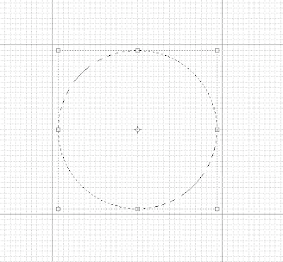
6. Now you will click on the paintbucket tool (G) and click in the circle to fill it with black (the color doesn't actually matter). It should now look like this:
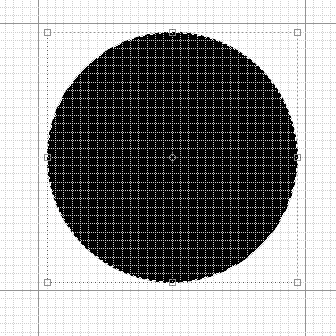
7. Now you get to duplicate that dot eight more times, not by repeating that process, but by using the keystrokes command–J (PC: Ctrl–J) eight times. You will now have nine total dots all sitting one on top of the next in the center circle. Move each one so that it perfectly centered in its own sqaure (one subdivision on each side). You do this by clicking once on one of the layers, then using the move tool (V) to put it in a different square. Repeat the process on each layer until you have a grid of black dots like this:
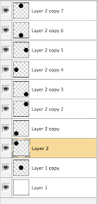
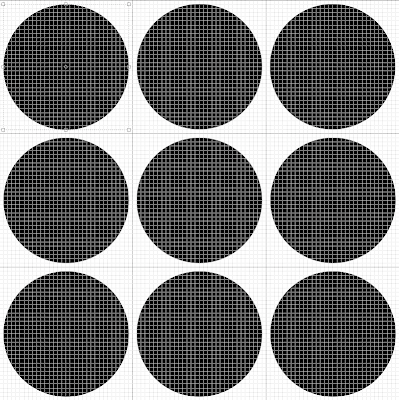
These going to create a template that you can use over and over. Here's how:
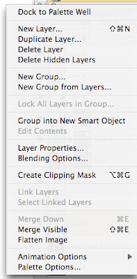
8. Deselect (by unclicking the eye icon in the left of the layers palette) the layer (or layers) below all of your dot layers. In other words, you will still see your grid of dots, but no background. Now you can merge the dots onto one layer by selecting "merge visible" from the layers palette pull-down menu ("merge visible" is four from the bottom on the image at right). All of your dots will now be on the same layer. This is a good time to do a "save as" and call it "5x5 dots template." If you are worried about accidentally saving over your template, create another file with and name it something else by doing a "save as" again.


9. Now the fun begins. Since you know the size of the grid square for each dot, you can begin opening and cropping photos for each dot. Open a photo, and with the crop tool selected, enter 1.67 x 1.67 (inches, not pixels) at 320 dpi resolution and crop your photo as desired.

If you like the crop, duplicate the layer and move it (with the move tool) on top of one of your dots like this:
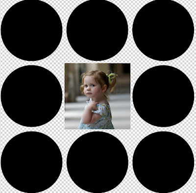
Each time you do this, you will creating a new photo layer on top of the dot layer. Keep them on their own layers as long as you want to move them around, but when you like your layout you will merge the photos just like you did with the dots earlier. But first...

(optional) 10. What about some colors? In my opinion, it looks nice not to have photos in every single dot. You may want to reserve a few dots for colors. It's amazingly easy. Just choose the rectangle shape tool (NOT the dotted line marquee tool):
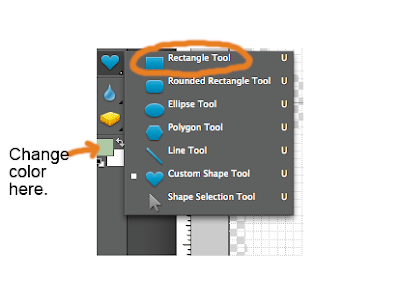
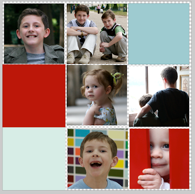
and you can change the color by clicking in the foreground box and selecting a new color (Note: in Photoshop, the box to click for changing color is in the top menu bar). Now, when you click and drag to fill a grid box, your selected area will be filled with color. Want to change colors? No problem. Just make sure that layer is active and click in the color box to change it. You can add new color squares and change their colors as needed until eventually, you get something like this:
11. Once you are happy with the layout, you will need to put all those photos and colors on the same layer before we get back to the dots. As you did in step 8, you will deselect anything you don't want to merge—this means anything that is not a photo or color square. DO NOT merge the dot layer with everything. It needs to stay on its own layer.

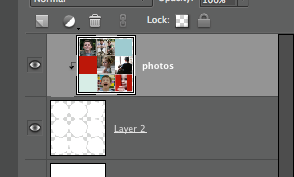
12. Now you are ready to see it turn back into polka dots by creating a clipping group/mask (If you did last month's photo in text tutorial, you already know how). Make sure all your layers are now visible (eyeball icons on each). Then, make sure your photo layer is above the dot layer as seen below:
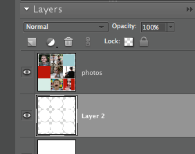
Make the photo layer active by clicking on it (note that—uh-oh—it is not the active layer in the photo above) and then create a clipping group (in Elements) by holding down Command+G (Mac) or Ctrl+G (PC). (In Photoshop, you will create a "clipping mask" by holding down Command+Option+G (Mac) or Command+Alt+G). See how the top layer is clipped by the layer underneath it?

IMPORTANT NOTE: If the above step does not work, you may be using an earlier version of Photoshop. In that case, simply place you cursor in between the two layers being used for the clipping mask while holding down the option (or alt) key until you see two intersecting circles. Click when those little circles appear and it should work.
(optional) 13. Want to add text over a box? Apply the same basic principle seen in my "add text to a photo" tutorial.

13. Finally, you can flatten your image, save it, print it, and bask in the satisfaction. And don't forget to come back to this link (under the "Participate in the Monthly Special" at the right), and share your results for all to see. See the FAQ page for details. If (when?) you do post and link back here, make sure you use the permalink (also discussed on the FAQ page)—the link for that post—and not just your general blog link.

I can't wait to see your results!
